Bug report
When a custom bundle is created the kendo.aspnetmvc script is not placed on the correct order. Thus, in some scenarios errors occur. For example if a custom kendo script is created using the following kendo-config.json and MultiColumnComboBox is used with ServerFiltering enabled and error will be thrown:
{
  "version": "2026.2.520",
  "components": [
    {
      "file": "kendo.aspnetmvc.js",
      "features": []
    },
    {
      "file": "kendo.dropdownlist.js",
      "features": []
    },
    {
      "file": "kendo.multicolumncombobox.js",
      "features": []
    }
  ]
}
Reproduction of the problem
- Run the attached sample. In the sample a custom bundle as explained above is used. TelerikAspNetCoreApp1.zip

- Try to select values in the DropDownList or MultiColumnCombobox
Current behavior
The bundle builder allows kendo.aspnetmvc.js to run before the widgets whose UI for ASP.NET Core helpers it augments. The data in the components is not filtered and the following error is thrown:
Uncaught TypeError: kendo.ui.MultiColumnComboBox.requestData is not a function
Expected/desired behavior
The kendo.aspnetmvc.js schould be ordered correctly by the custom script builder, so errors to be avoided and the components to work as expected.
TicketID:
1716198
Environment
- Kendo/Telerik version: 2026.2.520
- Browser: [all ]
Bug report
Reproduction of the problem
- Open the Demos - https://demos.telerik.com/aspnet-core/pdfviewer/dpl-processing
- Load the file Test_pdf_png.pdf
Current behavior
An error: Unable to load image 'data:image/png;base64 is thrown in the console
Expected/desired behavior
Loaind images when using DPL is a limitation, but there should be no errors in the browser console even when a file containing image is loaded in the PDFViewer.
Environment
- Kendo/Telerik version: 2026.2.520
- Browser: [all ]
Bug Report
When applying the kendo.aspnetmvc.ready.min approach in the following Knowledge Base articles for PDFjs workarounds(MVC/Core), the watermark and banner display.
Reproducible
- See attached project: PDFViewerKendoReady.zip
- Run the project.
Current Behavior
The watermark and banner appear.

Expected Behavior
The watermark and banner should not appear.
Environment
Kendo UI version: 2026.2.520
jQuery version: 4.0.0
Browser: all
Bug Report
When applying the partial view approach in the following Knowledge Base articles(MVC/Core), the watermark and banner display.
Reproducible
- See attached project: PDFViewerPartialView.zip
- Run Project
Current Behavior
The watermark and banner appear

Expected Behavior
The watermark and banner should not appear.
Environment
Kendo UI version: 2026.2.520
jQuery version: 4.0.0
Browser: all
Bug report
The DateTimePicker's popup calendar view is cut in the Default, Classic, and Fluent themes.
Reproduction of the problem
- Run the following dojo
- Set the sizing option of the widget to large.
- Open to DatePicker popup.
Current behavior
The Date and Time views in the DateTimePicker popup are trimmed.
Expected/desired behavior
The Date and Time views in the DateTimePicker popup should not be trimmed.
Environment
- Kendo UI version: 2023.1.117
- Browser: [all]
### Bug report
When adding custom classes or styles to the TimeDurationPicker component, they are applied to the hidden input elenent rather than to the parent element.
### Reproduction of the problem
1. Create a TimeDurationPicker and add a class to its element:
<input id="timedurationpicker" class="testClass" />2. When you inspect the component's markup, the "testClass" is added to the hidden input element.
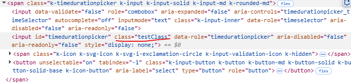
A Dojo sample for reproduction: https://dojo.telerik.com/IsTnGqsk
### Expected/desired behavior
Any custom attributes must be added to the parent element with class "k-timedurationpicker".
### Environment
* **Kendo UI version: 2025.2.520
* **jQuery version: 3.7.1
* **Browser: [all]
### Bug report
On mobile devices, when the TaskBoard columns are filled with cards, the users have trouble scrolling horizontally through the columns. When they attempt to scroll the screen, they accidentally drag cards instead of scrolling the columns. This makes navigation in the TaskBoard quite difficult, particularly for projects with a large number of cards.
### Reproduction of the problem
1. Create a TaskBoard with at least two columns.
2. Fill the columns with cards.
3. Open the browser DevTools and switch to mobile view. Tap a card to scroll the columns horizontally or tap at the bottom of the TaskBoard to activate the horizontal scrollbar.
4. The last card is accidentally dragged.
A Dojo sample for reproduction: https://dojo.telerik.com/izASODan
### Expected/desired behavior
When the user makes a hold/long press/long tap, show the "indicator for drag and drop" and then he/she continues with the gesture by moving the card to the desired column and lift the finger. This way, the accidental dragging will be prevented. For more information, refer to the GitHub issue.
Note: The cards in the TileLayout can be dragged only through the card's title element. The TaskBoard cards can be dragged through the card's body, as well.
### Environment
* **Kendo UI version: 2024.3.806
* **jQuery version: 3.7.0
* **Browser: [all]
As a result of an EF Core issue, the ToDataSourceResult() is not able to perform the query when the DataSourceRequest object contains grouping.
The problem occurs using the query below, assembled by Telerik routine:
var temp = _db.Pessoa
    .OrderBy(item => item.Email)
    .Skip(0)
    .Take(40)
    .GroupBy(item => item.Email)
    .OrderBy(g => g.Key)
    .Select(g => new AggregateFunctionsGroup
    {
        Key = g.Key,
        ItemCount = g.Count(),
        HasSubgroups = false,
        Member = "Email",
        AggregateFunctionsProjection = new
        {
            Count_Referencia = _db.Pessoa
                    .Select(t => new
                    {
                        t.IdPessoa,
                        t.Referencia,
                        t.Nome_RazaoSocial,
                        t.Apelido_Fantasia,
                        t.CPF_CNPJ,
                        t.RG_IE,
                        t.Email
                    })
                    .OrderBy(item => item.Email)
                    .Where(item => item.Email == g.Key)
                    .Count()
        },
        Items = g
    })
    .ToList();
In the routine where the AggregateFunctionsGroup is created, the Items property must not only be the query itself, but also the fields specified in the main Select. Or, the call to the Select() method must simply be added:
var temp = _db.Pessoa
    .OrderBy(item => item.Email)
    .Skip(0)
    .Take(40)
    .GroupBy(item => item.Email)
    .OrderBy(g => g.Key)
    .Select(g => new AggregateFunctionsGroup
    {
        Key = g.Key,
        ItemCount = g.Count(),
        HasSubgroups = false,
        Member = "Email",
        AggregateFunctionsProjection = new
        {
            Count_Referencia = _db.Pessoa
                    .Select(t => new
                    {
                        t.IdPessoa,
                        ...
                    })
                    .OrderBy(item => item.Email)
                    .Where(item => item.Email == g.Key)
                    .Count()
        },
        Items = g.Select(t => new
        {
            t.IdPessoa,
            ...
        })
    })
    .ToList();
This way, the issue does not occur.
Currently, the text in the Grid commands can be customized in Kendo UI for jQuery using the following commands:
However, such options are missing in the wrappers. Thus, to customize the texts of the commands in the edit dialog, the elements must be modifed as in the example below:
 function onEdit(e){
      e.container.closest('.k-window').find('.k-window-title').text('My custom text')
      e.container.closest('.k-window').find('.k-button[ref-update-button]').text('Button Update Changed');
      e.container.closest('.k-window').find('.k-button[ref-cancel-button]').text('Button Cancel Changed');
 }
In addition, it will be good to have an option that will allow customizing the Edit Dialog text
Bug report
Even if a message file is added, the command buttons and the popup title in the Grid are not localized
Reproduction of the problem
- Open the Dojo examples:
- Dojo with messages file - https://dojo.telerik.com/CehWjRrE
- Dojo with overriding the kendo.ui.Grid.prototype.options.messages - https://dojo.telerik.com/RWCxqxIm
- Decrease the size of the screen so the Grid to be displayed in adaptive mode.
- Click on a row and select the 'Edit' button to open the Edit popup
Current behavior
The command buttons and the dialog title are not localized:

Expected/desired behavior
It should be possible to change and localize the messages texts.
Workaround
 function onEdit(e){
      e.container.closest('.k-window').find('.k-window-title').text('My custom text')
      e.container.closest('.k-window').find('.k-button[ref-update-button]').text('Button Update Changed');
      e.container.closest('.k-window').find('.k-button[ref-cancel-button]').text('Button Cancel Changed');
 }
Environment
- Kendo UI version: 2025.4.1217
- Browser: [all ]
### Bug report
When subscribing to the "requestStart"/"requestEnd" events of the DataSource after the Grid's initialization, the events do not fire during the Excel export.
### Reproduction of the problem
1. Enable the server operations of the Grid's DataSource.
2. Get a reference to the Grid and handle the DataSource "requestStart"/"requestEnd" events by using the bind() method.
3. Export the Grid's data to Excel through the built-in command.
4. The "requestStart"/"requestEnd" events do not trigger when the read request is activated.
A Dojo sample for reproduction: https://dojo.telerik.com/eyiDIGeM
### Expected/desired behavior
The "requestStart"/"requestEnd" events must trigger when exporting the Grid to Excel.
### Environment
* **Kendo UI version: 2024.3.806
* **jQuery version: 3.7.0
* **Browser: all
Currently, the DatePicker can be set to read-only mode by adding the "readonly" attribute through the HtmlAttributes() option or by calling the client-side readonly() method.
Is it possible to implement a built-in Readonly() option, so the DatePicker is initialized as read-only? For example:
@(Html.Kendo().DatePickerFor(m => m.StratDate)
  .Readonly(true)
)
Consider the use of TextWriter async methods for the HTML Helpers, for example the WriteInitializationScript methods. In certain scenarios the use of the synchronous methods causes an exception: System.InvalidOperationException: Synchronous operations are disallowed. Call WriteAsync or set AllowSynchronousIO to true instead.
This can be resolved by explicitly enabling synchronous operations
services.Configure<IISServerOptions>(options =>
    {
        options.AllowSynchronousIO = true;
    });
though synchronous operations have been disabled by default at framework level as of .NET 3.0.
> PivotGridV2 local flat-data binding produces identical values for all measures when multiple field-based measures are defined
---
**Description:**
When using **PivotGridV2** with local flat data (`.BindTo()` / inline `data` option) and defining **multiple measures that each reference a different numeric field**, all measures resolve to the same aggregated value instead of summing only their designated field.
### Environment
- Telerik UI for ASP.NET Core (2025 Q2 / latest)
- .NET 10
- Tested in Chrome, Edge
### Steps to Reproduce
1. Define a flat data model with multiple numeric properties:
```csharp
public class PivotRow
{
public string Category { get; set; }
public int Revenue { get; set; }
public int Units { get; set; }
}
```
2. Configure PivotGridV2 with two measures on separate fields:
```csharp
.Schema(schema => schema
.Cube(cube => cube
.Dimensions(d => { d.Add(m => m.Category).Caption("Category"); })
.Measures(measures =>
{
measures.Add("Total Revenue").Field(m => m.Revenue).AggregateName("sum");
measures.Add("Total Units").Field(m => m.Units).AggregateName("sum");
})
)
)
.Measures(measures => measures.Values("Total Revenue", "Total Units"))
```
3. Bind to local data containing rows where Revenue ≠ Units (e.g., Revenue=5000, Units=3).
### Expected Behavior
Each measure column aggregates **only its own field**:
- "Total Revenue" sums only the `Revenue` property
- "Total Units" sums only the `Units` property
### Actual Behavior
**All measure columns display the same value.** Both "Total Revenue" and "Total Units" show the same number. The pivot engine appears to ignore the `field` property on each measure definition during aggregation, summing the same (first?) numeric field for every measure.
### Key Observations
- The serialized cube schema is correct — each measure has the proper `field` mapping:
```json
{
"Total Revenue": { "field": "Revenue", "aggregate": "sum" },
"Total Units": { "field": "Units", "aggregate": "sum" }
}
```
- The underlying `PivotCubeBuilder.process()` method (used by `PivotDataSource` v1) **does** produce correct per-measure values when invoked manually with the same data and configuration.
- The bug is specific to **`PivotDataSourceV2`** — the v2 pipeline does not pass the per-measure field context through to its internal aggregation path, causing all measures to resolve identically.
- A single measure (e.g., only "Total Revenue") works correctly. The bug only manifests with **2+ measures referencing different fields**.
### Workaround
We implemented a monkey-patch on `PivotDataSourceV2.fn._saveState` that intercepts the rendered cell array and recalculates each cell's value from raw data using the measure's `field` property and tuple member filters. This confirms the issue is isolated to the v2 data source aggregation pipeline — the grid rendering layer correctly displays whatever values `_saveState` provides.
### Attached
Full `.cshtml` page demonstrating the issue (with workaround patch included for reference).
According the the documentation a user should be able to use the keyboard to navigate out of the spreadsheet as deescribed here. However, this does not happen.
Steps to reproduce:
- Open the Dojo - https://dojo.telerik.com/IvdWHNwo/2
- Navigate or click in the last cell in the last row
- Click Tab key.
Current behavior: The focus remains in the same cell.
Expected behavior: Teh second input should be focused.
The issue is a regression starting with version 2024.4.1112
### Bug report
When the virtualization is enabled, in some cases, the selected options in the dropdown do not match the selected options in the input.
### Reproduction of the problem
1) Create a MultiSelect with Virtualization (for example, the same configuration as in the online demo).
2) Select multiple options from the dropdown.
3) Enter a search entry in the input to filter the displayed options and select a specified option.
4) Scroll down and select another option.
5) Remove some of the already selected options through the input.
6) Open again the dropdown. The selected options in the input do not match the selected options in the dropdown.
A screencast for reproduction: https://app.screencast.com/v6GtyST0dQAnh
### Expected/desired behavior
### Environment
* **Kendo UI version: 2025.3.825
* **jQuery version: 3.7.1
* **Browser: [all]
The FormItemBuilder exposes an EditorTemplateView method which allows a view to represent the item and provides the entire modal to the view.
As the elements available to forms are limited to those hard coded by Telerik and whilst extension methods can be employed to expand this limitation slightly, the ability to create a context specific view would be ideal
The current implementation looks like this
Html.Kendo().Form<Model>()
    .Items(items =>
    {
        items.AddGroup("Test", 1, 10)
            .Items(i =>
                {
                    i.Add().Field(x => x.Username)
                    i.Add().Field(x => x.Password).EditorTemplateView(Html.Partial("MyView"))
                }
            );
    })
In this example, the entire model is provided into MyView.
I suggest adding an EditorTemplateFor that uses the lamda expression provided in the Field() method such as
Html.Kendo().Form<Model>()
    .Items(items =>
    {
        items.AddGroup("Test", 1, 10)
            .Items(i =>
                {
                    i.Add().Field(x => x.Username)
                    i.Add().Field(x => x.Password).EditorTemplateViewFor(Html.Partial("MyView"))
                }
            );
    })
Bug report
When a user creates a filter with a date, it starts as an empty Datepicker, but the value is appearing as an empty string. Thus, if the user clicks apply, an error appears in the console. If you place a value in the DatePicker and clear it, the value will be Null.
Reproduction of the problem
- Go to this Progress Telerik ASP.NET Core REPL.
- Add filter for a Date but keep the datepicker empty.
- Select apply.
- Now, add a date and clear the value.
Current behavior
The filter menu sends isnull filter queries in the following format:
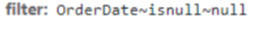
While the Filter component sends it as follows:

As a result the ToDataSourceResult method fails.
Expected/desired behavior
If the DatePicker is empty, the filter should properly perform the 'isnull' query upon clicking apply.
Environment
- Kendo UI version: 2023.2.606
- jQuery version: All Supported Versions
- Browser: all