Declined
Last Updated: 19 Jun 2023 12:36 by ADMIN
Legrand
Created on: 06 Mar 2023 10:45
Category: UI for .NET MAUI
Type: Bug Report
0
ImageEditor in HorizontalLayout not working

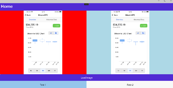
If I uncomment "HorizontalStackLayout", the image is not displayed.

I want to display 2 Imageeditor in the same tabview, how to do this ?

        <telerik:RadTabView 
            telerik:RadDockLayout.Dock="Left"
            x:Name="tabView" AutomationId="tabView"
            HeaderPosition="Bottom"
            >
            <telerik:TabViewItem HeaderText="Face 1">
                <!--<telerik:RadImageEditorToolbar ImageEditor="{x:Reference imageEditor}">
                    </telerik:RadImageEditorToolbar>-->

                <!--<HorizontalStackLayout>-->
                    <telerik:RadImageEditor x:Name="imageEditor1" 
                        MinZoomLevel="0.1" 
                        MaxZoomLevel="20"
                        Source = "{Binding DisplayedPhoto, TargetNullValue={versares:ImageResource Images.palette.png}}"
                                       />

                    <!--<telerik:RadImageEditor x:Name="imageEditor2" 
                        MinZoomLevel="0.1" 
                        MaxZoomLevel="20"
                        Source = "{Binding DisplayedPhoto, TargetNullValue={versares:ImageResource Images.palette.png}}"
                                       />-->
                <!--</HorizontalStackLayout>-->

            </telerik:TabViewItem>
            <telerik:TabViewItem HeaderText="Face 2">
                <Label Margin="10" Text="This is the content of the Folder tab" />
            </telerik:TabViewItem>
        </telerik:RadTabView>

1 comment
ADMIN
Didi
Posted on: 07 Mar 2023 08:17

Hi Legrand,

The control does not appear in the horizontal stack/vertical stack as these layouts do not provide enough space the control to fill into.

You have to set a definitive width and height to the control and the stack layout or using a Grid layout with star sized row. 
Here is an example with Grid Layout: 

    <telerik:RadTabView 
            telerik:RadDockLayout.Dock="Left"
            x:Name="tabView" AutomationId="tabView"
            HeaderPosition="Bottom">
        <telerik:TabViewItem HeaderText="Face 1">
            <telerik:RadImageEditorToolbar ImageEditor="{x:Reference imageEditor1}"/>
            <Grid RowDefinitions="*,Auto"
                  ColumnDefinitions="*,*">
                <telerik:RadImageEditor x:Name="imageEditor1" Grid.Row="0" Grid.Column="0" BackgroundColor="Red" />
                <telerik:RadImageEditor x:Name="imageEditor2" Grid.Row="0" Grid.Column="1" BackgroundColor="LightBlue"/>
                <Button Grid.Row="1" Grid.ColumnSpan="2" Text="Load Image" Clicked="Button_Pressed"/>
            </Grid>
        </telerik:TabViewItem>
        <telerik:TabViewItem HeaderText="Face 2">
            <Label Margin="10" Text="This is the content of the Folder tab" />
        </telerik:TabViewItem>
    </telerik:RadTabView>

And the result: 

Let me know if you have any comments on this. 

Regards,
Didi
Progress Telerik

Virtual Classroom, the free self-paced technical training that gets you up to speed with Telerik and Kendo UI products quickly just got a fresh new look + new and improved content including a brand new Blazor course! Check it out at https://learn.telerik.com/.