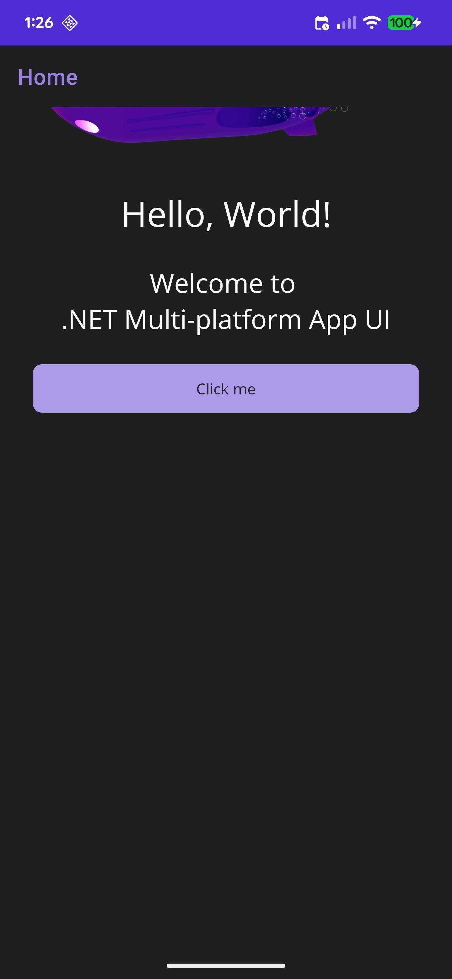
Right to left flow direction completely breaks the RadDataGrid on Android and on iOS it doesn't seem to do anything.
Repro steps:
Android:
- Download project from github: Kbperri/RadDataGridBug
- Run the app on an Android device
- See that the DataGrid is showing up
- Click the "Click me" button which sets the FlowDirection
- See that the DataGrid disappears
- Click the button again and it appears again
iOS:
- Download project from github: Kbperri/RadDataGridBug
- Run the app on an iOS device
- See that the DataGrid is showing up
- Click the "Click me" button which sets the FlowDirection
- See that the DataGrid doesn't change direction
If you test this on Windows, the FlowDirection is being appropriately applied.
Android LTR:
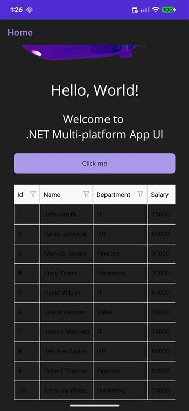
RTL:
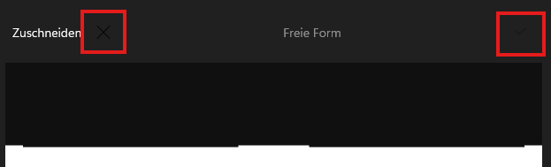
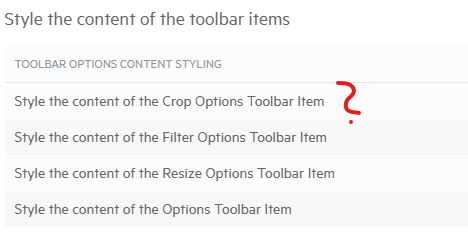
When using the app in dark mode and using crop mode in Image Editor, the OK/Cancel icons are displayed in the wrong color and are difficult to see.
I don't know if and how this can be customized—the documentation doesn't really help me. There are a few points about this without any further information.
Please help if it's customizable.
Maybe I'm just blind, then sorry
.NET MAUI ImageEditor Documentation - Toolbar Styling - Telerik UI for .NET MAUI
I reported a couple of other issues with the Pdf Viewer toolbar items a couple of weeks ago that turned out to be bugs, presumably this is too, but if I am doing something wrong or there is a workaround please let me know.
Thanks
Tony
The TabView behaves erratically in RTL languages (e.g. Arabic). The tabs are correctly outlined from right-to-left but clicking on them leads to unexpected behaviour, as can be seen in the attached video. Clicking on a tab moves the selection to a completely different tab. Furthermore, the tab content is not displayed if any tab except the first one is selected.
Our product reaches an international market and is translated to more than 20 languages. Right-to-left language support is an integral part of our application. A similar bug has been reported almost two years ago (TabView: Right to Left support). Please fix this.
A VisualStudio solution has been attached to this bug report. It uses the sample code from your documentation (Telerik TabView for.NET MAUI—Tabbed UI with Native Look) to display three tabs.
Deploy the sample application to Android or iOS platforms to reproduce the issue.
Hello,
Id would be great having basic editing functionalities in MAUI PDFViewer as you offer in WPF version.
Especially we're interested in having ability to add text and basic shape annotations.
Best Regards,
Raymond
I recently migrated my code from Xamarin.forms to MAUI.
RadListView.GetDataView now always returns null in MAUI , its working fine in Xamarin.forms.
I am trying to close all the groups while loading, but facing a null exception with DATAVIEW
protected override void OnAppearing()
{
base.OnAppearing();
try
{
//collapse all
var dataView = MyRadListView.GetDataView();
dataView.CollapseAll();}}
Regardless of the RadEntry's BackgroundColor property, I've noticed the visible-background-color to differ when the RadEntry receives active focus.
The observed behavior is this:
- RadEntry's visible-background-color generally equals RadEntry's BackgroundColor property
- RadEntry's visible-background-color changes to gray when hovered regardless of day-night mode
- RadEntry's visible-background-color changes to white when focused
- RadEntry's visible-background-color restores to RadEntry's BackgroundColor when unfocused
Typically, in day mode settings (Windows default), the RadEntry's BackgroundColor == white so you don't see the problem. However, in night mode settings (Android default), we want the RadEntry's BackgroundColor == black so the problem is more prevalent since you're typing white text on a white background.
When using Visual States, and, if you try to re-enforce the same BackgroundColor property in all of the visual states, sometimes focus, hover, unfocus, hover, focus sequence will allow you to edit in the RadEntry in your desired RadEntry's BackgroundColor property instead of white, but, most of the time is white.
This problem can be reproduced on Windows and Android if you set your application to night mode Application.Current.UserAppTheme = AppTheme.Dark and set RadEntry's BackgroundColor=Black and TextColor=White in XAML. Put 2 or 3 RadEntry's on the page so you can navigate between them to see the problem.
Hello,
there is probably a Bug in the ListPicker Commands. (https://docs.telerik.com/devtools/maui/controls/listpicker/commands)
Like in the example:
  private void OnAccept(object obj)
    {
        // implement your custom logic here
    }
the object is null.
Shouldn't you get the selected value for further implementations?I'm looking for a splitter control (to display master info on the left view and detailed info on the right view, and the possibility to resize both view)
i tried : Add Splitter control (telerik.com) but it's not working well (only moving a little bit, then it stops)
Any idea how to achieve this ?
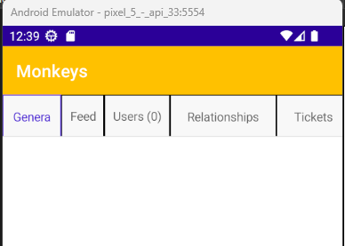
In certain situations, the RadTabView cuts off part of the header text for some of the headers. A specific scenario where this is happening is when the following tabs are present:
- General
- Feed
- Users (0)
- Relationships (0)
- Tickets (0)
- Attachments (0)
The problem is worse when the BorderThickness of the TabViewHeaderItem is set to 1
  <Grid>
    <telerik:RadTabView>

      <telerik:RadTabView.HeaderItemStyle>
        <Style TargetType="telerik:TabViewHeaderItem">
          <Setter Property="BorderColor"
                  Value="Black" />
          <Setter Property="BorderThickness"
                  Value="1" />
        </Style>
      </telerik:RadTabView.HeaderItemStyle>

      <telerik:TabViewItem HeaderText="General" />
      <telerik:TabViewItem HeaderText="Feed" />
      <telerik:TabViewItem HeaderText="Users (0)" />
      <telerik:TabViewItem HeaderText="Relationships (0)" />
      <telerik:TabViewItem HeaderText="Tickets (0)" />
      <telerik:TabViewItem HeaderText="Attachments (0)" />

    </telerik:RadTabView>
  </Grid>
I would love to have an option to display a calendar in the DatePicker date selection popup
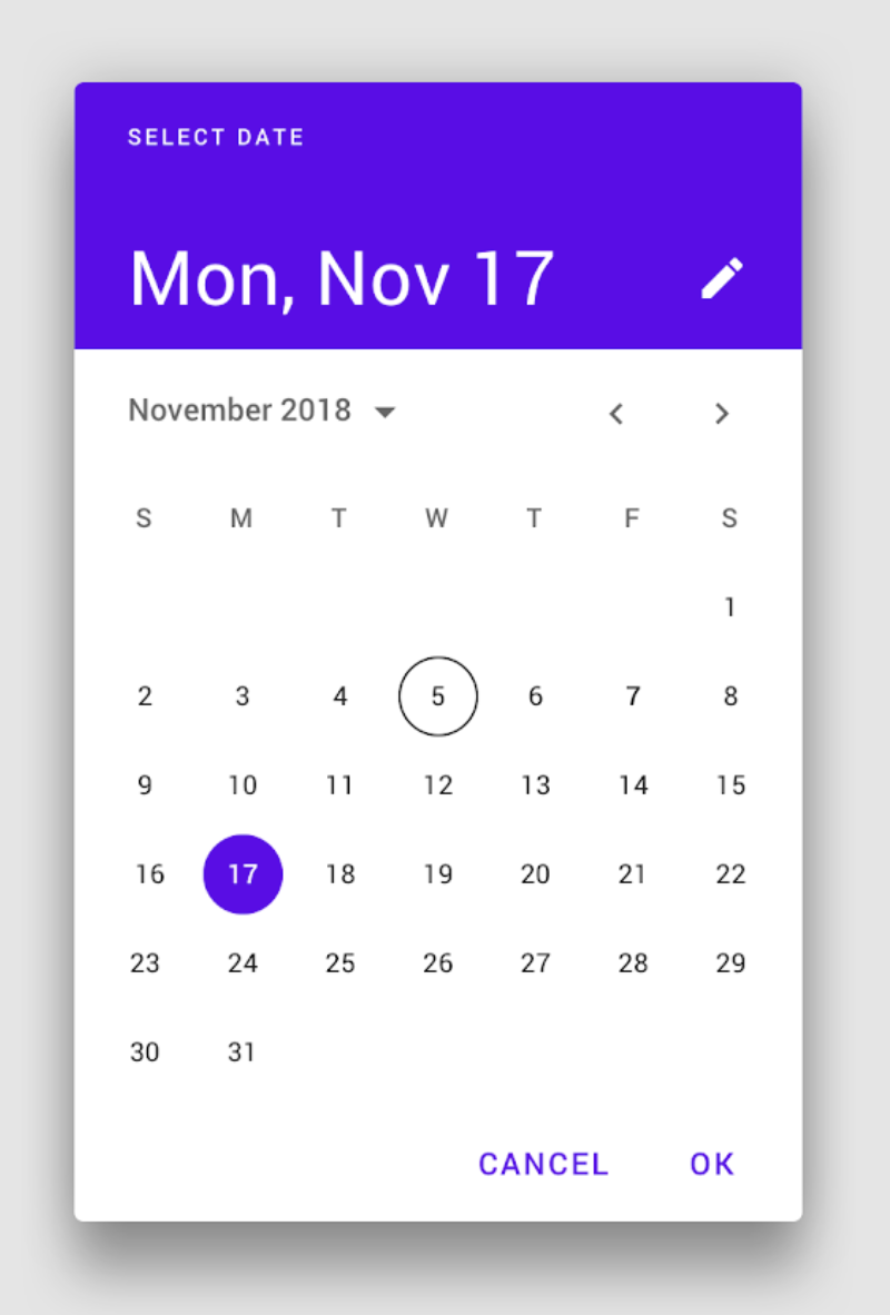
Best regards,
Marcel Souza
Pds Informática
Error clang++ exited with code 1:
ld: in /Users/jaajitech/Library/Caches/Xamarin/mtbs/builds/inSisMobileApp/a3a8ad44c41ca6a9c305417349b408b3294f1a61364d707faf7d6c17f11ad8b5/obj/Debug/net7.0-ios/iossimulator-arm64/linker-cache/TelerikUI.a(TKChartAnnotation.o), building for iOS Simulator, but linking in object file built for iOS, file '/Users/jaajitech/Library/Caches/Xamarin/mtbs/builds/inSisMobileApp/a3a8ad44c41ca6a9c305417349b408b3294f1a61364d707faf7d6c17f11ad8b5/obj/Debug/net7.0-ios/iossimulator-arm64/linker-cache/TelerikUI.a'
clang: error: linker command failed with exit code 1 (use -v to see invocation) inSisMobileApp C:\Program Files\dotnet\packs\Microsoft.iOS.Sdk\16.4.7107\targets\Xamarin.Shared.Sdk.targets 1272

Hey,
when binding to any collection of T with a nested property the DataGrid throws a NullReferenceExpection in Telerik.Maui.Controls.Compatibility.Common.Data.Fields.PropertyInfoFieldInfo.GetValue(object item) when the parent property is null, rendering nested propert< bindings kinda useless.
To mitigate this issue a Fallback-value option for each column (or at least catching the exception and returning null) would be nice.
Hi team,
This is a request to have a detail row (aka RowDetail template) for the DataGrid on at least Windows and MacCatalyst platform target.
This feature is already available in the WinUI DataGrid component, for reference: WinUI DataGrid Documentation | Row Details | DataGrid | Telerik UI for WinUI.
Thank you,
Patrick