HI Team,
When using DynamicResource for any content inside the RadItemsControl, there are two problems:
- If I define them in ContentPage.Resources, the RadItemsControl it does not use it at all
- If I define them in App.Resources, the RadItemsControl will get the initial value, but not respond to any changes.
You can use the following code to verify, or use my attached demo
Resources (try them in both App.xaml and in ContentPage):
<Color x:Key="TitleTextColor">SlateBlue</Color>
DataTemplate
<DataTemplate x:Key="MonkeyItemTemplate">
    <Grid Padding="10">
        <Grid.RowDefinitions>
            <RowDefinition Height="Auto" />
            <RowDefinition Height="Auto" />
        </Grid.RowDefinitions>
        <Label Text="{Binding Name}"
               FontAttributes="Bold"
               TextColor="{DynamicResource TitleTextColor}"
               Grid.Row="0" />
        <Label Grid.Row="1"
               Text="{Binding Location}"
               FontAttributes="Italic"
               VerticalOptions="End"
               TextColor="{DynamicResource TitleTextColor}"/>
    </Grid>
</DataTemplate>
View
<!-- Use CollectionView to see how it's supposed to operate -->
<CollectionView ItemsSource="{Binding Monkeys}"
                ItemTemplate="{StaticResource MonkeyItemTemplate}"
                SelectionMode="None"
                Grid.Row="0"
                Grid.Column="0"/>

<telerik:RadItemsControl ItemsSource="{Binding Monkeys}"
                         ItemTemplate="{StaticResource MonkeyItemTemplate}"
                         Grid.Row="0"
                         Grid.Column="1"
                         x:Name="ItemsControl1"/>

<Button Text="Change Colors"
        Clicked="Button_OnClicked"
        TextColor="{DynamicResource TitleTextColor}"
        BackgroundColor="{DynamicResource SubtitleTextColor}"
        Grid.Row="1"
        Grid.ColumnSpan="2"/>
Code-behind
private bool isChanged;

private void Button_OnClicked(object sender, EventArgs e)
{
    if (isChanged)
    {
        App.Current.Resources["TitleTextColor"] = Colors.SlateBlue;
    }
    else
    {
        App.Current.Resources["TitleTextColor"] = Colors.DarkRed;
    }

    isChanged = !isChanged;
}
Hi Team,
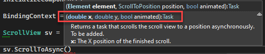
This is request for you to please expose some of the ScrollView that the ItemsControl uses internally. It would be best of it was a direct reference to the ScrollView itself... but I understand if you don't want folks messing with the ScrollView's content or functionality.
So, I want to set a lower bounds of this feature request and ask that you at least allow us set a X/Y position for scrolling (I have my own custom acceleration code). For example, here's the actual method of the .NET MAUI ScrollView:
Thank you,
Aaron