NET MAUI net 9 and net 10 projects
tested on winui and android
Warnings: Element (warning): Microsoft.Maui.Controls.SolidColorBrush is already a child of Telerik.Maui.Controls.RadEffectsView. Remove ... before adding ... (x many) Element (warning): Microsoft.Maui.Controls.SolidColorBrush is already a child of Telerik.Maui.Controls.RadBorder. Remove ... before adding ... ``` ## Reproduction 1. A `ContentPage` inside a `NavigationPage` containing several Telerik `RadEntry` styled via **implicit styles** that set `BorderBrush` across multiple `VisualState`s (Normal/Focused/Invalid/ReadOnly/…). No custom `ControlTemplate` is applied; only `BorderBrush` (and background/text) setters. 2. Interact with the page, and with the entry control on it 3. There are warnings in the output
I'm looking to replace the Xamarin RadRichTextEditor control in my Maui app. The Maui native Editor control is good but doesn't scroll.
And to be honest, the RadRichTextEditor gave me more trouble than it was worth (I loved the functionality, but it wasn't a good fit for my implementation).
So, adding the appropriate support to RadEntry to make it more of a 'multiline text editor' or even a 'mini word processor' would be awesome.
When setting horizontal text alignment to center, the text in Telerik Entry is not centered. In MAUI entry works.
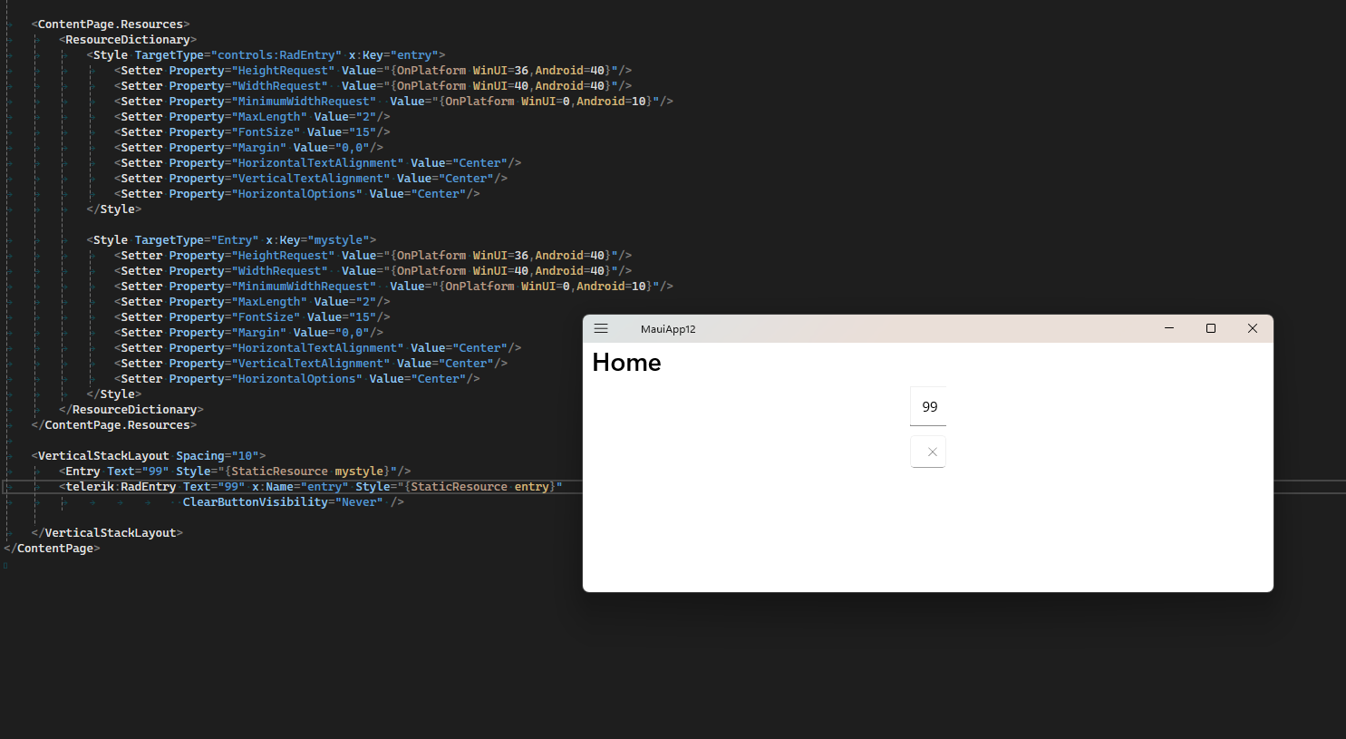
<ContentPage.Resources>
		<ResourceDictionary>
			<Style TargetType="telerik:RadEntry" x:Key="entry">
				<Setter Property="HeightRequest" Value="{OnPlatform WinUI=36,Android=40}"/>
				<Setter Property="WidthRequest"  Value="{OnPlatform WinUI=40,Android=40}"/>
				<Setter Property="MinimumWidthRequest"  Value="{OnPlatform WinUI=0,Android=10}"/>
				<Setter Property="MaxLength" Value="2"/>
				<Setter Property="FontSize" Value="15"/>
				<Setter Property="Margin" Value="0,0"/>
				<Setter Property="HorizontalTextAlignment" Value="Center"/>
				<Setter Property="VerticalTextAlignment" Value="Center"/>
				<Setter Property="HorizontalOptions" Value="Center"/>
			</Style>

			<Style TargetType="Entry" x:Key="mystyle">
				<Setter Property="HeightRequest" Value="{OnPlatform WinUI=36,Android=40}"/>
				<Setter Property="WidthRequest"  Value="{OnPlatform WinUI=40,Android=40}"/>
				<Setter Property="MinimumWidthRequest"  Value="{OnPlatform WinUI=0,Android=10}"/>
				<Setter Property="MaxLength" Value="2"/>
				<Setter Property="FontSize" Value="15"/>
				<Setter Property="Margin" Value="0,0"/>
				<Setter Property="HorizontalTextAlignment" Value="Center"/>
				<Setter Property="VerticalTextAlignment" Value="Center"/>
				<Setter Property="HorizontalOptions" Value="Center"/>
			</Style>
		</ResourceDictionary>
	</ContentPage.Resources>

	<VerticalStackLayout Spacing="10">
		<Entry Text="99" Style="{StaticResource mystyle}"/>
		<telerik:RadEntry Text="99" x:Name="entry" Style="{StaticResource entry}"
						  ClearButtonVisibility="Never" />

	</VerticalStackLayout>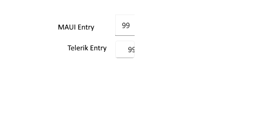
Text is not centered horizontally on WinUI.
on maui 9.0.50 text is not visible and hiding the ClearButton does not work
on maui 9.0.40 text is not centered but hiding the ClearButton works
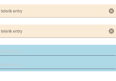
when adding entry to the page a margin is added. The space between the Entry and other controls is significant:
this is a sample xaml:
	<VerticalStackLayout>
		<telerik:RadEntry  x:Name="entry" Placeholder="telerik entry" BackgroundColor="AntiqueWhite" />
		<telerik:RadEntry x:Name="myentry" Placeholder="telerik entry" BackgroundColor="AntiqueWhite" />
		<Entry Placeholder="maui entry" BackgroundColor="LightBlue"/>
		<Entry Placeholder="maui entry" BackgroundColor="LightBlue"/>
	</VerticalStackLayout>
this is the result:
Currently, when setting Numeric keyboard, on Mac and windows you can also enter non-numeric characters.
Provide an option when keyboard is numeric, the entry to replace its internal input control, so only numeric values to be entered.
Similar feature is opened for maui Entry: https://github.com/dotnet/maui/issues/9201
When updating to Telerik MAUI 8.0.0 and building the app on Android 5.1 the controls that use RadTextInput internally crash
Controls like, DataGrid, RadEntry, ComboBox, AutoComplete, Numeric, Masked
UNHANDLED EXCEPTION:
[MonoDroid] Java.Lang.NoSuchMethodError: no non-static method "Landroidx/appcompat/widget/AppCompatEditText;.getTextCursorDrawable()Landroid/graphics/drawable/Drawable;"
[MonoDroid] at Java.Interop.JniEnvironment.InstanceMethods.GetMethodID(JniObjectReference type, String name, String signature)
[MonoDroid] at Java.Interop.JniType.GetInstanceMethod(String name, String signature)
[MonoDroid] at Java.Interop.JniPeerMembers.JniInstanceMethods.GetMethodInfo(String method, String signature)
[MonoDroid] at Java.Interop.JniPeerMembers.JniInstanceMethods.GetMethodInfo(String encodedMember)
[MonoDroid] at Java.Interop.JniPeerMembers.JniInstanceMethods.InvokeVirtualObjectMethod(String encodedMember, IJavaPeerable self, JniArgumentValue* parameters)
[MonoDroid] at Android.Widget.TextView.get_TextCursorDrawable()
[MonoDroid] at Telerik.Maui.Handlers.RadTextInputHandler.MapCustomCursorColor(RadTextInputHandler handler, IRadTextInput virtualElement)
[MonoDroid] at Microsoft.Maui.PropertyMapper`2.<>c__DisplayClass5_0[[Telerik.Maui.IRadTextInput, Telerik.Maui.Core, Version=8.0.0.0, Culture=neutral, PublicKeyToken=5803cfa389c90ce7],[Telerik.Maui.Handlers.RadTextInputHandler, Telerik.Maui.Core, Version=8.0.0.0, Culture=neutral, PublicKeyToken=5803cfa389c90ce7]].<Add>b__0(IElementHandler h, IElement v)
[MonoDroid] at Microsoft.Maui.PropertyMapper.UpdatePropertyCore(String key, IElementHandler viewHandler, IElement virtualView)
[MonoDroid] at Microsoft.Maui.PropertyMapper.UpdateProperties(IElementHandler viewHandler, IElemen
.....
For example the RadComBoBox has ClearButtonStyle, while RadEntry has separate properties for clear button color, hover: https://docs.telerik.com/devtools/maui/controls/entry/styling#clear-button-style and no text property
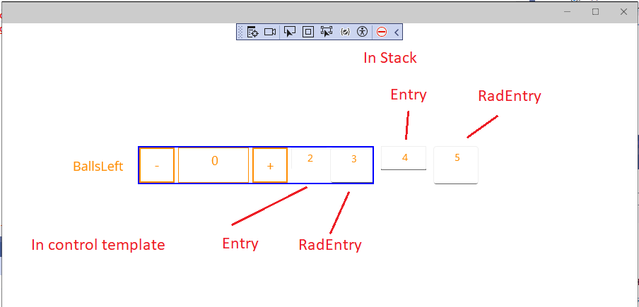
When setting BorderBrush, BorderThickess, FocusedBorderBrush and FocusedBorderThickness do not apply on the entire entry control, they apply only on bottom.
<VerticalStackLayout>
    <telerik:RadEntry Text="Hello World" TextColor="DarkRed"
                        Background="Wheat"
                        FocusedBorderBrush="Yellow"
                        FocusedBorderThickness="10"
                        x:Name="entry"
                        BorderBrush="DarkRed"
                        BorderThickness="8"
                        CornerRadius="5,7,7,5"
                        WidthRequest="150"/>
</VerticalStackLayout>
And the result:

Workaround:
Place the entry in a RadBorder:
<telerik:RadBorder BorderColor="Red"
CornerRadius="5,7,7,5"
BorderThickness="4,4,4,4">
<telerik:RadEntry Text="Hello World"
TextColor="DarkRed"
Background="Wheat"
x:Name="entry" />
</telerik:RadBorder>
Text is not centered vertically on WinUI with latest Maui. The issue also affects NumericInput control as RadEntry is used internally.
I tried the following and the custom context menu does not apply:
<telerik:RadEntry x:Name="telerikEntry">
    <FlyoutBase.ContextFlyout>
        <MenuFlyout>
            <MenuFlyoutItem Text="Custom flyout telrik radentry"
                            Clicked="MenuFlyoutItem_Clicked">
            </MenuFlyoutItem>
        </MenuFlyout>
    </FlyoutBase.ContextFlyout>
</telerik:RadEntry>
It works for MAUI Entry. Provide this menu for Telerik MAUI RadEntry too.
Request for a manual Done button to be added to any of the existing Telerik controls when using numeric keyboard.
Request for RadEntry, NumericInput.
The MAUI Editor has manual done button above the Numeric keyboard, so the keyboard can be dismissed when pressing on this button.