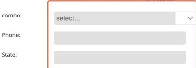
The width of RadEntry, RadMaskedEntry, and RadComboBox are the same on windows, android and ios. On mac there is difference when the width of the defined Column is set to * in grid:
MacCatalyst:
Windows:
Hello,
The development team researched the case in details and actually this is not a bug. The RadComboBox and the RadEntry have the same width. RadEntry in MacCatalyst is preserving space on its right side for the error icon (validation feature). I have changed the status of the bug to Declined.
Solution:
If you do not use the validation feature of the entry control, you have to set the RadEntry.ReserveSpaceForErrorView property to False.
For all RadEntry controls (including the RadMaskedEntry as it inherits from the RadEntry) you can set the property using implicit style:
<Grid.Resources>
        <ResourceDictionary>
            <Style TargetType="telerik:RadEntry">
                <Setter Property="ReserveSpaceForErrorView" Value="False"/>
            </Style>
        </ResourceDictionary>
    </Grid.Resources>
Regards,
Didi
Progress Telerik
Love the Telerik and Kendo UI products and believe more people should try them? Invite a fellow developer to become a Progress customer and each of you can get a $50 Amazon gift voucher.
- All
- Completed (439)
- Declined (76)
- Duplicated (35)
- In Development (16)
- Under Review (3)
- Unplanned (517)
- Won't Fix (13)
- All
- UI for .NET MAUI
- Accordion
- AI Coding Assistant
- AIPrompt
- AutoComplete
- BadgeView
- Barcode
- Border
- BottomSheet
- BusyIndicator
- Button
- Calendar
- Chart
- Chat (Conversational UI)
- CheckBox
- CollectionView
- ComboBox
- DataForm
- DataGrid
- DataPager
- DatePicker
- DateTimePicker
- DockLayout
- Editor
- Entry
- Expander
- Gauge
- GridSplitter
- ImageEditor
- Installer and VS Extensions
- ItemsControl
- Licensing
- ListPicker
- ListView
- Map
- MaskedEntry
- NavigationView
- NumericInput
- Path
- PDFViewer
- Popup
- ProgressBar
- RangeSlider
- Rating
- RichTextEditor
- Scheduler
- SegmentedControl
- SideDrawer
- SignaturePad
- Skeleton
- Slider
- SlideView
- SmartPasteButton
- SpeechToTextButton
- TabView
- TemplatedButton
- TemplatedPicker
- TimePicker
- TimeSpanPicker
- ToggleButton
- Toolbar
- TreeDataGrid
- TreeView
- VS Code Extension
- WrapLayout


