Unplanned
Last Updated:
02 May 2023 08:10
by FIMS Computing Services FIMS - UWO
FIMS Computing Services FIMS - UWO
Created on:
02 May 2023 08:10
Category:
Scheduler
Type:
Feature Request
Improve the default editor template of the Scheduler with adaptive rendering enabled
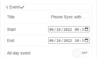
The current layout of the edit template when adaptive rendering is enabled is not very intuitive and user friendly - https://demos.telerik.com/aspnet-mvc/scheduler/adaptive-rendering
It would be beneficial if the design is improved for better user experience on mobile devices. For example, identifying and locating the save button is not easy:
0 comments
Type
Status
- All
- Completed (334)
- Declined (54)
- Duplicated (10)
- Need More Info (3)
- Pending Review (3)
- Planned (3)
- Under Review (2)
- Unplanned (361)
- Won't Fix (1)
Category
- All
- UI for ASP.NET Core
- ActionSheet
- AICodingAssistant
- AIPrompt
- AppBar
- ArcGauge
- AutoComplete
- Avatar
- Badge
- Barcode
- BottomNavigation
- Breadcrumb
- BulletChart
- Button
- ButtonGroup
- Calendar
- Captcha
- Cards
- Chart
- ChartWizard
- Chat
- Checkbox
- CheckBoxGroup
- Chip
- ChipList
- CircularGauge
- CircularProgressBar
- ColorGradient
- ColorPalette
- ColorPicker
- ComboBox
- ContextMenu
- DataSource
- DateInput
- DatePicker
- DateRangePicker
- DateTimePicker
- Diagram
- Dialog
- DockManager
- Draggable
- Drawer
- DropDownButton
- DropDownList
- DropDownTree
- Editor
- ExpansionPanel
- FileManager
- Filter
- FlatColorPicker
- FloatingActionButton
- Form
- Gantt
- Grid
- GridLayout
- HeatMap
- ImageEditor
- InlineAIPrompt
- Installer and VS Extensions
- Licensing
- LinearGauge
- ListBox
- ListView
- Loader
- Map
- MaskedTextBox
- MediaPlayer
- Menu
- MultiColumnComboBox
- MultiSelect
- MultiViewCalendar
- Notification
- NumericTextBox
- OrgChart
- OTPInput
- Pager
- PanelBar
- PDFViewer
- PivotGrid
- PivotGridV2
- Popover
- ProgressBar
- PromptBox
- PropertyGrid
- QRCode
- RadialGauge
- RadioButton
- RadioGroup
- Rating
- ResponsivePanel
- Ripple
- Sankey
- Scheduler
- ScrollView
- SegmentedControl
- Signature
- SkeletonContainer
- Slider
- SmartPasteButton
- Sortable
- Sparkline
- SpeechToTextButton
- SplitButton
- Splitter
- Spreadsheet
- StackLayout
- Stepper
- StockChart
- Switch
- TabStrip
- TaskBoard
- Template
- TextArea
- TextBox
- TileLayout
- TimeDurationPicker
- Timeline
- TimePicker
- ToggleButton
- Toolbar
- ToolTip
- TreeList
- TreeMap
- TreeView
- Upload
- VS Code Extension
- Window
- Wizard

