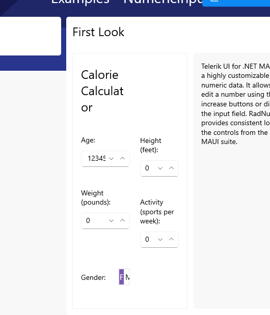
I'm forced to use RadNumericInput with styling the NumericInputEntry HorizontalTextAlignment set to End
<Style x:Key="rightNumericInputEntryStyle"
       TargetType="telerik:NumericInputEntry">
    <Setter Property="HorizontalTextAlignment" Value="End" />
</Style>
...
<telerik:RadNumericInput AutomationId="ageNumeric"
                         EntryStyle="{StaticResource rightNumericInputEntryStyle}"
                         Minimum="0"
                         Value="{Binding Age, Mode=TwoWay}" />
doing this, the value is cut off, when the controls width gets small.
There is some space on the left, which is not used.
Easy to reproduce in the SDK Samples.
I'm not able to find a way changing this
Value in this Screenshot: 123456, cut after 5
any workaround (keeping the value HorizontalTextAlignment="End") is highly appreciated
Hi Nico,
Thank you for the update, I'm happy to see that you were able to identify what is limiting your customization needs. I've passed this on to the dev team, you can track its progress via this Feature Request => [NumericInput] Set NativeEditor's MinWidth via EntryStyle (telerik.com)
You have a good point about the lifecycle of the internal parts. The better place to do this would likely be the entire control's HandlerChanged (the NumericInput), rather than the subcomponent's (NumericInputEntry), However, the top control's Loaded event works the same as it should be the last part of the abstraction layer's lifecycle.
As for documentation, we typically do not document the layout settings for a control's internal subcomponents. To avoid similar issues for anyone else who is looking to make such level of customization, I will publish a new KB article today that covers how to override the control's default native layer settings (similar to my previous Entry customization KB article).
Again, thank you for bringing this to our attention. If you have any further problems, please open a Support ticket, rather than a Feedback Portal item, so that we can assist more quickly (feedback portal is not a technical support channel and can take ~120 hours for a response, while a Support ticket is ~24 hours).
Regards,
Lance | Senior Manager Technical Support
Progress Telerik
Love the Telerik and Kendo UI products and believe more people should try them? Invite a fellow developer to become a Progress customer and each of you can get a $50 Amazon gift voucher.
Hello Lance,
thx for your feedback, but Entry inside or underneath the Border did not change the behavior.
Luckily i've found the reason:

the InputEditor has set a MinWidth of 64.
This can only be changed in the loaded event, because InputEditor is null in HanderChanged and your InputEditorChanged event is set to internal.
There is no obvious or documented reason for this 64.
I would be happy to see a cleaner solution in the future
thx Nico
Hello Nico,
Thank you for the update and especially the details.
I noticed you've placed the Entry inside a RadBorder. Can you please make sure the RadBorders are underneath the Entry? This is so that the boundaries of the Entry are against the Grid and not internal to the RadBorder.
I have attached an example where I've done this and it appears to be operating the way you want it to. Here's a quick screenshot of the example, which seems to be working as expected:

Now, at runtime, it cannot get any smaller than the bounds of the RadEntry

This is important to distinguish form the situation where the RadEntry is sliding underneath the boundaries of another parent control. Without a star-size column, there is no mor room to shrink.
Further Customization
If this doesn't work for you, you can get all the control you need by accessing the native instance of the component. This is easily done using the HandlerChanged event. I have a how-to article here for general RadEntry guidance.
In this situation, you would be subscribing to the ControlTemplate's instance of NumericInputEntry (which inherits from RadEntry):

The only difference for your implementation is that (note, you need to change the type from RadEntry to NumericInputEntry), so it should look like this now:

Now, at runtime, you can access all of the WinUI-only properties that are implemented. For example, here I placed a breakpoint and inspected the nativeEntry object:

Regards,
Lance | Senior Manager Technical Support
Progress Telerik
Love the Telerik and Kendo UI products and believe more people should try them? Invite a fellow developer to become a Progress customer and each of you can get a $50 Amazon gift voucher.
Hello Didi,
unfortunately I have to disagree and ask that it be reopened.
My example was actually just to show that it is a problem that cannot be solved by the ControlTemplate, Padding, Margin etc.
This is a real world partial Screenshot

<telerik:RadNumericInput.IncreaseButtonStyle>
<Style TargetType="telerik:RadButton">
<Setter Property="IsVisible" Value="False" />
</Style>
</telerik:RadNumericInput.IncreaseButtonStyle>
<telerik:RadNumericInput.DecreaseButtonStyle>
<Style TargetType="telerik:RadButton">
<Setter Property="IsVisible" Value="False" />
</Style>
</telerik:RadNumericInput.DecreaseButtonStyle>
Buttons are hidden
Changing the ControlTemplate
<telerik:NumericInputEntry x:Name="PART_Entry" Style="{TemplateBinding ActualEntryStyle}" />
no matter how, does not work.
There must be some Padding on the left, which is set on the native control and cannot be changed.
I want to show it again with a very reduced ControlTemplate


lets make the Windows smaller

and smaller

I hope you understand what i mean. For me, this is a problem that cannot be solved using the available Telerik styling options.
And it may not sound like it at first, but it is a high priority issue for the customer. Because a user may assume an incorrect value
thx
Nico
Hello Nico,
Thank you for the details. Actually this is not a bug, but rather the expected behavior of a Grid column when you place content that is larger than the size of that column. I am setting this Bug Report as Declined, but I will still be able to explain in more details below.
In the future, if you're looking for styling assistance, a Bug Report is usually not the right place. You can open a Support Ticket. Of course if something turns out to be a Bug, or Feature Request, we will log it on your behalf.
Control Layout
First, it is important to understand the internal layout of the control. At a high level it is a Grid with columns and the buttons are located depending on the platform and visual state. In general, the Numeric control has buttons and entry in its control template and how the elements are measured depends on the layouts used.
While yes, you might have set the TextHorizontalAlignment to End, the reality is the text does get right-aligned, but the parent layout control was squeezed too small to keep showing the child content. The Entry is now sliding under the Grid Column's only dynamic portion.
To explain this better, here's a mockup. That first column is star-sized, so when the minimum width of a star-sized column is surpassed, the only place for that content to go is behind edge of the star column (it will not break the column boundary and go over the auto-sized column's content)

So, how do you deal with this? You need to either decrease the padding, decrease the button size, decrease the font size, or similar. You need to get that first column's contents to not be larger than the minimum space you shrink it to.
I can't give you exact advice for this, because it is your custom design, but I can give you some recommendations:
- Give every child a temporary background color so that you can visualize exactly where it is and you know what padding/margin it has.
- Make the font smaller
- Make the Padding (or Margin) smaller
- Try a different column sizing type
- Try a different parent layout type
- set minimum width for the elements inside the control.
So any content that is inside that first column will always get clipped if the content is larger than the column has space for. Don't forget that you need to include any padding or margin in the child's size. You can set all of these to zero... then add them back in if you need.
Control Template:
If you want further customize the numeric control, you can use the control template to arrange the layout, use another layout structure, etc. Here is the documentation for this: https://docs.telerik.com/devtools/maui/controls/numericinput/control-template#net-maui-numericinput-control-template
If you have any additional questions you can open a support ticket.
Regards,
Didi
Progress Telerik
Love the Telerik and Kendo UI products and believe more people should try them? Invite a fellow developer to become a Progress customer and each of you can get a $50 Amazon gift voucher.
- All
- Completed (477)
- Declined (77)
- Duplicated (35)
- In Development (4)
- Planned (1)
- Under Review (1)
- Unplanned (515)
- Won't Fix (18)
- All
- UI for .NET MAUI
- Accordion
- AI Coding Assistant
- AIPrompt
- AutoComplete
- BadgeView
- Barcode
- Border
- BottomSheet
- BusyIndicator
- Button
- Calendar
- Chart
- Chat (Conversational UI)
- CheckBox
- CollectionView
- ComboBox
- DataForm
- DataGrid
- DataPager
- DatePicker
- DateTimePicker
- DockLayout
- DropDownButton
- Editor
- Entry
- Expander
- Gauge
- GridSplitter
- ImageEditor
- Installer and VS Extensions
- ItemsControl
- Licensing
- ListPicker
- Map
- MaskedEntry
- NavigationView
- NumericInput
- Path
- PDFViewer
- Popup
- ProgressBar
- PromptInput
- RangeSlider
- Rating
- RichTextEditor
- Scheduler
- SegmentedControl
- SideDrawer
- SignaturePad
- Skeleton
- Slider
- SlideView
- SmartPasteButton
- SpeechToTextButton
- TabView
- TemplatedButton
- TemplatedPicker
- TimePicker
- TimeSpanPicker
- ToggleButton
- Toolbar
- TreeDataGrid
- TreeView
- VS Code Extension
- WrapLayout