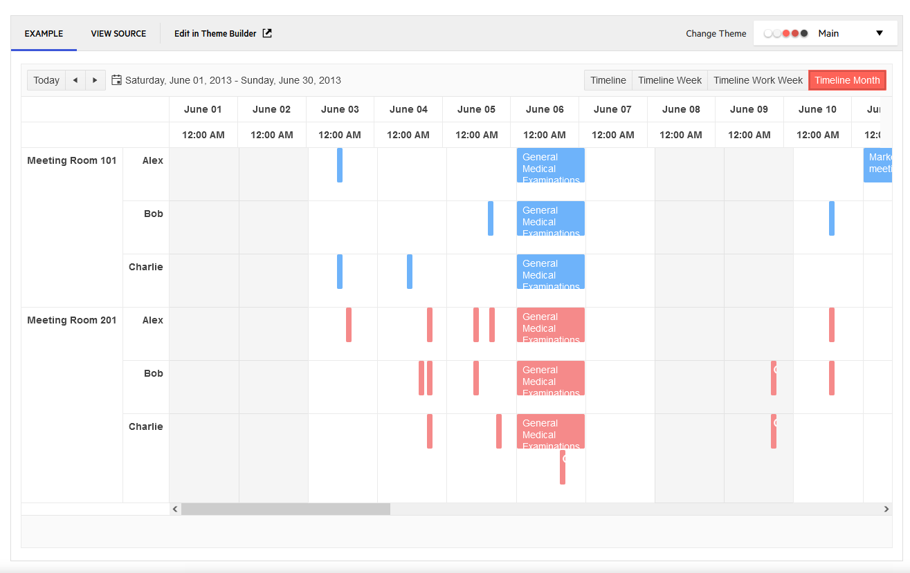
The columns widths do not match the header and are slightly off, and after enough columns it is half a column out.
Hi Sean,
Thank you for the additional details provided. Now I can see your point clearly.
I confirm that you are totally correct. This is a bug and it already exists logged for fixing in our system:
If any further information or assistance is needed, do not hesitate to contact me and the team.
Best Regards,
Anton Mironov
Progress Telerik
Virtual Classroom, the free self-paced technical training that gets you up to speed with Telerik and Kendo UI products quickly just got a fresh new look + new and improved content including a brand new Blazor course! Check it out at https://learn.telerik.com/.
Hi Anton,
the bug can be seen on the timeline demo. https://demos.telerik.com/aspnet-mvc/scheduler/timeline
The browser isnt zoomed in. The only CSS is from the demo site. I have tried it on Edge, Firefox and Safari.
Hello Sean,
Thank you for the image and details provided.
I am currently trying to replicate the pointed behavior locally.
In the MVC demos, the behavior is the expected one:
Could you please double-check if the browser is not zoomed? Furthermore, is there some custom CSS applied?
The fastest route to getting you up and running is if you could provide a runnable, isolated, sample project. Examining this project will let us replicate the issue locally and further troubleshoot it. A member of the developers' team who is a Kendo UI Scheduler expert is already involved and once we have a runnable example locally, will confirm if it is a bug, a workaround for it and I will increase your Telerik points accoringly.
Looking forward to hearing back from you.
Kind Regards,
Anton Mironov
Progress Telerik
Love the Telerik and Kendo UI products and believe more people should try them? Invite a fellow developer to become a Progress customer and each of you can get a $50 Amazon gift voucher.
- All
- Completed (341)
- Declined (140)
- Duplicated (10)
- In Development (3)
- Need More Info (8)
- Planned (2)
- Under Review (1)
- Unplanned (318)
- All
- UI for ASP.NET MVC
- ActionSheet
- AICodingAssistant
- AIPrompt
- AppBar
- ArcGauge
- AutoComplete
- Avatar
- Badge
- Barcode
- BottomNavigation
- Breadcrumb
- BulletChart
- Button
- ButtonGroup
- Calendar
- Captcha
- Card
- Chart
- ChartWizard
- Chat
- Checkbox
- CheckBoxGroup
- Chip
- ChipList
- CircularGauge
- CircularProgressBar
- Collapsible
- ColorGradient
- ColorPalette
- ColorPicker
- ComboBox
- ContextMenu
- DateInput
- DatePicker
- DateRangePicker
- DateTimePicker
- Diagram
- Dialog
- DockManager
- Drawer
- DropDownButton
- DropDownList
- DropDownTree
- Editor
- ExpansionPanel
- FileManager
- Filter
- FlatColorPicker
- FloatingActionButton
- Form
- Gantt
- Grid
- GridLayout
- HeatMap
- ImageEditor
- InlineAIPrompt
- Installer and VS Extensions
- Licensing
- LinearGauge
- ListBox
- ListView
- Loader
- Map
- MaskedTextBox
- MediaPlayer
- Menu
- MultiColumnComboBox
- MultiSelect
- MultiViewCalendar
- Notification
- NumericTextBox
- OrgChart
- OTPInput
- Pager
- PanelBar
- PDFViewer
- PivotGrid
- PivotGridV2
- Popover
- ProgressBar
- PromptBox
- PropertyGrid
- QRCode
- RadialGauge
- RadioButton
- RadioGroup
- Rating
- ResponsivePanel
- Ripple
- Sankey
- Scheduler
- ScrollView
- SegmentedControl
- Signature
- SkeletonContainer
- Slider
- SmartPasteButton
- Sortable
- Sparkline
- SpeechToTextButton
- SplitButton
- Splitter
- Spreadsheet
- StackLayout
- Stepper
- StockChart
- Switch
- TabStrip
- TaskBoard
- Template
- TextArea
- TextBox
- TileLayout
- TimeDurationPicker
- Timeline
- TimePicker
- ToggleButton
- Toolbar
- ToolTip
- TreeList
- TreeMap
- TreeView
- Upload
- Window
- Wizard

