Bug report
Bundling the Kendo js files in an ASP.NET MVC application throws a NullReferenceException error. Reproduced with versions 2024.1.319 and 2024.2.514. The bundling works without exceptions in version 2023.3.1114.
Reproduction of the problem
- Add the following bundle to the BundleConfig.cs file:
bundles.Add(new ScriptBundle("~/bundles/kendo").Include(
        "~/Scripts/kendo/2024.2.514/kendo.web.min.js",
        "~/Scripts/kendo/2024.2.514/kendo.aspnetmvc.min.js"
));
Instead of kendo.web.min.js you can use kendo.all.min.js with the same result.
- Render the scripts in the _Layout.cshtml's head element after jQuery by calling:
@Scripts.Render("~/bundles/kendo")
Current behavior
Exception Details: System.NullReferenceException: Object reference not set to an instance of an object.
Workaround:
Use bundles.Add(new Bundle("~/bundles/kendo") instead of bundles.Add(new ScriptBundle("~/bundles/kendo")
Expected/desired behavior
No exception is thrown when bundling the Kendo script files.
Environment
- Kendo UI version: 2024.2.514
- jQuery version: x.y
- Browser: [all ]
Bug report
Reproduction of the problem
- Reference kendo.all.min.js and kendo.all.min.js.map in a project
- Add a basic Grid:
<div id="grid"></div>
<script>
    // The dataSource is initialized as a stand-alone widget that can be bound to the Grid.
    var dataSource = new kendo.data.DataSource({
        transport: {
            read: {
                // The remote endpoint from which the data is retrieved.
                url: "https://demos.telerik.com/kendo-ui/service/products",
                dataType: "jsonp"
            }
        },
        pageSize: 10
    });

    $("#grid").kendoGrid({
        // The dataSource configuration is set to an existing DataSource instance.
        dataSource: dataSource,
        pageable: true
    });
</script>
- Open the browser's dev tools Source tab and place a breakpoint (e.g., on line 3715).
Current behavior
The breakpoint is added at the last line (326079) of the file.
Expected/desired behavior
The breakpoint is added at the desired line (e.g., 3715).
Environment
- Kendo UI version: 2023.3.1010
- jQuery version: x.y
- Browser: [ Chrome XX]
Bug report
Clearing the value with the Signature "clear" button does not trigger the widget's change event.
Reproduction of the problem
Run the following Dojo example: https://dojo.telerik.com/KhlVWvam
- Draw something in the Signature
- Click on the "clear" button
Expected
The change event fires.
Actual
The change event does not fire.
Environment
**Kendo UI version: 2025.1.211
**Browser: [all]
The below exception is thrown when upgrading using latest Telerik UI for ASP.NET MVC extension.
Failed to execute command.
System.NotImplementedException: Not implemented (Exception from HRESULT: 0x80004001 (E_NOTIMPL))
at System.Runtime.InteropServices.Marshal.ThrowExceptionForHRInternal(Int32 errorCode, IntPtr errorInfo)
at Microsoft.VisualStudio.CommonIDE.Solutions.Dte.DteGenericProject.GetFileName()
at Telerik.VSX.Internal.VisualStudio.VisualStudioThreadHelper.<>c__DisplayClass1_0`1.<<RunInMainThread>b__0>d.MoveNext()
--- End of stack trace from previous location where exception was thrown ---
at System.Runtime.ExceptionServices.ExceptionDispatchInfo.Throw()
at System.Runtime.CompilerServices.TaskAwaiter.HandleNonSuccessAndDebuggerNotification(Task task)
at Microsoft.VisualStudio.Threading.JoinableTask.CompleteOnCurrentThread()
at Microsoft.VisualStudio.Threading.JoinableTask`1.CompleteOnCurrentThread()
at Telerik.VSX.NuGet.NuGetPackageService.GetInstalledPackage(Project project, String packageName, Boolean isPackageNamePartial, Boolean ignoreCapabilityMatchCheck)
at Telerik.VSX.Web.Helpers.ProjectWrap.GetMvcVersion()
at Telerik.VSX.Web.Helpers.ProjectWrap.CheckIsProjectSupported()
at Telerik.KendoUI.Mvc.VSX.Helpers.KendoUIMvcProjectWrap.CheckIsProjectSupported()
at Telerik.KendoUI.Mvc.VSX.Helpers.ProjectSearcher.FilterTelerikSupportedLanguageProjects(List`1 projectsList)
at Telerik.VSX.Internal.VisualStudio.VisualStudioThreadHelper.<>c__DisplayClass1_0`1.<<RunInMainThread>b__0>d.MoveNext()
--- End of stack trace from previous location where exception was thrown ---
at System.Runtime.ExceptionServices.ExceptionDispatchInfo.Throw()
at System.Runtime.CompilerServices.TaskAwaiter.HandleNonSuccessAndDebuggerNotification(Task task)
at Microsoft.VisualStudio.Threading.JoinableTask.CompleteOnCurrentThread()
at Microsoft.VisualStudio.Threading.JoinableTask`1.CompleteOnCurrentThread()
at Telerik.KendoUI.Mvc.VSX.Helpers.ProjectSearcher.GetTelerikEnabledProjectsByMainAssemblyMvcVersion(TargetMvcVersion mvcVersion)
at Telerik.KendoUI.Mvc.VSX.ProjectConfigurators.ProjectConfigurationTypeSelector.ShouldShowTargetMvcPage(TargetMvcVersion targetMvcVersion)
at Telerik.KendoUI.Mvc.VSX.ProjectConfigurators.ProjectConfigurationTypeSelector.GetProjectUpgradePreWizardData(IScenarioDef template)
at Telerik.KendoUI.Mvc.VSX.ProjectConfigurators.ProjectConfigurationTypeSelector.ProjectUpgrade(IPropertyDataDictionary additionalPreWizardData)
at Telerik.KendoUI.Mvc.VSX.ProjectConfigurators.StreamlinedProjectConfiguration.StartUpgradeWizard()
at Telerik.VSX.VSPackage.PackageBase.CommandCallback(Object sender, EventArgs e)
Bug report
The tables within the Editor are not exported correctly (do not fit in the exported pdf document) when resized before exporting.
Reproduction of the problem
- Open the following demo.
https://demos.telerik.com/kendo-ui/editor/pdf-export - Resize the column of the table.
- Export to PDF.
Current behavior
The table does not fit in the exported document.
Expected/desired behavior
The table should fit in the document.
Environment
- Kendo UI version: 2022.2.510
- Browser: [all]
Bug report
When using MVVM generated DropDownList input decorated with required attribute the validation message is not displayed upon validation.
Reproduction of the problem
- Run this dojo
- Click on a slot to create an event
- Select an item from the second DropDownList
- Click Save
Current behavior
Upon clicking Save the validation fails, as the first input has a required attribute, but a validation message is not displayed.
Expected/desired behavior
On failed validation, a validation message should be displayed.
Environment
- Kendo UI version: 2020.1.406
- Browser: [all]
Bug report
When a table is created through the table wizard and cellspacing is set to 0, this value is ignored and the table is created with no cellspacing value. 0 is a valid value and it affects the appearance of the table, so it should not be equivalent to not setting cellspacing.
Reproduction of the problem
Reproducible in the demos.
- Use the table wizard.
- Set 0 as cellspacing value.
- Create the table.
- Inspect the table in the browser's dev tools.
Current behavior
The table has no cellspacing attribute.
Expected/desired behavior
The table has cellspacing set to 0.
Environment
- Kendo UI version: 2020.2.617
- jQuery version: x.y
- Browser: [all ]
View several folders in treeview of the filemanager: folder1, folder2, folder3
select folder1
now Click and drag folder2 to folder3.
the folder1 moves to folder3.
this is not desired.
can be reproduced in the demo
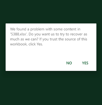
We are using the Kendo UI for different components like Grid in our APS.Net MVC application. Currently we are experiencing an issue while exporting the Kendo grid to Excel from mobile (both android and ios). It shows the following warning message. The same works when exporting from a PC without any issue. Could you please help to resolve the issue.
Bug report
Reproduction of the problem
Dojo example.
- Open the dev tools console.
- Click on the button above the Editor.
- The Editor value is logged in the console.
Note this part in the content:
if (value == 1) { text += "<h2>Apple</h2>Lorem ipsum dolor sit amet, consectetur adipiscing elit, sed do eiusmod tempor incididunt ut labore et dolore magna aliqua. Ut enim ad minim veniam, quis nostrud exercitation ullamco laboris nisi ut aliquip ex ea commodo consequat. Duis aute irure dolor in reprehenderit in voluptate velit esse cillum dolore eu fugiat nulla pariatur. Excepteur sint occaecat cupidatat non proident, sunt in culpa qui officia deserunt mollit anim id est laborum.<br><br>>> APPLE Deutschland</a>";
- Click on the "viewHtml" tool. In the popup do not make any changes to the content, just click on "Update".
- Click on the button above the Editor.
The mentioned part of the script tag now looks like this:
if (value == 1) { text += "<h2>Apple</h2>
Lorem ipsum dolor sit amet, consectetur adipiscing elit, sed do eiusmod tempor incididunt ut labore et dolore magna aliqua. Ut enim ad minim veniam, quis nostrud exercitation ullamco laboris nisi ut aliquip ex ea commodo consequat. Duis aute irure dolor in reprehenderit in voluptate velit esse cillum dolore eu fugiat nulla pariatur. Excepteur sint occaecat cupidatat non proident, sunt in culpa qui officia deserunt mollit anim id est laborum.<br><br>>> APPLE Deutschland</a>";
A js exception is thrown after this content is loaded in the div below the Editor, because of the line break after:
if (value == 1) { text += "<h2>Apple</h2>
Current behavior
The viewHtml modifies the content of script tags, which causes js logic to become invalid.
Expected/desired behavior
The viewHtml tool should not make changes to the content of script tags.
Environment
- Kendo UI version: 2020.3.1021
- jQuery version: x.y
- Browser: [all]
Hello,
I have problem with menu control. Sometimes its items are duplicated. To reproduce it do the following:
- create a menu control;
- bind it to remote data source (to reproduce issue easier set some delay for server side method);
- hover on menu item (datasource request will start), fast leave menu item (don't wait until it open) and hover again (one more datasource request will start), leave it again (optional);
- wait some time until second request completed;
- open menu item.
As a result you will see duplicated menu items. This issue can be reproduced on your demo page https://demos.telerik.com/kendo-ui/menu/remote-data-binding.
Could you please suggest me some workaround for this?
BR,
Artsem
Bug report
If there is a Spreadsheet on a given page and we scroll the page down using the mouse wheel, once the scrolling stops over the Spreadsheet and we try to continue it, we cannot do it. If the Spreadsheet has defined rows that are not currently visible when the mouse wheel is moved, then Spreadsheet is being scrolled, not the current page.
If the Spreadsheet has a lower number of pre-defined rows that are all displayed on the component's initialization the scrolling is again not applying to the page. Instead, moving the mouse wheel doesn't do anything until the mouse cursor is moved outside the Spreadsheet.
Reproduction of the problem
- Open this Dojo example and run it
- Move the mouse cursor in the middle of the pane displaying the compiled code.
- Use the mouse wheel to scroll down the page and stop the scrolling once the cursor is in the zone of the Spreadsheet
- Scroll down again
Current behavior
Because the cursor is inside the Spreadsheet the page cannot be scrolled. If the rows configuration is commented, when the scrolling is started again, the Spreadsheet data will be scrolled.
Expected/desired behavior
If all the data in the Spreadsheet is displayed, moving the mouse wheel over the component should result in page scrolling. If there is data in the Spreadsheet, there should be some way to prevent the scrolling inside the component.
Environment
- Kendo UI version: 2020.1.114
- jQuery version: x.y
- Browser: [all]
Bug report
Class k-state-focused is not removed from DropDownlist on blur, if its filter input was clicked.
Reproduction of the problem
- Use Events demo
- Click on DropDownList to expand its dropdown.
- Click on DropDownList's filter input.
- Click on demo's title to blur the DropDownList
Current behavior
DropDownList appears focused as k-state-focus class is not removed from its span
<span unselectable="on" class="k-dropdown-wrap k-state-default k-state-focused">
Expected/desired behavior
DropDownList does not appear focused.
Environment
- Kendo UI version: 2019.2.619
- Browser: all
Bug report
The kendoWindow does not appear on top of the kendoDialog, even when explicitly calling .toFront(). The z-index is not being updated correctly to bring the kendoWindow to the front.
Reproduction of the problem
- Open the Dojo example - https://dojo.telerik.com/BrnfHeaO
Current behavior
The Dialog is displayed over the Window, although the Window toFront() method is used.
Expected/desired behavior
The kendoWindow (Dialog 2) should appear on top of the kendoDialog (Dialog 1) when opened, similar to the behavior in version 2024.1.130. When .toFront() is called on the kendoWindow, it should update the z-index appropriately and bring the window to the front, displaying it above all other dialogs/windows.
The issue is a regression starting with 2024.1.319
Workaround:
$("#dialog2").parents('.k-window')[0].style['z-index'] = 12000
Dojo - https://dojo.telerik.com/HmQpGqeB
Environment
- Kendo UI version: 2025.4.1111
- Browser: [all]
Currently, only the List and Number validation rules are supported when using Workbook.ToDocument();
It happens when the type of validation is text or custom
for example:
If I saved :
"validation": {
"type": "reject",
"comparerType": "custom",
"dataType": "custom",
"from": "AND(LEN(A2)<3)",
"showButton": true,
"allowNulls": true
}
I get back:
"validation": {
"type": "reject",
"comparerType": "equalTo",
"dataType": "number",
"from": "=AND(LEN(A2)<3)",
"to": "\"=\"",
"allowNulls": true
}
It happens also when the comparer type is text - it saves it as a number
Also when I use the create validator with your UI and choose a custom formula it can't be saved because the compare type is null. As a result, I must define manually the custom validator
.jpg)
### Bug report
When a specified Splitter pane has a defined minimum or maximum size, it does not resize as expected.
The last working version is 2024.3.1015.
### Reproduction of the problem
A Dojo sample for reporduction: https://dojo.telerik.com/XbuxxnfF
The left pane cannot be resized.
### Expected/desired behavior
The left pane must be resized up to 50%.
### Environment
* **Kendo UI version: 2025.3.825
* **jQuery version: 3.7.1
* **Browser: [all]
Bug report
When an item's name includes an underscore (_), its associated settings are not correctly applied or recognized by the component.
Reproduction of the problem
- Create a PropertyGrid.
- Ensure that one of the items is named using an underscore (e.g., Item_Name) and assign an editor to it e.g. AutoComplete.
- The editor in the PropertyGrid is not the same as the assigned editor in the configuration.
Current behavior
(optional)
The ismte settings are not considered when the item name is set with underscore
Expected/desired behavior
The items settings should be considered if the item name is set with underscore.
TicketID:
1695350
Environment
- Browser: [all]
Bug report
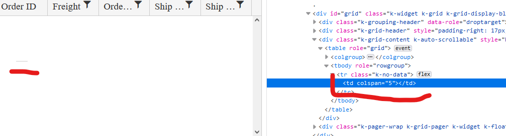
When the Grid AutoBind() configuration is set to false, the Grid is rendering an empty cell in the row element with class .k-no-data. (Image.png)
Reproduction of the problem
Set AutoBind configuration of Telerik UI for Asp.Net MVC Grid to 'false'. The Grid is rendered correctly except for the empty row and the empty cell in the table body.
Current behavior
An empty row with one empty cell is rendered.
Expected/desired behavior
The tbody element should be empty.
Environment
- Kendo UI version: 2022.2.621
- Browser: [all]
I have a Kendo ComboBox() on CountryCode property that has [MaxLength(2)] data annotation on the property in the ViewModel. This is limiting the filtering on the ComboBox and I can't type more than 2 characters in the component. Please see the sample project for the reproduceable issue.
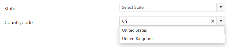
Upon inspecting the markup generated by the Kendo ComboBox(), I'm seeing that there are 2 inputs being generated and maxlength HTML attribute is applied to both.
- The first input tag is displayed to the user and used for filtering. This should NOT have maxlength HTML attribute since it incorrectly limits the number of characters the user can filter by.
- The second input tag is a hidden input that passes the selected data value for form submission. This correctly has the maxlength HTML attribute to still enforce validation.
When I manually removed the maxlength HTML attribute from the first input tag, this fixed the filtering of the ComboBox while still retaining the validation on the second input tag.
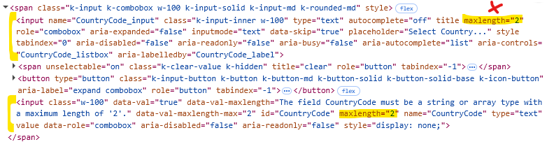
Please review the markup generated by the Kendo ComboBox() and see if it can be fixed to remove maxlength from the first input tag.
Expected behavior:
If [MaxLength] is applied to a property, it should generate a markup that allows the user to filter without character limitation while still validating against the selected data value.