Unplanned
Last Updated:
01 Mar 2023 09:01
by Denis
Denis
Created on:
01 Mar 2023 09:01
Category:
Reporting
Type:
Bug Report
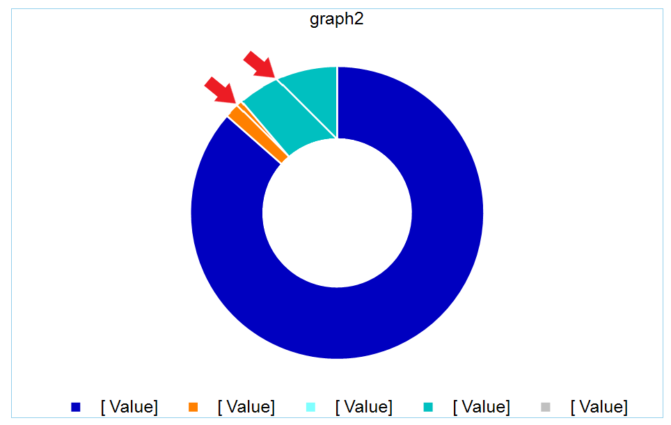
The Graph generates extra lines when outlining BarSeries of Dohnut charts that display very small values
The chart BarSeries has DataPointStyle > LineColor set to white so that there is a white small gap between them. However, this has led to incorrect behavior if the chart contains small values, in relation to other values. The chart shows lines that should not be there:
0 comments