Declined
Last Updated: 17 Nov 2023 15:29 by ADMIN
Pascal
Created on: 02 Nov 2023 17:31
Type: Bug Report
0
Other objects cause components to placed differently.

To prevent questions that I can't answer: I'm an end user for this product. I DO NOT have the ability to look at or update code related to the tools integration. So please ignore my answers to Product Version and Target Framework. They were required before I was allowed to post this ticket. 


The uploaded report has 6 components. 

Two panels (one containing multiple objects, the other only containing one object [hb2])

4 text boxes each with some bindings.

The two key components to look at for the issue are hb and hb2. Both these objects are identical and both have the same bindings for height and top.

From my math hb2 is correctly positioned and sized by hb has been pushed down. The only difference is that other objects are in the container for hb.

Without any containers, hb and hb2 are positioned incorrectly.

I'm doing all this because the vertical alignment for text boxes was not working, once I exported to PowerPoint.


What I expected was that the Top value would only depend on the container holding the component and the components' top value. I did not expect it to be dependent on a mixture of variables from other components also held within the same container.


Attached Files:
6 comments
ADMIN
Todor
Posted on: 17 Nov 2023 15:29

Hi Pascal,

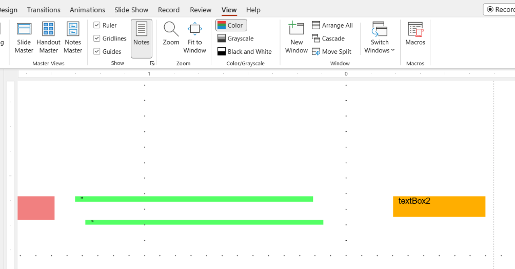
Here is how the PPTX report looks in PowerPoint at a zoom level of 400% with grid lines for easier comparison:

You are right that the lines are not perfectly aligned. The difference is minimal and most probably due to rounding during the calculations.

Regards,
Todor
Progress Telerik

Stay tuned by visiting our roadmap and feedback portal pages, enjoy a smooth take-off with our Getting Started resources, or visit the free self-paced technical training at https://learn.telerik.com/.
Pascal
Posted on: 10 Nov 2023 19:58

Your numbers are what I calculated as well, but in PowerPoint the position does not reflect this.


I added two more orange background textboxes one with

Height =Parameters.FontSize + "pt" 

and the other

Height = 0.253 cm 

I also added a red background textbox with

Height =Parameters.FontSize/23.53418077*0.79+'cm'

All three should have a height equal to the top of the second green bar but all three are shorter than the top of the second green bar.

Top of second green =Parameters.FontSize/23.53418077*0.79+'cm'


ADMIN
Todor
Posted on: 10 Nov 2023 13:12

Hello Pascal,

Thank you for the corrected report.

Here are the calculations I made based on the initial values of the report item properties and the Bindings that are respected run time. All the values are converted to 'cm':

  • Definition Expressions:
Coef = Parameters.FontSize/23.53418077

ht
Height = Coef*0.22+'cm'
LocationX/X-Left = 1.875in
LocationY/Y-Top = 0

hb
Height = Coef*0.21+'cm'
LocationX/X-Left = 1.927in
LocationY/Y-Top =Coef*0.79+'cm'


  • Calculated Values for 'Parameters.FontSize = 7.5':
Coef = 0.3186854079730943

ht
Height = 0.3186854079730943*0.22+'cm' = 0.0701107897540807cm
LocationX/X-Left = 1.875in = 4.7625cm
LocationY/Y-Top = 0

hb
Height = 0.3186854079730943*0.21+'cm' = 0.0669239356743498cm
LocationX/X-Left = 1.927 in = 4.89458cm
LocationY/Y-Top = 0.3186854079730943*0.79+'cm' = 0.2517614722987445cm


  • Here are the calculated distances in the Standalone Report Designer at a zoom level of 800%:

All the locations and sizes seem fine to me. Can you specify what is wrong and why?

Note that the Height of the TextBox 'text' depends on the Font size, as the TextBox may grow vertically to accommodate its content.

There may be some rounding as well, due to the zoom and due to conversion during the processing and rendering. This may explain why the vertical distance of 0.18cm seems like the horizontal distance of 0f 0.3 on the screenshot.

If we confirm an unexpected behavior I will approve the bug report.

Regards,
Todor
Progress Telerik

Stay tuned by visiting our roadmap and feedback portal pages, enjoy a smooth take-off with our Getting Started resources, or visit the free self-paced technical training at https://learn.telerik.com/.
Pascal
Posted on: 09 Nov 2023 15:38
@Todor dDo I need to resubmit this bug?
Pascal
Posted on: 09 Nov 2023 15:35

The file attached is a trdp converted to a zip showing the issue without any overlapping containers. 


Surprisingly I use overlapping containers to guarantee the position of my components. The panel isolates a component from other components so that the binding of Top and Left are unaffected by other components. 


You'll notice that the component which is isolated within its own panel is correctly positioned while the same component in a panel with other components or in a different report not using any panels or overlapping components gets positioned incorrectly.

The screenshot below is the same report with all panels removed and their components shifted so that none would overlap.

You can still see that the second green line is still lower than it should be.


ADMIN
Todor
Posted on: 09 Nov 2023 09:57

Hi Pascal,

Thank you for the runnable report.

I noticed that the containers/Panels are overlapping. Some of the items within the Panels also overlap. Please, note that in this scenario we cannot guarantee a particular layout. For that reason, I have declined the bug report.

The issue with the [hb] is indeed due to other items that interfere with it within the container. Please, check the article Basic Design Considerations for Report Items for more details.

I suggest solving all overlapping issues. This assumes no overlapping after applying the Bindings as well.

Regards,
Todor
Progress Telerik

Stay tuned by visiting our roadmap and feedback portal pages, enjoy a smooth take-off with our Getting Started resources, or visit the free self-paced technical training at https://learn.telerik.com/.