It would be helpful for the "< Back" button on the Advanced Edit workspace to take you back to the same scroll position on the Live Preview page (history management). Currently, the back button takes you to the top of the page. This would be helpful when editing several components at the same time.
Consider adding support to set a data URL with SVG when creating a color variable
For example, that would allow the usage of different SVGs when switching between color modes and using components like the Switch
Current state:
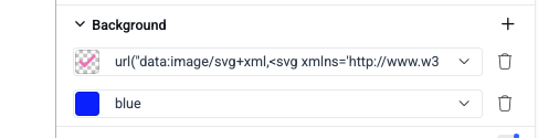
The above means that it is not possible to use differently colored SVGs when using multiple color modes.
Requested through t.1679372
Hi,
I created a new Q4 2024 (SVG Icons) Kendo Default Theme.
When I try to apply any of the provided color swatches, I see a loading spinner for 30 seconds and a "Failed to save document" error.
When I checked the network requests, I noticed that PATCH https://themebuilderapp.telerik.com/api/v1/projects/67a267df70e5e715ec193d0e/variables method returns 500 Internal Server Error with "Transaction with { txnNumber: 11 } has been aborted." error.
Consider exposing a template or a component part for the DateTickerPcker > Time > Highlight part.
The styling option is similar to what ThemeBuilder currently has for the TimePicker template
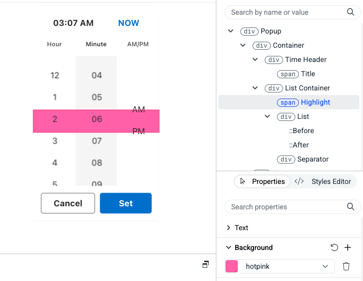
requested through t.1676966
Hi Team,
I encountered an issue while exporting a few selected components from the theme build. When I use them in my application, I’m seeing variable-related errors in the index file.
Please refer to the screenshot below:
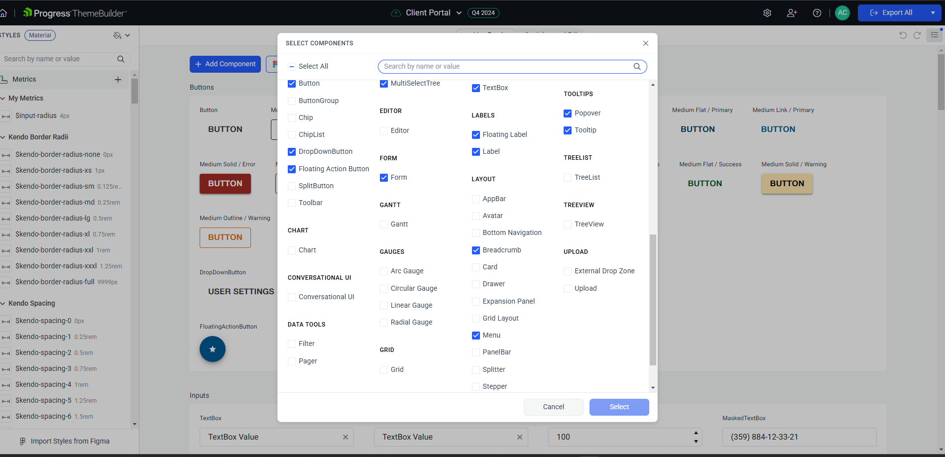
In the screenshot, you can see that I have not exported the AppBar, Badge, and BottomNavigation components. However, their variables still appear in the index file.
I’m currently using:
kendo-theme-material": "^10.1.0"
Kindly look into this issue.
Thanks
Consider and research the options for automatically exporting and mapping styles from the Telerik UI Kits to the built-in Telerik/Kendo templates in ThemeBuilder.
Currently, when using Telerik UI Kit alongside the Figma plugin for ThemeBuilde, one can do one of the following:
- Export only the styles *& variables and then manually map the styles in ThemeBuilder
- Export and create custom components, which won't be connected to the Telerik/Kendo components and will have a custom HTML rendering.
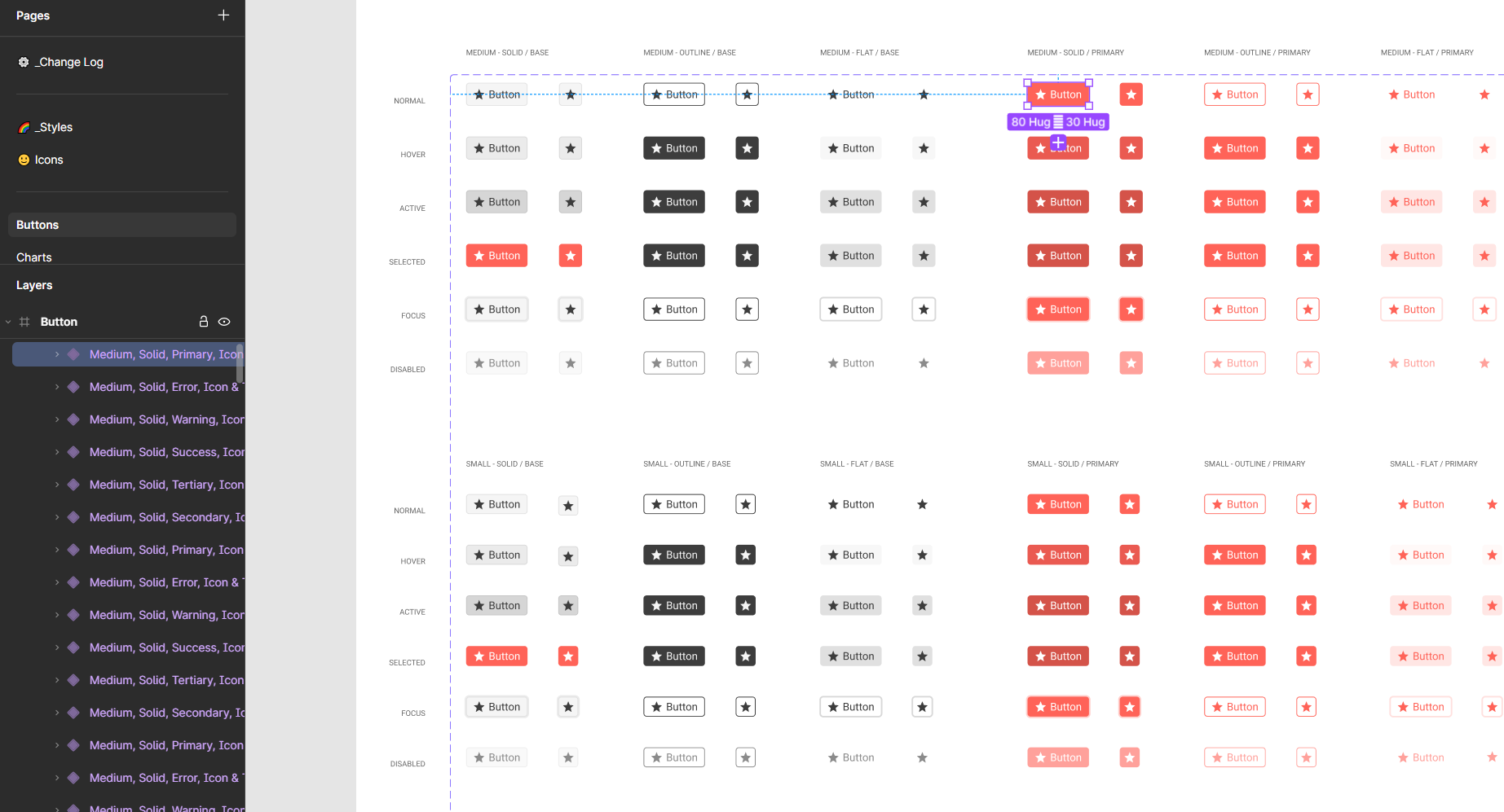
Consider adding a functionality that will allow the bulk export of component variants in Figma while using the Figma plugin for ThemeBuilder.
For example, an option to export and create all variants of the Button in the Telerik UI kit
When exporting only selected components, it would be incredibly beneficial if ThemeBuilder could automatically generate separate override files specifically for those components. This approach would keep the codebase more modular, improve performance, and better serve applications relying only on certain Kendo components.
Requested through 1674517
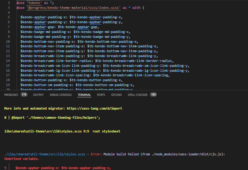
I modified a theme this morning and after changing a property got the error: "There are errors in SASS and it cannot be compiled to CSS.". Changing the property back to what it was before did not resolve the problem. Clicking the Undo button over and over and over did not resolve it.
I started over with a backup taken yesterday and started reapplying changes. When I clicked "Export All" I once again got the same error. There is no way to recover from it.
I've had ThemeBuilder licensed for some time, but this is the first week I've tried to use it in our application. It seems to be total garbage. I can't see any why forward with us using a tool that's going to randomly produce unrecoverable errors.
We recently upgraded our theme builder to ultimate so we could migrate our theme builder project from R1 2023 to Q4 2024. After we did this there were some small changes we needed to fix but after that we followed all the normal installation procedures.
We are running angular 18 and have updated all kendo components to the latest versions.
After installing the new theme we also added/changed the way we imported the theme package following the documentation (using @use).
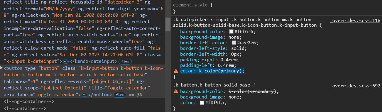
Most everything looks good but there is one large issue with several of our components and that is the kendo theme mixin "k-color" is not working.
In several places there is no color or background color being set on the component(s). When i inspect the style i see color: k-color(primary); is not working. dev tools states that the variable is wrong. i can only assume the mixin is not imported/being used.
Image of my description
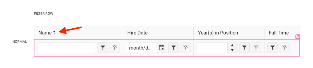
Currently, there are no templates for modifying the sort icons of the filter cells of the TreeList component. There is a template for the Filter Row, which refers to the Grid component. However, the part with the sort icon is not connected to the Grid, as modifying it there doesn't reflect the change in the TreeList.
Consider exposing a templates for these icons.
Currently, we have templates for the different states of the Calendar cells:
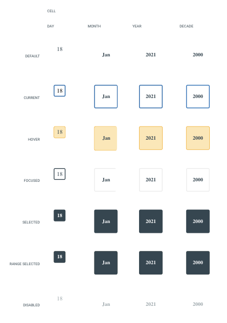
However, it's common to apply multiple states simultaneously. For example, the user may want to style a day cell that is considered current and selected or current, selected, and hovering at the same time. Consider exposing templates for the most commonly used combinations, such as the ones mentioned here.
Requested through t.1670882.
Sometimes, when using the Export Font Icons functionality of the ThemeBuilder Plugin for Figma, the export freezes with "Sending data to server: 0%":
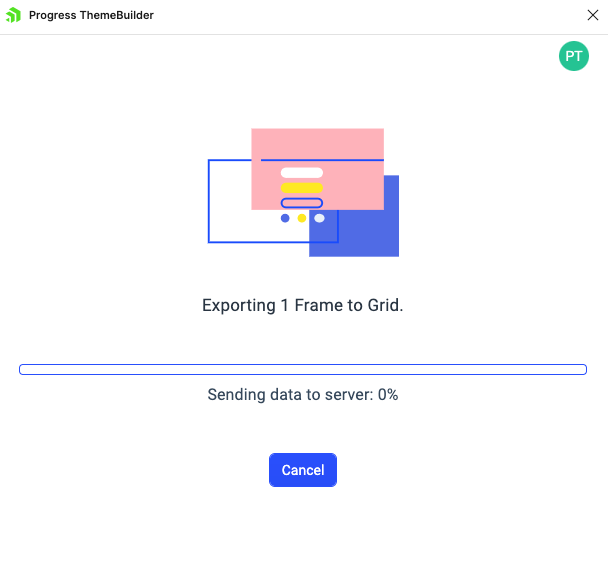
This is due to how Figma handles the export of icons.
Consider implementing a mechanism for indicating the problematic icons so that users can remove/update them and make them eligible for export.
Starting from Q2 2024, new variables were introduced in the Kendo themes, such as primary-subtle, primary-subtle-hover, primary-subtle-active, etc., and they're all variants of some base color variable (e.g., primary).
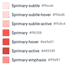
Currently, if users choose to use a different hue for such base variables, they must manually change all of their variants as well.
Consider implementing a feature allowing users to change all variants of a variable based on an internal algorithm when the base variable (e.g., primary) is modified.
Sometimes, errors occur in ThemeBuilder due to various reasons.
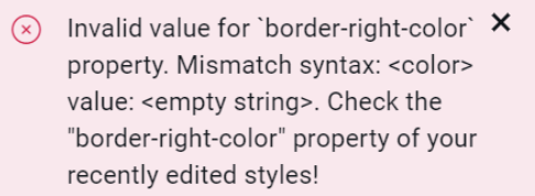
Consider including indicators in these errors to let the users know where they are located so they can possibly fix them through ThemeBuilder's user interface if applicable.
Requested through t.1667194.
In Sass is possible to define à variable like this
$primary: red;
$primary-filter: rgba($primary, .5);
But this possibility is not supprted by ThemeBuilder
It may be usefull for variation of same color in theme whit only one variable to adjust.
_tokens.scss
tb-custom-primary: #014d5b !default; //Is the value if not defined in final scss
tb-primary: tb-custom-primary;
-----------------------------------------------
index.scss
$tb-custom-color: #34b232; //Now I can define the final value for variable
@import '_tokens'
it would be useful to add it in ThemeBuilder UI.
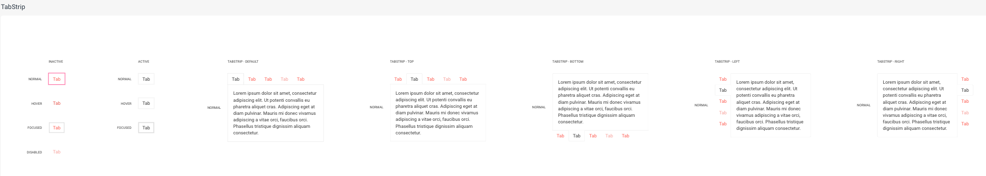
Currently, ThemeBuilder exposes templates for the states of the TabStrip items. However, the changes apply to all positions of the TabStrip. This is inconvenient if you want to apply changes only to one of its positions. Also, these items' states have specific styles coming with the keyword "!important", which the default templates do not override.
Consider exposing templates for these states based on the position of the TabStrip component.
Requested through t.1666111.
- Open a themebuilder project
- Click on the settings icon in the header bar on the right side
- Navigate to the colors section
- Try to navigate away from the color section
--> Create Variable Dropdown turns invalid and I can't navigate away from the section. Also there is no way to make it valid.
Consider providing a way for users to define color palettes. Such a feature is currently unavailable in ThemeBuilder.
Requested through t.1665887.