I am in the process of preparing my product for alpha release and I am scrubbing my log files for anything that needs to be cleaned up prior to release. I am seeing two message in my log file that I cannot pinpoint in my code so I am suspecting it is coming from your code. I use NLog to log errors so I format Errors differently than general errors. I am seeing the following two errors being logged on app startup:
----------------------------------
2024-07-26 07:28:06.9283 ERROR
  Call site:         App.LogException
  Method name:       MobyClient.WinUI.App.LogException
  Line:              0
  Exception Type:    System.ArgumentException
  Exception Message: The parameter is incorrect.

Assets/Fonts/Segoe UI.otf is not a valid absolute URI.
  Stack Trace:       at WinRT.ExceptionHelpers.<ThrowExceptionForHR>g__Throw|39_0(Int32 hr)
  Additional Info:   An error occurred
----------------------------------
and
----------------------------------
2024-07-26 07:28:06.8891 ERROR
  Call site:         App.LogException
  Method name:       MobyClient.WinUI.App.LogException
  Line:              0
  Exception Type:    System.ArgumentException
  Exception Message: The parameter is incorrect.

Assets/Fonts/Segoe UI.ttf is not a valid absolute URI.
  Stack Trace:       at WinRT.ExceptionHelpers.<ThrowExceptionForHR>g__Throw|39_0(Int32 hr)
  Additional Info:   An error occurred
----------------------------------
In my MauiProgram.cd file, I load many fonts:
		_ = builder
			.UseMauiApp<App> ()
			.UseTelerik ()
			.ConfigureFonts (fonts => {
				_ = fonts.AddFont ("FontAwesome6Brands-Regular-400.otf", "FaBrands");
				_ = fonts.AddFont ("FontAwesome6Duotone-Solid-900.otf", "FaDuotone");
				_ = fonts.AddFont ("FontAwesome6Pro-Light-300.otf", "FaLight");
				_ = fonts.AddFont ("FontAwesome6Pro-Regular-400.otf", "FaRegular");
				_ = fonts.AddFont ("FontAwesome6Pro-Solid-900.otf", "FaSolid");
				_ = fonts.AddFont ("FontAwesome6Pro-Thin-100.otf", "FaThin");
				_ = fonts.AddFont ("OpenSans-Regular.ttf", "OpenSansRegular");
				_ = fonts.AddFont ("OpenSans-Semibold.ttf", "OpenSansSemibold");
				_ = fonts.AddFont ("Poppins-Black.otf", "PoppinsBlack");
				_ = fonts.AddFont ("Poppins-BlackItalic.otf", "PoppinsBlackItalic");
				_ = fonts.AddFont ("Poppins-Bold.otf", "PoppinsBold");
				_ = fonts.AddFont ("Poppins-BoldItalic.otf", "PoppinsBoldItalic");
				_ = fonts.AddFont ("Poppins-ExtraBold.otf", "PoppinsExtraBold");
				_ = fonts.AddFont ("Poppins-ExtraBoldItalic.otf", "PoppinsExtraBoldItalic");
				_ = fonts.AddFont ("Poppins-ExtraLight.otf", "PoppinsExtraLight");
				_ = fonts.AddFont ("Poppins-ExtraLightItalic.otf", "PoppinsExtraLightItalic");
				_ = fonts.AddFont ("Poppins-Italic.otf", "PoppinsItalic");
				_ = fonts.AddFont ("Poppins-Light.otf", "PoppinsLight");
				_ = fonts.AddFont ("Poppins-LightItalic.otf", "PoppinsLightItalic");
				_ = fonts.AddFont ("Poppins-Medium.otf", "PoppinsMedium");
				_ = fonts.AddFont ("Poppins-MediumItalic.otf", "PoppinsMediumItalic");
				_ = fonts.AddFont ("Poppins-Regular.otf", "PoppinsRegular");
				_ = fonts.AddFont ("Poppins-SemiBold.otf", "PoppinsSemiBold");
				_ = fonts.AddFont ("Poppins-SemiBoldItalic.otf", "PoppinsSemiBoldItalic");
				_ = fonts.AddFont ("Poppins-Thin.otf", "PoppinsThin");
				_ = fonts.AddFont ("Poppins-ThinItalic.otf", "PoppinsThinItalic");
				_ = fonts.AddFont ("Segoe-Ui.ttf", "SegoeUi");
				_ = fonts.AddFont ("Segoe-Ui-Bold.ttf", "SegoeUiBold");
				_ = fonts.AddFont ("Segoe-Ui-Regular.ttf", "SegoeUiRegular");
				_ = fonts.AddFont ("Segoe-Ui-Semibold.ttf", "SegoeUiSemibold");
				_ = fonts.AddFont ("Segoe-Ui-Semilight.ttf", "SegoeUiSemilight");
			})
			.ConfigureMobyApplication ();
As you can see, 'Assets/Fonts/Segoe UI.ttf' or 'Assets/Fonts/Segoe UI.otf' is a font I am loading. In fact, all of the 'Segoe' font names use a dash '-' instead of a space in the file name. Also, I only load 'ttf' fonts and not 'otf' fonts for Seqoe fonts. Telerik controls are the only non-standard controls I am using so I am suspecting this font name is being loaded by your controls somehow. Can you please confirm this?
Also, when I went to report this incident, I noticed that you had requested input from me on previous issues I have raised, but I never received any email from you requesting this information. Since I rarely log into this website for anything, I don't know how you expect people to answer your questions if they are not made more visible. Is there a way to subscribe to an issue so I see all updates? I looked over the complete set of items I can add to this issue and none of them seem to be related to answering questions from you. It would be helpful for you to send any and all updates on any issues that have been logged. I just scanned my entire set of email folders and other than messages from your sales department, no other messages were found. Just sayin'...
I tried the following and the custom context menu does not apply:
<telerik:RadEntry x:Name="telerikEntry">
    <FlyoutBase.ContextFlyout>
        <MenuFlyout>
            <MenuFlyoutItem Text="Custom flyout telrik radentry"
                            Clicked="MenuFlyoutItem_Clicked">
            </MenuFlyoutItem>
        </MenuFlyout>
    </FlyoutBase.ContextFlyout>
</telerik:RadEntry>
It works for MAUI Entry. Provide this menu for Telerik MAUI RadEntry too.
Asking for a webview which opens external links ( links with a target= element) in the same webview instead of it does do nothing onbios and android, but in windows opens it a browser window with that url of the link!
we need the functionality to overrule the target= function of a link. To the same webview. At this moment we need a hybridwebview functionality! And it would be very handy to have that in a telerik control!
best regards, Fandy
Provide an option to swipe the TreeView Item.
I have tried using the Microsoft .NET MAUI SwipeView, but the control cannot scroll.
Hi Team,
I need to know when the SuggestionsView is visible or not. This appears to be independent of the existing events, so I am requesting an official feature for this to be implemented.
I do have a shaky workaround right now, but it is not reliable and this ultimately requires something from the Telerik UI for Maui side to be implemented.
Thank you!
Jiri
I set a minimum height on a RadRichTextEditor control so its height would expand as the user typed more into the editor. This caused different issues on both Android and iOS.
On Android: As the height attempts to expand, it gets caught in an infinite loop where the bottom of the height is shaking. I believe this is because the call to UpdateContentSize in OnSizeAllocated causes a re-render of the underlying webview, which causes it to keep resizing over and over.
On iOS: The editor height never expands, but I believe this might be a platform issue and not a telerik issue.
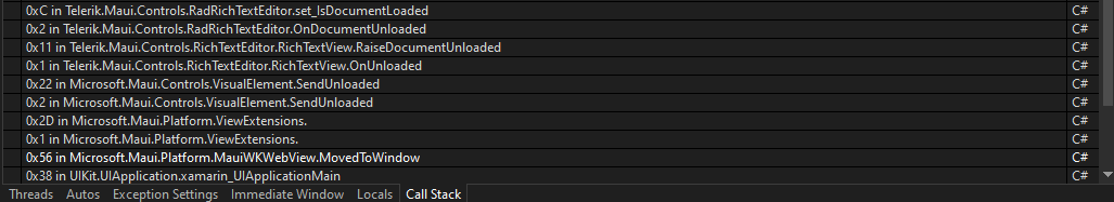
In iOS if you are on a page with a rich text editor, then navigate to a new page, the editor gets unloaded. When the user navigates back, the document is still unloaded and is no longer functional. This is not a problem on Android.
Here is a stack trace of when that document gets unloaded:
Hi Team,
Please consider adding a way to cancel a group's expand/collapse action when the user taps on the group header.
For example, through a GroupTapping event handler that fires just before GroupTapped, and we can execute logic that prevents the operation:
private void RadCollectionView_OnGroupTapping(object sender, RadTappingEventArgs<GroupContext> e)
{
    if (e.Data.Key.ToString() == "GroupToStayPermanentlyExpanded")
    {
        e.Cancel();
    }
}


// which uses this imaginary event args with Cancel method
public class RadTappingEventArgs<T>(T data) : RadTappedEventArgs<T>(data)
{
    public void Cancel()
    {
        // prevents GroupTapped event
    }
}
Thank you,
Rodrigo
RadComboBox for .NET MAUI has search feature, however it does not filters the items matching the text, instead it only scrolls to the matching item. We can manually filter the items in the item source but it would be nice to have such filtering built in.
Also we need to highlight the first item that matches the search string. Currently it doesn't seem to be possible. One way could be to select the first item manually which may change the background of the item and give a feel of highlight but that causes problem with selected item because we also need to subscribe to selected item change and do some other processing based on that. If we select item as filter happens then it would trigger selection change multiple times needlessly.
Also it seems that currently RadComboBox dropdown does not have support for keyboard navigation. We need to be able to navigate between items with keyboard up/down arrows so that user can navigate to different items and then press enter to select the highlighted item. This feature might not make sense on mobile but it is needed for desktop platforms.
Let me know if there is already a way to achieve the above behavior.
Hi Team,
I would like to be able to have client-side filtering/sorting/grouping capabilities for large backend datasets that cannot be entirely loaded on the client.
As it stands now, the DataGrid (and other data components) can only operate on the data that is has in the local DataView. This means that I need to build a custom filtering solution that prefilters/presorts the backend data before paging and loading it into the DataGrid.
To accomplish the "full view", we need a data layer that understands both the UI as well as the backend. The Telerik UI for WPF product has an excellent solution for this, known as the WPF EntityFrameworkCoreDataSource - Overview - Telerik UI for WPF and the WPF DataServiceDataSource - Overview - Telerik UI for WPF.
If such a feature can be added to Telerik UI for MAUI, it would be an excellent bonus for the component suite in data heavy applications.
Thank you,
Peter
I'm forced to use RadNumericInput with styling the NumericInputEntry HorizontalTextAlignment set to End
<Style x:Key="rightNumericInputEntryStyle"
       TargetType="telerik:NumericInputEntry">
    <Setter Property="HorizontalTextAlignment" Value="End" />
</Style>
...
<telerik:RadNumericInput AutomationId="ageNumeric"
                         EntryStyle="{StaticResource rightNumericInputEntryStyle}"
                         Minimum="0"
                         Value="{Binding Age, Mode=TwoWay}" />
doing this, the value is cut off, when the controls width gets small.
There is some space on the left, which is not used.
Easy to reproduce in the SDK Samples.
I'm not able to find a way changing this
Value in this Screenshot: 123456, cut after 5
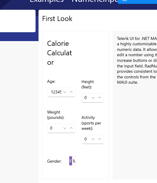
any workaround (keeping the value HorizontalTextAlignment="End") is highly appreciated
Hi Team,
Please review this conversation for technical details. In summary, I needed to reduce the minimum size of the native RadMauiEntry.InputEditor.MinWidth on WinUI, but this value appears to be hard coded to 64px.
This request is to allow us to set it using a Style in .NET MAUI, possible via the NumericInput's EntryStyle property.
Thank you,
Nico