Unplanned
Last Updated: 22 May 2026 09:54 by ADMIN
Luca
Created on: 14 Jun 2022 19:29
Category: SpreadProcessing
Type: Feature Request
3
SpreadProcessing: Add functionality to switch legend between showing series and showing category list

When a chart is created with RadSpreadProcessing, by default it is exported with legend showing category list. If an xlsx file with a chart with legend showing only series is imported and exported, it will be changed to category list as well. API to switch between the two should be added.

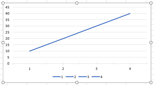
Legend showing category list:

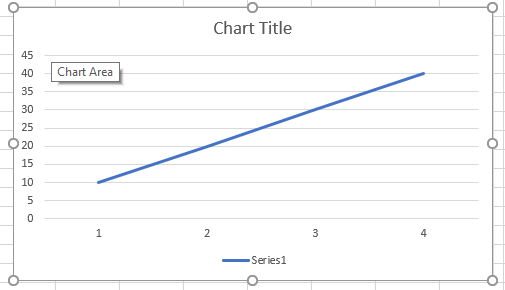
Legend showing series:

2 comments
ADMIN
Yoan
Posted on: 22 May 2026 09:53

Hello Alexander,

Thank you for taking the time to share your thoughts on this topic.

We have reviewed your comments and discussed the current state of this request with our Engineering team. Based on this review, we agreed that it is appropriate to log a separate bug report for the behavior where chart legends are changed during import/export, specifically where Series-based legends are converted into Categories: SpreadProcessing: Charts with Series-based legends are exported as Categories during import/export

We also appreciate the additional insights you shared, and they will be taken into consideration when the Engineering team works on this area.

If you would like to track progress or receive updates, you can follow the relevant tasks on our public feedback portal. Any status updates or changes will be published there.

Thank you in advance for your patience and cooperation.

Regards,
Yoan
Progress Telerik

Love the Telerik and Kendo UI products and believe more people should try them? Invite a fellow developer to become a Progress customer and each of you can get a $50 Amazon gift voucher.

Alexander
Posted on: 21 May 2026 07:37

This need to be fixed

In my view, this belongs to Bug Report, not Feature Request. You are explicitly given the choice between a series defined by "Category + Value" and one defined by "X-Value + Y-Value." If you explicitly select "X- and Y-values" (Scatter), yet categories still appear in the legend, I consider that to be unintended behavior.

Another thing I noticed is that if you create two series using "X and Y values" (Scatter), those two series are correctly listed in the legend as a single Data (XY-Point) Series—rather than Category Series. This further suggests that this is a bug, rather than a desirable feature.

Unfortunately, I am currently facing a problem where I need to plot 900 data points on my chart (for a client application). This leaves me with two options: either I use two series—even though I only need one—which works (but looks ridiculous having an empty series), or I use just one series, in which case Excel displays 900 entries in the legend...

This absolutely needs to be fixed!