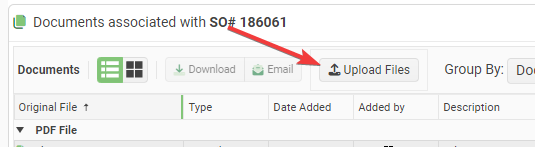
It is impossible to customize the Text and Icon for the Telerik Upload Blazor Component. It always sans "Select Files". This is not easy to see at a glance.
Requests:
- Add a Title attribute to the upload component that lets you change the text from the default "Select Files".
- Add the ability to set the Icon on the upload button.
Proposed Code:
<TelerikUpload Title="Upload Files" Icon="@SvgIcon.Upload" ... />I had to write some hacky JavaScript interop to accomplish this:
function setTelerikUploadButtonText(text) {
// Finds all the telerik blazor upload components on the page and changes the text of the upload button.
let replaced = 0;
const defaultText = "Upload";
// Find all the buttons with class "k-upload-button". There should be one for each upload component.
const buttons = document.getElementsByClassName("k-upload-button");
for (let i = 0; i < buttons.length; i++) {
// Find the span with class "k-button-text" and change its text.
const spans = buttons[i].getElementsByClassName("k-button-text");
if (spans.length > 0) {
// Add horizontal padding to the span.
spans[0].classList.add("px-2");
// Change the text.
spans[0].innerHTML = text ?? defaultText;
// Insert a font awesome icon.
spans[0].insertAdjacentHTML('afterbegin', '<i class="fas fa-upload"></i> ');
// Track how many buttons were updated.
replaced++;
}
}
console.info("setTelerikUploadButtonText: " + replaced + " buttons updated.");
return replaced;
}/// <summary>
/// Finds all the telerik blazor upload components on the page and changes the text of the upload button.
/// </summary>
/// <returns>The number of upload components button text that were found & replaced.</returns>
public static async Task SetTelerikUploadButtonText(this IJSRuntime jSRuntime,
string text = "Upload Files")
{
await jSRuntime.InvokeVoidAsync("setTelerikUploadButtonText", text);
}
Screenshot:
Is there any scope to add a Blazor Ranged Bar/Column Chart component as seen in other products:
- Telerik Web Forms Range Column Chart - RadHtmlChart - Telerik UI for ASP.NET AJAX
- Demo of core features in jQuery Range Bar Charts widget | Kendo UI for jQuery (telerik.com)?
We attempted to work around this by adding an invisible stacked series underneath our dataset. However, without the Ability to customize the highlighted/hovered series item (telerik.com), we are not able to effectively hide the invisible series from the user. We will have to fall back into the jQuery Kendo UI components once again. Alternatively, are there any other known work arounds to achieve this in Blazor?
I saw that DropDown TreeList is already in the to-do list, but I would like to even extend it by adding MultiSelect feature to it
So basically add MultiSelect but with TreeList inside
Regards
Andrzej
In many cases in a grid you may have additional data that the user can view however you don't want to show it as a default.
In these cases it would be nice to create the column normally, set the visible="false", and then have a built in column chooser feature.
This chooser would be a simple popup with a list of columns where the user can check whether visible or not.
I currently have this functionality in an Angular application using ag-grid, but would like to rewrite the application using Blazor. The only limitation I have run into is this missing functionality in any Blazor grid. Even ag-grid falls short when it comes to nice animations. Here is an example of the animations and scrolling that I would like to have in a grid: https://autodesk.github.io/react-base-table/examples/draggable-rows.
The application is easiestbudget.com.
I hope I'm not the first person to request these features, and I would be delighted to see them in a future version of your Blazor grid.
I want to use a token to access the Telerik NuGet feed for my CI/CD builds, instead of using credentials.
---
ADMIN EDIT
At the moment, the options for that are:
- Have an account in your company that is assigned a license and is used for builds. A trusted human developer can also use it to access the components and do their daily work. They should make sure to not change their password, or to notify the people who can update it in the secrets in the CI/CD pipeline immediately.
- Make your own private nuget feed and ensure the Telerik packages you want in it are available there. It can be as simple as a network location internal to your company. Make sure that this feed is not publicly available, however. When you need to upgrade, make sure to copy the new packages to that feed too so automated builds can access them.
You can read more details and some troubleshooting tips in the CI and CD Automated Builds section of our documentation.
The goal of this request is to provide a way to detach the user credentials from the builds so that they can use their accounts freely, and only provide necessary keys to the build pipeline, and those keys can be updated/revoked as needed. This would also avoid manual work on downloading and copying new nuget packages to a custom feed.
---
Hello,
Please add an expandable and collapsible panel (container), similar to the ExpansionPanel in Kendo UI.
Please add organizational chart control similar with
https://demos.telerik.com/aspnet-ajax/orgchart/examples/overview/defaultcs.aspx
You can add a search box in the grid toolbar that lets the user type their query and the grid will look up all visible string columns with a case-insensitive Contains operator, and filter them accordingly. You can change the filter delay, and the fields the grid will use - see the Customize the SearchBox section below.
-----
I have an int and a string field and would love to be able to let the user search in both at the same time.
Workaround is now:
public int number {get; set;}
public string numberString => number.ToString();
public string name {get; set;}
But I would love to see it without the need to use the numberString
I would like to be able to override the No Data message in DropDownList component when there are no elements in the Data.
--
ADMIN EDIT
Until this feature is implemented, here is a workaround.
If you already have localization in your project, just set "DropDownList_NoData" key to an empty string in your resources.
If you don't have localization, here are the steps you should do (shortened version of the documentation):
1. Create a class for your localizer:
public class SampleResxLocalizer : ITelerikStringLocalizer
{
    public string this[string name]
    {
        get
        {
            return GetStringFromResource(name);
        }
    }

    public string GetStringFromResource(string key)
    {
        // this will override only DropDownList_NoData message and it will return other messages as they are
        if (key == nameof(Messages.DropDownList_NoData))
        {
            return string.Empty;
        }

            return Messages.ResourceManager.GetString(key, Messages.Culture); ;
        }
}
2. Override the existing Localizer. This step should be done when configuring your services after calling "AddTelerikBlazor()":
builder.Services.AddSingleton(typeof(ITelerikStringLocalizer), typeof(SampleResxLocalizer));--
I would like to have the Label property to all input components, like ComboBox, NumericTextBox, all date inputs and pickers and so on. Right now only TextBox have it.
There a hack using HTML labels and CSS to get that but I think it is necessary to unify and not have to deal with two different concepts within the same form.
Input with Label property:
<TelerikTextBox Label="Container Name" @bind-Value="@ContainerSettings.ContainerName"></TelerikTextBox>
Hack to get same result in other inputs:
<label class="k-label" for="port">
Port <br>
<TelerikNumericTextBox Id="port" Arrows="false" @bind-Value="@ContainerSettings.Port"></TelerikNumericTextBox>
</label>
.jpg)
This feature is requesting a Blazor version of the RadPropertyGrid, or a more modern Material Design(ish) equivalent.
https://docs.telerik.com/devtools/wpf/controls/radpropertygrid/overview
As more customers are adopting Blazor, we're porting our rich design time tooling to the web in SaaS type offers. No Blazor control vendor has this type of control today, and it's sorely needed. Even finding a Web/Angular version of this type of control is practically impossible.
Having this control combined with the existing Telerik Blazor property editors (combo boxes, edit fields, boolean controls, color pickers, font pickers, etc.) would give you a strong leg up on your competitors.
Note: Our company is already licensing your Blazor controls and I speak to Maria every few months on the roadmap.
Hi team,
I know we have Diagram like Kendo UI for Blazor, But it's confusing and gets very messy with more customizations. I would be very helpful if we have native Blazor component for diagram rather than integrating JQuery with Kendo. Hence making a feature request.
let me know if there is any plan in pipeline for this feature.
Regards,
Rikam
We would like a parameter for Grid to set the placeholder of the DateTime filter in FilterRow (e.g. instead of 'yyyy. MM. dd' an own pattern).
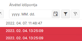
We think of a parameter like the FormatPlaceholder parameter of the DatePicker component.
Telerik.Blazor.DialogFactory
User types in an input string, but they have to click 'ok' with the mouse to proceed - typing enter does nothing
The Image Thumbnail Viewer Component should have features like:
- Face detection-based image cropping
- Overlay an image over detected faces [To hide faces]
- Blur or pixelate faces
- Thumbnail masking within different shapes like:
- Circle
- Square
- Rectangle
- Hexagon
- Star etc.
- Content Aware Padding of images to fix the container size
- Set transparent background
- Text overlay
- Image watermark overlays
- Recolor a picture
- Antic Effect
This Thumbnail Viewer can then be used within Data Grid, File Manager/Explorer, Card View, Drop down lists, List Views, Tiles etc.
I would like to be able to set the aria-required or the required HTML attribute to the input components in the Telerik UI for Blazor suite. This is needed because currently, the screen readers do not notify the users of the application that an input is required.