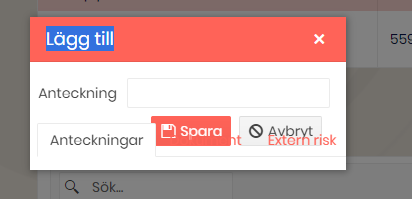
It seems that the TabBar convers some parts of the popup form from the Grid. See image. If we move the grid outside of the TabBar, the problem goes away.
Hello,
I'm using a numeric textbox and when I test my page for accessibility, Allyable reports the following:
Category: Ensure button or link have discernible text that is not repeated as image description
Selector: .k-form-field-wrap > .k-numerictextbox.k-widget > .k-numeric-wrap > .k-select > [role="button"].k-link-decrease
Severity: Critical
Here is my source code:
<TelerikNumericTextBox @bind-Value="@cardCleaner.Quantity" Id="cleanerQty" Width="100px" />
Is this really an accessibility issue?
Thanks,
Bernard

I just updated to Telerik.UI.for.Blazor 2.30.0 and the grid search boxes look a little screwy. Not a huge deal but thought I would report it.
Hi,
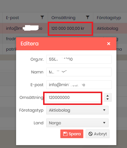
It seems when using popup form editing with the DataGrid, the displayformat is lost even though it is displayed correctly in non edit mode. This seem to be true regardless if you specify it with Data Annotations of as DisplayFormat in markup.
I'd like to have an ExpansionPanel component where I can declare my desired panel instances and their content in the markup.
Similar to https://www.telerik.com/kendo-angular-ui/components/layout/expansionpanel/
Hello,
first of all, thank you for relelasing Dialog, it is what we are "simulating" by modal Window on any kind of heavy data editing app,again and again and again :) .
The problem is,
- when you put DropDownList in Dialog, using OnRead async task event, the UI is still "empty". => Iam fiddled with reassigning datasource, changing order of assigning source, nothing helped.
- same dropdownlist scenario inside window, working/displayed as expected.
Steps to reproduce:
1) click on then button to show window by -> async task
2) event OnRead of the dropdownlist is correctly called, data to the IEnumerable<model> is loaded
3) window appear, but DropDownList is empty
4) when you filter by typeing inside DropDownList, OnRead is called and model populated, but GUI is still empty
What doesnt worked:
- statechaned, reassign datasource, clear datasource, task delay
What partially worked:
- OnRead=> async Task changed to just: OnRead=> Task
Thanks for info what should be made done else.
Stripped sample:
<TelerikButton @onclick="@(() => ParamEd(4444, null))">open window or dialog</TelerikButton>
<TelerikWindow Modal="true" @bind-Visible="@ShowEditWindow" Draggable="true">
<WindowTitle>
<strong>@ShowEditWindowCaption</strong>
</WindowTitle>
<WindowContent>
<TelerikDropDownList @bind-Value="@CurrentEdit.ValTxt"
ScrollMode="@DropDownScrollMode.Virtual"
Data="@CurrentEdit.ComboSource"
OnRead="@ReadComboData"
ItemHeight="30"
TotalCount="@Paging.CNT"
PageSize="14"
PopupHeight="400px"
TextField="Nazev1"
ValueField="KeyVal"
Filterable="true"
FilterOperator="StringFilterOperator.Contains">
</TelerikDropDownList>
....
vs
<TelerikDialog @bind -Visible="@ShowEditWindow" Title="@ShowEditWindowCaption" CloseOnOverlayClick="false">
<DialogContent>
<TelerikDropDownList @bind-Value="@CurrentEdit.ValTxt"
ScrollMode="@DropDownScrollMode.Virtual"
Data="@CurrentEdit.ComboSource"
OnRead="@ReadComboData"
ItemHeight="30"
TotalCount="@Paging.CNT"
PageSize="14"
PopupHeight="400px"
TextField="Nazev1"
ValueField="KeyVal"
Filterable="true"
FilterOperator="StringFilterOperator.Contains">
</TelerikDropDownList>
....
@code{
public NotificationBase Notification { get; set; }
[CascadingParameter]
public DialogFactory Dialogs { get; set; }
//clicked on the button to show window/dialog:
async Task ParamEd(int xtyp, object it)
{
await Task.Delay(500);//await load captions... and THEN open window:
ShowEditWindowCaption = "window title";
ShowEditWindow = true;
}
async Task ReadComboData(DropDownListReadEventArgs e)
{
try
{
var r = await readDBDATA...
//CurrentEdit.ComboSource = new List<EdBase>();
//CurrentEdit.ComboSource = null;
//CurrentEdit.ComboSource = new IEnumerable<EdBase>(r);
//CurrentEdit.ComboSource = await ReadDBDATA
CurrentEdit.ComboSource = r;
Paging.CNT = p.Get<int>("CNT");
/*
//!! HOTFIX FROM ANOTHER BUG(show selected data) - ReAssign data(but id doesnt impact result):
string v = CurrentEdit.ValTxt;
int? i= CurrentEdit.ValInt;
CurrentEdit.ValTxt = string.Empty;
CurrentEdit.ValInt = null;
StateHasChanged();
//await InvokeAsync(() => StateHasChanged());
CurrentEdit.ValTxt = v;
CurrentEdit.ValInt = i;
//CurrentEdit.ValTxt = CurrentEdit.ValTxt;
//StateHasChanged();
*/
}
catch (Exception ex)
{
Notification.ShowSQLErr(ex.Message);
}
}
//PARTIALLY WORKING, but not filtering:
Task ReadComboData(DropDownListReadEventArgs e)
{
try
{
var r = readDBDATA...
CurrentEdit.ComboSource = r;
Paging.CNT = p.Get<int>("CNT");
}
catch (Exception ex)
{
Notification.ShowSQLErr(ex.Message);
}
}
}
Incremental Search A grid that can be searched incrementally as one types in the search box.
On-demand Sort It should have the ability to do a toggle between ascending and descending sort order when the user taps on a column header.
Pagination It should provide customizable pagination so only one page worth of data is fetched at any given time.
Did I describe the jQuery Datatable functionality? It is because it is so good and having the equivalent of its server-side implementation equivalent in Blazor will be awesome.
Implementation Thoughts The control sends a predefined model to an event bound function as parameter. The model has the information like requested page, column-sort request, letters the user typed into the search box etc. The function fetches data based on the model and the grid updates dynamically.
Hi,
I have found some evidence of a bug which I believe add to the portrait of this issue which has already been reported but declined. Could you please have a look at my recent comments and report it to follow on it (so it remains active)?
https://feedback.telerik.com/blazor/1532895-initcheckbox-was-undefined
Regards.
Maurice.
.png)
Hello
Just seeing if it would be easy to separate the "StockChartNavigator" component that currently sits within the "TelerikStockChart" component.
So in other words, have a generic "ChartNavigator" component; the navigator is very good as a standalone and could be applied to many things such as grids, non-telerik charts (not only stock data) etc.
Alternatively, if there were a way to override the chart template of the TelerikStockChart, that would achieve the same result?
Cheers
Phil
Provide ability to define icons for input prefix and suffix. Thus, provide mechanism for built-in validation icon as well.
Example image with suffix icons to give you better perspective of the feature.

I have a column grouped by groupname of producttype having values likes diesel,electric,gas,petrol but i want specific order in groups to appear like diesel,petrol,electric,gas
Using
Protected void onstateinithandler(gridstateeventargs <prdouctmodel> args)
{
gridstate <productmodel> statetobe = new gridstate <productmodel>()
{
GroupDescriptors = new list <groupdescriptor>()
{
new GroupDescriptor()
{ Member= "producttype",
Membertype =typeof (string)
}
},
Collapsedgroups =enumerable.range (0,4).tolist ()
};
args.gridstate = statetobe
}
Hello
The column group headers functionality is great, however it messes with the export to excel/csv, as the headers no longer align on the 1 row.
Just seeing if there was a way to export to csv/excel but ignore the column group headers? Maybe a feature on the <GridCsvExport ExportGroupHeaders=false /> option?
Or is there a way to turn off column group headers programmatically? Then this could be removed then readded on the events; OnBeforeExport, OnAfterExport
Cheers
Phil
I would like to use the new structs that are part of .NET6 - the DateOnly and TimeOnly.
Their support should extend to all respective date and time pickers and more complex components like the Grid, Gantt, Scheduler, and other applicable components.
Further to issue reported in https://feedback.telerik.com/blazor/1545177-selected-items-are-not-preserved-when-loading-the-state-when-the-component-is-bound-to-expandoobjects wrt Expando Object, the column menu reset also does not work when grid is bound to Expando Object
Regards
Naved
I am experiencing this problem with version 2.29 when the dropdown list is in a "component"
It seems to be intermittent but dependent on how long the async method takes to complete.
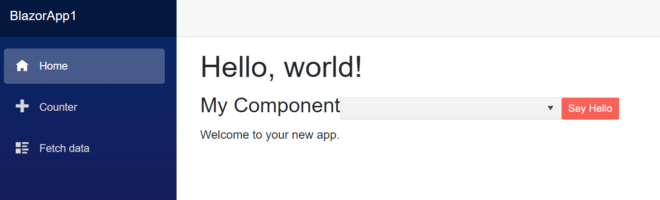
Edit page
@page "/"
@using System.Diagnostics
@using System.Threading
@using BlazorApp1.Components

<h1>Hello, world!</h1>

<EditForm class="form-inline" Model="@Model">
    <MyComponent />
</EditForm>

Welcome to your new app.

@code {
    object Model = new();
    private Guid InstanceId;

    public Index()
    {
        InstanceId = Guid.NewGuid();
        Debug.WriteLine($"Index - {InstanceId}");
    }

    protected override Task OnInitializedAsync()
    {
        Debug.WriteLine("Index - OnInitializedAsync");
        return base.OnInitializedAsync();
    }

    protected override Task OnParametersSetAsync()
    {
        Debug.WriteLine("Index - OnParametersSetAsync");
        return base.OnParametersSetAsync();
    }
}
Component
@using System.Diagnostics
<h3>My Component</h3>
<br />
<TelerikDropDownList @bind-Value=_selectedValue Data="@myComboData" TextField="MyTextField" ValueField="MyValueField" TValue="int" TItem="MyDdlModel"></TelerikDropDownList>
<br />
<TelerikButton OnClick="@SayHelloHandler" Primary="true">Say Hello</TelerikButton><br />
@helloString
<br />
@code {
private Guid InstanceId;
MarkupString helloString;
int _selectedValue { get; set; } = 2; // Preselected value
IEnumerable<MyDdlModel> myComboData { get; set; } = Enumerable.Empty<MyDdlModel>();
void SayHelloHandler()
{
string msg = string.Format("Hello from <strong>Telerik Blazor</strong> at {0}.<br /> Now you can use C# to write front-end!", DateTime.Now);
helloString = new MarkupString(msg);
}
public MyComponent()
{
InstanceId = Guid.NewGuid();
Debug.WriteLine($"MyComponent - {InstanceId}");
}
protected override async Task OnInitializedAsync()
{
Debug.WriteLine("MyComponent - OnInitializedAsync");
myComboData = await LoadData();
await base.OnInitializedAsync();
}
protected override Task OnParametersSetAsync()
{
Debug.WriteLine("MyComponent - OnParametersSetAsync");
return base.OnParametersSetAsync();
}
private async Task<IEnumerable<MyDdlModel>> LoadData()
{
await Task.Delay(100);
return Enumerable.Range(1, 20).Select(x => new MyDdlModel { MyTextField = "item " + x, MyValueField = x });
}
public class MyDdlModel
{
public int MyValueField { get; set; }
public string MyTextField { get; set; }
}
}
Hi.
I'd like to request the ability to use a TimeSpanPicker component in Blazor.
For example, see https://www.telerik.com/maui-ui/timespanpicker
Thank you.
Can we have the Image Gallery control like the ASPX AJAX, please? The slide show feature with various transitions is very useful. Thanks.
https://www.telerik.com/products/aspnet-ajax/image-gallery.aspx
1) Validation of handwritten value after loosing focus.
When there are restrictions for min / max values of component, user can't picks invalid date with dropdown and validation works perfectly. However when user enters value as a string, telerik component lets him do that without any alerts. After loosing focus component sets date that match to chosen interval. The problem arrives when user clicks "Save button" after handwritten invalid date and Telerik corrects it by itself with valid but not always correct date from user side. Is it normal situation or there might be a solution to prevent possibility of entering of invalid date before loosing control?
2) Result date after handwritten input that out of accessible range.
After input of out of range date Telerik compute valid date and set it in component. May be situation when user entered correct value for the first time and then tried to change it to invalid, then he would lose his first entered date. Maybe should save last valid date for the next attempts of inputs or leave component logic in current condition?
There is example of situation:
1. TelerikDateTimePicker.Max = 11/1/2021 6:12 PM;
2. User picks date 11/1/2021 6:07 PM;
3. User decides to set 11/1/2021 6:35 PM and writes it in text field;
4. Telerik corrects its date to 11/1/2021 6:03 PM because it's valid, but previous user date was lost.