Hello,
We are planning on setting many custom variables and would like more control over their ordering and naming.
- Enable sorting of custom variables
- Enable numbers in variable names
Thank you for your consideration!
Hi,
Inside the exported zip from ThemeBuilder is a npm package, and I noticed that the package version is always set to 1.0.0.
Is there a way to edit and/or auto increment the package version so we can publish the exported themes to our internal npm repository?
Consider providing a styling template for the Kendo/Telerik Grid with sticky columns
For example:
https://demos.telerik.com/aspnet-mvc/grid/sticky-columns
Note:
Currently, in Kendo UI for React a similar concept is the locked columns https://www.telerik.com/kendo-react-ui/components/grid/columns/locked/
Currently, there is no way to style the different states (e.g. hover) of the Grid's Column Menu items through ThemeBuilder.
Consider exposing templates for those states.
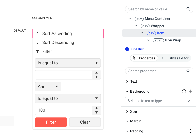
Requested through t.1661051.
The Progress ThemeBuilder currently has the Fluent theme (by Microsoft), but only the light version is available.
As for the other themes (kendo, bootstrap, material) would it be possible to have the dark version too?
Thank you,
best regards
Roberto
I would like to be able to set the style for the focus state for all the input controls in one place.
Currently I would need to select each control, go the advanced edit and set my style. If I then need to make a small change to that style I have to repeat the process for each individual component.
It would be useful if there was a selector on the title bar of each component group that allowed you to set a styles for all the components in the group for states such as hover, focus etc.

As the subject suggests, I think the ability to support multiple swatches in a single project would be a fantastic addition to Themebuilder!
This change would allow a user to select a theme that'll encompass an app's light mode, and once finished, select a separate theme to repeat the process for dark.
As it currently stands, separate Themebuilder projects need to be created in order to separate light and dark themes.
Thank you in advance for your consideration!
Support in ThemeBuilder for using variable fonts (a font where a single file contains all weight variations).
https://fonts.google.com/knowledge/glossary/variable_fonts
Example for variable font: https://fonts.google.com/specimen/Inter
Requested through t.1627093
Consider providing an option to customize the text content for various components (like "Button", "Notification", etc.) so that users can test various scenarios like having longer strings, multiline strings, and similar scenarios.
For example, a user should be able to easily change the template text so that he can test sub-element alignment
Current template
Desired template with customized text
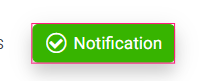
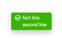
As of now, customization is only possible through the browser developer's tooling.
Consider the possibility of creating a gallery-like platform to showcase various ThemeBuilder demo projects.
The goal is to demonstrate the potential of creating different themes in ThemeBuilder and customizing various Kendo/Telerik components. The gallery should showcase different supported themes alongside multiple demo projects from the supported frameworks, such as JQuery, Angular, Vue, Blazor, and MVC, with Material, Bootstrap, Fluent, and Default themes.
Consider the options for providing a ThemeBuilder template for Kendo Spreadsheet
https://demos.telerik.com/kendo-ui/spreadsheet/index
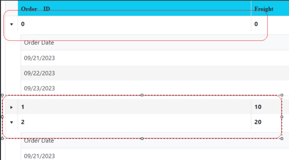
Consider the option to support the Telerik/Kendo hierarchical grids or grid grouping through separate component templates.
For example,
https://demos.telerik.com/aspnet-mvc/grid/hierarchy
https://www.telerik.com/kendo-angular-ui/components/grid/grouping/basics/
The hierarchical grids are visualized with a master row similar to the Grouping Row template. However, it is currently impossible to directly style the hierarchical master row.
Example for grid groups
https://stackblitz.com/run/?file=src%2Fapp%2Fapp.component.ts
In ThemeBuilder Q1 2024 there are Grid templates for styling alternate rows and selected rows. However, there is no template for styling selected alternate row.
Consider providing templates for each rendering option.
I have a grid with a column that contains clickable text in <a> tags and want it to be obvious to the user that this is clickable, by having the text display in blue.
However, there is a CSS class being applied that is preventing the styling from showing:
.k-grid a {
color: inherit;
text-decoration: none;
}
Is it possible for me to modify the styling of these links within ThemeBuilder and not have to add a custom global style override? I have not found any way of changing this.
Thanks
In my example the neumorphism-default
box-shadow: 3px 3px 5px 0px rgba(52, 178, 50, .33), -3px -3px 5px 0px rgba(255, 255, 255, .6);On the ButtonGroup I got overflow on the other buttons and I want to clip the buton for remove the shadow on adjacents buttons.
In my example:
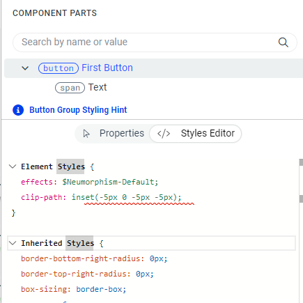
This clip-path can help to apply shadow on the buttons group
to pass from this :
to this


There is a template in the Constructive Elements canvas of components, such as Grid, MultiSelect, etc., for Filter List Item. Currently, ThemeBuilder does not have an exposed component part for modifying its search icon. It becomes problematic when we use font icons, especially a different font file for the icons, which requires changing the character code.
Consider exposing a component part to modify this icon.
Starting from Q2 2024, new variables were introduced in the Kendo themes, such as primary-subtle, primary-subtle-hover, primary-subtle-active, etc., and they're all variants of some base color variable (e.g., primary).
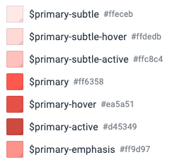
Currently, if users choose to use a different hue for such base variables, they must manually change all of their variants as well.
Consider implementing a feature allowing users to change all variants of a variable based on an internal algorithm when the base variable (e.g., primary) is modified.