The KendoReact Upload Component is designed to send files from file systems to dedicated server handlers, however we would like to use it to send files as byte arrays in form submission. A workaround has been provided here: https://www.telerik.com/forums/kendoreact-upload however we would like to see if there is any community interest in this becoming a standard feature.
Thanks
The navigation sidebar smooth scroll animation doesn't work for the Calendar component.
Here is a codesandbox that showcases the issue: https://codesandbox.io/s/hopeful-river-sk4oc?fontsize=14&hidenavigation=1&theme=dark
Thanks in advance for fixing this :-)
Add an option to show a callout (arrow) element for the Chart tooltip.
Similar to the Tooltip component option:
https://www.telerik.com/kendo-react-ui/components/tooltip/api/TooltipProps/#toc-showcallout
Hi there!
I've written this component for a custom message input box for the Chat in Conversational UI for React:
import { ChatMessageBoxProps } from '@progress/kendo-react-conversational-ui'
import { FC } from 'react'

const CustomChatMessageBox: FC<ChatMessageBoxProps> = (props) => {
  return (
		<>
			<input
				type="text"
				name="message"
				className="h-full w-full text-base md:text-sm focus:outline-none"
			/>
			{props.sendButton}
		</>
  )
}

export default CustomChatMessageBox
I'm supplying this component to the `messageBox` prop of the Chat component. However, sending the message doesn't work; neither by pressing enter or pressing the send button. If I replace the input with props.messageInput, it works.
Any help in fixing this will be greatly appreciated!
Thank in advance :-)
When changing the popup setting "appendTo" to a different element that has a wider width then the input of the dropdown multiselect is not working properly.
The dropdown is attached to that element but the styling is not changing to that parent and is just taking the width of it initial parent.
Example can be found here:
https://stackblitz.com/edit/react-wwhosr-awnrdm?file=app/main.jsx
When using the standalone popup control this is working as it should and adjusting it's width based on the parent it's appended to.
1) Use this StackBlitz application: https://react-scwx3i.stackblitz.io - This is based on Telerik's own DatePicker React example.
2) Highlight the AM/PM section.
3) Try to change the AM/PM section via typing. It doesn't change. Note that other fields in the date/time picker are responsive to keyboard input.
Expectation is that the AM/PM section should respect at least "A" and "P" inputs.
https://www.telerik.com/kendo-react-ui/components/charts/api/GridLines/
Similar to how other elements provide the option to render a custom visual.
I have grid with 1000 items. On every small change to my models, like selection or expand, I am getting every table cells being re-mounted, instead of re-rendered (imagine how many of them is currently with 1000 rows). I have tried to use shouldComponentUpdate to optimize my rendering, but grid component just removes old cell and mounts new one, instead of rerender.
Set TabStrip items on multiple rows, instead of scrolling.
If there are many items, they should be shown on multiple row.
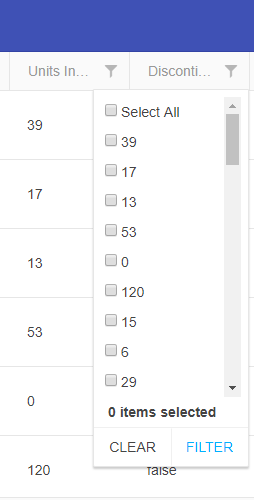
Currently the GridFilterCell OnChange returns a subset of a FilterDescriptor (A value an an Operator to run on the value), which allows a custom filter cell to create one filter rule (FilterDescriptor). However, the CompositeFilterDescriptor structure allows a lot more flexibility. `month == 'January' OR 'March' OR 'May'`. If the GridFilterCell could be passed a CompositeFilterDescriptor instead of the current subset, then a custom filter cell could be much more powerful.
In an orders grid for instance, with a status of Pending, Paid, Shipped, and Delivered a "Show/Hide Shipped" button would exclude or include the Shipped and Delivered orders when clicked. Or a list of checkboxes to choose the statuses you want to see (like the JQuery Grids support).
TL;DR: There is currently no way to re-implement multi-checkboxes or other complex filtering interfaces with the Kendo React Grid without re-implementing all of the filtering logic manually from scratch, as the Existing filter cells don't support this and a custom GridFilterCell can't be configured to return that logic in a single FilterDescriptor.
Hi
Please add SignalR support for grid and other controls similar to Kendo UI for jQuery.
Thank you
Hello,
I have a request that for some tables the user needs arrows to be able to scroll left and right horizontally through the grid content. Is there a functionality like this provided out of the box by Kendo Grid, can you please point me to the docs or provide an example? I have provided an image to reflect this.
Thank you,
Andrei
Hi,
we have a feature request as per description, value isn't changed when manually entering numbers in the field, it only changes when selecting a presented date. When manually entering date, value remains null so reset is actually changing null to null, not the entered value to null. Your colleague mentioned that the feature of exposing mask to be controlled would make it possible to clear the mask.
Please refer to this github issue for more detailed information, containing stackblitz example and gifs of an user case, as it was an ongoing discussion.
Please implement an option to properly reset partially entered dates.
https://github.com/telerik/kendo-react/issues/368
Create the KendoReact Media Player component.
Similar to the Kendo UI for jQuery component:
https://demos.telerik.com/kendo-ui/mediaplayer/index
Add the ability to customize the Filter component elements.
For example:
1) Customize the fields' DropDownList.
2) Customize the Add expression button. It could be used to open a Dialog with a list of expressions.