Imaging a GridColumn field that is a simple object {name:"My Item", value: 123}. It would be great to be able to define properties of the object as what to display without having to build a custom renderer.
displayField/displayFunction as a callback function with the fieldName of the columns and the dataItem of the row as parameters
const nameDisplay = (field, dataItem) => {
return "some value"
}
...
<GridColumn field={"name"} displayFunction={nameDisplay}
I am already using the KendoReact library and consider the scheduler for a new feature. I am confused with the functionality to add new events. Most other calendars I am used to (Google, Teams, ...) work like this: You select a time range and then a new entry is added from the start to the end. But in KendoReact scheduler I have to double click to add a new event.
Is it possible to get the feature I am looking for? Some kind of setting or so.
Sebastian
For now we have had to add a settings option for the user to turn the reorderable feature on and off depending on how they want to use the UI.
It would be a lot better user experience if there was on option to only drag the tile by the header, therefor allowing the user to still highlight and copy text areas and such.

we have X(cross) for combo box but it is not coming for datetime picker
Hi,
we are currently using the Kendo jQuery PivotGrid in our application. We have already migrated some controls to React in our application and would like to switch the PivotGrid to React as the next control.
In the jQuery PivotGrid there is the possibility to export the configured PivotGrid to Excel. You can see the feature here: saveasexcel
Is this functionality also available with the React PivotGrid? And can you show us an example how to use this feature to export the pivot grid data to excel?
If this functionality doesn't exist yet, when can we expect it? Are there already plans for this or can you already vote for it somewhere?
Regards,
Oliver
We are migrating our legacy application which uses Telerik for Silverlight to react application with KendoReact controls. I am converting one screen which uses RadTreeView which gives us Drag and Drop with Reordering feature. Now, in KendoReact, TreeList control does not provide both the features.
Here is what we get when we start dragging item in Silverlight control:
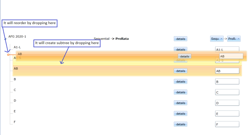
I am expecting the same behavior in KendoReact: TreeList as we have to achieve the same behavior in our react application. This link has some discussion with support team.
Thanks,
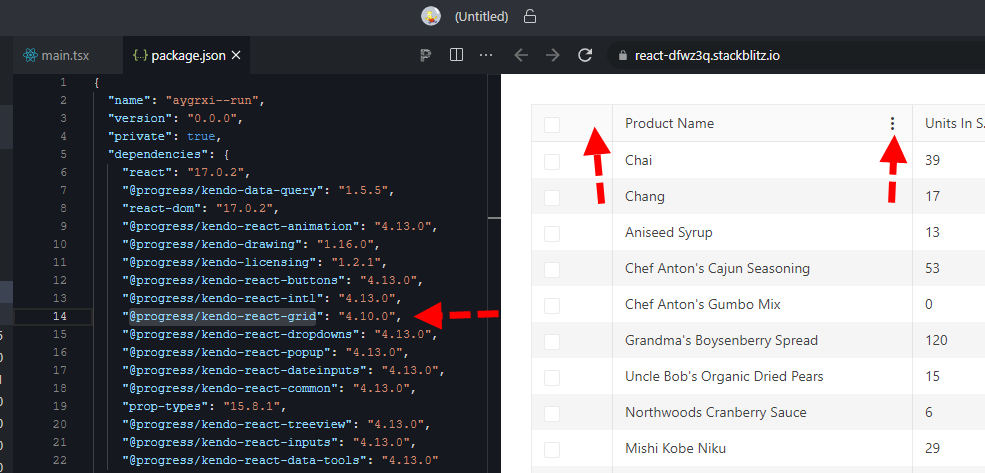
here is a quick repro: https://stackblitz.com/edit/react-dfwz3q?file=package.json
in package.json just switch @progress/kendo-react-grid from 4.10.0 back to 4.9.0 and the column menu renders.
bug still present up through 4.11, 4.12, and @latest 4.13
What I would like to see is a full height Panel anchored to the body tag similar to a drawer, but the panel would allow me to set the Title, Close Button, and Content manually. My intent is to create forms in the panel or to use the panel to display details of a single row of data. What you have appears to be geared towards navigation or the display of discrete data only.
<Panel
isOpen={boolean}
hasCloseButton={boolean}
isBlocking={boolean}
footerIsSticky={boolean}
titleIsSticky={booelan}
width={number or string}
panelPosition={"start", "end" - similar to flex positions
header={JSX.Component or string}
title={JSX.Component or string}
/>
<Content>{Placeholder for Content}</Content>
<Footer>{Placeholder for Footer Content}</Footer>
</Panel>
The layout would be
------- Top Sticky
Header Close Icon
</hr>
Title (could be in the sticky or not)
------ End Top Sticky
Content - Scrollable
Footer
Right now you have the ability to mark a field "Optional" in the label component. This is fine unless you have a large form and almost everything is optional. It will then look cluttered.
On the other hand, you don't have a "Required" option.
I would like to add a prop for subtext so that I can change the subtext from "optional" to anything I would like such as * or (Required).
Hi Team,
we are looking the similar functionality in React Grid? Could you implement this feature in feature releases?
 columns: [
        {
          field: "id",
          width: 80,
          filterable: {
            operators: {
              number: {
                eq: $translate.instant("Is equal to")
              }
            }
          }
        },
Introduce a Format painter/brush tool that will allow copying the format from one selection to another (as in MS Word for example)
The format painter lets you copy all of the formatting from one object and apply it to another one – think of it as copying and pasting for formatting. Select the text or graphic that has the formatting that you want to copy.
Hi,
I require the ability to use generate a PDF of React content using the PDFExport component, but instead of calling the `save()` function to download a file to the client's disk, return the blob/URI back to the JS which can be processed further.
I tried using the `drawDOM` method, however it doesn't support many of the features I require for `PDFExport`, such as 'Author', 'Title' and most importantly 'pageTemplate'.
Is there a way I can use the drawDOM method to achieve the same functionality as the core PDF export? If not, could another method be exposed of `saveURI` which returns a promise similar to drawDOM?
In addition, is there any temporary workaround you can think of that would facilitate what I'm trying to achieve? I couldn't spot any event I could intercept to solve this problem.
Kind regards,
Thomas
Hi Team,
we are looking the similar functionality in React Grid? Could you implement this feature in feature releases?
Kendo jQuery UI : https://docs.telerik.com/kendo-ui/api/javascript/ui/grid/configuration/pageable.refresh
pageable: {
refresh: true,
},
Hello Team,
With respect to the ticket - https://www.telerik.com/account/support-center/view-ticket/1547304
Currently, when we drag and drop items between multiple trees, item is getting removed from source and added to the destination. Would be nice, if there is an option to copy the item (while dragging) instead of removing from the source.
Hi,
When a table overflows from one page to another, I have not been able to find a way to ensure the table header and the next row stay together.
I am looking to use the keepTogether property to achieve this, but as this takes in a CSS selector, I am unable to set one that encompasses both the 'thead' and first 'tr' within the 'tbody'. In other cases I can achieve this by wrapping with a 'div', but due to it being a table there is no suitable element that can group these together. Is there a solution to this problem?
As a result the table can split on the first row, which also causes the table widths to be different (as shown below).

Due to some recent need (remove the filter buttons) in a Grid I think that having the ability to provide a className for the filter of a column would be very usefull.
Hello,
I am using Filter component from kendo-react-data-tools and I need to parse oData filter string in URL to initialize the filter component. Is there a way to convert oData string to filter data that Filter component can use ? I am using toODataString to convert filter to oDataString and I am looking for the opposite way。
Thanks,
Rita
It doesn't possible to set different "no events" text for the Agenda component, can we add the ability to set it by prop like in the example below?
<Agend noEventMessage="No meetings" />

<Agend noEventMessage="No vacations" />