Please provide row virtualization as addition to the current virtual scrolling functionality.
Current behavior
Virtual scrolling is currently tied to the pageSize. This is not always desirable as page size can be much higher than the visible area to optimise for network latency.
For example if the pageSize is 200 rows and the grid is only 10 rows high we'll be rendering 190 more rows than needed at initialization time.
Expected behavior
Virtual scrolling should include an option to render only the visible rows at any given time.
Proposal
CellCloseEvent<T> should provide dataItem: T
Why
Currently the CellCloseEvent dataItem is typed as any. This could be the default, but adding a generic type here would allow strong typing in the event handler.
Currently the Grid Filter menu logic is "and" and there is no built-in option for changing it even when using the configurable filter menu components in the Filter menu template.
It would be nice having an option to configure the default logic as well as to limit the list of options to only "And"/"Or" or prevent the end user from changing the programmatically set filtering logic.
As a workaround for setting the initial logic, the developer can use the logicChange method, e.g.:
https://www.telerik.com/forums/default-filter-menu-logic#4935605
Currently, the Selection feature behaves strangely with the Keyboard Support enabled, see [demo](https://plnkr.co/edit/hTOg7Flx5Fnm63jJ6CgX?p=preview):
* Enter, Ctrl+Enter and Shift+Enter select the rows, but do not function if the cell has focusable components
* Space works only on the checkbox column
* Ctrl+Space, Shift+Space do not work at all
Ideally, the Grid should support the following shortcuts when the Selection and KB Navigation are enabled:
* Select the current row on Space, regardless of the cell content
* Support Ctrl and Shift modifiers for Space
* Shift + Up/Down Arrow for adding/removing the next/last row to the selection.
Similar to the TreeList KB navigation:
https://www.telerik.com/kendo-angular-ui/components/treelist/keyboard-navigation/
Overcoming the last listed limitation would be nice:
https://www.telerik.com/kendo-angular-ui-develop/components/grid/columns/locked/#toc-known-limitations
The Spreadsheet (Google Docs, etc.) addresses this situation by duplicating the cell content on both sides and clipping the right cell accordingly.
A similar approach can be used and providing a setting that disables word-wrapping and duplicates the content.
Currently when I click the horizontal scrollbar button which is present at the left side or right side of the scroll bar then the columns are scrolled as a regular table.
It will be nice to move from one column to another column instead.
hello
i`m always using kendo grid in my project
but i can`t import excel to kendo grid
please make it possible to import excel file and select specific sheet to kendo grid
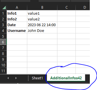
input to grid:
@Input()
public additionalExcelExportInfos: { additionalWorksheetTitle: string,
parameters: { key: string, parameterValue: any }[]
};
output in excel file:
Given: a kendo grid with resize enabled.
And: the input locked on kendo-grid-colum is undefined (by ex. due the component class property not initialized)
When: the user double click on the column resize handler
Actual: the column width is set to 0
Expected: the colum autofit behaviour remain consistent and set the column width as usual.
Thank you for providing information about customization using <kendo-grid-message>
We can customize text inside drag a column here.... using <kendo-grid-message>
but in that line I am willing to add column chooser and one icon
i.e in tag <kendo-grid-group-panel> I want to add column chooser and one icon
please find below screen shot, in highlighted areas I want to add mentioned things
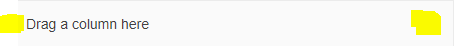
I want to replace highlighted areas in tag <kendo-grid-group-panel> as

Please help me for this issue
There is a bug with the kendoGridGroupBinding directive when changing the input data and using virtual scrolling. If you have many rows and scroll down to a lower virtual page and then change the input data to a small subset the grid will think there is no data. And if you then change back to the full data set you have to start scrolling down before the grid repaints with data.
Reproduction available here https://tyb2ys--run.stackblitz.io
Steps:
1. scroll down halfway in the grid
2. click the "Show subset" button. Note the grid shows the no records message but should show three rows
3. click the "Show all" button. Now the grid shows the scrollbar and the no records message is gone but it is not showing data. You have to scroll down past where you previously were with all data before it repaints the rows
One workaround is to have an ngIf on the grid to destroy and recreate the grid when the input data changes, something like this:
Currently it is possible to override certain messages of the kendo grid with the KendoGridMessages component.
However, this applies the message to the entire grid at once.
For example assume I have a grid with 2 boolean value columns, I would like to override the filter menu IsTrue & IsFalse messages to another string.
This is entirely possible with the KendoGridMessages component.
After the columns in my grid I might put something like this:
This would work if I wanted both boolean filter menus to display Yes & No.
But lets suppose I have set a template for cells in one of the columns like so:
the cells in this column would now display 'Validated' or 'Not Validated' instead of true/false.
It would make more sense for this column filter menu to have 'Validated' & 'Not Validated' instead of the Yes/No message that has been set to the entire grid.
Currently I would have to choose between one or the other strings for the boolean filter, either Yes/No or Validated/Not Validated.
This is a simple example, and in this case using the Yes/No messages for both wouldn't cause a user too much head-ache, but there are plenty of other more complex use cases where not having individual grid messages could cause confusion.
Here is a Stackblitz where I have mocked the grid:
https://stackblitz.com/edit/angular-qynsrr?file=src%2Fapp%2Fapp.component.ts
In the above Stackblitz I've mocked what I would expect it to work like.
I would expect that you can add a KendoGridMessages in the grid to set a default, and then on each column override it as necessary with another component or another KendoGridMessages.
Hi Team,
We need to add caption on grid table as explained here: https://accessibility.psu.edu/tableshtml/#caption
JAWS should read this caption on pressing T while selecting the table.
Can you guide us how can we add this caption!
Thanks,
Saini
I have a Grid with a command column for edit/remove buttons.
I also have a custom button that has to be hidden while the row is being edited, but there is no variable that exposes that state.
Please provide isEdited field in the kendoGridCellTemplate context.
I had already made an entry in the Foum about it.
https://www.telerik.com/forums/is-there-a-way-for-percentage-column-widths
Link to the demo with the css workaround:
https://stackblitz.com/edit/angular-y8y55s
The main intention is that I want to be able to specify the column width in percentage values rather than fixed pixel values.
There are some edge cases that must be considered:
- If columns are rearranged, the column width is taken to the new position.
- If the table is grouped, the columns in the group remain aligned below the column headers.
- If a column is manually resized, the behavior changes, the table is allowed to grow beyond 100% and gets a scrollbar.
Please provide a frozen column separator as the one for the WPF DataGrid:
https://docs.telerik.com/devtools/wpf/controls/radgridview/columns/frozen-columns
thank you
Please provide an [autoSync] option of the ColumnMenuChooser component as the [autoSync] option for the ColumnChooser component:
https://www.telerik.com/kendo-angular-ui/components/grid/api/ColumnChooserComponent/#toc-autosync
Thank you.
Hi Team
It would be very helpful if Grid allow to prevent focus on cell out-of-box, at the moment, we have to handle focusin event then set focus to other cell, however when using navigation keys or shortcut key, we need to handle differently depend on which cell should be focus next.