Please add support to change order of filter/clear buttons in Grid Filter Menu Component (so instead of "Clear-Filter" button order we can use "Filter-Clear" button order).
Change the position of the grid filter dropdown, so it is unclear for which column it applies when opened. For example, as seen in the below screenshots, the popup of the filter to be displayed under the column to which it applies instead of on the right-hand side of it.
Actual behavior:
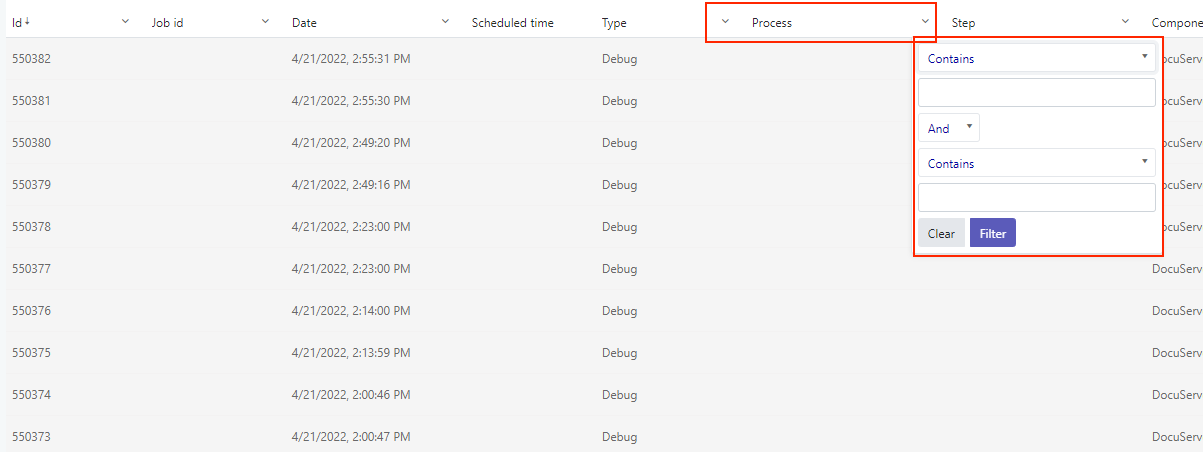
Desired behavior:
Related ticked: 1562369
But when virtual scrolling is enabled, pagination does not work with actual "pages" in terms of `skip` always being a multiple of `pageSize`. Instead, it relies on the `skip` and `take/pageSize` numbers to determine the next portion of data (it does not match with fixed ranges like 1-100, 101-200, etc., being "page1", "page2"...). This makes it hard to use virtual scrolling in combination with ASP.NET Core API, as there is no helper method that is compatible with the virtual scrolling mechanism.
The developer needs to use regular paging, or pass the `skip` and `take` properties in raw format to the server and create custom logic which to determine the portion of data that needs to be returned to the client.
Please, please, please! We have scrollBottom event. It works like a charm. Add the same event for loading prev page on scroll top in [Kendo UI for Angular Grid], plese.
Hi there
I am wondering if there is a way to customize the column labels / titles used in the column-chooser component.
I'm using the grid component with columns and column-groups (see example below) and would like to reflect the title of the group in the column-chooser's list as well.
Right now the chooser shows two checkboxes per group "Amount", "Weight" "Amount", "Weight" but does not reflect the group title...
Users might not be sure which "Amount" or which "Weight" is affected by which checkbox (in fact in my real world application there may be even more than 2 Productgroups in a row).
@Component({
    selector: 'my-app',
    template: `
      <kendo-grid [data]="data">
         <ng-template kendoGridToolbarTemplate>
            <kendo-grid-column-chooser></kendo-grid-column-chooser>
         </ng-template>
         <kendo-grid-column field="Field1"></kendo-grid-column>
         <kendo-grid-column field="Field2" [hidden]="true"></kendo-grid-column>
         <kendo-grid-column-group title="Productgroup A">
           <kendo-grid-column title="Amount" field="groupA.amount"> </kendo-grid-column>
           <kendo-grid-column title="Weight" field="groupA.weight"> </kendo-grid-column>
         </kendo-grid-column-group>
         <kendo-grid-column-group title="Productgroup B">
           <kendo-grid-column title="Amount" field="groupB.amount"> </kendo-grid-column>
           <kendo-grid-column title="Weight" field="groupB.weight"> </kendo-grid-column>
         </kendo-grid-column-group>
      </kendo-grid>
    `
})
export class AppComponent {
  public data: any[] = [{ Field1: 'Foo', Field2: 'Bar', groupA: { amount: 11, weight: 111, annotation: "none"}, groupB: { amount: 22, weight: 222, annotation: "yes"}}];
}
Thanks for any help!
Jochen
We need to overwrite kendo-grid-column-chooser component reset button logic. We need reset button to select all columns that were selected during the initial load of grid.instead of current reset logic. Is there a way to overwrite reset button logic?
I tried <kendo-grid-column-chooser (reset)="resetColumnMenu($event)"></kendo-grid-column-chooser> but it didn't work.
Feature to add "Select All" option in the Column Chooser of the Grid.
Similar to the feature in jQuery Grid: Display SelectAll in the ColumnMenu for Showing and Hiding Columns | Kendo UI Grid for jQuery | Kendo UI for jQuery (telerik.com)
The filter descriptors support accessor functions in the "field" option. It would be great to see this implemented in the sort, group, and aggregate options.

const result = process(items, {
    filter: {
        logic: "and",
        filters: [{ field: x => x.getValue(), operator: "eq", value: 0 }], // <- supported
    },
    group: [
        field: x => x.getValue(), // <- not supported
        aggregates: [{ aggregate: "sum", field: x => x.getValue() }] // <- not supported
    ],
    sort: [{ field: x => x.getValue(), dir: "desc" }] // <- not supported
});
Since the client side filtering honours ignoreCase and the toOdatastring not, we got a difference in behaviour, so i'd like to report this as a BUG!

With dropdowns I use: &$filter=contains(tolower(FieldName), tolower('" + searchString + "')) but for grid filtering a COLUMN BASED ignoreCase is a MUST!
Allow user to filter like excel and your Keno UI for jquery. Where user can filter record by applying checkbox check and search.
We recently had an ask to limit the number of columns that could be selected, and were not able to find an out of the box solution (nor was support).
Something like this would be great, which is the same implementation as the kendoGridFilterMenuTemplate which allows you to override just the content of the column chooser, and not have to manually create your own menu entry by overriding the whole kendoGridColumnMenuTemplate
<ng-template kendoGridColumnChooserMenuTemplate let-service="service">
    <our-custom-chooser-component></our-custom-chooser-component>
</ng-template>
or, alternatively, if we were able to specify a grid parameter for a max number of columns as a grid level [maxColumns], that would work as well.
Hello,
As discussed with Martin in support ticket 1429284, some of the column values in my grid might be the same, but with different letter cases. For example, column "First Name" could have the values "Elias", "elias", and "ELIAS".
When grouping, Kendo grid grouping treats those values as 3 separate groups because its case sensitive. Our users expect those values to be grouped as 1 to avoid confusion.
The workaround provided might affect other dependent features and make the code a bit messy.
I would appreciate it if you could add in a future version, a built in option to ignore case when grouping without changing the original displayed values.
Regards,
Elias
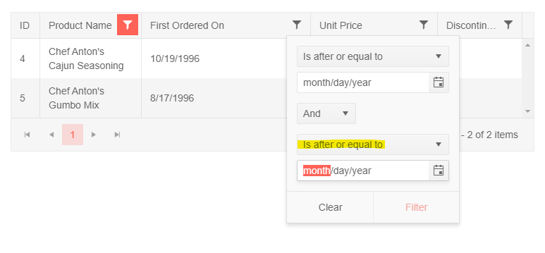
Is it possible to modify the default filter for a date on a grid so that it is a "between" filter? i.e. the second clause will show "Is before or equal to" instead of "Is after or equal to"?
https://stackblitz.com/edit/angular-ygnmj1
Preferred default:
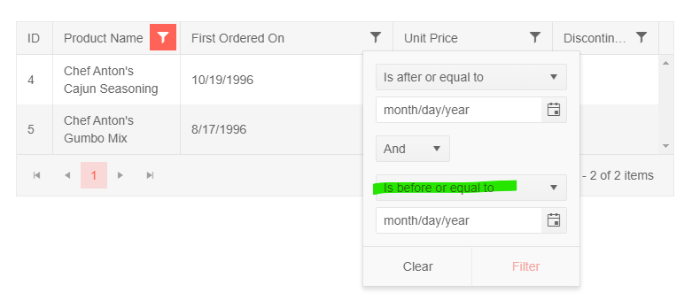
instead of:
As of right now it is a lot of work to properly implement a foreign key column and some of the features are only working with multiple workarounds. It would be nice to have a foreign key grid column as it already exists for ASP.NET. The ultimate goal would be to set the foreign key field which the column is bound to, pass a list of complex objects and set the text field and value field for that list.
An example of an hypothetical implementation:
<kendo-grid-column field="ProductId" [data]="ProductList" [valueField]="'Id'" [textField]="'Name'"></kendo-grid-column>Currently all of this has to be done manually by defining a cell template and edit template which comes with a couple of limitations. The greatest limitation is that the out of the box sorting and filtering does not work since the grid will sort/filter by the Id instead of the cell template value. For the filtering additionally a custom made filter needs to be implemented for each column which displays the DropDown in the filter menu.
For ASP.NET all of these things come out of the box and are extremely helpful. Here is a link to the ASP.NET implementation for a foreign key column: https://demos.telerik.com/aspnet-core/grid/foreignkeycolumn
I wish something like that will be implemented in Angular as well in the near future as it makes the development extremely hard without this feature.
I saw the sorting/filtering together with the foreign key column as one of the main reasons to choose Telerik as it is extremely helpful and setting it apart from its competitors.
Hi,
It will be a good addition to the CheckboxColumnComponent if you allow developers to disable the checkboxes conditionally.
Workaround adding `k-disabled` class using class and headerClass properties:
https://stackblitz.com/edit/angular-n4gpjp-xqkpjz?file=src%2Fapp%2Fapp.component.ts
Currently, the pageSizes option of the available Grid's PagerSettings only allows passing a boolean or a number array as possible values. Thus, at the moment, the Grid component allows displaying an "All" option in the pager by implementing a kendoPagerTemplate:
It would be great if an "All" page size option could be set directly through the settings of the pageable property by having the ability to pass a PageSizeItem array to the pageSizes option, similarly to how its done in the standalone Pager component:
Support TYPE in DataResult (speciallly GridDataResult)


In state you would like to do something like:


export interface SomethingState {
  loading: boolean;
  success: boolean;
  data: GridDataResult<XYZ>
}


it would be State with data: XYZ[].