Category 2
- Item 1
- Item 2
Category 1
- Item 3
- Item 4
But the MultiSelect control seems to order the category name alphabetically (Category 1, Category 2, etc).
This appears to be documented behavior, but it also seems to me like this is something that the component should be handling.
When using row virtualization with a Grid, a DropDownList, a MultiSelect, etc, the OnRead is called for every scroll event, regardless of whether the component _actually_ needs to fetch new data or not.
For example: A DropDownList with a PageSize of 100, but with only 10 items visible in the dropdown at a time will ask for 100 records every time the user even scrolls 1 record down. This results in many requests to the backend server, with many of the results being the majority of the contents from the previous request.
I have worked around this by implementing a buffer that keeps results for me and returns them as the user scrolls, only requesting for more from the backend server when the buffer runs out, but this feels like something that the components themselves should be handling.
If this is expected behavior, all good. Just wanted to raise some awareness on it.
Using row virtualization on MultiSelect, and am attempting to put a loading indicator into the popup content if the request to the server is still ongoing.
Problem with this is that the popup contents don't update if the popup is open when loading finishes. I put together a reproduction on Telerik REPL showing the behavior I am experiencing.
https://blazorrepl.telerik.com/mvvQvVvN2458vinQ36
Note, Options finish loading (seen by the div update above the MultiSelect component), but if the popup is open, the contents do not update to reflect the loaded options.
My current workaround is to just make the MultiSelect disabled while it is doing its initial load.
The following, took a bit of effort to identify where the behaviour was failing for a screen reader.
for all scenarios below the multi-select component currently has items (more than one) in it as selected.
GOOD
if keyboard focus is on text edit, and u leave the component (w/ tab key), when revisiting the component (w/ shift+tab keys) all selected items are read out correctly
BAD
if keyboard focus is on selected item, and u leave the component (w/ tab key), when revisiting the component (w/ shift+tab key) the focused (selected) item is not read out correctly.
(sorry example read out not provided)
GOOD
selected items are read out correctly when;
- closing items panel w/ escape key,
- closing items panel when selecting an item
BAD
delete item;
- remove all selected items w/ escape key does not inform a screen reader user of the outcome; that no item is now selected (should state something).
- removing last item with backspace does not inform screen reader of the outcome; that no item is now selected (should state something). I swear this worked once with firefox.
the following behaviour also occurs after removing all items via a keyboard, the keyboard focus becomes lost;
- (BAD) most times u can't press a right / down key into the text section of the multi-select (experienced w/ firefox too)
- (GOOD) most times can press alt+down to bring the panel (experienced w/ firefox too)
- (GOOD) u can still tab out to next clickable object
When user is inside list of selected options/items, navigating amongst the items with keyboard left/right keys, it states "item # of # of items of level 1".
what is "of level 1"? (is items selected in level 1 and level 2 is the text editable section?)
i am expecting the screen reader to state item "<value/label/title>" when i set focus to an item via keyboard left or right.
The issue did not occur in firefox. Sorry, i have not provided the firefox readout w/ the screen reader for comparison.
however, for the most likely user scenario the behaviour with the screen reader is correct.
if keyboard focus is on text edit, and u leave the component (w/ tab key), when revisiting the component (w/ shift+tab keys) all selected items are read out correctly
tested in Chrome and firefox using NVDA.
Hi,
I would like checkbox support including the check all checkbox on the multiselect component like: https://docs.telerik.com/devtools/aspnet-ajax/controls/combobox/functionality/checkbox-support
The url below shows how to create custom checkboxes in the multiselect component but adding a check all checkbox in the headertemplate does not update the multiselect popup
In drop down panel colour indicates which option has been selected (is it the dark colour or is the light colour). Suggestion: having an icon of tick would assist.
As an alternative option - Blazor MultiSelect - Templates | Telerik UI for Blazor this would be great if you could template selected and non-selected items, but at the moment there is just the one item template.
When re-visiting the input when it has options selected as badges, using keyboard;
- to move between badges it say 'blank' (see: Multiselect options read as blank by AT [WCAG 1.3.1 level A] (telerik.com))
- does not tell you what you have already selected (if you don't tab to input and just use up or down it will read the options)
- adding and removing items the user is not informed how many options have been selected
First visit of options in drop down, using keyboard:
- each option is read as 'blank' in screen reader
- number of options not read out
I would like to have the ability to refresh the Multiselect Popup.
Currently, if the AutoClose="false" feature is applied and the items are programmatically selected, you cannot display them as selected while the Popup is opened. You need to close it first to accordingly update the selected items collection in it.
In the MultiSelect Component you have Item, Footer, and Header Template sub components. I see no way of providing a template for the selected items. This would be a very nice feature to have.
My specific use case it that I would like to add a tool tip to the selected tags.
Thanks
Hi team,
I just upgraded Blazor version to 2.25 and the primary button in FooterTemplate of MultiSelect started behaving differently. This was shown correctly prior to update. Also, normal button where Primary="true" is shown with correct styling.
I have written a little code snippet to demonstrate.
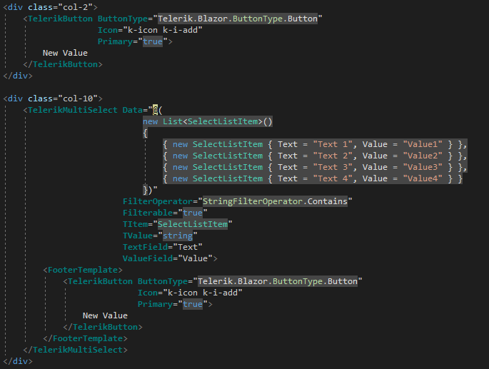
<div class="row">
<div class="col-2">
<TelerikButton ButtonType="Telerik.Blazor.ButtonType.Button"
Icon="k-icon k-i-add"
Primary="true">
New Value
</TelerikButton>
</div>
<div class="col-10">
<TelerikMultiSelect Data="@(
new List<SelectListItem>()
{
{ new SelectListItem { Text = "Text 1", Value = "Value1" } },
{ new SelectListItem { Text = "Text 2", Value = "Value2" } },
{ new SelectListItem { Text = "Text 3", Value = "Value3" } },
{ new SelectListItem { Text = "Text 4", Value = "Value4" } }
})"
FilterOperator="StringFilterOperator.Contains"
Filterable="true"
TItem="SelectListItem"
TValue="string"
TextField="Text"
ValueField="Value">
<FooterTemplate>
<TelerikButton ButtonType="Telerik.Blazor.ButtonType.Button"
Icon="k-icon k-i-add"
Primary="true">
New Value
</TelerikButton>
</FooterTemplate>
</TelerikMultiSelect>
</div>
</div>
As it can be seen the the code for button is exactly same in both places but the output is different.
Please have a look into this.
Many thanks,
Hi,
When displaying a MultiSelect control on a TelerikWindow (modal), the dropdown of items is displayed behind the dialog:
How can I change the Z-Index of the dropdown?
So, imagine I want to select every item which contains letter 'S'. I type 'S' then when I click on the first item containing 'S', the 'S' in the input is removed and all the items are shown. So I need to type S again and again 1 time for each Item I want to select.
I attach a gif showing the behavior.
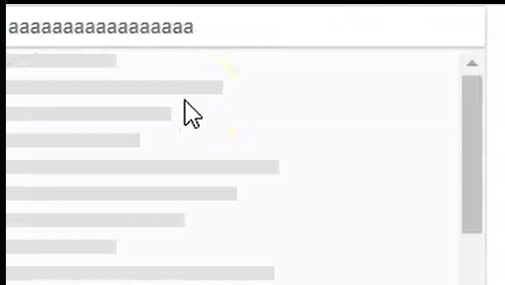
I'm seeing a scroll bar appear then disappear as I type. Repeatedly typing "a" in the box will show/hide the scroll bar. Also typing "a" then backspace has the same behavior.
<TelerikMultiSelect Filterable="true" Data="@Countries"
                    @bind-Value="@Values"
                    Placeholder="Enter Balkan country, e.g., Bulgaria"
                    Width="350px" ClearButton="true"
                    AutoClose="false">
</TelerikMultiSelect>


@if (Values.Count > 0)
{
    <ul>
        @foreach (var item in Values)
        {
            <li>@item</li>
        }
    </ul>
}

@code {
    List<string> Countries { get; set; } = new List<string>();
    List<string> Values { get; set; } = new List<string>();

    protected override void OnInitialized()
    {
        Countries.Add("Albania");
        Countries.Add("Bosnia & Herzegovina");
        Countries.Add("Bulgaria");
        Countries.Add("Croatia");

        base.OnInitialized();
    }
}
---
ADMIN EDIT:
Currently, the component works the following way:
- User starts typing in the input of the component.
- Popup of the MultiSelect opens.
- Skeleton is shown:
- Data processing starts.
- After the data is processed, the skeleton is replaced with the actual data.
The scrollbar is shown by the skeleton and is always present (visible on step 3). The tricky part is that If the user is typing very fast, the Blazor framework bundles 2 renderings together and thus the scrollbar is not visible. The result is that the user sees a very brief flicker with the skeleton. Adding a small delay before showing the skeleton on step 3 will prevent the user from seeing the skeleton and thus remove the impression of seeing a "flicker".
As a workaround, you can hide the skeleton with CSS. This is applicable for all "select" components
<TelerikMultiSelect>
    <MultiSelectSettings>
        <MultiSelectPopupSettings Class="no-skeleton"></MultiSelectPopupSettings>
    </MultiSelectSettings>
</TelerikMultiSelect>

<TelerikComboBox>
    <ComboBoxSettings>
        <ComboBoxPopupSettings Class="no-skeleton"></ComboBoxPopupSettings>
    </ComboBoxSettings>
</TelerikComboBox>

<style>
    .no-skeleton .k-skeleton {
        display: none;
    }
</style>
---
I have a requirement to be able to select multiple values. I have filtering enabled, but I only want the user to be able to select valid values and not enter custom data. My approach would be to clear any invalid data when the control loses focus. I want the MultiSelect input to be cleared when it looses focus (similar to the ComboBox behavior).
=========================
ADMIN EDIT
=========================
In the meantime, such behavior could be achieved with a JavaScript function called through the JS Interop.
@inject IJSRuntime JsInterop

<TelerikMultiSelect Filterable="true" Data="@Countries"
                    @bind-Value="@Values"
                    Placeholder="Enter Balkan country, e.g., Bulgaria"
                    Width="350px" ClearButton="true"
                    AutoClose="false" OnBlur="@OnBlurHandler">
</TelerikMultiSelect>


@if (Values.Count > 0)
{
    <ul>
        @foreach (var item in Values)
        {
            <li>@item</li>
        }
    </ul>
}

@code {
    List<string> Countries { get; set; } = new List<string>();
    List<string> Values { get; set; } = new List<string>();

    async Task OnBlurHandler()
    {
        await JsInterop.InvokeVoidAsync("clearMultiselectInput");
    }

    protected override void OnInitialized()
    {
        Countries.Add("Albania");
        Countries.Add("Bosnia & Herzegovina");
        Countries.Add("Bulgaria");
        Countries.Add("Croatia");
        Countries.Add("Kosovo");
        Countries.Add("North Macedonia");
        Countries.Add("Montenegro");
        Countries.Add("Serbia");
        Countries.Add("Slovenia");

        base.OnInitialized();
    }
}
You can include the following script tag in your index page or place the function in a separate JavaScript file in your project. This function will clear all instances of the Multiselect inputs, so you don't have to specify separate selectors for each of them. If you only want to work with one instance, you can use another approach.
<script>
        function clearMultiselectInput() {
            var inputs = document.querySelectorAll(".k-multiselect .k-input-values input");
            inputs.forEach(e => e.value = "")
        }
</script>
I would like to add a feature similar to the Tag Mode in the Kendo suite
===========
ADMIN EDIT
===========
In the meantime, there are two possible workarounds:
1. Mimic the desired 'single' TagMode behavior and display the number of selected items inside the MultiSelect, instead of the selected items themselves.
This approach uses custom CSS, which hides the list of selected items and displays a dynamically updated count value. The most important bits are highlighted:
UI for Blazor 2.30
<TelerikMultiSelect Data="@Products" Class="single-tag-mode"
                    @bind-Value="@SelectedProductIDs"
                    ValueField="@nameof(Product.ProductID)"
                    TextField="@nameof(Product.ProductName)"
                    Placeholder="Select Products">
</TelerikMultiSelect>

<style>
    .single-tag-mode ul.k-reset {
        float: left;
    }

    .single-tag-mode ul.k-reset li.k-button {
        display: none;
    }

    .single-tag-mode ul.k-reset:before {
        content: "Selected items: @SelectedProductIDs.Count";
        display: inline-block;
        line-height: 1.8em;
        padding: 0 7px;
        vertical-align: bottom;
        border: 1px solid rgba(0, 0, 0, 0.08);
        background: #f5f5f5 linear-gradient(rgba(0, 0, 0, 0), rgba(0, 0, 0, 0.02));
    }
</style>

@code {
    List<Product> Products = new();
    List<int> SelectedProductIDs = new();

    protected override async Task OnInitializedAsync()
    {
        for (int i = 1; i <= 10; i++)
        {
            Products.Add(new Product()
            {
                ProductID = i,
                ProductName = "ProductName " + i
            });
        }

        await base.OnInitializedAsync();
    }

    public class Product
    {
        public int ProductID { get; set; }
        public string ProductName { get; set; }
    }
}
UI for Blazor 3.0
<TelerikMultiSelect Data="@Products" Class="single-tag-mode"
                    @bind-Value="@SelectedProductIDs"
                    ValueField="@nameof(Product.ProductID)"
                    TextField="@nameof(Product.ProductName)"
                    Placeholder="Select Products">
</TelerikMultiSelect>

<style>
    .single-tag-mode .k-input-values {
        float: left;
    }

    .single-tag-mode .k-input-values .k-chip {
        display: none;
    }

    .single-tag-mode .k-input-values:before {
        content: "Selected items: @SelectedProductIDs.Count";
        display: inline-block;
        line-height: 1.8em;
        padding: 0 7px;
        vertical-align: bottom;
        border: 1px solid rgba(0, 0, 0, 0.08);
        background: #f5f5f5 linear-gradient(rgba(0, 0, 0, 0), rgba(0, 0, 0, 0.02));
    }
</style>

@code {
    List<Product> Products = new();
    List<int> SelectedProductIDs = new();

    protected override async Task OnInitializedAsync()
    {
        for (int i = 1; i <= 10; i++)
        {
            Products.Add(new Product()
            {
                ProductID = i,
                ProductName = "ProductName " + i
            });
        }

        await base.OnInitializedAsync();
    }

    public class Product
    {
        public int ProductID { get; set; }
        public string ProductName { get; set; }
    }
}
2. Restrict the component's size and allow scrolling to see all selected items.
Use some custom CSS to set desired height of the container holding the selected items (.k-chip-list) and to control its overflow. You can use the Class parameter of the Multiselect to set your custom CSS class to the main wrapping container of the component and style a specific instance of the component, not all instances on the page/app.
In terms of controlling the container's height, you can:
- Set fixed height : the container will have fixed height and if its content exceeds it, a scrollbar will appear.
- Set max-height: when filled with content, the container will expand until it reaches its max height. Scrollbar will appear afterwards.
<style>
    .my-multiselect{
        overflow: auto;
        max-height: 60px;
    }
</style>

<TelerikMultiSelect Class="my-multiselect"
                    Data="@Countries"
                    @bind-Value="@Values"
                    Placeholder="Enter Balkan country, e.g., Bulgaria"
                    Width="350px" ClearButton="true" AutoClose="false">
</TelerikMultiSelect>

@code {
    List<string> Countries { get; set; } = new List<string>();
    List<string> Values { get; set; } = new List<string>();

    protected override void OnInitialized()
    {
        Countries.Add("Albania");
        Countries.Add("Bosnia & Herzegovina");
        Countries.Add("Bulgaria");
        Countries.Add("Croatia");
        Countries.Add("Kosovo");
        Countries.Add("North Macedonia");
        Countries.Add("Montenegro");
        Countries.Add("Serbia");
        Countries.Add("Slovenia");

        base.OnInitialized();
    }
}