Completed
Last Updated: 05 Jul 2023 13:21 by ADMIN
Release 4.4.0 (07/19/2023) (R3 PI1)
Created by: Bert
Comments: 7
Category: Charts
Type: Feature Request
62
I would like to zoom on a particular part of the Chart.
Completed
Last Updated: 22 May 2024 13:24 by ADMIN
Created by: Sylvain
Comments: 10
Category: Charts
Type: Feature Request
59

Hi,

I would like to be able to show / hide a serie by clicking to a legend.

Is there a way to do it actually ?

Completed
Last Updated: 28 Jan 2021 10:05 by ADMIN
Release 2.15.0
I'm using version 1.1 of the UI for Blazor and have leveraged several different types of charts.  I now need to add click events on different parts of the chart so I can navigate to a drilldown page.  How can I accomplish this?
Completed
Last Updated: 10 Jun 2020 10:03 by ADMIN
Release 2.15.0
Created by: Bryon
Comments: 2
Category: Charts
Type: Feature Request
35

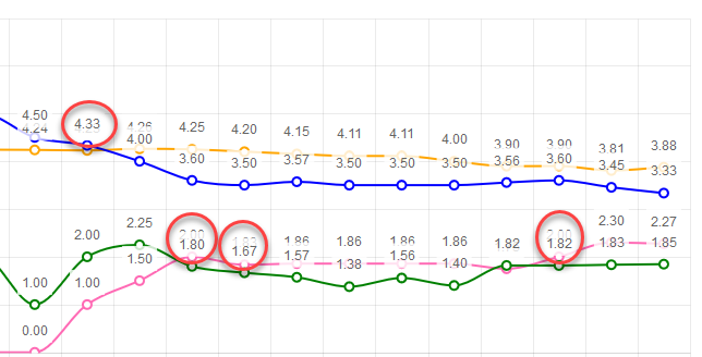
The idea is to ensure labels don't render on top of each other. If series values are close to each other, labels start overlapping. Having tooltips will let me remove the labels.

Example:

Completed
Last Updated: 22 Dec 2023 09:43 by ADMIN
Release 5.0.0 (15 Nov 2023) (R1 PI1)
Created by: Fairoz
Comments: 13
Category: Charts
Type: Feature Request
32

I want horizontal and vertical lines in the chart to act as markers (limits, thresholds). It would be awesome if there was a way to simply draw a horizontal and vertical lines, bound to a collection of y and x data respectively.

Something like the below would be nice 

    <TelerikChart>
        <ChartSeriesItems>
            <ChartSeries Type="@ChartSeriesType.Line" Name="@P_Name1" Color="blue"
                         Data="@P_Data1"
                         Field="@P_Field1"
                         CategoryField="@P_CategoryField1">
                <ChartSeriesLabels Visible="true" Template="#=dataItem.P_Description#" />
                <ChartSeriesMarkers Size="4" />
            </ChartSeries>
            <ChartHorizontalLines Data="@YLinesData"/>
            <ChartVerticalLines Data="@XLinesData"/>
        </ChartSeriesItems>
</TelerikChart>

@code{

List<double> YLinesData, XLinesData;

}

---

ADMIN EDIT

You can find some more details and ideas for workarounds here to consider in the meantime.
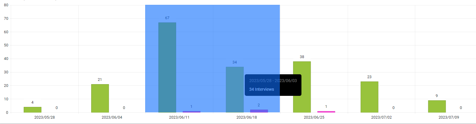
---

Completed
Last Updated: 02 Dec 2021 14:51 by ADMIN
Release 2.30.0
Created by: Kelly
Comments: 7
Category: Charts
Type: Feature Request
24
At the moment it is always white. I often want it transparent so it can blend better with the rest of the content (e.g., it should be able to the color of the grid row it is embedded in).
Unplanned
Last Updated: 09 Aug 2019 05:14 by ADMIN
Created by: Mark Stevens
Comments: 0
Category: Charts
Type: Feature Request
22
Completed
Last Updated: 15 Aug 2023 08:04 by ADMIN
Release 4.5.0 (08/30/2023) (R3 PI2)
Created by: Daniela
Comments: 2
Category: Charts
Type: Feature Request
19
I would like to be able to click on the labels of the X-axis of a Chart. An event similar to the OnSeriesClick would be suitable.
Completed
Last Updated: 15 Aug 2023 08:04 by ADMIN
Release 4.5.0 (08/30/2023) (R3 PI2)
Created by: Oscar
Comments: 2
Category: Charts
Type: Feature Request
18
I would like to be able to click on the legend labels of a Chart. An event similar to the OnSeriesClick would be suitable.
Duplicated
Last Updated: 16 Mar 2022 11:44 by ADMIN
Created by: Chris1108
Comments: 0
Category: Charts
Type: Feature Request
18

Is there any plan to add an Org Chart as a control?

For reference - Kendo jQuery Org Chart.

The Org Chart should display the reports to / is a manager of relation (1:0,m) between employees and/or managers graphically.

Unplanned
Last Updated: 17 Oct 2023 15:35 by Mark
Created by: Lee
Comments: 1
Category: Charts
Type: Feature Request
16
Are there border settings in the Chart?
Unplanned
Last Updated: 19 Oct 2023 19:24 by ADMIN
Created by: Rajesh
Comments: 2
Category: Charts
Type: Feature Request
15
I would like to be able to create small size charts and thus implementing Sparkline Charts like in the Kendo suite would work.
Completed
Last Updated: 11 Sep 2020 04:26 by ADMIN
Release 2.17.0
Created by: Cheryl
Comments: 5
Category: Charts
Type: Bug Report
15

Hi!

I'm building a Blazor Component using your TelerikChart.  To build my chart, I'm dynamically inserting the series name and the series data, which is pulled from a list.  I also have a button on the page that changes the dataset (last month, this month, next month, etc).  The button will rebuild the list of names and data, and Blazor will build the chart with a 'foreach' entry in the ChartSeriesItems section of the Chart Component.

The problem is that the Items are not cleared each time.  When I click the button, I'm getting previous values. In the example below, I have 3 data sets.  The first has 4 items, the second has 8 and the third has 6.  If the user clicks the second, showing all 8, then clicks the first, the chart will show the new 4, and the previous 5-8 from the second set.  

 My chart description in HTML is:

... 

<ChartSeriesItems> @foreach(Tuple<string, object[]> t in myData) { <ChartSeries Type="ChartSeriesType.Column" Name=@t.Item1 Data=@t.Item2 /> } </ChartSeriesItems>

... 

I have checked my data through debugging to ensure that the myData variable is correct (i.e. when I click the first data, it only has 4 items).  However, when the chart displays, it shows 8 items. 

Is there a CLEARDATA method or something I can call on the Chart to ensure that the data is reset each time?  I see that there is a Clear() in JavaScript, but I'm writing in only Blazor and C#, with no JavaScript.

I've attached the .razor page for your reference.  (As this is my test code, I'm using random number generation to get the data.)


Thank you so much for your help!!

-Cheryl Simpson 

Unplanned
Last Updated: 24 Oct 2023 14:55 by ADMIN
Created by: Sylvain
Comments: 4
Category: Charts
Type: Feature Request
14

I would like to visually distinguish a certain element in a series from the others if its value matches a given criteria (for example, value exceeds a threshold). Ideally, I'd want to add a hash to my bars, because I want to keep all items with the same color (I don't want to use the ColorField).

Something similar is available in Kendo: https://demos.telerik.com/kendo-ui/bar-charts/visuals.

Unplanned
Last Updated: 12 Sep 2023 15:17 by ADMIN
Created by: Bryon
Comments: 5
Category: Charts
Type: Feature Request
14

It would be nice to make the label container less than the width of the element so that it stands out more.

I know that it can be set to different colors and transparent but adjusting the width would be a nice addition as well.

Unplanned
Last Updated: 11 Jan 2024 14:30 by ADMIN
Created by: Alexander
Comments: 11
Category: Charts
Type: Feature Request
13
I'm looking for a way to change the hover colors of the chart. Please allow customization of the highlighted series item.
Unplanned
Last Updated: 27 Sep 2019 06:41 by ADMIN
Created by: Datafyer
Comments: 0
Category: Charts
Type: Feature Request
12

I have a page where I am displaying a chart and associated data in a grid below.

Being able to range select in the chart like in the asp.net core link below would offer a much better user experience.
That way the selected range could be specifically targeted in the grid data below the chart.

https://demos.telerik.com/aspnet-core/chart-api/selection

Unplanned
Last Updated: 22 Nov 2022 12:13 by ADMIN
Created by: Jesper
Comments: 4
Category: Charts
Type: Feature Request
12
I would like to customize the appearance of the Chart Legend
Unplanned
Last Updated: 20 Jun 2024 09:16 by ADMIN
I would like to customize the appearance of the Chart markers. For example, in a Scatter Chart, I want to set different markers than the ones supported in the ChartSeriesMarkersType enum.
Completed
Last Updated: 04 Jul 2023 13:38 by ADMIN
Release 4.4.0 (07/19/2023) (R3 PI1)
Created by: Datafyer
Comments: 3
Category: Charts
Type: Feature Request
11

It would be helpful to me if this chart type was supported.

https://demos.telerik.com/kendo-ui/range-bar-charts/index

1 2 3 4 5 6