Is it possible to change plot area background color on charts so that every second line is a different color.
I have attached a image with the background color look.
---
ADMIN EDIT
The current request targets the ability to color the whole plot area in alternating way. If you need to only color a certain range of the plot area, you may take a look at the Plot bands feature request.
While the most common use case is to alter the background color based on the major plot area units, we'd like to gather your feedback on how you'd expect the feature to behave - allow color altering on major units, minor units or custom steps.
---
I want horizontal and vertical lines in the chart to act as markers (limits, thresholds). It would be awesome if there was a way to simply draw a horizontal and vertical lines, bound to a collection of y and x data respectively.
Something like the below would be nice
<TelerikChart>
<ChartSeriesItems>
<ChartSeries Type="@ChartSeriesType.Line" Name="@P_Name1" Color="blue"
Data="@P_Data1"
Field="@P_Field1"
CategoryField="@P_CategoryField1">
<ChartSeriesLabels Visible="true" Template="#=dataItem.P_Description#" />
<ChartSeriesMarkers Size="4" />
</ChartSeries>
<ChartHorizontalLines Data="@YLinesData"/>
<ChartVerticalLines Data="@XLinesData"/>
</ChartSeriesItems>
</TelerikChart>
@code{
List<double> YLinesData, XLinesData;
}
---
ADMIN EDIT
You can find some more details and ideas for workarounds here to consider in the meantime.
---
Like in Kendo (here and here) so I can change the cursor for the chart to a pointer when the user hovers the series - I want that to indicate they can click on it (through the SeriesClick event).
---
ADMIN EDIT
workaround that you can consider which uses CSS to traverse the chart rendering:
<style>
    /* this will work in the chart below with its settings, axes, title and so on */
    .k-chart g[clip-path] g g g path {
        cursor: pointer;
    }

    /* a very generic selector that will capture just about everything in the plot area of the chart */
    /* Try this if you cannot make a more specific selector like the one above by inspecting the rendered content */
    /*.k-chart path {
        cursor: pointer;
    }*/
</style>

<TelerikChart>
    <ChartSeriesItems>
        <ChartSeries Type="ChartSeriesType.Column" Name="Product 1" Data="@series1Data">
        </ChartSeries>
        <ChartSeries Type="ChartSeriesType.Column" Name="Product 2" Data="@series2Data">
        </ChartSeries>
    </ChartSeriesItems>

    <ChartCategoryAxes>
        <ChartCategoryAxis Categories="@xAxisItems">
        </ChartCategoryAxis>
    </ChartCategoryAxes>

    <ChartTitle Text="Quarterly revenue per product"></ChartTitle>

    <ChartLegend Position="ChartLegendPosition.Right">
    </ChartLegend>
</TelerikChart>

@code {
    public List<object> series1Data = new List<object>() { 10, 2, 5, 6 };
    public List<object> series2Data = new List<object>() { 5, 8, 2, 7 };
    public string[] xAxisItems = new string[] { "Q1", "Q2", "Q3", "Q4" };
}
---
When a Chart Series has a click handler defined, I think the cursor should be set to 'pointer' when the user is hovering over the series so the user knows its clickable. Currently the Chart Series Labels change to a pointer cursor when you hover them, however they are not clickable. Not sure if this was the intended functionality, but it seems backwards to me.
I would like to be able to control the rendering of the Lines on the X and Y axis for the Chart. For example, I would like to be able to hide them, change their color, etc. Currently, such an option is available for the stock chart with the following nested tags: StockChartCategoryAxisLine and StockChartValueAxisLine.
Hello support team,
from the donut chart example under https://demos.telerik.com/blazor-ui/chart/donut-chart:
Is there a specific reason why all charts have a Template sub-property for the ChartSeriesTooltip construct but the Template field with the template syntax for the ChartSeriesLabels construct? I would favour a unified syntax for both of the properties, if this is possible somehow...
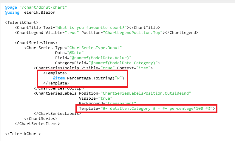
Is this planned for the future to be unified? Especially formatting like shown under https://docs.telerik.com/blazor-ui/knowledge-base/chart-format-percent is not as simple as I would have expected as nobody wants to touch JavaScript code literally :D (Also, localizing data seems quite difficult with that technique).
The best option in my opinion would be to remove those templates completely and just let the user decide what to show there while using a field called e.g. TooltipMappingName and LabelMappingName or something like that. This gives the chart the maximum of configuration possible.
Example:
<TelerikChart>
    <ChartTitle Text="What is you favourite sport?"></ChartTitle>
    <ChartLegend Visible="true" Position="ChartLegendPosition.Top"></ChartLegend>

    <ChartSeriesItems>
        <ChartSeries Type="ChartSeriesType.Donut"
                     Data="@Data"
                     Field="@nameof(ModelData.Value)"
                     CategoryField="@nameof(ModelData.Category)">
            <ChartSeriesTooltip Visible="true" Context="item" TooltipMappingName="@nameof(ModelData.Tooltip)"/>
            <ChartSeriesLabels Position="ChartSeriesLabelsPosition.OutsideEnd"
                               Visible="true"
                               Background="transparent"
                               LabelMappingName="@nameof(ModelData.Label)">
            </ChartSeriesLabels>
        </ChartSeries>
    </ChartSeriesItems>

</TelerikChart>

@code {
    public class ModelData
    {
        public string Category { get; set; }
        public int Value { get; set; }
  public string Tooltip { get; set; }
        public string Label { get; set; }
    }

    public List<ModelData> Data = new List<ModelData>()
    {
        new ModelData()
        {
            Category = "Football",
            Value = 35,
   Tooltip = "35%",
   Label = "Football: 35%"
        },
        new ModelData()
        {
            Category = "Basketball",
            Value = 25,
   Tooltip = "25%",
   Label = "Basketball: 25%"
        },
        new ModelData()
        {
            Category = "Volleyball",
            Value = 20,
   Tooltip = "20%",
   Label = "Volleyball: 20%"
        },
        new ModelData()
        {
            Category = "Rugby",
            Value = 10,
   Tooltip = "10%",
   Label = "Rugby: 10%"
        },
        new ModelData()
        {
            Category = "Tennis",
            Value = 10,
   Tooltip = "10%",
   Label = "Tennis: 10%"
        }
    };
}
Best regards,
Christian
I would like to control the font of the Value axis labels in a similar fashion to the way I can control the labels of the category axis:
    <ChartCategoryAxes>
        <ChartCategoryAxis Categories="@xAxisItems">
            <ChartCategoryAxisLabels Font="bold 12px 'Helvetica'"></ChartCategoryAxisLabels>
        </ChartCategoryAxis>
    </ChartCategoryAxes>
*** Thread created by admin on customer behalf ***
In need a chart that has a shaded area between a max and min set of curves, indicating the allowable area
Like this one: https://demos.telerik.com/kendo-ui/range-area-charts/index
The code below does not produce a chart series with a line that is 50 width? What am i missing?
@page "/chartdemo"
Line series
<TelerikChart>
<ChartSeriesItems>
<ChartSeries Type="ChartSeriesType.Line" Name="Product 1" Data="@series1Data">
<ChartSeriesMarkers Size="10"></ChartSeriesMarkers>
</ChartSeries>
<ChartSeries Type="ChartSeriesType.Line" Size="10" Name="Product 2" Data="@series2Data">
<ChartSeriesLine Width="50"></ChartSeriesLine>
</ChartSeries>
</ChartSeriesItems>
<ChartCategoryAxes>
<ChartCategoryAxis Categories="@xAxisItems"></ChartCategoryAxis>
</ChartCategoryAxes>
<ChartTitle Text="Quarterly revenue per product"></ChartTitle>
<ChartLegend Position="ChartLegendPosition.Right">
</ChartLegend>
</TelerikChart>
@code {
public List<object> series1Data = new List<object>() { 10, 2, 5, 6 };
public List<object> series2Data = new List<object>() { 5, 8, 2, 7 };
public string[] xAxisItems = new string[] { "Q1", "Q2", "Q3", "Q4" };
}