Please add a "native" Carousel component for the Telerik UI for Blazor solution.
Currently, to implement a Carousel option in a Blazor application using Telerik components, you may need to leverage the Kendo UI widgets based on jQuery that rely on direct DOM manipulation. In a Blazor application, the software engineer should rely on Blazor to manipulate the DOM, instead of direct DOM manipulation required with tools such as jQuery.
Overlapping Telerik products in the same web application, such as Kendo UI and UI for Blazor, can create issues if releases are out of alignment between the solutions, use of CSS files, and other areas of complication.
Please consider adding a Carousel component as it offers a great experience for marketing to customers, business or consumer, on the home page of any website.
Now we can expand/collapsed tree view item using bound read/write model property.
We need to bind read-only property or controll expandability outside of tree view.
Examples:
- Expand tree view item when IsActive read-only model property is true
- Expand/collapse all tree items with a button click
Thank you
When a content is displayed in TelerikWindow and a TelerikTreeView`s item is expanded, the item`s content is above the window one due to higher z-index.
To fix it, use this CSS:
/* Telerik window content (with z-index 10001) above their animation container (with z-index 10002, used for example in tree view) */.k-dialog-wrapper {
z-index: 11000;
}
Is a ListBox control, similar to https://demos.telerik.com/aspnet-core/listbox/index, on the roadmap currently?
---
ADMIN EDIT
You can use a grid that has 1 column for the text you want to show with selection and perhaps even row dragging, and maybe hide its headers with css if you do not want them.
---
Docking Control like WPF Docking Control: https://www.telerik.com/products/wpf/docking.aspx
According to the doc (https://docs.telerik.com/blazor-ui/components/grid/columns/width),
"When all column widths are explicitly set and the cumulative column width is greater than the available Grid width, a horizontal scrollbar appears and all set column widths are respected."
I have a grid with a width of 1500px and a cumulative column width of 1750 pixels:
<TelerikGrid Data="@datos"Class="ns-grid-fitxatges"
PageSize="10"
Pageable="true"
Sortable="true"
Width="1500px"
Height="60vh">
<GridColumns>
<GridColumn Field="@nameof(LlistaFitxatgesDto.CodiInternActivitat)" Title="Codi Intern" Width="150px" />
<GridColumn Field="@nameof(LlistaFitxatgesDto.CodiExternActivitat)" Title="Codi Extern" Width="250px" />
<GridColumn Field="@nameof(LlistaFitxatgesDto.Activitat)" Width="300px" />
<GridColumn Field="@nameof(LlistaFitxatgesDto.HoraFitxatge)" Title="@Loc["Fitxatge"]" Width="150px">
<Template>
@{
var hora = (context as LlistaFitxatgesDto).HoraFitxatge.DateTime;
<span>@hora.ToString("dd/MM/yyyy HH:mm:ss")</span>
}
</Template>
</GridColumn>
<GridColumn Field="@nameof(LlistaFitxatgesDto.Sessio)" Title="@Loc["Sessió"]" Width="180px" />
<GridColumn Field="@nameof(LlistaFitxatgesDto.Sentit)" Title="@Loc["Sentit"]" Width="80px" />
<GridColumn Field="@nameof(LlistaFitxatgesDto.TipusDocument)" Title="@Loc["DOC"]" Width="70px" />
<GridColumn Field="@nameof(LlistaFitxatgesDto.DocParticipant)" Title="@Loc["Document"]" Width="90px" />
<GridColumn Field="@nameof(LlistaFitxatgesDto.Nom)" Title="@Loc["Nom"]" Width="90px" />
<GridColumn Field="@nameof(LlistaFitxatgesDto.Cognom1)" Title="@Loc["Cognom1"]" Width="90px" />
<GridColumn Field="@nameof(LlistaFitxatgesDto.Cognom2)" Title="@Loc["Cognom2"]" Width="90px" />
<GridColumn Field="@nameof(LlistaFitxatgesDto.Metode)" Title="@Loc["Metode"]" Width="80px" />
<GridColumn Field="@nameof(LlistaFitxatgesDto.RutaXml)" Title="XML" Width="60px">
<Template>
@{
var ruta = (context as LlistaFitxatgesDto).RutaXml;
<a href="@ruta">XML</a>
}
</Template>
</GridColumn>
<GridColumn Field="@nameof(LlistaFitxatgesDto.Terminal)" Title="Terminal" Width="70px" />
</GridColumns>
</TelerikGrid>
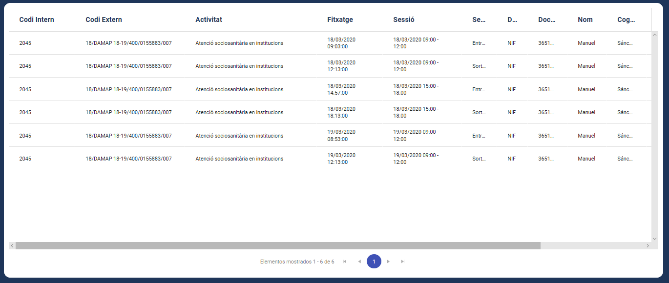
The horizontal scroll bar appears all right, but the column widths are not respected. As shown in the image, the columns on the right are squeezed
Any clues?
Thanks in advance
Thanks and best regards,
Sten
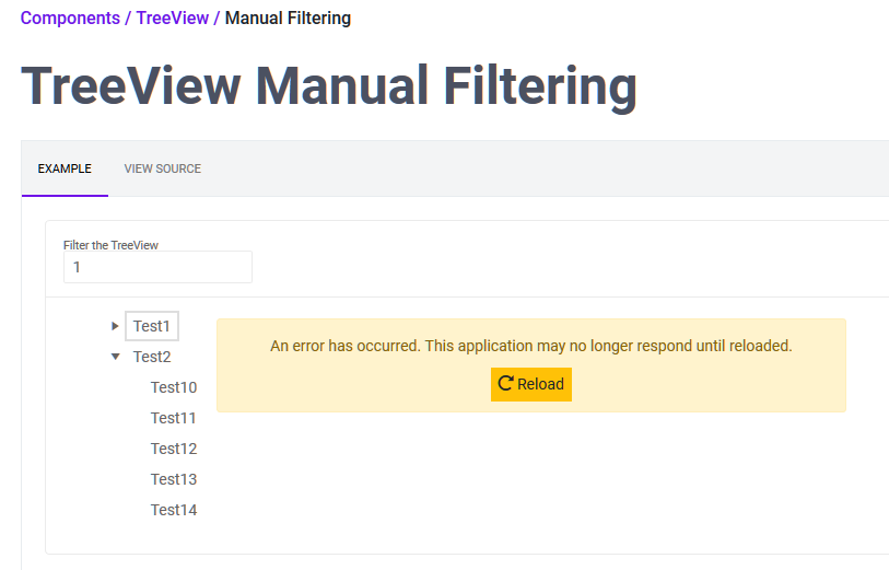
Using your tree view live sample, filter the list with "1", then try to expand "Test1" - crash.
I would expect "Test1" to apprear in the list but without the expandable icon or the expandable icon does nothing when clicked
The Ribbon Control (UI for ASP.NET AJAX) is totally superb.
Implementing this for Blazor would be a killer component.
Please!
Like the one in Kendo https://demos.telerik.com/kendo-ui/breadcrumb/index
With the ability to hook to the URL and URL change like this https://docs.telerik.com/kendo-ui/controls/navigation/breadcrumb/navigation
I'd like to request a native Blazor Image Component that allows to provide different parameters to control the image.
This could also help to connect it to the upload component, for user to see the image while still in browser and make some changes, i.e resizing, cropping, Black/White, before sending it to server to be stored.
Thanks!
..Ben
Hello,
I have updated Blazor UI to the latest version (2.9.0) and some of my controls lost their state.
Let me explain:
I have a page with 4 tabs (TelerikTabStrip), if i choose the value of a dropdown (TelerikDropDown) in the first tab and move to the second tab and then come back to the first tab, the value would be lost and the dropdown is empty however, if i put a breakpoint and look at the model, it shows that the value is still preserved.
Is there something i am missing? is this an update gone wrong (on my side)?
I have downgraded back to 2.8.0 and it works as expected.
Thanks.
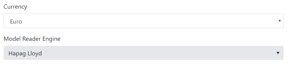
Hi,
the Blazor form controls like DropDownList & ComboBox have a fixed width of 300px (why ???).
This does not respect the Boostrap 4 style guidelines and in a <form> looks like:
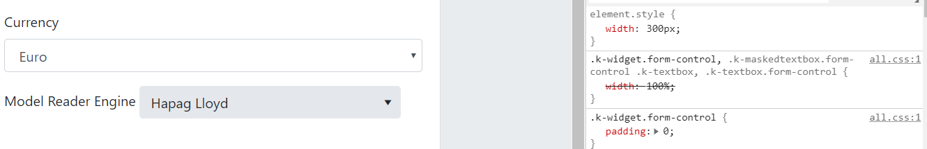
where the "Currency" field is a standard <select> and "Model Reader Engine" is a <TelerikDropDownList>.
If I try to set the "Width" attribute of the DropDownList to "100%" the result is:
but if I try to open the DropDown the element list is large as the entire screen:
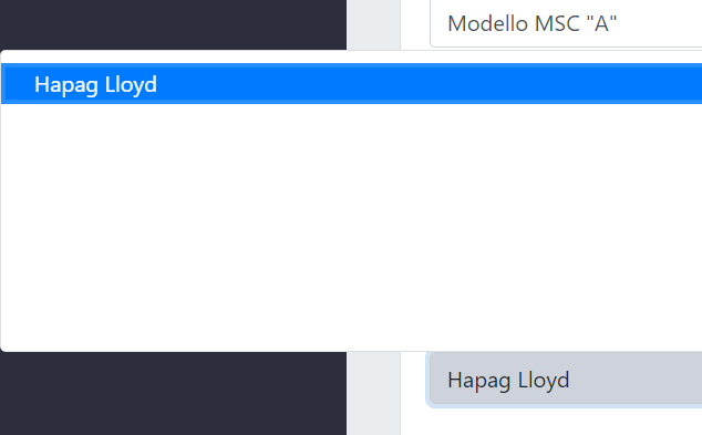
Have you planned a fix for this ?
Thanks in advance