

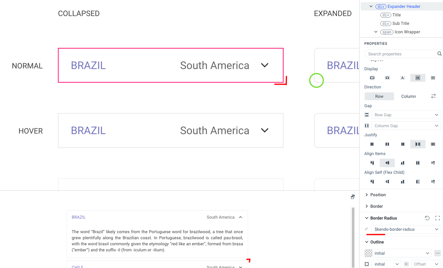
When editing the collapsed state, the border-radius section does not work, in the expanded section everything is fine. Both states have the same variable set.
Additionally, there is no editing of the FOCUSED state for the header, which occurs in a similar component - PanelBar.


Currently, the ThemeBuilder application supports only major Kendo releases (like R1, R2, and R3) and the version of the theme that is interconnected with these release versions.
Consider the option to provide functionality to choose between newer versions of the Kendo themes that are released with service packs and patches. This way, the user will have the ability to test versions that contain theme fixes before the next major release.
For example, R2 2023 officially supports Kendo theme 6.4.0, and before R3 2023 is released the Kendo theme is already at version 6.7.0
Hello,
Do you have any documentation on how best to equate the Themebuilder styles with the Kendo's Figma design kit's styles?
I've changed the hex values and fonts for the Kendo default styles within my Themebuilder project but it is difficult to know which styles in your Figma community design kit to change the hex values, fonts, etc... for, seeing that there are many more/specific styles provided in the Figma kit file that don't match 1-to-1.
I'd like to know this in order to know if there is a best systematic approach to go about this to ensure my Themebuilder project and Figma kit match as close as possible with as little manual corrective work needed on my part afterward.
Thank you!
Best,
Claudia Tommasi
ThemeBuilder only allows limited control over a specific set of exposed variables. Although these variables are constantly analyzed and updated, some, such as $base-gradient, cannot be modified through ThemeBuilder and require manual adjustments.
Example of variable that is not currently exposed: $base-gradient
The feature request is to explore the possibility of exposing more variables or providing a UI for selecting Kendo variables, bearing in mind that some Kendo themes may have over 2,000 variables.
So far the following variables were requested explicitly:
1623384: $base-gradient
1630912:
$kendo-grid-header-padding-y
$kendo-grid-padding-x
$kendo-grid-padding-y
$kendo-input-border
$kendo-input-hover-border
Q: Can one css file be produced for just the components selected in ThemeBuilder?
Ideally, we would like to have the option to produce only partial themes for specific components. This will allow to minimize the size of the output CSS/SASS files, which will allow us to lower the size of the end application.
Alternative ways to achieve similar results through manual application builds: https://docs.telerik.com/themebuilder/partial-theme-build
Hello,
I'm able to customize the components of the webpage, like buttons, grids, etc., but not the entire webpage. Can you support to design an entire webpage using ThemeBuilder so that I can create a login page instead of creating login.css.
Allow customisation of frozen and locked columns & cells in Grid for more comprehensive component styling.
Hello,
There seems to be an automatic 25px margin on the <p> within the content element that we can't customize. Could you please remove this and allow this to be customized in the ThemeBuilder?
Thanks,
Brian
Hello,
The MultiSelect and ComboBox Icons seem to have issues. First, in the MultiSelect, I'm not able to customize the icon within the IconButton. In the similar ComboBox, I can customize the icon, but the change is not reflected in the live view.
I would expect that all the clear "X" icons within the dropdown components would inherit from the base TextBox "Clear Icon" but they don't.
Regards,
Brian

When the ThemeBuilder project has custom variables or variables exported from Figma in the output _tokens.scss file all variables are with the ‘tb’ or ‘figma’ prefix.
It will be good if these prefixes can be configuration options for the project and users can choose what prefix (or no prefix) should use.
Consider the option to expose predefined classes of HTML elements from the Kendo themes. This would allow atomic customization and mapping to other imported variables (like ones imported from Figma designs).
For example:
An option to style the H1 header from the Kendo theme, which has the .k-h1 class.
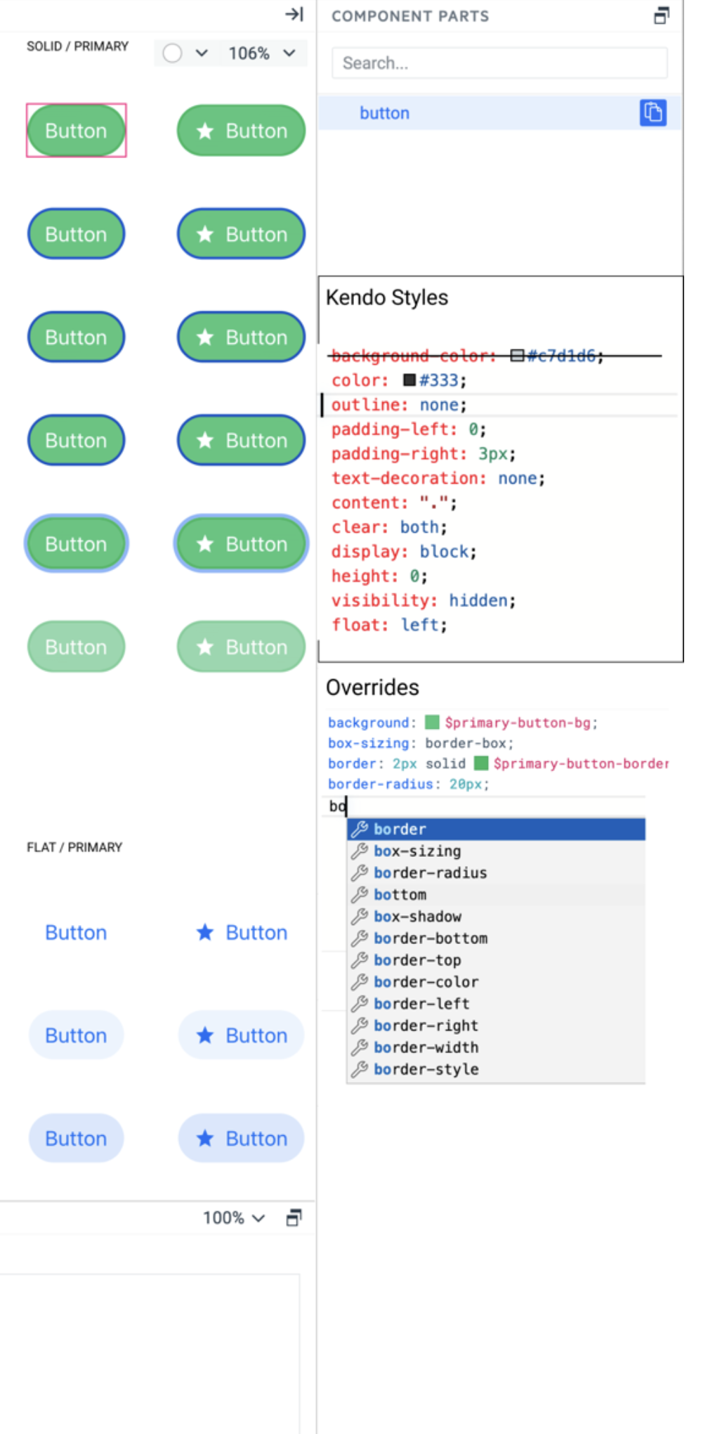
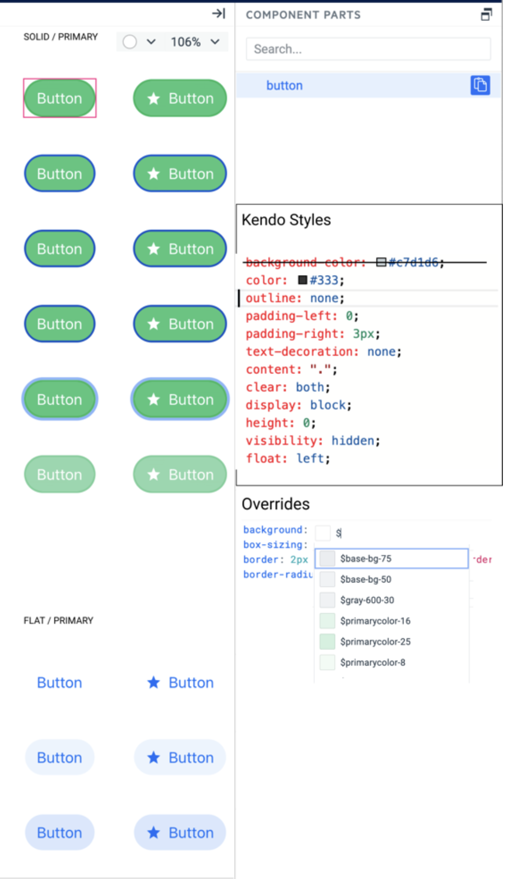
Add a new smart code editor as a variant of the Property Grid with all visual properties. Do not replace the property grid with this editor. They can live next to each other in different tabs. The smart code editor should support all features of the property grid but with advanced functionalities.
1. Show all kendo styles attached to the selected layer in a text format
2. Marks which style is overridden by user styles
3. Users can add any CSS property, not just the one listed by the Proprty grid editors.
4. Intellisense for CSS properties, something like:
5. Intellisense for using sass/css variables – the editor can recognize the property name and list only corresponding tokens for example – background – shows color tokens, box-shadow – shows effect tokens. Something like:

Consider providing export options for fonts - for example the one requested below:
...
I would like to request the inclusion of a non-exportable option in the Font Manager. Specifically, I suggest adding an additional field that allows users to choose whether to include a particular font in the "_fonts.scss" file or not.
The purpose behind this request is to utilize these fonts within the ThemeBuilder Pro to observe the visual outcomes (including Typeface & Icon fonts). However, it I do not want to generate these fonts in the final zip since I already have fonts with the same names in my application. I solely require the font names to be present in the "_tokens.scss" file.
Themebuilder used to export non compiled css
Now it's only compiled, and it's not easily plug and play with my current npm bundler.
Please bring back option to export non-compiled css