Feature request
The Kendo UI ToolTip exposes the AutoHide functionality. However, this option could not be configured for the labels' tooltip of the Kendo UI Chart
Expected/desired behavior
Be able to configure the AutoHide of the chart's tooltips. When the user hovers out, the tooltip should be persisted until a mouse click is present.
Environment
* **Kendo UI version:** 2019.3.1023
* **jQuery version:** 1.12.4
* **Browser:** [all]
The out of the box legend does not offer the ability to split its items and to show them as labels over the series (graphs).
Extract my attached zip file and look at the MSWord document which shows you where I would like to position the 2 legends.
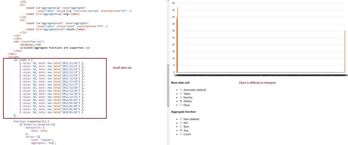
-- Problem: Consider a datasource where at least two date fields span a large time frame. We can build a chart that aggregates that data by small units (categoryAxis.baseUnits) such as 'days' or 'months'. That chart however contains many empty data points and the 'real' data is difficult to locate on the chart. This often requires zooming in and out many times to view the data one is looking for. However, it is still very valuable to be able to group by day or month, and to view this data in one succinct image.
-- Demo: The best way to experience this is to use the following Demo
https://dojo.telerik.com/eCILAMOB
This dojo is from the 'Date axis' chart demo on the demos.telerik.com site under Kendo UI for JQuery. Edit the example. There are 17 values in the datasource. Change the year on the last value to '2019'. All current values have dates between 2011-2012.
-- Required Chart Setup: Create a chart utilizing the following chart options
series.aggregate = 'avg'
categoryAxis.baseUnit = 'days'
dataSource with fields that contain at least one large date span
-- Suggestion
Add option to hide date aggregates chart points where no data exists within the datasource.
-- Image
Possibility to have half top, half bottom, half left, half right, quarter top left, quarter top right, quarter bottom left, quarter bottom right in additiont to circle and donut chart. Please add an option to be able to shape the Pie or Donut accordingly
I want the chart rendered with svg to be able to pan and zoom on a touch device.
Would like to have automatic text wrapping enabled feature as was available in obsolete charts in the HtmlChart control as well.

https://docs.telerik.com/devtools/aspnet-ajax/controls/chart/features/automatic-text-wrapping#automatic-text-wrapping
it would be good if there is a feature to export to excel the charts.
I use it to upload a chart, I'd like to prevent showing the uploaded chart in the browser. Prefer to just upload and then get control back and let my app decided what to do next.
I would like to be able to see each of the y-axis values plotted along, for example, each of the values of a line or stacked chart, at all times.
The bar chart I got is drawn form the values which are normalized. I have 7 bar charts which are drawn by looping a csv file and all the values are normalized. When I hover mouse on the bar, I want to see actual values not the normalized. So I need to include a variable in tooltip object of CSS part. But it is not working, please make something regarding this.
It would be very useful to have only some series of a kendo chart be stacked. For instance, to have series 1, 2, and 3 to be stacked with each other, but series 4 to not be stacked.
When I create a chart with multiple axis, if an axis has negative values and others don't, the zero is wrong positioned on the Y axis with negative values. Currently it can only be positioned manually with min and max values. It would be great a new option to do it automatically. Example: http://dojo.telerik.com/IYavE
Add an option for AxisLabelHover (similar to LegendItemHover) on the Chart. Because labels can be long, I truncate the text that is shown on the graph. I need to make the full text available via the hover.
I would like to set dashtype, line color, line width and other line segment properties for individual line segments (between two points) of a line type series in kendo chart.

this functionality is available in Microsoft charts.

note, I can set the dashtype for the entire line no problem. I have a requirement to change the dashtype for different sections of the line. maybe starting dashed, then long dash, then solid to indicate different aspects of the data being charted.

it would be great to be able to use a function to return dashtype, line color, line width and other line segment properties based on a e.dataitem.?
In the current version the legends for charts containing groups and series has a flat list of the series for each group. This is unreadable and toggling is not of any use.

The suggested improvement is a legend containing groups (e.g.) sex and series (e.g. age 0-19, 29-39 etc). Toggling of groups should be provided. Toggling of series would also be useful, but less important than toggling groups.
Per http://www.telerik.com/forums/auto-rotate-category-labels:

Having the option of enabling automatic rotation of category-axis labels when they would otherwise overlay would be very useful.

If this is unfeasible, an acceptable compromise would be adding a client-side function that could be called to change the rotation of a rendered chart.
When hovering over a chart data item (e.g. circle), the jqeury "mouseleave" is activated almost immidiately - the "mouseleave" event is fired before I actually leave the circle.  This causes the tooltip to remain, the circle itself is shown as "onHover" (e.g. filled) - but the line is removed, since "mouseleave" is fired and this is where I remove the line.

here's an example based on kendoui example: http://dojo.telerik.com/eqaLO
Note the "Status" at the bottom of the chart - it is "Hover" when you start the hover and "Left" after leaving the circle (according to the event).

I believe a "seriesLeave" event could solve this.