Provide support for momentum scrolling in Mobile Safari for virtualization of remote data grids.

http://demos.telerik.com/kendo-ui/web/grid/virtualization-remote-data.html
Hi,
When the grid is initially hidden and then revealed programmatically, the pageSizes (and several other elements) are not rendered.
Reproducer:
- Go to https://dojo.telerik.com/EBugiKAZ
- Press Run and click the button, see no pageSizes and no "1 - 1 of 4 items" text
- Resize the browser window and see the elements appear (requires a minimum size, seems responsive related)
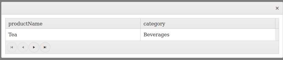
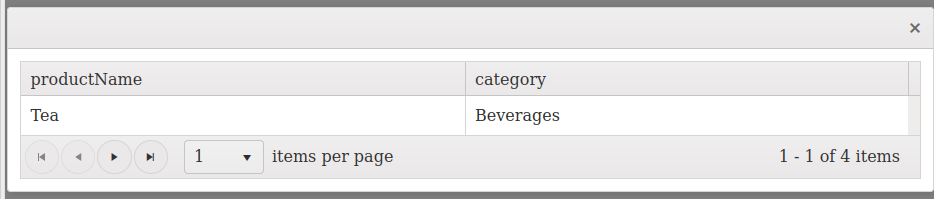
This also breaks when you have grid in a hidden div that you toggle open and it breaks in both Chrome and Firefox
The Grid should be able to easly navigate from rows with the keyboard, and also select them by enter.
with grouping/sorting/fixed wrapper size + prevent default select

http://www.kendoui.com/forums/ui/grid/local-virtual-scrolling---my-changes-grouping-sorting-works.aspx

My changes:
http://oskar.doppnet.com/kendo-grid/local.html
http://oskar.doppnet.com/kendo-grid/remote.html
there are ready to use methods fadeIn & fadeOut for animation In jQuery. Kendo UI Window already uses nifty close-effect, how about implementing this behavior for a grid-control. Expanding/Colapsing Detail-Gird in Hierarchy will go smoothly and comply with other controls' animation.
Searching by date range is a very common use-case in most business applications. I need a From and To calendar controls in the row filter.

I would advise Telerik to put this functionality on the roadmap, else the row filter functionality is so restrictive as to render it useless.

I am having to roll my own filters above the grid because of this one omission which is a real shame because the rest of the Grid functionality is so good.

(I don't want to use filters in column headers because I don't like the fact you loose visibility of what filters are on - probably the reason for the grid rows introduction)
i have a grid with number column and the template is replace the number with a text according to the number, but the sort is according to the number which is not correct.
for example: data[ status: 1 , 2 , 3 ]  the template return Cancelled for 1 Accept for 2 and in Processes for 3. it shoul be sorted in that order: Accept ,Cancelled, in Processes but actually is sort like that: Cancelled, Accept, in Processes
Based on the examples here (http://demos.telerik.com/kendo-ui/web/grid/editing-custom.html), "incell" editing allows editing a single cell at a time. The edit mode is activated upon a single click in the cell.

I would like to have a way to combine this with "cell" selectable mode, e.g. like this?
* A single click on a cell selects the cell and fires the "change" event.
* A double click on a cell activates the edit mode for the cell.
Hi, Please refer to the following forum for more detail about the problem and my suggestion:
http://www.telerik.com/forums/grid-row-navigation-by-keyboard#ncKqVMBBqUe5ZymNXwpFgg

Summary: I think in Grid widget, there should be difference between selectable="cell" and selectable="row" (for keyboard Up&Down Arrow navigation). or perhaps you want to add another choice, example selectable: "row cell" (to replace the current setting for "row") and the selectable = "row", just select the row not cell and also DO NOT go to grid header!
I believe it's good that you enhance/solve this shortcoming inside the Grid design, because developer like us who has already decided row selection (selectable: "row") during design-time, it doesn't make sense that still the keyboard navigation is at the cell level, isn't it?

Thank you.
Add a Title tag to grid headers so that if the user mouseouvers they can see the column title/filed name if it has been clipped by the ellipsis
### Bug report
When the column menu of the Kendo UI Grid widget with componentType set to 'modern' is used in a hierarchical grid, it expands behind the bottom of the page.
### Reproduction of the problem
1. Use the detail template feature of the Grid to create a child Grid;
2. Enable the "columnMenu" in the "modern" render mode;
3. Expand the last row and open the column menu;
4. Expand the filter menu. It is partly hidden.
A Dojo sample for reproduction: https://dojo.telerik.com/UbEzoYuF/5
### Expected/desired behavior
The "modern" column menu should be rendered as the "classic" column menu - its position should be changed based on the available space.
### Environment
* **Kendo UI version: 2021.2.616
* **jQuery version: 1.12.4
* **Browser: [all]
Grid control doesn’t allow to change width of columns via keyboard. Column width adjustments could be done only via mouse. It would be great to have this ability from the accessibility perspective.
Reproduction of the problem
- Open https://demos.telerik.com/kendo-ui/grid/index
- Set focus on header of any column
- Try to change width of the column
Current behavior
No hot key to change width.
Expected/desired behavior
Any hot key (e.g. Shift + Arrow Left / Right) to change width of a column.
Environment
Kendo UI version: "2020.3.1118"
Browser: Chrome 90.0.4430.212
For string columns especially, the default type of filter someone would want to apply is not the first option in the list. If it's not possible to reorder the items, then it should be possible to select which item is the default. This would prevent users from having to change the filter every single time.
sometimes you use same data which presented with grid and chart, but sometimes it need to be grouped by different categories such as in chart or grid, the problem is that you need to map data between categories in the chart and the grid
Hi team,
To reproduce that, go to https://demos.telerik.com/kendo-ui/grid/persist-state
- first, inspect the TH element of the "Contact Name" column, no headers attribute. (screenshot 1)
- then click on "Save State" button and click on "Load State" button.
- now, inspect again the TH element and you will find the attribute "headers"="undefined", on each column actually. (screenshot 2)
Not a big deal but this makes an entry (serious) with the Axe plugin accessibility checker.
Please advise and propose a workaround if any.
Best regards,
Laurent.
optional clearFilters button to grids toolbar
Currently the only way to make column headers fixed and always visible as you scroll through a Kendo Grid is to make the height of the grid fixed. This doesn't allow responsive UI and dynamic sizing of the grid. I would like to see support for having fixed headers regardless of height of the grid, such that the grid may fill whatever container it's in and change size while allowing this.
This Telerik response confirms the current functionality:
https://www.telerik.com/forums/columns-header-always-on-top
We have a requirement from customers to allow date columns to be filtered by the following criteria:
- IsToday
- IsBeforeToday
It should appear the grid as follows:
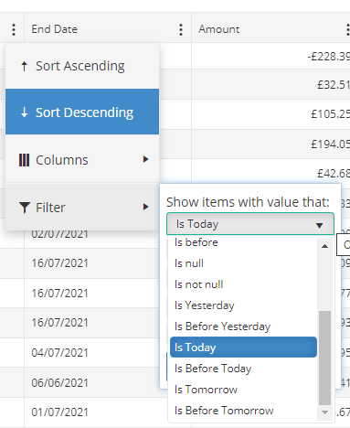
This would mean the filter is based on current date, rather than a date selected in a datepicker.
Rather than ask for this specific functionality we would like to be able to specify custom operators for date. As per the link:
https://docs.telerik.com/kendo-ui/api/javascript/ui/grid/configuration/filterable.operators.date
You can currently only alter the text on pre configured operators. We would like to be able to add new operators, like this.
kendo.ui.FilterMenu.fn.options.operators.date.today = "Is Today";
kendo.ui.FilterMenu.fn.options.operators.date.lttoday = "Is Before Today";
We would then need to be able to configure the logic used for the new operators.
I know I can do it from the dataBound event, but... that seems like a kludge compared to just re-using the existing attributes property code on other objects.
Instead of this:
dataBound: {
$(".k-grid-edit").attr("title", "View/Edit");
}
this:
command: [{ name: "edit", text: "", click: ShowDetails, attributes: {title: "View/Edit"} }], title: "", width: 40
Hi Team,
I would like to request the functionality to add a format configuration to the columns.filterable.multi property. This way, it will be easier to customize instead of using the ItemTemplate to recreate the whole filter.
Thank you!