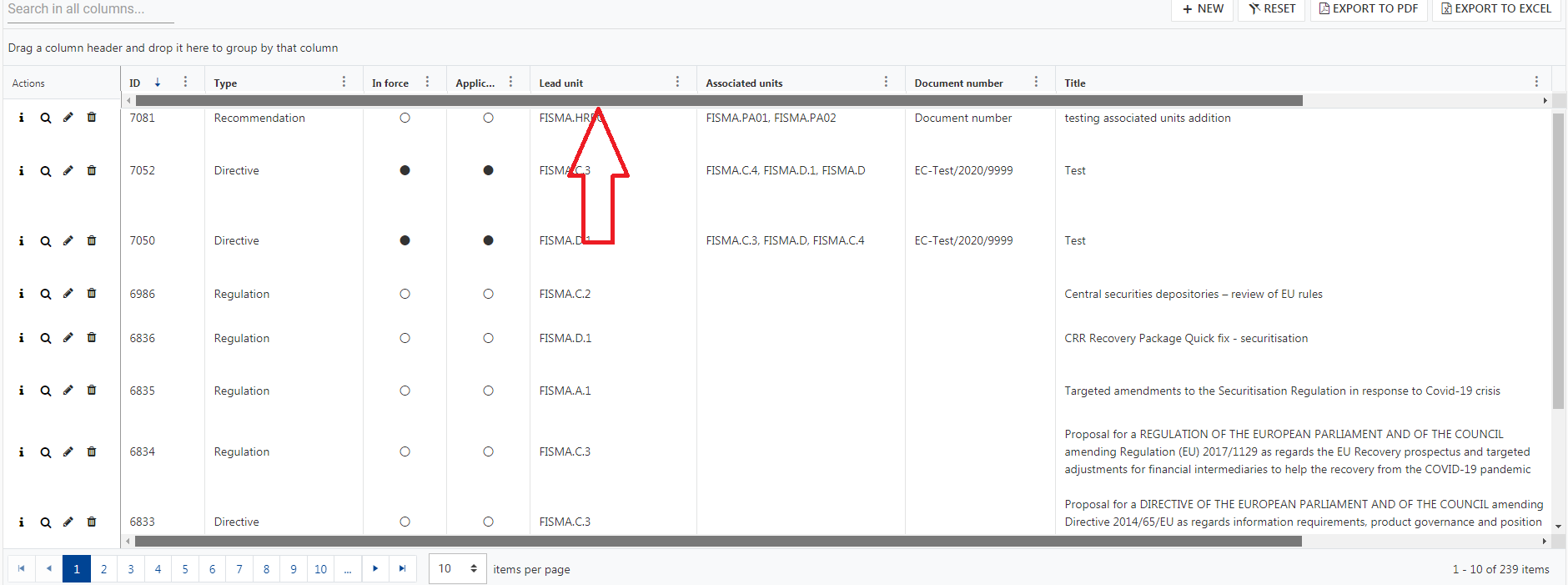
Overcoming the last listed limitation would be nice:
https://www.telerik.com/kendo-angular-ui-develop/components/grid/columns/locked/#toc-known-limitations
The Spreadsheet (Google Docs, etc.) addresses this situation by duplicating the cell content on both sides and clipping the right cell accordingly.
A similar approach can be used and providing a setting that disables word-wrapping and duplicates the content.
Currently, the Selection feature behaves strangely with the Keyboard Support enabled, see [demo](https://plnkr.co/edit/hTOg7Flx5Fnm63jJ6CgX?p=preview):
* Enter, Ctrl+Enter and Shift+Enter select the rows, but do not function if the cell has focusable components
* Space works only on the checkbox column
* Ctrl+Space, Shift+Space do not work at all
Ideally, the Grid should support the following shortcuts when the Selection and KB Navigation are enabled:
* Select the current row on Space, regardless of the cell content
* Support Ctrl and Shift modifiers for Space
* Shift + Up/Down Arrow for adding/removing the next/last row to the selection.
Similar to the TreeList KB navigation:
https://www.telerik.com/kendo-angular-ui/components/treelist/keyboard-navigation/
Currently the Grid Filter menu logic is "and" and there is no built-in option for changing it even when using the configurable filter menu components in the Filter menu template.
It would be nice having an option to configure the default logic as well as to limit the list of options to only "And"/"Or" or prevent the end user from changing the programmatically set filtering logic.
As a workaround for setting the initial logic, the developer can use the logicChange method, e.g.:
https://www.telerik.com/forums/default-filter-menu-logic#4935605
I had already made an entry in the Foum about it.
https://www.telerik.com/forums/is-there-a-way-for-percentage-column-widths
Link to the demo with the css workaround:
https://stackblitz.com/edit/angular-y8y55s
The main intention is that I want to be able to specify the column width in percentage values rather than fixed pixel values.
There are some edge cases that must be considered:
- If columns are rearranged, the column width is taken to the new position.
- If the table is grouped, the columns in the group remain aligned below the column headers.
- If a column is manually resized, the behavior changes, the table is allowed to grow beyond 100% and gets a scrollbar.
Proposal
CellCloseEvent<T> should provide dataItem: T
Why
Currently the CellCloseEvent dataItem is typed as any. This could be the default, but adding a generic type here would allow strong typing in the event handler.
I have a Grid with a command column for edit/remove buttons.
I also have a custom button that has to be hidden while the row is being edited, but there is no variable that exposes that state.
Please provide isEdited field in the kendoGridCellTemplate context.
Hi Team,
We need to add caption on grid table as explained here: https://accessibility.psu.edu/tableshtml/#caption
JAWS should read this caption on pressing T while selecting the table.
Can you guide us how can we add this caption!
Thanks,
Saini
Currently when I click the horizontal scrollbar button which is present at the left side or right side of the scroll bar then the columns are scrolled as a regular table.
It will be nice to move from one column to another column instead.
A built-in option for enabling a second scrollbar on the top of the Grid like the following screenshot would be nice feature to have:
Please provide a frozen column separator as the one for the WPF DataGrid:
https://docs.telerik.com/devtools/wpf/controls/radgridview/columns/frozen-columns
thank you
Please provide an [autoSync] option of the ColumnMenuChooser component as the [autoSync] option for the ColumnChooser component:
https://www.telerik.com/kendo-angular-ui/components/grid/api/ColumnChooserComponent/#toc-autosync
Thank you.
Hello Telerik,
We have implemented a custom reusable filter cell component similar to the example of the multi-select checkbox example from the docs. The difficulty using that example however, is that when the filter is updated, the other filters in the grid are removed due to the use of filterservice.filter. Because the CompositeFilterDescriptor can contain both filters and composite filters, why does the base filter cell component's base methods not allow a CompositeFilterDescriptor to be provided to the UpdateFilter method?
    protected filterByField(field: string): FilterDescriptor;
    protected filtersByField(field: string): FilterDescriptor[];
    protected removeFilter(field: string): CompositeFilterDescriptor;
    protected updateFilter(filter: FilterDescriptor): CompositeFilterDescriptor;
    protected applyFilter(filter: CompositeFilterDescriptor): void;
Our method for implementing the multi-checkbox filter cell was to build a composite filter using 'Or' logic and each selected value added as a filter descriptor with operator 'eq' and the selected item value as the value of the filter, and use a similar strategy as the base filter cell component to add this composite filter to the filter service's composite filter.
  private getSelectedFilters(values: Item[]): CompositeFilterDescriptor {
    const selected: FilterDescriptor[] = values.map((value) => {
      return {
        field: this.field,
        operator: 'eq',
        value: value.value,
      };
    });
    return {
      filters: selected,
      logic: 'or',
    };
  }

  public onChange(values: Item[]): void {
    this.selectedValues = values;
    const root = this.filter || {
      filters: [],
      logic: 'and',
    };
    this.removeFilter(this.field);

    if (values !== null && values.length !== 0) {
      root.filters.push(this.getSelectedFilters(values));
    }
    this.filterService.filter(root);
  }
If the base filter cell component allowed the CompositeFilterDescriptor type or the FilterDescriptor type in the updateFilters method, we could simplify the logic in our filter cell component to be similar to the patterns shown in the drop-down list filter component example, as shown below, but with a composite filter descriptor such as the one generated by the above getSelectedFilters function.
this.applyFilter(
      value === null // if value of the default item
        ? this.removeFilter(this.valueField) // remove the filter
        : this.updateFilter({
            // otherwise add/modify the filter for the field with the value
            field: this.valueField,
            operator: 'eq',
            value,
          })
    ); // and update the root filter
I think this would be a beneficial addition to the Kendo Angular2 product, as it would enable many more reusable filter components to be created more easily and also simplify/ enhance some of the existing examples you provide. If you would like more information or the full multiselect-filter component, I would be happy to supply it.
Thank you!
Hello,
You have this jQuery example: Binding to Kinvey Backend Services. Do you have a similar example for Angular? I cannot find one.
Thank you.

