The feature request affects built-in filter cell components for primitive types such as StringFilterCellComponent, NumericFilterCellComponent, etc.
The built-in filter cell components currently allow to hide operators, but doesn't allow to hide clear button, which is being shown when a user provides some input to these filters. The workarounds are in the current moment possible, but seems to be not very maintainable, as the most obvious workaround is to control with the CSS the internal stylings of the components, which can change with any patch. I would hope for some toggle, which can control hide/display of the clear button.
The use-case in which someone might want to achieve this, is when the filtering is being cleared only globally for the whole grid. and local clearing is not necessarily desired.
The behavior can be tested on an example or provided example in official docs.
It would be helpful to have a filter option inside the ColumnChooserComponent.
In some use cases we have around 30-50 items inside the list, it's hard to scroll through the small window to find your entries.
A simple textbox to search through the entries would be enough.
Hi,
It will be a good addition to the CheckboxColumnComponent if you allow developers to disable the checkboxes conditionally.
Workaround adding `k-disabled` class using class and headerClass properties:
https://stackblitz.com/edit/angular-n4gpjp-xqkpjz?file=src%2Fapp%2Fapp.component.ts
Hi,
It will be nice to have a feature to allow the Grid to be exported to Word(DOCX) format.
Hello,
In the documentation it says that sticky columns are not available while using virtual columns. It is really important for us to virtualize columns, when there's a lot of them in the grid, but also being able to use a sticky column at the same time.
Can you please consider implementing sticky columns while virtual columns are also enabled?
Best regards,
Boris
Hi,
Allow an option to filter when the user presses the enter key for the row filtering. The option can be a part of the StringFilterCellComponent(applicable to the other built-in filter components) and can also be considered for the TreeList component.
Hi, Team!
I would like to request functionality that would allow the developer to determine whether single or multiple items are expanded at the same time inside the Grid's Column Menu.
Currently, we can specify which columns to be included in the exported PDF file or Excel file:
It would be also convenient to have a property such as excludeFromPDF (or similar) for scenarios when only a single column should be removed from the PDF file.
Right now this is possible but defining the rest of the columns between <kendo-grid-pdf> tags which in scenarios with more columns drastically increases the HTML template.
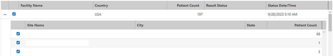
Hi. We have a master-detail grid with the detail being a nested grid.
Unfortunately, as the master grid is scrolled, the detail grid header is scrolled out out of view, and the columns look odd because they do not match the master grid header.
Before scrolling:
After scrolling:
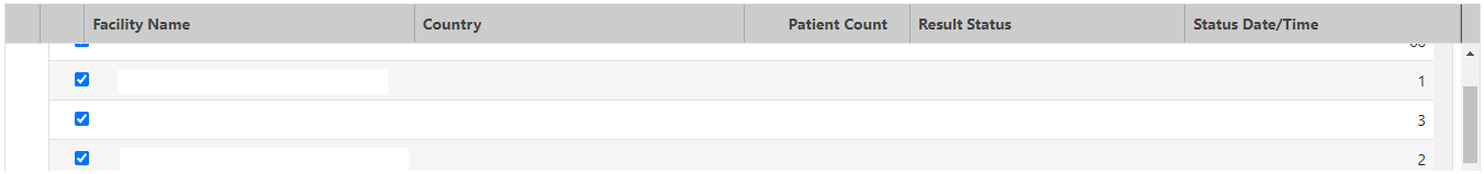
We would like to make the master row and detail header sticky.
Thanks.
Hi,
It will be a nice feature to have the ability to customize the drag hint of the built-in row reordering similar to the hintTemplate.
Implementing this functionality would greatly benefit applications that heavily rely on grid usage. Currently, each usage of the grid component requires a custom implementation to override default behavior.
https://www.telerik.com/kendo-angular-ui/components/grid/examples/column-menu/set-column-position/?theme=default-ocean-blue&themeVersion=6.6.0
Currently it is possible to override certain messages of the kendo grid with the KendoGridMessages component.
However, this applies the message to the entire grid at once.
For example assume I have a grid with 2 boolean value columns, I would like to override the filter menu IsTrue & IsFalse messages to another string.
This is entirely possible with the KendoGridMessages component.
After the columns in my grid I might put something like this:
This would work if I wanted both boolean filter menus to display Yes & No.
But lets suppose I have set a template for cells in one of the columns like so:
the cells in this column would now display 'Validated' or 'Not Validated' instead of true/false.
It would make more sense for this column filter menu to have 'Validated' & 'Not Validated' instead of the Yes/No message that has been set to the entire grid.
Currently I would have to choose between one or the other strings for the boolean filter, either Yes/No or Validated/Not Validated.
This is a simple example, and in this case using the Yes/No messages for both wouldn't cause a user too much head-ache, but there are plenty of other more complex use cases where not having individual grid messages could cause confusion.
Here is a Stackblitz where I have mocked the grid:
https://stackblitz.com/edit/angular-qynsrr?file=src%2Fapp%2Fapp.component.ts
In the above Stackblitz I've mocked what I would expect it to work like.
I would expect that you can add a KendoGridMessages in the grid to set a default, and then on each column override it as necessary with another component or another KendoGridMessages.
Please provide an option to configure the icon of the <kendo-grid-column-chooser> component. The available configurable options as input properties could be:
- fillmode
- icon
- svgIcon
similar to the same input properties for the Button component:
https://www.telerik.com/kendo-angular-ui/components/buttons/api/ButtonComponent/
thank you
But when virtual scrolling is enabled, pagination does not work with actual "pages" in terms of `skip` always being a multiple of `pageSize`. Instead, it relies on the `skip` and `take/pageSize` numbers to determine the next portion of data (it does not match with fixed ranges like 1-100, 101-200, etc., being "page1", "page2"...). This makes it hard to use virtual scrolling in combination with ASP.NET Core API, as there is no helper method that is compatible with the virtual scrolling mechanism.
The developer needs to use regular paging, or pass the `skip` and `take` properties in raw format to the server and create custom logic which to determine the portion of data that needs to be returned to the client.
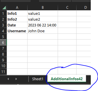
input to grid:
@Input()
public additionalExcelExportInfos: { additionalWorksheetTitle: string,
parameters: { key: string, parameterValue: any }[]
};
output in excel file:
Previously igrid 5.0.0 introduced sortable column headers and their contents being wrapped in spans with inner cell and link classes
<span class="k-cell-inner">
       <span class="k-link>......
now after upgrading to 11.2.0 it looks like ALL column headers get this additional element nesting even if they aren't sortable which is greatly affecting how column headers display since .k-link has a display: flex value. As well as many other styles.
Before
After
There are also "link" like styles applied to any and every column even if it doesn't sort giving the false impression that a column header is clickable.
This can be seen from kendo's own stackblitz for the grid https://stackblitz.com/edit/angular-lyxxa7?file=src%2Fapp%2Fapp.component.ts where if you inspect the header elements you'll see they've been wrapped in the sortable span elements. If this is intentional to wrap all column headers in we'll just have to work around it but we're curious if applying the sortable styling to ALL column headers was done on purpose or a bug.