The multiCheckbox filter popup in the Grid sorts its distinct-value list using JavaScript's native string comparison, which orders characters by Unicode code point. This produces correct results for ASCII-only data but breaks for any locale whose alphabet includes characters outside the ASCII range (Turkish İ/Ğ/Ş/Ö/Ü/Ç, German ä/ö/ü, Czech/Polish diacritics, etc.).
The request is to sort the filter item list using locale-aware comparison (`String.prototype.localeCompare`) so that values appear in the correct alphabetical order for the active language, or provide a custom way to order the filter options.
However when there is a lot of data, it is also very common to use virtual scrolling because of performance concerns.
So I think this combination should be supported by the kendo grid.
Add a method to reset the selection state so the next Shift-click starts from the default rangeSelectionStartRow instead of the previous selection.
Dynamic grid status content does not announce updates to screen readers during filtering or pagination.
For example, the status message “1 – 4 of 4 items” updates visually but is not announced to assistive technology users.
As a result, screen reader users do not know when filtered or paged results change.
This can be improved to read out how many items are left on the page for the user to navigate them, as in some cases, there might be none.
Similar to Kendo jQuery:
https://www.telerik.com/kendo-jquery-ui/documentation/controls/grid/grouping/group-paging
https://demos.telerik.com/kendo-ui/grid/server-grouppaging-virtualization
The implementation should also be compatible with the MVC helpers like: https://www.telerik.com/aspnet-mvc/documentation/api/kendo.mvc.ui/datasourcerequest
Hello,
When I try to delete all grouping manually by setting an empty group array, datas are disappearing. The grid datas are empty but reappears if I set grouping again. Also I could see data if I scroll down but I can't see any if I haven't enough lines to do so.
In attachment you could find a demo based on the "Collapse All with Grouping" tutorial.
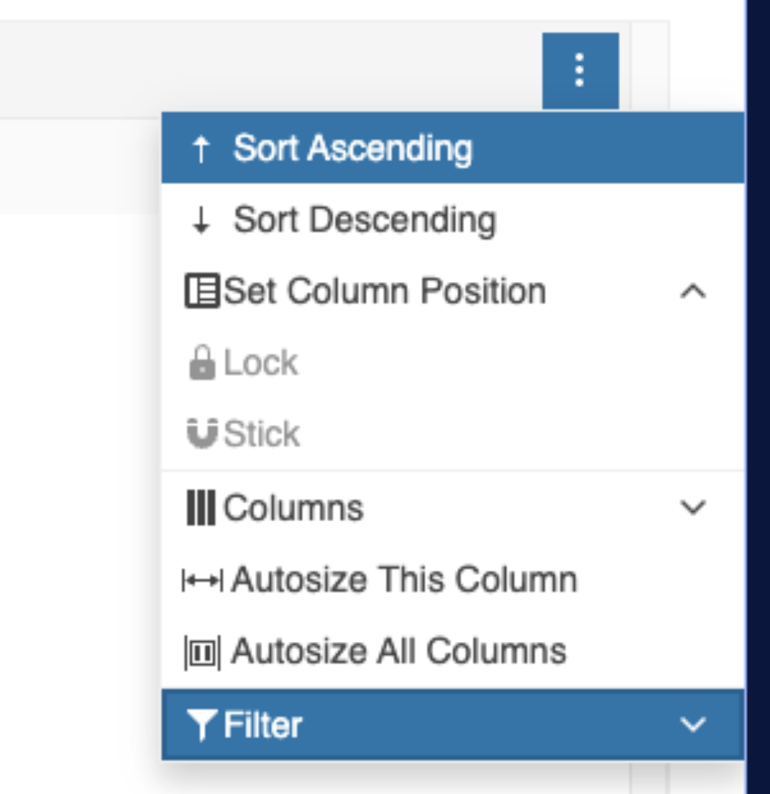
Highlight the Filter option in the Column Menu when a filter is applied to the column, similar to how the Sorting option is highlighted. This helps users recognize when a filter is active and keeps the design consistent with the sorting highlight.
Workaround - https://stackblitz.com/edit/angular-2ugqhdk3
Current rendering:
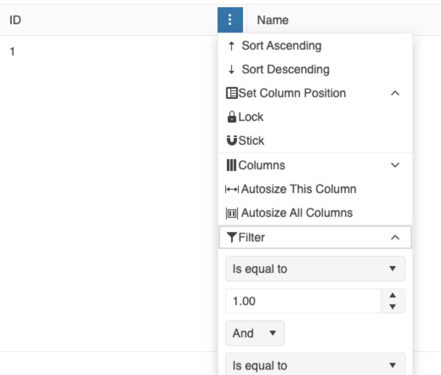
Desired rendering:
Our use case is a "search filter" grid:
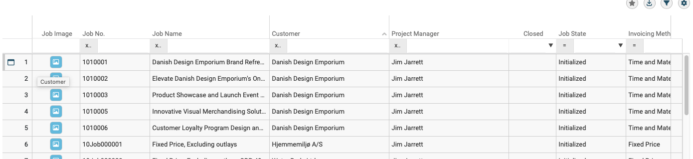
This "search filter" has the following characteristics:
1) It can potentially result in 1000's of rows being "found" by the search criteria, the actual search is done by the server using various HTTP(S) REST API's.
2) Obviously we only load a small initial number of rows from the server and then as the user scrolls down we load additional rows from the server as required.
3) The initial load of rows and the incremental subsequent load of rows are all done asynchronous using various HTTP(S) REST API's, so the new rows arrive asynchronous. While loading rows, the user is allowed to scroll freely in the already loaded rows. For the rows being loaded we show skeleton rows if the user scrolls into the area of the "search filter" currently being loaded.
We would request a update to the Kendo Grid libs. to support concurrent scrolling, loading of data (trough the pageChangeEven) and virtual rows & columns, all at the same time.
Hi,
we would like to submit a feature request for the grid component:
We would like the tds (generated when the kendoGridGroupHeaderColumnTemplate is specified) to be sticky if the related column is sticky (since right now, if i stick a grouped column, the group row td corresponding to the sticky /locked column scrolls with the rest of the row instead of being sticky as we would expect)
here's an exaple of the behavior we are encountering:
https://stackblitz.com/edit/angular-lgbef6c1?file=src%2Fapp%2Fapp.component.ts
Best regards,
Claudio Salvatore Conte
Hello,
I tried to implement this new feature : https://www.telerik.com/kendo-angular-ui/components/grid/scroll-modes/virtual#controlling-the-expanded-state-of-all-root-level-groups
You can see in the demo that if you remove all grouping, the content is now limited to 50 lines instead of displaying the whole 1000.
I found a workaround by expanding all before removing the grouping but it is not very user friendly.
If you can patch it ASAP that would be great.
And thank you to finally have pushed this long awaited feature !
First of all, thank you for providing the state management feature. For me it's one of the most important features of a grid component.
But unfortunately it fails to restore the columns state. This is because each time a grid component and it's columns are instantiated, new IDs are created for the columns. When loading state the columns are identified by their IDs.
When a column is persisted with e.g. id 'k-grid-column-1' and the grid will be destroyed and re-created, then the new column ID is not identical with the old one. Thus restoring the column's state will fail.
Please have a look to this StackBlitz example: https://stackblitz.com/edit/angular-vauqyshn?file=src%2Fapp%2Fapp.component.ts
A possible workaround is to save also the column's field property and later use it to re-map the saved id to the new id.
A better solution may be to extend the GridColumnComponent with something like a "PersistenceKey" property, which will be used for identifying a column. A directive may also work. Otherwise generating non transient unique ids for the grid columns will also work.
Best regards,
Holger
Provide a built-in column menu component (like in the Grid and TreeList) for the base column menu functionalities - filter, sort, sticky. This way, custom column menus can be easily created when you want to keep some of the default options.
Right now, I need to create all components, even those for filter and sort, from the ground up, but available as:
kendo-grid-columnmenu-filter
kendo-grid-columnmenu-sort
is the Grid.
It would be a useful improvement to the date filtering if developers had the option to exclude the time portion when filtering dates in the Grid.
This can be a property like includeTime with a default value, and the developers can choose to include or exclude it.
It would be great to have column highlighting in the Grid, so when a user hovers over a cell, the entire column, including the header, is highlighted. Something similar to the example below, but built-in, would provide a better experience for both users and developers.
https://stackblitz.com/edit/angular-ink98nn6?file=src%2Fapp%2Fapp.component.ts

Currently, the pageSizes option of the available Grid's PagerSettings only allows passing a boolean or a number array as possible values. Thus, at the moment, the Grid component allows displaying an "All" option in the pager by implementing a kendoPagerTemplate:
It would be great if an "All" page size option could be set directly through the settings of the pageable property by having the ability to pass a PageSizeItem array to the pageSizes option, similarly to how its done in the standalone Pager component:
The Grid provides column spanning by default, but the change is applied to all rows:
https://www.telerik.com/kendo-angular-ui/components/grid/columns/spanned
A good addition to the Grid would be to provide conditional columns spanning where some rows are normal while others - have spanned columns such as:

https://stackblitz.com/edit/angular-obj4gecf
If you click the first 2 cells in column "UnitPrice", the first one reports column 2 (which is correct), the second reports column 1.
I suspect rowSpan causes this, rows without rowSpan seem to work.