Add functionality to the Java Spring Boot sample application to support server-side data operations, such as sorting, filtering, and pagination. Currently, the demo uses the process method to do the operations on the client.
https://github.com/telerik/kendo-angular/tree/master/examples-standalone/kendoangular-java-integration
In the Kendo ComboBox, the selection part is not working with shadow dom.
1. Reproduction:
Please look at the below links,
With ShadowDOM:
https://stackblitz.com/edit/angular-evkasb?file=app%2Fapp.component.ts
Without ShadowDOM:
An example is provided in the below link under 'ENABLING SUGGESTION' section
https://www.telerik.com/kendo-angular-ui/components/dropdowns/combobox/suggestions/
Expected Result:
When user type 'C', the first word starts with C in the list 'Croatia' is suggested and 'roatia' is selected. But as soon as I type 'y' next to 'c', the combo box is suggesting 'Cyprus' and 'prus' should be selected
Actual Result:
As soon as I type the first word starts with C in the list is 'Croatia' is populated in the Combobox and 'roatia' is NOT selected. So the user cannot type ‘y’ in this case. But the user wants to select ‘CYPRUS’ but 'Croatia' is filled as the input and Cyprus is not suggested.
I have attached the video for the difference between with/without shadow dom.
Also, If you need any additional information, I have created a support ticket:
Hello Support,
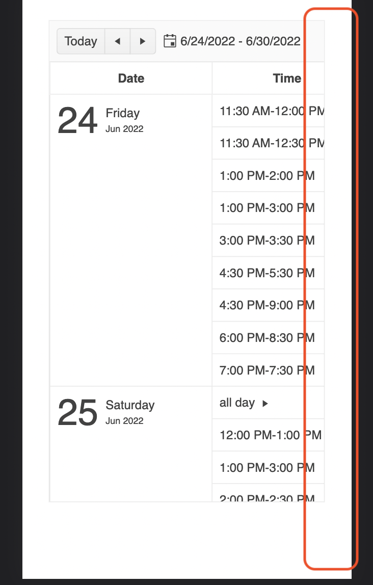
There is a feature request for this, but I see this as a bug. The Agenda view in the scheduler is advertised to work perfectly on mobile, but I would expect to see the event column one way or another. Now you can only see timeslots, which is not that useful. Can you fix it by making the event column available, maybe as part of the time as text or some other solution.
Ran this on StackBlitz
import { Component } from '@angular/core';
import {
  LegendLabelsContentArgs,
  SeriesClickEvent,
} from '@progress/kendo-angular-charts';
import { IntlService } from '@progress/kendo-angular-intl';

@Component({
  selector: 'my-app',
  template: `
    <kendo-chart
      (plotAreaClick)="onClick($event)"
      [transitions]="false"
      title="World Population by Broad Age Groups"
    >
      <kendo-chart-legend position="bottom"></kendo-chart-legend>
      <kendo-chart-series>
        <kendo-chart-series-item
          type="donut"
          [data]="pieData"
          field="value"
          categoryField="category"
          explodeField="exploded"
          [labels]="{ visible: true, content: labelContent }"
        >
        </kendo-chart-series-item>
      </kendo-chart-series>
    </kendo-chart>
  `,
})
export class AppComponent {
  public pieData: Array<{
    category: string;
    value: number;
    exploded: boolean;
  }> = [
    { category: '0-14', value: 0.2545, exploded: false },
    { category: '15-24', value: 0.1552, exploded: false },
    { category: '25-54', value: 0.4059, exploded: false },
    { category: '55-64', value: 0.0911, exploded: false },
    { category: '65+', value: 0.0933, exploded: false },
  ];

  constructor(private intl: IntlService) {
    this.labelContent = this.labelContent.bind(this);
  }

  public labelContent(args: LegendLabelsContentArgs): string {
    return `${args.dataItem.category} years old: ${this.intl.formatNumber(
      args.dataItem.value,
      'p2'
    )}`;
  }

  public onClick(event: any): void {
    console.log('Click');
  }
}
When the event is seriesClick, it works as expected, and if I change the type to bar, it works as expected, but when it's as shown as above, the onClick event isn't triggered.
As I have donuts/pies that might not have data in it, I needed to use plotAreaClick (which I have done for the bar charts)
Thanks,
Hello,
we are searching for two components that we don’t find in your ANGULAR Library.
These components are:
- KANBAN Cards / TASK LISTS
- Docking Manager
I have attached some print screens for existing components on the market...
Could you please check if there are any future/planned developments concerning these two components with Telerik?
Thank you in advance…
Add support for Angular's Trusted Types to eliminate CSP compatibility issues and errors when using the Kendo UI for Angular components in applications with strict Trusted Types security policies.
At the moment, the internal logic of the Kendo UI for Angular components uses innerHTML in various scenarios, like placeholder content for virtualization, dynamic rendering of icons and indicators, etc.
Thus, when applications have strict CSP with Trusted Types enabled, developers encounter a "This document requires 'TrustedHTML' assignment" error.
Although all content set via innerHTML is internally controlled and secure, the Kendo UI for Angular components should work seamlessly in applications with strict CSP and Trusted Types policies without requiring developers to modify their security configuration.
I am using below piece of code inside <kendo-grid>. Here, I am using a dropdown and kendo excel export button inside toolbar. dropdown is in left and button is right aligned. Earlier, it was working till Kendo 18. When I upgraded to kendo 19, it stopped working.
Root Cause is kendo-dropdownlist contains an array button. When we click on button to expand dropdown, excel export button gets the focus and dropdown loses focus. When we click on dropdown button, 'k-focus' class is applied on 'excel-export'. Because of this, dropdown is not working.
Code:
<ng-template kendoGridToolbarTemplate>
<div class="toolbar-container" style="display: flex; align-items: center; gap: 16px; width: 100%;">
<!-- Dropdown Wrapper -->
<div style="flex-shrink: 0;">
<kendo-dropdownlist [data]="data"
[(ngModel)]="someField" [valuePrimitive]="true" (valueChange)="perform()"
[popupSettings]="{ appendTo: 'component' }" style="width: 175px;">
</kendo-dropdownlist>
</div>
<!-- Spacer to push button to right -->
<div style="flex-grow: 1;"></div>
<!-- Excel Export Button -->
<div style="flex-shrink: 0;">
<button type="button" kendoGridExcelCommand>Export</button>
</div>
</div>
</ng-template>
Based on the feature set of the current jQuery widget - http://demos.telerik.com/kendo-ui/diagram/index
Hi team,
I am working on a simple UI where kendo combo-box is a "column" of a kendo tree-list. The problem is, the opening and closing of kendo combo-box also expands and collapses the kendo tree-list's row.
I think the event of kendo-combo-box is bubbled to treelist. Is this a bug or am I missing something?
Here's my Stackblitz example for reproducing the issue (Link: https://stackblitz.com/edit/angular-18guak?file=src/app/app.component.ts)
I upgraded today from 4.3.7 to v11 and the dates are 1 day off in the scheduler month view, meaning the date variable from let-date (I think).
<kendo-scheduler
    <ng-template kendoSchedulerMonthDaySlotTemplate let-date="date">
                ...
               <div>{{ date | kendoDate : 'dd' }}</div>
<kendo-scheduler
<ng-template kendoSchedulerMonthDaySlotTemplate let-date="date">
... <div>{{ date | kendoDate : 'dd' }}</div>
The date is just flat out wrong. What's weird is the mouseover shows the correct date.
Again, if I use the old version everything works as expected but the v11 update I'm off by one.
./node_modules/@progress/kendo-angular-layout/fesm2022/progress-kendo-angular-layout.mjs:19:0-75 - Error: Module not found: Error: Can't resolve '@progress/kendo-angular-progressbar' in 'C:\LiveMRIProjects\MRI.AgoraInsightsAnywhere-Angular\node_modules\@progress\kendo-angular-layout\fesm2022'
./node_modules/@progress/kendo-angular-layout/fesm2022/progress-kendo-angular-layout.mjs:22:0-56 - Error: Module not found: Error: Can't resolve '@progress/kendo-angular-intl' in 'C:\LiveMRIProjects\MRI.AgoraInsightsAnywhere-Angular\node_modules\@progress\kendo-angular-layout\fesm2022'
this is the error is coming
when we add kendo thing into module.ts file
If the pane is scrolled, the dark highlight shown when grabbing the splitter is misaligned like this:

Stackblitz repro can be found here
Issue 1: Flickering or Not Opening of Dropdown
- Steps to Reproduce:
- Click on the color picker.
- Click on any dropdown.
- Observe the behavior of the dropdown.
Issue 2: Clicking on Color Picker and Dropdowns (Dropdown not closing)
- Steps to Reproduce:
- Click on the color picker.
- Click on any dropdown.
- Repeat this with all dropdowns to get above screenshot.
Hi,
https://stackblitz.com/edit/angular-dadm5ywe?file=src%2Fapp%2Fapp.component.ts
Please select the top-most button, then press TAB until the focus is on the button in the last grid cell.
Then press tab again => the focus moves to the last cell itself.
Press tab again => the focus moves back to the last button.
=> here we got into an endless loop, you cannot navigate to the button below the grid.
Interestingly, you can leave the grid if you navigate backwards with shift+tab.
best regards,
Michael
When virtual is true for a multiselect and checkboxes are set to true, there is a bug which results in multiple items being selected.
To reproduce, one needs to scroll down a long list of items. The amount to scroll seems random but might have something to do with the itemHeight setting. When clicking directly inside the checkbox, two items are selected at once - the item selected, and one other seemingly random item. This does not happen if the click selection event happens inside the item, but not the checkbox.
I have reproduced this inside this code sandbox: https://codesandbox.io/p/sandbox/mystifying-shirley-2qxn32
It would be great if we could add footnotes in the Kendo editor, similar to how TinyMCE handles them, or a simpler version like the example found here: https://prosemirror.net/examples/footnote/
Hi,
It will be a good addition to your standalone examples if a Java backend implementation is also added to the list:
https://github.com/telerik/kendo-angular/tree/master/examples-standalone
Kendo's Angular components that have optional inputs are not built correctly.
For example on the `kendo-avatar`component the input `imageSrc` is defined like this:
@Input() imageSrc: string;however, since it is an optional input it should be defined like this:
 @Input() imageSrc?: string;
// or
 @Input() imageSrc: string | undefined;