Creating a new WebApp project template through the extension fails to build. This is caused by incorrect icon type in the MainLayout.razor file.
To make sure the app is correctly built, the Icon type should be FontIcon.
<TelerikButton Icon="@FontIcon.Menu"
               FillMode="@ThemeConstants.Button.FillMode.Clear"
OnClick="@( () => DrawerExpanded = !DrawerExpanded )" />It appears there are some issues with encoding special characters in the DataSourceExtensions.ToODataString extension method.
See snippet below.
var ds = new DataSourceRequest()
{
	Filters = [new FilterDescriptor("FieldName", FilterOperator.IsEqualTo, "Route #")],
	Sorts = []
};
{
Console.WriteLine(ds.ToODataString());
$count=true&$filter=(FieldName%20eq%20%27Route%20#%27)&$skip=0
This results in a malformed url as the last part of of the query is interpreted as a fragment due to this character not being encoded.
It stops working if you open it too fast. It goes into a state where no matter what you do (Rebind/changing data bound values etc.), it will not open and show items.
It can be reproduced easily by calling .Open() in OnInitializedAsync()
I have reproduced it without MS Playwright in REPL, so you can easily debug it.
https://blazorrepl.telerik.com/QIOUYoPc57iQKy6702
If you uncomment the await Task.Delay(3000); the code will work.
Expected behavior:
It is ok that Open() does nothing while the control is initializing. It is not ok that just because you called Open() once, then you are forever stuck without being able to open it later, no matter how long you wait or what you do with the items.
I do not want to insert random Delays in my code either as I expect the TelerikDropDownList to not malfunction just because I open it too early.
I hope you can prioritize this as right now the DropDownList is not usable for us.
I have a scenario in which we have user definable columns for a grid, including hundreds if not thousands that need to be ported from the old version of our product. This means these column keys would be strings that may contain spaces or even special characters - and as such cannot be a valid C# property name (which means using an ExpandoObject approach will not work)
It would be really beneficial if the TelerikGrid component could be given Data of an IEnumerable<Dictionary<string, object>> where the Field property of GridColumn (or a new property) would line up with a key in that dictionary rather than a field name for the component to then use reflection with.
A customer with multiple modules of our product installed may very well have columns with similar names, i.e "Some Key", "SomeKey", "Some_Key", "Some & Key" - so simply replacing spaces or special characters may not always still give unique keys.
Hi,
Are you planning to add a loader to the grid in the feature?
E.g as an isLoading attribute or exepnd the build-in one?
With method OnRead to fetch data, when grid is not yet loaded with data, it displays no records available.
Also when chenging data, loading is not starting, but there is an unsmooth transition after some time.
Thanks in advance for your time, Kacper
We are using Telerik UI for Blazor (V6.2.0) grid. The first 3 columns (Delivery No, Spot Check, Spotcheck Status) of the grid are frozen/locked. While horizontal scrolling the header text gets overlapped. We have used custom CSS to change the header color.
<TelerikGrid @ref="@GridRef" Data="@dashboardData"
Reorderable="true"
SortMode="@SortMode.Single"
Pageable="true"
FilterMode="GridFilterMode.FilterRow"
PageSize="10"
EnableLoaderContainer="true"
Sortable="true" Context="inboundContext" OnRowRender="@OnRowRenderHandler" Width="1800px" Height="500px">
@foreach (var header in tableHeader)
{
@if (@header.id == "SpotCheck")
{
<GridColumn Field="@(nameof(@header.id))" Width="150px" Title="@header.headerName" Visible="@header.isVisible" Locked="true" Reorderable="false" Filterable="false">
<Template>
@{
var item = (Delivery)context;
var isVisible = (item.DeliveryType.Equals("IN") && !string.IsNullOrEmpty(item.EUDRRefAndVerificationId));
}
<div class="spot-check-btn">
<TelerikButton Class="custom-btn custom-btn-secondary" OnClick="()=>reDirectTo(item.Id)" Visible="isVisible">Spot Check</TelerikButton>
</div>
</Template>
</GridColumn>
}
else if (@header.id == "status")
{
<GridColumn Field="@(nameof(@header.id))" Title="@header.headerName" Visible="@header.isVisible" Width="150px">
<Template>
@{
var item = (Delivery)context;
<span class="status-data @item.Status.ToLower()">
<span class="dot"></span>@item.Status
</span>
}
</Template>
</GridColumn>
}
else if (@header.id == "SpotcheckStatus")
{
<GridColumn Field="@header.id" Title="@header.headerName" Width="150px"
OnCellRender="@((e) => OnCellRenderHandlerSpotcheckStatus(e))"
Visible="@header.isVisible" Locked="true" Reorderable="false">
</GridColumn>
}
else
{
<GridColumn Field="@header.id" Title="@header.headerName" Width="150px"
OnCellRender="@((x) => OnCellRenderHandler(x, @header.id))"
Visible="@header.isVisible" Locked="@header.Locked">
</GridColumn>
}
}
</GridColumns>
<NoDataTemplate>
<p><strong style="color: var(--kendo-color-primary);">No Data Available.</strong></p>
</NoDataTemplate>
</TelerikGrid>
In the Appearance section of the ContextMenu component documentation on the Progress Design System Kit website (https://www.telerik.com/design-system/docs/components/contextmenu/#size), it is stated that:
The ContextMenu provides the size configuration option that enables you to control how big or small the rendered submenu items in the popup will be.
I’ve observed that this functionality is implemented in at least one library—Kendo UI for Angular (https://www.telerik.com/kendo-angular-ui/components/menus/contextmenu/appearance#size).
Is there a plan to introduce support for the Size parameter in the ContextMenu component of the Telerik UI for Blazor library?
Hello,
I am currently reworking an old webapp with server-side Blazor and Telerik UI for Blazor. I noticed that TelerikDialogs kind of break the rerendering of child components if the TelerikDialog and all of its content are placed inside their own component:
<PageTitle>Home</PageTitle>

<EditWithDialog @ref="EditDialogInside"></EditWithDialog>
Where EditWithDialog is (basically) defined as follows:
<TelerikDialog @ref="Dialog" @bind-Visible="@Visible">
	<DialogTitle>
		Edit ID
	</DialogTitle>
	<DialogContent>
		<div>
			<div>TelerikDialog inside of component</div>
			<TelerikTextBox Value="@AppState.CustomerString" OnChange="@SetID" Width="300px"></TelerikTextBox>
			<TelerikButton OnClick="@GenerateID">Generate ID</TelerikButton>
		</div>
	</DialogContent>
	<DialogButtons>
		<TelerikButton OnClick="@ToggleVisible">Close</TelerikButton>
	</DialogButtons>
</TelerikDialog>
However, if the TelerikDialog is placed on a page and its content is placed inside of its own component, everything works as expected:
<PageTitle>Home</PageTitle>
<TelerikDialog @bind-Visible="@Visible">
	<DialogTitle>
		Edit ID
	</DialogTitle>
	<DialogContent>
		<div>
			<div>TelerikDialog outside of component</div>
			<EditWithoutDialog @ref="EditDialogOutside"></EditWithoutDialog>
		</div>
	</DialogContent>
	<DialogButtons>
		<TelerikButton OnClick="@ToggleEditOutside">Close</TelerikButton>
	</DialogButtons>
</TelerikDialog>
EditWithoutDialog.razor:
<TelerikTextBox Value="@AppState.CustomerString" OnChange="@SetID" Width="300px"></TelerikTextBox>
<TelerikButton OnClick="@GenerateID">Generate ID</TelerikButton>
I am using the state-container approach described here, but the problem persists when using two-way binding via parameters.
In this scenario, putting the dialog directly on the page is not a problem, but with larger applications where there's possibly multiple dialogs and a lot more content on one page, this can become very unwieldy and confusing. Considering Blazors emphasis on making components reusable, this also prevents proper use of a customized dialog component that uses the TelerikDialog as a base.
I have attached a small project that implements both versions on a single page for you to test. I have tested using both Edge and Firefox.
Hi there,
I have a TelerikGrid with a DateTime column. I use a custom FilterEditorFormat which is localizable depending on the user settings, e.g. "dd/MM/yyy HH:mm:ss". Unfortunately, any '/' in the date component is always replaced by the current culture's DateSeparator. Using any other separator works, e.g. '-'.
Expectation: Use the FilterEditorFormat without modification, unless it's a standard format string like "g" or "D".
I already traced it down to Telerik's FormatHelper class and it seems like a quick fix.
Steps to reproduce:
- Create a TelerikGrid with a DateTime column and a FilterEditorFormat as shown above.
- If required, change the DateSeparator to anything else but '/'.
- Run and open the filter dialog
Please let me know if you need any additional information.
Best regards
Andreas
I have come across a few instances where it would be awesome if the Data Collection on a MultiSelect, or even a DropDown could have a dynamic property to denote if the option in the collection is selectable. The use case is around items being disabled but remain intact on historical records. If I remove the item currently from the collection then the component no longer shows the item as selected because it isnt in the collection. If I leave the item in the collection, then it shows, but, can then be selected on future items, which I dont want. Would be awesome if I could pass a component parameter, similar to TextField, which is the bool property for if the option in the dropdown is selectable/disabled. This would then make it so that the item could be REMOVED, but not readded or selected on future records unless the value for the property was set back to true.
Please add a property (e.g., OpenOnFocus or AutoOpenOnEdit) to dropdown-based components (such as DropDownList, ComboBox, or inline grid editors) to automatically open the dropdown when the component gains focus or enters edit mode.
Why This Matters
In data-dense UIs — like inline grid editing, cutover task assignment, or status changes — users often need to:
- Quickly select from a known list, such as Status, Owner, or Type.
- Tab rapidly through form fields without needing extra clicks.
- Use keyboard-only navigation efficiently.
Currently, dropdowns often require an additional manual click to open — which slows down power users and disrupts workflows in editable grids.
Hello,
related to my previous bug report.
When Add / Edit is clicked in the Grid, it causes a Dialog to open.
The dialog has a Form, and if the model for that form is set through OnParametersSet, the method is called in an infinite loop, and the Dialog never gets shown.
Grids honor the [DisplayFormat(DataFormatString ... )] annotation for column content, but the FilterMenuType.CheckBoxList filter menu and the TelerikCheckBoxListFilter component don't. This is particularly noteworthy for formatting that truncates the contents such as DateTime which frequently tracks data smaller than user's care about, which can generate many visually identical checkboxes. To go along with the requested change, it would be nice if the filter matched off of the DisplayFormat string considering that is what the user sees and would therefore be referencing, since again, many DataFormatStrings can truncate data.
Because the TelerikCheckBoxListFilter component requires the field to match the data type of the grid's field, there isn't a way for the programmer to choose to show the filter menu with a checklist that matches the displayed values without building a fully custom FilterMenuTemplate with their own foreach loop and then figuring out a way to construct a CompositeFilterDescriptor filled with bracketing FilterDescriptors to account for the range of matching values. This is doubly troublesome since using the structure of CompositeFilterDescriptors needed to do that is not supported in the FilterMenuTemplate without also having to override the FilterMenuButtonsTemplate.
Generally speaking, it would make more sense to the users if the default options in the filter logically and visually matched with the default displayed values.
Reference material:
Grid column contents: https://www.telerik.com/blazor-ui/documentation/components/grid/columns/display-format
Checkbox List: https://www.telerik.com/blazor-ui/documentation/components/grid/filter/checkboxlist
Alternate FilterDescriptor shapes not supported: https://feedback.telerik.com/blazor/1681745-clear-button-in-grid-filtermenu-not-properly-clearing-custom-filter
Example Repl: https://blazorrepl.telerik.com/mJOSuxQw117zM1h321
(https://docs.telerik.com/devtools/wpf/controls/radgridview/filtering/basic)

(https://docs.telerik.com/devtools/winui/controls/raddatagrid/filtering/datagrid-overview)

can you provide a initial File click event handler attribute?
I want the user to be able to click on an initial file to download the file.
While working on how to connect the filters together, I noticed that the clear button can gets the later part of the CompositeFilterDescriptor stuck in the grid.
Reproducible example: https://blazorrepl.telerik.com/wzuRPRvB00Vlj1Ac28
With the current configuration of the repl, filtering using only the TelerikCheckBoxListFilter and clicking filter will filter the column as expected, and clicking clear will blank out the checklist but won't reset the grid's filtering from those checkboxes until after ticking a checkbox and clicking filter, then unticking all checkboxes and clicking filter again. If the checkbox gets used then the clear button gets clicked, clicking the filter button after using the TelerikFilter without any checkboxes checked will filter based on the checkboxes the grid remembers ANDed with the new values from the TelerikFilter, again until the checkbox gets used and then manually emptied without using the clear button.
If the order of _textFilterValueInternal and _checkFilterValueInternal in the FilterDescriptors list get reversed, then the grid's filter memory issue gets transferred to the TelerikFilter meaning the issue is presumably with the grid itself. Also, if you use one or more values in both filters, then the clear button works as intended if there weren't already filters stuck inside the grid.
The clear button works as expected if filtering with both the filter and the checklist before clearing the filter.
Example images:
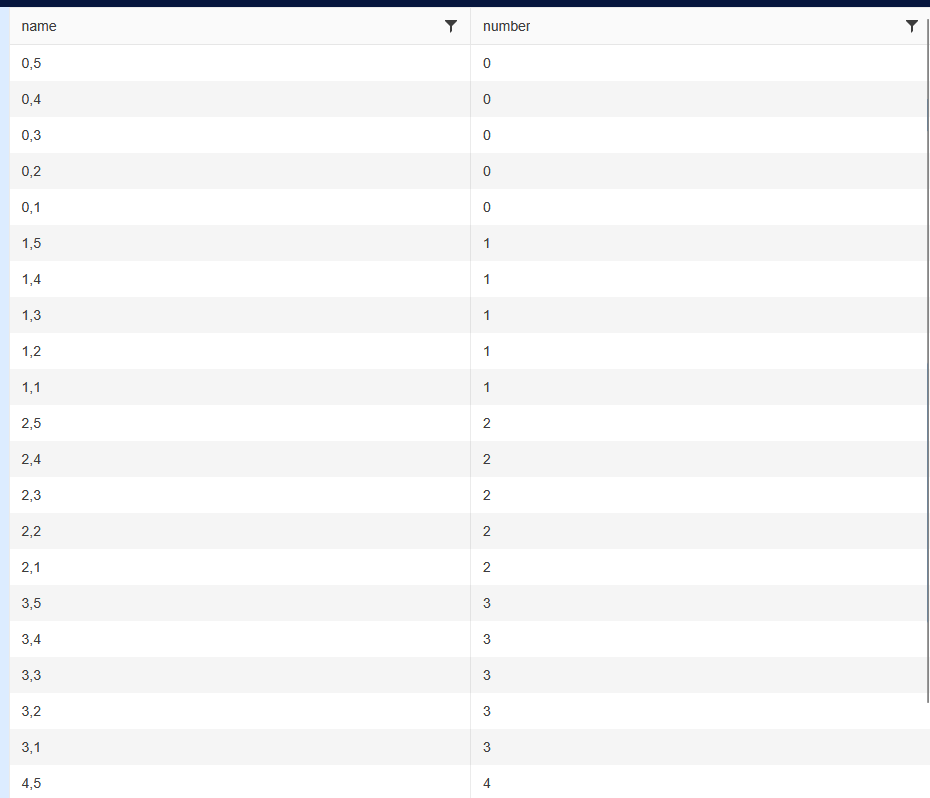
Start:
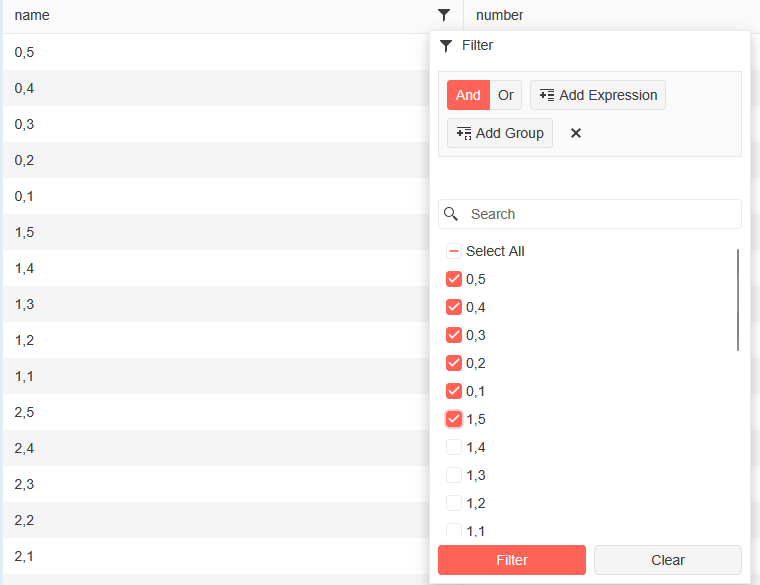
Check some boxes:
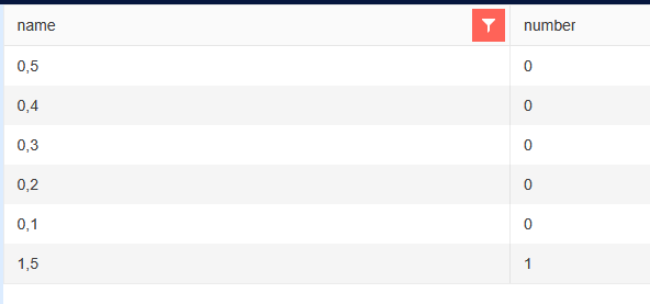
Filtered:
Open filter menu and click "Clear":
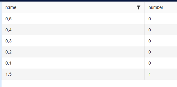
Re-open the filter menu:
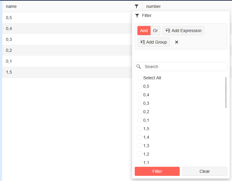
New filter:
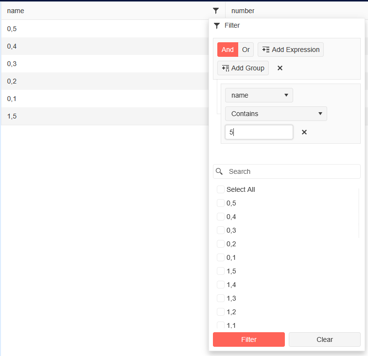
Click "Filter":

Re-open filter menu:
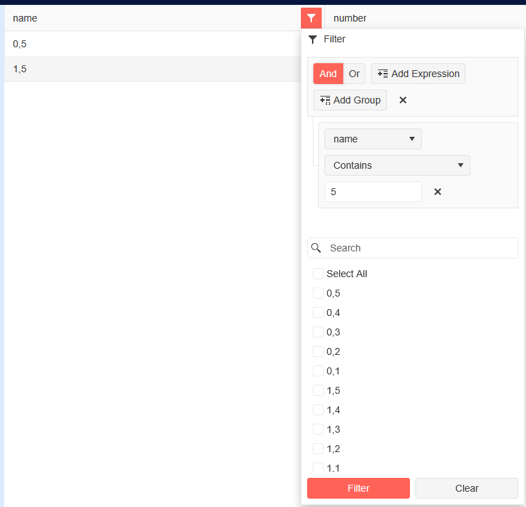
Click "Clear" button again:
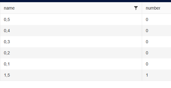
The problematic behavior can be reproduced in the following case:
- The DropDownList is at the lower part of the page, so the popup is rendered on top of the main element.
- The popup height is set to "auto".
In this scenario, when the user filters, the popup position remains unchanged but its height is reduced to fit the filter results. Thus, the popup looks detached from the main element. The behavior is not the same when the popup is rendered below the main element as in this case its top part sticks to the main element.
Reproduction: https://blazorrepl.telerik.com/mpEHGzOt25F1Znxi57.
===
ADMIN EDIT
===
As a workaround for the time being, you can ensure that the popup has a fixed height, so it does not collapse when there are less items to show. You may keep the default popup height or set your desired one through the settings tag. For example: https://blazorrepl.telerik.com/mpYdcfaN38JvIHgP41.