Currently, the AdaptiveMode.Auto in Blazor Hybrid has to be defined at the component level.
It would be nice if it could be globally defined at the TelerikRootComponent level.
As an additional possibility...
The current ASP.NET Ajax Telerik Controls, there is a property for Rendering -- Lightweight mode, Classic mode, etc. This can be defined at the control level, the custom control level, the page level and globally in web.config.
It would be great if this property AdaptiveMode could be defined in a similar way -- control level, custom Blazor component level, Razor page level or global level. If I understand correctly, much of the specific CSS styling can be done at different levels in Blazor. This would be similar.
Regards,
Dennis
Hi,
I'm in the process of implementing a form in a Window component and would like the content to remain present in the DOM between hiding and showing of the window. I noticed that there's a line in the documentation where it states that PersistContent will allow the content of the window to remain in the DOM whenever the window is minimized. I recommend this be extended to the Visibility of the form, not just minimizing, as to create a more coherent approach.
I did come across this post here where it gives a description of how the above is achieved. This is a very inelegant approach as the consumer of the framework has to manually implement stuff which should be provided by the framework. The suggested approach also prevents the developer from opening multiple windows at once, which might be an issue in some cases.
Hello,
I would like to have a parameter to show or hide a clear button on TextBox.
regards
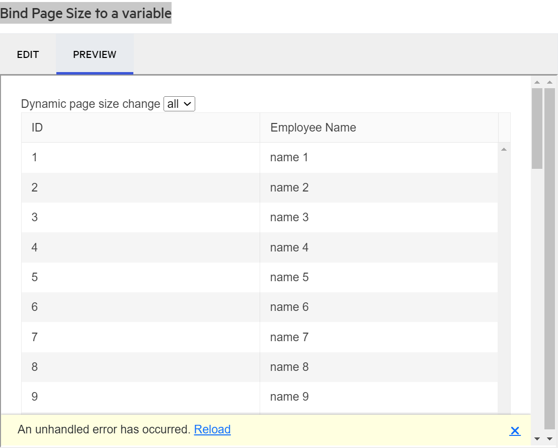
https://docs.telerik.com/blazor-ui/components/grid/paging
Under the section "Bind Page Size to a variable", if you click preview it generates an error.
Peter
Hi,
I see this feature request which is marked as COMPLETED in v2.28 (I`m running v3.7) but I don`t see how to achieve the functionality of having a blank placeholder for a DateTimePicker which has a null datetime variable bound it.
Are you able to help please?
Regards,
Tom
If I create a <TelerikGrid> whose Data property is set to a collection of 'object' (actual type not known at compile time, only at runtime), I can create <GridColumn> components for each property through e.g.
@{
IEnumerable<PropertyInfo> props = GetModelType().GetProperties();
foreach (PropertyInfo prop in props)
{
string propName = prop.Name;
<GridColumn Field="@propName" ... />
}
}
@code {
private Type GetModelType()
{
Type modelType = ...; // code determines the type of model at runtime ...
return modelType;
}
}
This works fine if the grid's EditMode is GridEditMode.Popup. When editing a row, the popup dialog properly displays each column header and value and binds correctly.
However, this does not work if the EditMode is GridEditMode.Inline nor GridEditMode.Incell. When placing the row in edit mode, no editor control appears at all, and the value in the cell is displayed as blank.
The design of the grid component thus only works well when given a known type at compile time, or one is constrained to always use Popup edit mode due to this flaw.
In addition to a request to fix this, it would also be great if the grid could be passed a Type (a runtime type, not a class name) to use for generating columns automatically, rather than having to resort to developers having to use reflection to generate grid columns themselves.
For instance,
<TelerikGrid T="@GetModelType()" ...> should invoke the GetModelType() method which would return a type at runtime, not necessarily known at compile time. Currently T can only be set to a hard-coded type name such as "Employee".
Per API documentation, the Decimals property defaults to what is set in the user's region (culture). This is a flawed design.
Why would one think that ALL properties of type double or float in grid models should be truncated to 2 decimal places (when my region is set to US and that is the default)?
This seriously limits property values. Not everything is a dollar and cent value! The region setting I believe is for how to format general currency values perhaps (I am not exactly sure what it is for, because there is a different tab for 'Currency' with a 'No. of digits after decimal' setting as well as the tab for 'Numbers' having the same thing. But this does not mean that Windows always formats numbers that way.
Suppose for example I have a property in my model named "Weight" (expressed in terms of pounds). The value 150.12345 (pounds) is perfectly valid. It should not be truncated to 150.12. Or another, "Length" (expressed in terms of Feet): 17.0625 (that's 17 feet, 1 inch) - should not be morphed into 17.06.
To work around this, developers currently either have to override a <GridColumn>'s <EditorTemplate> and place a <TelerikNumericTextBox> element bound to the same property that the <GridColumn> is, and explictly set the Decimals property themselves.
Or what I have found is a better workaround, although not desirable to have to do this at all, is to put this kind of code snippet in the Program.cs file, right after the line var app = builder.Build();
app.UseRequestLocalization(action =>
{
var currentCulture = CultureInfo.CurrentCulture.Clone() as CultureInfo;
currentCulture!.NumberFormat.NumberDecimalDigits = 10; // for example, to allow this many decimal places in everything numeric
var cultures = new List<CultureInfo>() { currentCulture };
action.SupportedCultures = cultures;
});
Please remove the default value for the Decimals property being tied to the culture. It should just allow as many decimal places as a normal float or double would allow for its precision. Perhaps just allow a developer to set it and honor that, but if not set, basically let it be unlimited, just like the number of digits to the left of the decimal point.
Repl demo link: https://blazorrepl.telerik.com/cROhmgvP088tMZDF58

My grid bind to ExpandoObjects, and I would like to implement a Group Header.
So I referenced these two documents
https://docs.telerik.com/blazor-ui/knowledge-base/grid-binding-to-expando-object
https://docs.telerik.com/blazor-ui/components/grid/columns/multi-column-headers
From the first document, it make sense to me that we need to set FieldType for each column that binds to ExpandoObject, but it seems this restriction also applies to the group header column, which does not make sense.
Foe example:
<TelerikGrid Data="@GridData"
Pageable="true"
Sortable="true"
FilterMode="@GridFilterMode.FilterRow">
<GridColumns>
<GridColumn Title="Test Group Header">
<Columns>
<GridColumn Field="PropertyInt" Title="Int Column" FieldType="@typeof(int)" />
<GridColumn Field="PropertyString" Title="String Column" FieldType="@typeof(string)" />
<GridColumn Field="PropertyDate" Title="DateTime Column" FieldType="@typeof(DateTime)" />
</Columns>
</GridColumn>
</GridColumns>
</TelerikGrid>
I get error:
I need to set FieldType on the "Test Group Header" column to an arbitrary value to get rid of this error.
Hello there,
I encountered an issue with the TelerikForm component after upgrading Telerik.UI.for.Blazor from version 4.0.1 to 4.4.0. In the code below I have placed the two form items in a Bootstrap grid:
<TelerikForm Model="@person">
    <FormValidation>
        <DataAnnotationsValidator></DataAnnotationsValidator>
    </FormValidation>
    <FormItems>
        <div class="row">
            <div class="col-md-6">
                <FormItem Field="@nameof(Person.Id)" LabelText="Id"></FormItem>
            </div>
            <div class="col-md-6">
                <FormItem Field="@nameof(Person.FirstName)"
                        EditorType="@FormEditorType.TextArea"
                        LabelText="First name">
                </FormItem>
            </div>
        </div>
    </FormItems>
</TelerikForm>
With version 4.0.1, the two fields were displayed in two columns within the form element. However, with version 4.4.0, I noticed that the HTML code, specifically the div elements, are now rendered outside of the form element. The HTML structure looks like this:
<div class="row">
	<div class="col-md-6">
	</div>
	<div class="col-md-6">
	</div>
</div>
<form class="k-form telerik-blazor k-form-md" dir="ltr" style="">
	<div class="k-form-field">
		<label class="k-label k-form-label" for="a6cc8103-4d52-4377-8656-169e4a3de33a">
            Id
		</label>
		<div class="k-form-field-wrap">
......
I wanted to check with you if this change is intentional or if it might be a bug with the TelerikForm component in the latest version.
Best regards,
Ivaylo
Hello,
I need to perform some tasks in case of pressing some keyboard shortcuts. For example when a user press Alt+Enter key combination. But it seems that your grid catches this key combination as well and performs its action (Editing the current cell and jumping to the next one below). How can I suppress this behavior please? Maybe not just for this key combination but more generally.
I attached a small sample to better demonstrate the problem. Just run the sample please, focus some cell in the grid and press Alt+Enter.
Very thanks.
Miroslav
In TreeView the selected and checked items have to be provided as IEnumerable<object>. This can make things a bit of a pain if you have for example outside events that are also trying to change the list of checked items. Not insurmountable or hard but just a pain.
For example to remove an item since IEnumerable is immutable you to have to completely re-assign the collection. SelectedItems = SelectedItems.Where[Some condition] . Instead of SelectedItems.Remove, add etc.
I realize the reasons you are binding to IEnumerable<object> and not using generics
I propose adding "CheckedField" and "SelectedField" in your observable treeview binding and then we would not have to pass in Checked / Selected Items at all and just bind those fields to the Data we are passing in. Make life a lot easier.
The same thing likely applies to some other controls that have the same problem. So keep it consistent.
Unexpected scroll behaviour is seen after selecting an item in a DropDownList/Multiselect with a scroll mode set to virtualise. We are unable to easily scroll upwards using the scroll bar in the control or using a mouse/trackpad. The scroll position immediately snaps back to the selected item. Sometimes we are able 'escape' this by rapidly scrolling but this does not feel like intended behaviour.
Downward scrolling seems okay and using the keyboard arrow keys also seems unaffected. This is reproducible on the demo page: Blazor DropDownList - Virtualization - Telerik UI for Blazor and https://docs.telerik.com/blazor-ui/components/multiselect/virtualization.
Reproduction steps on Chrome:
- Navigate to demo page and render local example preview
- Select item "Name 27"
- try to scroll up with the arrow buttons on the scrollbar or the mouse wheel
Minimal reproducible example: Blazor MultiSelect - Virtualization - Telerik UI for Blazor
Hi Team,
I was implemeting the approach mentioned in the below URL in my Blazor .Net Project
https://github.com/telerik/blazor-ui/tree/master/common/pdf-jpg-export-js
But getting this error while execution, can someone please look into this or help me.
Error: Could not find 'telerikClientExporter.exportPDF' ('telerikclientexporter' was undefined).
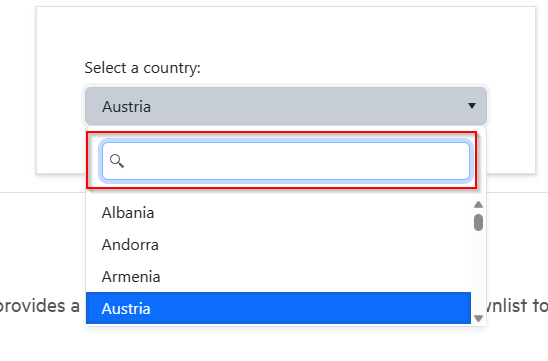
Please add the option for the Multiselect to filter the same way the DropDownList does. It's very odd & confusing for end users (and bad UX) in a UI toolkit for similar controls to do things in different ways. Can you please add the ability for the Multiselect control to filter items in the popup window the same way the DropDownList does with the nice filter text box.
https://demos.telerik.com/blazor-ui/form/templates
When you edit in Telerik Repl, you get a warning message:
What was weird though, is when I ran it from directly from the link in the documentation, I didn't get an error. I made one small change to the code (swapped line 54 and 55 (just seeing if I could change the rendering order, which I can) and then I saw this warning. But any change to the code generates the warning.
Peter
Are you thinking about developing an app builder for Blazor to create a project and add telerik component and finally export it as Blazor app (server or wasm)?
(like this one develop from Infragistics https://appbuilder.indigo.design/app/)
This tool export every single page as razor page.
BR,
Flavio


