Pretty simple. With each release the product examples in the Github repo should be updated.
For example, I am looking at the drawer -> sidenav example. Before I can even run the example, I now need to go through all the code to make the updates from 2.14.1 to 3.4.0. Some of the changes that I have to make are:
- TelerikButton no longer supports the Primary attribute
- Drawer content needs now needs to be in a <DrawerContent> element not <Content>
I should not have to make these updates to look at an example, especially when it is referenced from a forum posting.
I should just be able to compile and run the example.
Hello,
Please add an expandable and collapsible panel (container), similar to the ExpansionPanel in Kendo UI.
To be considered for implementation as a standalone component or feature of ListView, for example.
The purpose of such component is to provide option for users to reveal contextual actions when they do a swipe gesture on mobile devices. The swiping direction to consider is left and right (up and down are out of scope).
List of possible functionalities for consideration:
- Option to configure menu actions on left and right swipe gesture and define which menu actions will be shown on left and which on right swipe
- Option to use icons in menu items
- Additional customization options for menu items - color, images, custom content
- Configurable number of items for the menu, plus option to define more
- Confirmation of actions (needed for actions related to deleting/removing data)
Please feel free to provide any feedback and share your suggestions on desired functionalities.
In the Blazor DropDownList it would be great to provide custom text or template to replace the "no data" message when the Data property returns an empty collection. Often, in cascading dropdowns, an empty list occurs because a value up the hierarchy has not been chosen yet. For example, if you have dropdowns for County and City, the City dropdown will be empty until a County is selected. It would be nice if the City dropdown, in that case, could say "Please select a county first" instead of "no data".
Thanks.
<AdminEdit>
This is also applicable to the MultiSelect, ComboBox, AutoComplete.
</AdminEdit>
Just Moving from Ajax UI to Blazor
Used the search box a lot - multi-columns, had first match as typed toward an item,filtering, a click return the item selected
Wonderful
please can we have a blazor version?
Nick
Hi
Passwords are not yet supported. There is a DataAnotations Datatype for that. So technically this is possible and should not be a big deal. Almost all apps have a password entry somewhere.
Example:
class LoginModel
{
[Required]
[Display(Name = "User Name")]
public string UserName { get; set; }
[Required]
[DataType(DataType.Password)]
[Display(Name = "Password")]
public string Password { get; set; }
}
Annoying because then you have to do the form fields all manually because of the password.
Thanks for considering.
Best regards, Michael
Hi. VS 2022 version 17.2.4, C#, Windows 11
I thought I'd have a look at blazor and selected the Telerik version in the new projects window and ran through the wizard.
I selected the dashboard look, .net 6, teleric UI for blazor 3.4.0 (Dev) and to enable localization, which is what I assume to be the cause of the following error message. There were no other hints and as I've never tried blazor or telerik for
blazor I don't know if there's anything missing from the solution. If I ran another wizard without localization there was no error.
An error occurred while running the wizard.
Error executing custom action Telerik.Blazor.VSX.Actions.CopyBlazorLocalizationResourcesAction: System.Collections.Generic.KeyNotFoundException: The given key was not present in the dictionary.
at System.ThrowHelper.ThrowKeyNotFoundException()
at System.Collections.Generic.Dictionary`2.get_Item(TKey key)
at Telerik.Blazor.VSX.Actions.CopyBlazorLocalizationResourcesAction.Execute(WizardContext wizardContext, IPropertyDataDictionary arguments, IProjectWrap project)
at Telerik.VSX.WizardEngine.ActionManager.ExecActions()
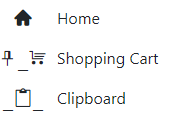
In the example below, the home icon is displayed correctly but the two with underscores are not. Moving the span outside the drawer does display correctly.
<TelerikRootComponent>
<TelerikDrawer Data="@NavigablePages"
@bind-Expanded="@DrawerExpanded"
MiniMode="true"
Mode="@DrawerMode.Push"
@ref="@DrawerRef"
@bind-SelectedItem="@SelectedItem">
<Template>
<div class="k-drawer-items">
<ul>
<li class="k-drawer-item" style="white-space:nowrap">
<span class="k-icon material-icons" style="margin-right: 8px;">home</span>
@if (DrawerExpanded)
{
<span class="k-item-text">Home</span>
}
</li>
<li class="k-drawer-item" style="white-space:nowrap">
<span class="k-icon material-icons" style="margin-right: 8px;">shopping_cart</span>
@if (DrawerExpanded)
{
<span class="k-item-text">Shopping Cart</span>
}
</li>
<li class="k-drawer-item" style="white-space:nowrap">
<span class="k-icon material-icons" style="margin-right: 8px;">content_paste_search</span>
@if (DrawerExpanded)
{
<span class="k-item-text">Clipboard</span>
}
</li>
</ul>
</div>
</Template>
<DrawerContent>
<div class="content px-4">
@Body
</div>
</div>
</DrawerContent>
</TelerikDrawer>
</TelerikRootComponent>
Hi good morning. I am implementing a FileManager control, but by business logic only certain users have permission to rename files. So in the onEdit method I validate the permission and if it doesn't have it I send a DialogFactory and after that I send an args.IsCancelled = true. And at the end of the event if I click on another item (file) inside the folder. throw an exception:
public async Task OnEdit(FileManagerEditEventArgs args)
    {
        Dialogs.AlertAsync(message, "FileManager");
        args.IsCancelled = true;
    }
crit: Microsoft.AspNetCore.Components.WebAssembly.Rendering.WebAssemblyRenderer[100]
Unhandled exception rendering component: Object reference not set to an instance of an object.
System.NullReferenceException: Object reference not set to an instance of an object.
at Telerik.Blazor.Extensions.ReflectionExtensions.GetPropertyValue(Object target, String propertyName)
at Telerik.Blazor.Components.TelerikFileManager`1[[XXX.WASM.Shared.HierarchicalFileEntry, XXX.WASM.Shared, Version=1.0.0.0, Culture=neutral, PublicKeyToken=null]].ConvertToFileEntry(Object dataItem)
at Telerik.Blazor.Components.FileManager.FileView.FileManagerFileViewBase`1[[XXX.WASM.Shared.HierarchicalFileEntry, XXX.WASM.Shared, Version=1.0.0.0, Culture=neutral, PublicKeyToken=null]].ConvertToFileEntry(Object dataItem)
at Telerik.Blazor.Components.FileManager.FileView.FileManagerListFileView`1.<>c__DisplayClass17_2[[XXX.WASM.Shared.HierarchicalFileEntry, XXX.WASM.Shared, Version=1.0.0.0, Culture=neutral, PublicKeyToken=null]].<BuildRenderTree>b__8(RenderTreeBuilder __builder3)
at Microsoft.AspNetCore.Components.Rendering.RenderTreeBuilder.AddContent(Int32 sequence, RenderFragment fragment)
at Telerik.Blazor.Components.ListView.ListViewItem`1[[XXX.WASM.Shared.HierarchicalFileEntry, XXX.WASM.Shared, Version=1.0.0.0, Culture=neutral, PublicKeyToken=null]].<BuildRenderTree>b__17_0(RenderTreeBuilder __builder2)
at Microsoft.AspNetCore.Components.Rendering.RenderTreeBuilder.AddContent(Int32 sequence, RenderFragment fragment)
at Microsoft.AspNetCore.Components.CascadingValue`1[[Telerik.Blazor.Components.ListView.IListViewCommandContainer, Telerik.Blazor, Version=3.3.0.0, Culture=neutral, PublicKeyToken=20b4b0547069c4f8]].Render(RenderTreeBuilder builder)
at Microsoft.AspNetCore.Components.Rendering.ComponentState.RenderIntoBatch(RenderBatchBuilder batchBuilder, RenderFragment renderFragment, Exception& renderFragmentException)
.jpg)
We're a paying customer for the Blazor software components under AVEVA.
We need to do a substantial amount of custom real-time drawing on top of a Blazor based map control using a layer rendered on top of the Tile Layer. The currently supported Map layers are somewhat specific to smaller map indicators and static overlays.
Our rendering subsystem doing this drawing will be using SkiaSharp/Skia on WebAssembly, drawing on a Skiasharp canvas in the browser (this already works). I'm assuming behind the scenes the Map is drawing with a standard HTML canvas.
I believe we need a solution which resembles the following:
- The Image is a layer rendered on top of the map viewport (as opposed to the entire map canvas)
- The Image layer can know the size of the ViewPort so it can create an identical size image (or perhaps this is handled automatically by the Map control)
- The Image layer can be re-rendered as often as the customer code desires (we're showing realtime data on top of maps, so we will want to re-render the Image layer say every 250ms.
- When the map viewport changes (pan, zoom, etc.), events are fired so the Image layer customer code can re-render the image based on the new viewport coordinates and zoom level.
- Click events are passed through the Image Layer for processing.
Since we're using a different rendering technology than the underlying map control, my assumption is the best way to keep this simple is our code draws to a SkiaSharp canvas then converts that to PNG/BMP/whatever so that can be injected into the Image layer for rendering.
It would be expected that every pan/zoom/viewport change causes an entire re-rendering of the Image layer.
Hi I have noticed that if the dropdown for an enum cannot wordwrap the item then the styling is broken, see the following the screenshot:
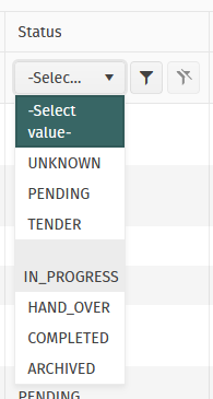
As you can see IN_PROGRESS is so long that it exceeds the column width and creates empty space above.
To me it appears as though an attempt to try to wordwrap the IN_PROGRESS but IN_PROGRESS has no applicable breaks in it.
Thanks,
Daniel
Hi I was wondering if there is a way for us to have the functionality of CloseOnOverlayClick like on Dialogs for the Create/Edit Popup in the TelerikGrid?
I can't seem to find the option within the TelerikGrid -> GridSettings -> GridPopupEditSettings component
Thanks,
Daniel
We have a grid with the standard numeric filter menu.
When we copy a numeric value from Excel or from somewhere else and paste it into the field it is not copied.
This also happens with the demo on https://demos.telerik.com/blazor-ui/grid/filter-menu
It does not work since the 3.3.0 version.
Looks like the filter row has the same problem.
As a user, I would like to ability to pin one to many row(s) in a grid so that the pinned rows are always the first rows at the top of the grid.
If a filter is applied, the pinned records that match the filter should be displayed first. Non matching rows may be hidden.
If a column sort is changed, the pinned rows should be sorted then the unpinned rows should be sorted to ensure the pinned rows are always at the top of the grid.
As a developer, Pinning should be a optional feature configured when the grid is setup.
This essentially would only add a data populated "pin" column the user can toggle on or off, but the real effort in this request is around the sorting and filtering to ensure when the user clicks a column the event is captured, and the sort is submitted as pin column, then the selected column, to ensure the pin takes precedent.
All I ask is to give a way to have a proper working datepicker. Like your javascript datepickers. That doen't care only for right values but for the person that uses it. Telerik was an early adopter in the Blazor ecosystem, I don't know how they haven't yet fixed their datepickers.
You can do this with many ways. I don't know them all but I will propose some here.
- Create a second datepicker component that works properly.
- Put an attribute in the component to work with free-text
- Maybe if this attribute is on you can switch behind between 2 different components
- Find a other solution of your own.
In the end behind the scenes you shouldn't bind the datepicker input in the datetime property but to a sting one. DevExtress has done this right.
This will solve
- Proper user expirience when a user uses the keyboard to edit dates
- Copy-Paste issue
- Clear date parts issue
- all from 30/4/2022 to edit to 31/5/2022 with out having to clear the input
- Strange editing of years (I have an example in the end)
- Allow to have dots or what ever the users want between dates numbers. (e.x. 13.3.2022 )
I this is a trade-off and you will have senarios with wrong inputs and other things, but you already know them from the javascript world, and it's less importand than the aboves.
*Strange editing of years
Lets say that we have the year 1998 19and we want to put 2014.
the users See
-> 1/1/1998
-> 1/1/9982
-> 1/1/9820
-> 1/1/8201
-> 1/1/2014
That's not user friendly, and is very disturbing.
The feature request is to provide a way for Telerik customers to define custom validation classes. It seems appropriate to have the FieldCssClassProvider override in Telerik components. Thus, if required customers would be able to apply custom styling and remove the default theme classes for valid and invalid state.
Related #1564471
My team is currently using animation containers as menu popups in our web app, which will need to work on both desktop and mobile devices in a web browser. For the mobile layout, I would like to be able to open animation containers via swipe gestures. I understand that animation containers are not strictly menus, however, I would love to see swipe action support in Telerik UI for Blazor, and then be able to bind that action to an animation container.
The only framework I have found by way of example is https://onsen.io/. Please observe how it is possible to open a panel by swiping close to the edge of the sample device on their homepage.
This feature would make it much easier to build dynamic web apps that perform well on desktop and feel native on mobile devices as well.
Thank you,
David
Hi Team,
We are using Telerik Modal popup on the GridView edit click button.
This Modal Window moves out of the screen when user clicks on popup header click when there is a vertical page scrollbar and the scroll position is not top.
Can you please fix this bug? We implemented your workaround, but using that workaround with below link, after opening the popup, below screen automatically scrolls on top. This is not good user experience on lengthy page.
Expectation : Page scroll should stay with the previous position after opening the popup with scrollbar.
Thanks,
Aarti Tare