Currenty, when the Grid is in InCell edit mode, if a column binds to a boolean field, it is required a custom logic to display the field as a checkbox, which is always in edit mode and can be updated through a single click. Here is a REPL sample that shows the example:
https://netcorerepl.telerik.com/GJOhEIkj47P2xHf709
My opinion is that this functionality should work correctly out of the box without additional coding. If this is not available, then there should be an applicable sample code.
Is it possible to make an example where EF, Dirty works, no double click required and the checkbox always looks like a checkbox?
Starting with version 2025.2.520, the toolbar tools like "Save changes" and "Cancel changes" are hidden by default. When the ShowInactiveTools(true) option is set, the inactive tools are displayed as disabled until a change in the Grid's data is made (for example, the tools are active when the edited cell is closed).
Is it possible to create an option that enables the previous behavior of the inactive toolbar tools - to keep the tools always active and visible no matter if there is a change or not?
For example:
.ToolBar(toolbar =>toolbar
            .Items(itm =>
            {
                itm.Create();
                itm.Save();
            })
            .EnableInactiveTools(true)
)
I'm in the process of rewriting all Kendo components to use CSP compatible templates. I'm looking at https://docs.telerik.com/aspnet-core/html-helpers/template/overview which shows how we'd use TemplateComponentName() for popup editors and that we would need to rewrite everything in the popup editor to use Kendo Template's AddHtml or AddComponent methods.
Original:
<div class="mb-2 row required">
	@Html.LabelFor(model => model.FileName, new { @class = "col-sm-4 col-form-label fw-bold text-sm-end" })
	<div class="col-sm-6">
		@(Html.Kendo().TextBoxFor(model => model.FileName).HtmlAttributes(new { @class = "w-100" }))
	</div>
</div>

<div class="mb-2 row">
	@Html.LabelFor(model => model.FileDescription, new { @class = "col-sm-4 col-form-label fw-bold text-sm-end" })
	<div class="col-sm-6">
		@(Html.Kendo().TextBoxFor(model => model.FileDescription).HtmlAttributes(new { @class = "w-100" }))
	</div>
</div>
Rewritten:
@(Html.Kendo().Template()
	.AddHtml("<div class='mb-2 row required'>")
	.AddHtml(@<text>
		@Html.LabelFor(model => model.FileName, new { @class = "col-sm-4 col-form-label fw-bold text-sm-end" })
	</text>)
	.AddHtml("<div class='col-sm-6'>")
	.AddComponent(c => c.TextBoxFor(model => model.FileName).HtmlAttributes(new { @class = "w-100" }))
	.AddHtml("</div></div>")

	.AddHtml("<div class='mb-2 row'>")
	.AddHtml(@<text>
		@Html.LabelFor(model => model.FileDescription, new { @class = "col-sm-4 col-form-label fw-bold text-sm-end" })
	</text>)
	.AddHtml("<div class='col-sm-6'>")
	.AddComponent(c => c.TextBoxFor(model => model.FileDescription).HtmlAttributes(new { @class = "w-100" }))
	.AddHtml("</div></div>")
)
While this works, this markup seems much harder to read than the original. Could this be made to be simpler? Ideally I'd like to be able to drop my existing mix of html and kendo components in one method and it'd parse through to render the template properly.
As a result of an EF Core issue, the ToDataSourceResult() is not able to perform the query when the DataSourceRequest object contains grouping.
The problem occurs using the query below, assembled by Telerik routine:
var temp = _db.Pessoa
    .OrderBy(item => item.Email)
    .Skip(0)
    .Take(40)
    .GroupBy(item => item.Email)
    .OrderBy(g => g.Key)
    .Select(g => new AggregateFunctionsGroup
    {
        Key = g.Key,
        ItemCount = g.Count(),
        HasSubgroups = false,
        Member = "Email",
        AggregateFunctionsProjection = new
        {
            Count_Referencia = _db.Pessoa
                    .Select(t => new
                    {
                        t.IdPessoa,
                        t.Referencia,
                        t.Nome_RazaoSocial,
                        t.Apelido_Fantasia,
                        t.CPF_CNPJ,
                        t.RG_IE,
                        t.Email
                    })
                    .OrderBy(item => item.Email)
                    .Where(item => item.Email == g.Key)
                    .Count()
        },
        Items = g
    })
    .ToList();
In the routine where the AggregateFunctionsGroup is created, the Items property must not only be the query itself, but also the fields specified in the main Select. Or, the call to the Select() method must simply be added:
var temp = _db.Pessoa
    .OrderBy(item => item.Email)
    .Skip(0)
    .Take(40)
    .GroupBy(item => item.Email)
    .OrderBy(g => g.Key)
    .Select(g => new AggregateFunctionsGroup
    {
        Key = g.Key,
        ItemCount = g.Count(),
        HasSubgroups = false,
        Member = "Email",
        AggregateFunctionsProjection = new
        {
            Count_Referencia = _db.Pessoa
                    .Select(t => new
                    {
                        t.IdPessoa,
                        ...
                    })
                    .OrderBy(item => item.Email)
                    .Where(item => item.Email == g.Key)
                    .Count()
        },
        Items = g.Select(t => new
        {
            t.IdPessoa,
            ...
        })
    })
    .ToList();
This way, the issue does not occur.
The grid must allow changes to be made in specific cells, without those changes being committed/saved unless the user clicks on the "Save" button in the toolbar. Basically the users enter in some values for editable currency columns that aren't locked, and (without saving) some columns (both locked and not locked) that are not editable must be refreshed as the value in those cells depend on the edited column. Those cells have client templates and client footer templates which need to be used by whatever is refreshing their cells.
Having this functionality provided built-in will be a nice addition:
https://docs.telerik.com/kendo-ui/knowledge-base/grid-update-particular-row-without-refresh
Current configuration: server-side filtering
Desired behavior:
- Grid searches are "anded" to any existing filters
- When the search box is cleared the pre-existing filters are retained
This should be applied when using a Telerik UI for ASP.NET Core Grid with PopUp Edit Mode.
By default, when the "paste" command is added, the default option is "insert" mode ("Paste (Insert)"). Is it possible to add an option that allows setting the default paste mode to "replace" ("Paste (Replace)")?
Is it possible to implement template options for the "update" and "cancel" column commands of the Grid?
For example:
$("#grid").kendoGrid({
  columns: [{
    command: [{
        name: "edit",
        template: {
            update: "<button class='customUpdate'>Save</button>",
            cancel: "<button class='customCancel'>Cancel</button>",
          }
      }]
   }],
  ...
});
Currently, when using the default Grid search functionality and the column filter menus, we observe the following:
- When a column filter is applied first, using the Search feature afterward overrides the column filters, applying the search filter with the "contains" operator to the specified columns.
- Conversely, when a search is performed first and then followed by a column filter, the grid generally functions as expected.
However, there’s a specific scenario where this does not work properly:
- If a search is performed and then a column filter is applied to a column where the search criteria are relevant, the Grid returns no data.
For example:
- After searching for "2018," the expected columns displayed in the filters (notably, the ContractNumber is among them).
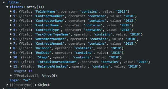
- When a column filter is subsequently applied to ContractNumber (e.g., setting it to "2018-CR0018"), the Grid removes the ContractNumber from the search filters and adds the column filter with an "AND" operator. This setup returns no data because of the search filters and the "AND" operator.
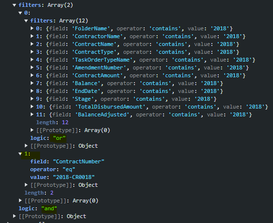
Expected Behavior and Alternative
This functionality behaves correctly in the Telerik UI for Blazor Grid component - the search and column filters are managed as separate objects.
Is it possible to enhance the Grid filtering similar to the Blazor Grid?
Hi, is there a way to configure the grid so that when it's grouped and later sorted, the grouping state (expanded/collapsed) is preserved?
Kind Regards
Erwin
It would be convenient to have built-in MultiColumnComboBox editing for the Grid.
I was hoping the component would show the addresses formatted in columns (as per a fields list) and then return the address concatenated into a single to the grid field (e.g. from .DataTextField("FullAddress")).
When creating columns in a TagHelper Grid definition, the Width property allows only numbers:
                                <column field="OrderID" width="100">
                                </column>
This does not match the width property in the Kendo UI and HtmlHelpers Grid definitions which allow string values to be entered as well:
https://docs.telerik.com/kendo-ui/api/javascript/ui/grid/configuration/columns.width
That way, the developer will be able to add rem and other unit values in TagHelper syntax as well.
Also, it would be convenient if there is a new property similar to this:
                                <column field="OrderID" tooltip="Unique Number of the Order">
</column> <column field="Freight"
html-attributes='new Dictionary<string, object>{ ["style"] = "width: 30rem;" }'>
</column>
column-command template does not access datasource as an ordinary column template.
<kendo-grid name="grid">
    <columns>
        <column field="ProductID" title="ID" />
        <column title="Column" template="#=columnTemplate(data.ProductID)#" />
        <column title="ColumnCommand">
        <commands>
            <column-command name="change" template="#=columnTemplate(data.ProductID)#"></column-command>
        </commands>
    </column>
    </columns>
    <datasource type="DataSourceTagHelperType.Custom" server-filtering="true">
        <transport>
            <read url="@Url.Action("ServerFiltering_GetProducts", "MultiSelect")" />
        </transport>
    </datasource>
</kendo-grid>

<script>
    function columnTemplate(productID) {
        if (productID % 2 == 0)
            return 'even';
        else
            return 'odd';
    }
</script>
Reproduction of the problem:
https://netcorerepl.telerik.com/myurdlbI16kA1TM213
Current behavior:
There is no way to have a dynamic template for column commands that depends on datasource.
Expected/desired behavior:
Having column-command template as column template, making it possible to access data from datasource.
Environment:
Kendo UI version: 2024.2.514
Workaround:
As an alternative solution, I'm using data-bound event, performing a for loop to all rows, but it needs to go line by line, which is not the best solution for large data.
Currently, this can be achieved with custom javascript:
https://docs.telerik.com/kendo-ui/knowledge-base/filter-by-date
Hi
I'm using the popup editor to edit rows in the grid.
I'm using following javascript method to open the popup:
function editSelectedRow(name) {
    var grid = $('#' + name).data('kendoGrid');
    var rows = grid.select();
    grid.editRow(rows[0]);
}
This function is called when a row is double clicked:
$("#Binders tbody").on("dblclick", "tr[role='row']", function (e) {
    editSelectedRow("Binders");
});
I have this code for many years now and it was never a problem.
With the latest version of the grid this code fails (the popup doesn't open) upon making a change in the popup window. As long as no changes is done to the record in the popup, there will not be a problem.
The error received is the following:
jquery-3.7.1.min.js:2 jQuery.Deferred exception: Cannot read properties of undefined (reading 'id') TypeError: Cannot read properties of undefined (reading 'id')
at HTMLTableRowElement.<anonymous> (https://kendo.cdn.telerik.com/2024.1.319/js/kendo.all.min.js:9:1814199)
at Function.each (https://code.jquery.com/jquery-3.7.1.min.js:2:3129)
at Le.fn.init.each (https://code.jquery.com/jquery-3.7.1.min.js:2:1594)
at init._persistSelectedRows (https://kendo.cdn.telerik.com/2024.1.319/js/kendo.all.min.js:9:1814160)
at init.select (https://kendo.cdn.telerik.com/2024.1.319/js/kendo.all.min.js:9:1811103)
at init._displayRow (https://kendo.cdn.telerik.com/2024.1.319/js/kendo.all.min.js:9:1779176)
at https://kendo.cdn.telerik.com/2024.1.319/js/kendo.all.min.js:9:1894615
at Array.forEach (<anonymous>)
at init.refresh (https://kendo.cdn.telerik.com/2024.1.319/js/kendo.all.min.js:9:1894600)
at init.trigger (https://kendo.cdn.telerik.com/2024.1.319/js/kendo.all.min.js:9:4189) undefined
When the data in the grid is refreshed, no error will occur anymore.
HOWEVER... I also have an "Edit" button on the toolbar of the grid. That buttons uses the same 'editSelectedRow' function but when that button is used, the popup window will open, even after a change to the record!!
With other words... something goes wrong when double clicking a row after an update was made.
What has changed?
Best regards,
Peter