### Bug report
When the Dialog is configured with actions and the Content Security Policy is enabled, it throws an "Invalid template" error.
### Reproduction of the problem
1) Configure a Dialog widget with actions and set the CSP with the following content:
<meta http-equiv="Content-Security-Policy" content="script-src 'self' 'unsafe-inline' https://kendo.cdn.telerik.com https://code.jquery.com; style-src 'self' 'unsafe-inline' https://kendo.cdn.telerik.com;" />2) Open the browser console to review the error.
A Dojo sample for reproduction: https://dojo.telerik.com/ULOyazUC
### Expected/desired behavior
The Dialog should be rendered correctly without using the 'unsafe-eval' keyword in the "script-src" directive.
### Workaround
Insert the following script before the Dialog initialization:
 <script>
    kendo.ui.Dialog.fn._mergeTextWithOptions = function(action) { var text = action.text; if(text) { return kendo.isFunction(text) ? text(this.options) : text; } return ""; }
</script>
### Environment
* **Kendo UI version: 2023.2.606
* **jQuery version: 3.4.1
* **Browser: [all]
Bug report
When the Model for the Grid inherits the CustomTypeDescriptor, an error is thrown.
Reproduction of the problem
-
Open the attached sample project -
TelerikAspNetCoreApp3.zip -
Load the About page
Current behavior
The following error is thrown:
An unhandled exception occurred while processing the request.
InvalidOperationException: Bound columns require a field or property access expression.
Kendo.Mvc.UI.GridBoundColumn<TModel, TValue>..ctor(Grid grid, Expression<Func<TModel, TValue>> expression)
Expected/desired behavior
The view should load without any errors
Environment
- Kendo UI version: 2020.3.1118
- Browser: [all ]
Bug report
Validation attributes are not rendered on Kendo editors if ViewData contains same key as the model.
Reproduction of the problem
@{
  ViewData["Title"] = "Home Page";
}

@using (Html.BeginForm())
{
  @Html.Kendo().TextBoxFor(model => model.Title)
}

<script>
  $(function () {
    $("form").kendoValidator();
  });
</script>
Current behavior
Validation attributes are not rendered.
Expected/desired behavior
Validation attributes should be rendered on the input element.
Environment
- Kendo UI version: 2020.1.219
- Browser: [all]
Dears,
While browsing the new components of UI for Asp Core, I found an Issue in the provided online sample (https://demos.telerik.com/aspnet-core/ripplecontainer/index)
After transferring and moving items between the lists of "RIPPLE ON LIST ITEMS", the list display the raw HTML of the items. So, I provided a screen record reproducing the issue (https://pasteboard.co/I7Fx0AW.gif).
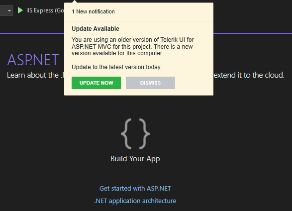
When both UI for ASP.NET MVC and UI for ASP.NET Core Visual Studio extensions are installed and only UI for ASP.NET Core project is loaded, the notification for new version is shown for UI for ASP.NET MVC.
When trying to install Microsoft.VisualStudio.Web.CodeGeneration.Design 7.0.4 NuGet package in a Telerik UI for ASP.NET Core 2022.3.1109 application, it throws an exception:
NU1107: Version conflict detected for Microsoft.CodeAnalysis.CSharp.Workspaces. Install/reference Microsoft.CodeAnalysis.CSharp.Workspaces 4.4.0 directly to
project TelerikAspNetCoreApp3 to resolve this issue.
### Reproduction of the problem
1) Create a Telerik UI for ASP.NET Core 2022.3.1109 application (.NET 7.0).
2) Install Microsoft.VisualStudio.Web.CodeGeneration.Design NuGet package (version 7.0.4).
3) Review the NuGet Error in the output.
### Workaround
Install the the following NuGet packages:
- Microsoft.CodeAnalysis.Common
- Microsoft.CodeAnalysis.Workspaces.Common
- Microsoft.CodeAnalysis.CSharp
- Microsoft.CodeAnalysis.CSharp.Workspaces
- Microsoft.CodeAnalysis.VisualBasic
- Microsoft.CodeAnalysis.VisualBasic.Workspaces
Alternatively, install an older version of the Microsoft.VisualStudio.Web.CodeGeneration.Design package.
### Environment
* **Telerik UI for ASP.NET Core version: 2022.3.1109
* **.NET version: 7
I know you can query the client side JavaScript version using
kendo.versionIt would be handy if you could query the dll assembly version or cdn url so the URLs can automatically match the dll used in the solution especially when nuget is used to update it currently I work around this using:
    @{  var version = typeof(Kendo.Mvc.KendoServices).Assembly.GetName().Version;
        string kendoCDN = $"//kendo.cdn.telerik.com/{version.Major}.{version.Minor}.{version.Build}";}
<link href="@Url.Content(kendoCDN + "/styles/kendo.bootstrap-v4.min.css")" rel="stylesheet" type="text/css" />Test Environment:
OS Version: 22H2 OS Build 22621.1702
Edge Version: Edge(Chromium) Version 114.0.1823.37 (Official build) (64-bit)
Pre requisites:
High contrast mode: Settings->Accessibility->contrast themes-> select Aquatic/desert theme
Repro-Steps:
- Open ASP.NET Core DateRangePicker Key Features Demo | Telerik UI for ASP.NET Core using valid credentials.
- Navigate to 'Start'/'End' calendar using Tab key and invoke it.
- Select any Date from Start/End calendar.
- Observe the issue in high contrast mode i.e. Aquatic/Desert mode whether we are able to identify the selected date in high contrast themes or not.
While invoking start and end date calendar, the selected date is not visible in both aquatic and desert theme.
While invoking start and end date calendar, the selected date should be visible clearly in both aquatic and desert theme.
User Impact:
Users with low vision and who rely on high contrast aquatic and desert theme will face difficulties if the selected date is not visible clearly.
Running WAVE on websites that use the Slider throw up a load of alerts to do with "Redundant title text" and "Unlabeled form control with title".
You can see examples of this on any demo page such as the Basic Usage one.
Can you please remove the offending attributes - or come up with values that don't throw these issues up? I'm not sure if they're in place to work with ToolTips, but if we elect not to support ToolTips (which is default behaviour) then they are effectively redundant.
I don't want to have to do this myself in script because it is an unnecessary overhead and may cause downstream issues in your code.
I'm looking to add the Nonce to the standard inline kendo initialization scripts rather that having to defer initialization and output the initialization scripts in a script tag with a nonce, as demonstrated in the documentation https://docs.telerik.com/aspnet-core/html-helpers/helper-basics/content-security-policy#for-r1-2023-sp1-and-later-working-with-telerik-ui-for-aspnet-mvc-components
Hi,
From: Edit in Telerik REPL
https://demos.telerik.com/aspnet-core/gantt
Results:
One or more compilation failures occurred: /Views/Snippet.cshtml(24,18): Error RZ1006: The section block is missing a closing "}" character. Make sure you have a matching "}" character for all the "{" characters within this block, and that none of the "}" characters are being interpreted as markup.
Thanks
Andreas
As per the subject, if you use jQuery to get a Kendo TabStrip in a ComboBox change event it inserts this div into the TabStrip control:
<div class="k-tabstrip-items-wrapper k-hstack">
    <ul class="k-tabstrip-items k-reset" role="tablist"></ul>
</div>
This used to work as we were changing the selected tab in a TabStrip based on a ComboBox selection, but this no longer works. Please see the following REPL where a new div is added every time you change the ComboBox value:
https://netcorerepl.telerik.com/mxETafaT24zWOe0C50
Kind regards,
David
When using the ASP.NET Core helpers for input elements, it shall be possible to specify separate id and name attributes.
Example
Currently, when rendering a checkbox:
Html.Kendo()
    .CheckBox()
    .Name("enable")
Results in:
<input id="enable" name="enable" type="checkbox" value="true" data-role="checkbox" class="k-checkbox k-checkbox-md k-rounded-md">As you can see, this sets both the id AND name attributes to the same string. For more advanced web pages, this is not sufficient. The id attribute must be unique within the the whole page, whereas name does not.
Suggested solution
Add a new InputName() helper method to explicitly set the name for all applicable form/input elements. This is possible with e.g. RadioGroup, but not with CheckBox, RadioButton, DropDownList, etc.
Adding an AdaptiveMode configuration to Editors, similar to UI for Blazor would be beneficial when UI for ASP.NET Core components are used on smaller screens/mobile devices:
https://demos.telerik.com/blazor-ui/dropdownlist/adaptive
I am using TreeList for setting permissions. It seemed a perfect choice until I realized that state of ALL the checkboxes is set to either true or false.
I would like to be able to select checkbox based on the value of record i.e. to be able to save it's state in database, retrieve it, and batch update it.
I know that this behavior can be simulated / achieved by using javascript, but it would be so much better, easier and neater to have it data bound just like all the other columns.
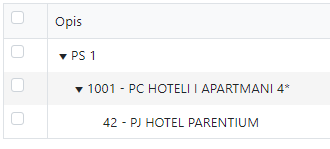
For example, I have an organisational structure on the picture below. We can set permissions on any level.
I imagine that the syntax could be something like:
@(Html.Kendo().TreeList<OrgStrukturaTree>()
    .Name("treeOrgRO")
    .Columns(columns =>
    {
        columns.Add().Selectable(true).Width("20px");
        columns.Add().Field(e => e.Opis).Width(250);
    })
    .Filterable(false)
    .Sortable(true)
    .DataSource(dataSource => dataSource
        .Read(read => read.Action("ObjektiTree_Read", "Admin"))
        .ServerOperation(false)
        .Model(m => {
            m.Id(f => f.Id);
            m.ParentId(f => f.ParentId);
            m.Expanded(true);
            m.Selected(f => f.Selected);
            m.Field(f => f.Opis);
        })
    )
)
I sincerely hope you would consider this update, as I cannot think of a scenario when I would use checkboxes that are all the same state.
Thank you in advance.


