Unplanned
Last Updated:
16 Nov 2023 15:17
by Martin Ivanov
Created by:
Martin Ivanov
Comments:
0
Category:
ChartView
Type:
Feature Request
By default when the chart is zoomed in, the major step between the axis ticks is automatically re-calculated to match the new zoom level. Add a property that allows you to access the recalculated major step.
Unplanned
Last Updated:
12 Oct 2022 06:40
by Martin Ivanov
Created by:
Martin Ivanov
Comments:
0
Category:
ChartView
Type:
Feature Request
Add ScatterRangeSplineSeries visualization, same as RangeSplineSeries, but in scatter scenario (two linear axes).
Unplanned
Last Updated:
04 Jan 2017 07:16
by ADMIN
ADMIN
Created by:
Martin Ivanov
Comments:
0
Category:
ChartView
Type:
Bug Report
The data points are not rendered when the series' axis is set at runtime through a DataTrigger in the series' style.

Note: The data points are rendered when the chart is resized or zoomed.

Workaround:
Change the resource type in the DataTrigger that changes the axis - instead of DynamicResource, use StaticResource.

<telerik:CategoricalSeriesDescriptor.Style>
    <Style TargetType="telerik:LineSeries">
        <Style.Triggers>
            <DataTrigger Binding="{Binding Path=Axis}" Value="Left">
                <Setter Property="VerticalAxis" Value="{StaticResource AxisLeft}"/>
            </DataTrigger>
            <DataTrigger Binding="{Binding Path=Axis}" Value="Right">
                <Setter Property="VerticalAxis" Value="{StaticResource AxisRight}"/>
            </DataTrigger>
        </Style.Triggers>
    </Style>
</telerik:CategoricalSeriesDescriptor.Style>
Unplanned
Last Updated:
03 Jan 2017 21:14
by ADMIN
ADMIN
Created by:
Petar Marchev
Comments:
0
Category:
ChartView
Type:
Bug Report
Workaround:
One way to work around this is to set the plot mode of the axis to OnTicksPadded.
Unplanned
Last Updated:
04 Jan 2017 07:34
by ADMIN
ADMIN
Created by:
Martin Ivanov
Comments:
0
Category:
ChartView
Type:
Bug Report
MovingAverageIndicator doesn't recalculate its data points when a new item is added in its ItemsSource at runtime

Workaround:
To update the data points of the indicator reset its Period property when a new item is added in the ItemsSource. For example:

// add new item
var indicator = chart.Indicators[0] as MovingAverageIndicator;
var period = indicator.Period;
indicator.Period = 0;
indicator.Period = period;
Unplanned
Last Updated:
04 Jan 2017 07:22
by ADMIN
ADMIN
Created by:
Petar Marchev
Comments:
0
Category:
ChartView
Type:
Bug Report
In a multiple series scenario if one series gets removed, an internal axis flag is incorrectly reset resulting in the horizontal axis displaying only one label when SmartLabelsMode is used. One way to work-around this is to add an empty dummy series after removing a real series:

            this.chart1.Series.Remove(EmptyDummySeries);
            if (this.chart1.Series.Count > 0)
            {
                this.chart1.Series.RemoveAt(this.chart1.Series.Count - 1);
                if (this.chart1.Series.Count > 0)
                {
                    this.chart1.Series.Add(EmptyDummySeries);
                }
            }
Unplanned
Last Updated:
03 Jan 2017 21:22
by ADMIN
ADMIN
Created by:
Dinko | Tech Support Engineer
Comments:
0
Category:
ChartView
Type:
Bug Report
Workaround: Bind the UpStroke and DownStroke properties of the Candlestick via custom style (which is set to the DefaultVisualStyle property) to properties from the model. Then in the setter of the Close property, can set different color depending on whether the Close is less than Open property.
Unplanned
Last Updated:
31 Jan 2017 06:45
by ADMIN
ADMIN
Created by:
Martin Ivanov
Comments:
0
Category:
ChartView
Type:
Feature Request
Currently, if the trackball position is outside the plot area boundaries, the element is not clipped and there is no mechanism that allows clipping it.

Note: The trackball is the small ellipse that snaps to the data points.
Unplanned
Last Updated:
20 Dec 2016 09:09
by ADMIN
ADMIN
Created by:
Dinko | Tech Support Engineer
Comments:
0
Category:
ChartView
Type:
Feature Request
Unplanned
Last Updated:
03 Jan 2017 20:54
by ADMIN
ADMIN
Created by:
Martin Ivanov
Comments:
0
Category:
ChartView
Type:
Bug Report
When there is defined a ChartPanAndZoomBehavior and the axes of the chart are switched at run-time, the orientation of the PanZoomBar elements it is not changed.

Workaround:
Get the PanZoomBar element and set its Orientation property.

private void TrySetOrientation(CartesianAxis axis, Orientation orientation)
{
    var panZoomBar = Telerik.Windows.Controls.ChildrenOfTypeExtensions.FindChildByType<PanZoomBar>(axis);
    if (panZoomBar != null)
    {
        panZoomBar.Orientation = orientation;
    }
}

private void SwapAxes()
{
    // Swapping code here

    this.Dispatcher.BeginInvoke((Action)(() =>
    {
        this.TrySetOrientation(this.chart.HorizontalAxis, Orientation.Horizontal);
        this.TrySetOrientation(this.chart.VerticalAxis, Orientation.Vertical);
    }));
}
Unplanned
Last Updated:
03 Jan 2017 21:10
by ADMIN
ADMIN
Created by:
Petar Marchev
Comments:
0
Category:
ChartView
Type:
Bug Report
Workaround:
The issue is caused by the MajorTickInterval property, so one way to go is to remove this setting and use the LabelInterval instead. This will plot more ticks than before, but should eliminate the label clip. If the number of ticks bothers you, you can set the MajorTickLength property of the axis to 0 (so that the ticks are not visible) and use a LabelTemplate in which you will include a label and a tick.

Another, simpler, work-around is to set a right margin of the chart and set the ClipToBounds property of the chart to false.
Unplanned
Last Updated:
03 Jan 2017 20:23
by ADMIN
ADMIN
Created by:
Petar Marchev
Comments:
0
Category:
ChartView
Type:
Feature Request
Unplanned
Last Updated:
03 Jan 2017 21:19
by ADMIN
ADMIN
Created by:
Petar Marchev
Comments:
0
Category:
ChartView
Type:
Feature Request
Currently the ChartSmartLabelsStrategy places the labels outside the bars, not taking into consideration the Horizontal and Vertical Alignment of the label definition.
Unplanned
Last Updated:
03 Jan 2017 21:19
by ADMIN
ADMIN
Created by:
Petar Marchev
Comments:
0
Category:
ChartView
Type:
Feature Request
The ability to select a series instead of a series' items.
Unplanned
Last Updated:
03 Jan 2017 21:19
by ADMIN
ADMIN
Created by:
Petar Marchev
Comments:
0
Category:
ChartView
Type:
Feature Request
There are scenarios where the actual minimum and maximum of the axis are of high importance but they are not displayed (due to TickOrigin). For instance if the axis range is (-1, 11) and TickOrigin is "0", the labels will be (0, 2, 4...) and "-1" and "11" will not be displayed.
Unplanned
Last Updated:
03 Jan 2017 20:57
by ADMIN
ADMIN
Created by:
Martin Ivanov
Comments:
0
Category:
ChartView
Type:
Feature Request
Implement Label Fit Mode In the polar chart to avoid label overlapping.
Unplanned
Last Updated:
20 Jun 2023 14:31
by ADMIN
Created by:
Martin Ivanov
Comments:
2
Category:
ChartView
Type:
Feature Request
Implement pan and zoom ability for the polar chart.
Unplanned
Last Updated:
29 Jul 2022 08:11
by ADMIN
Created by:
Nazar
Comments:
4
Category:
ChartView
Type:
Bug Report
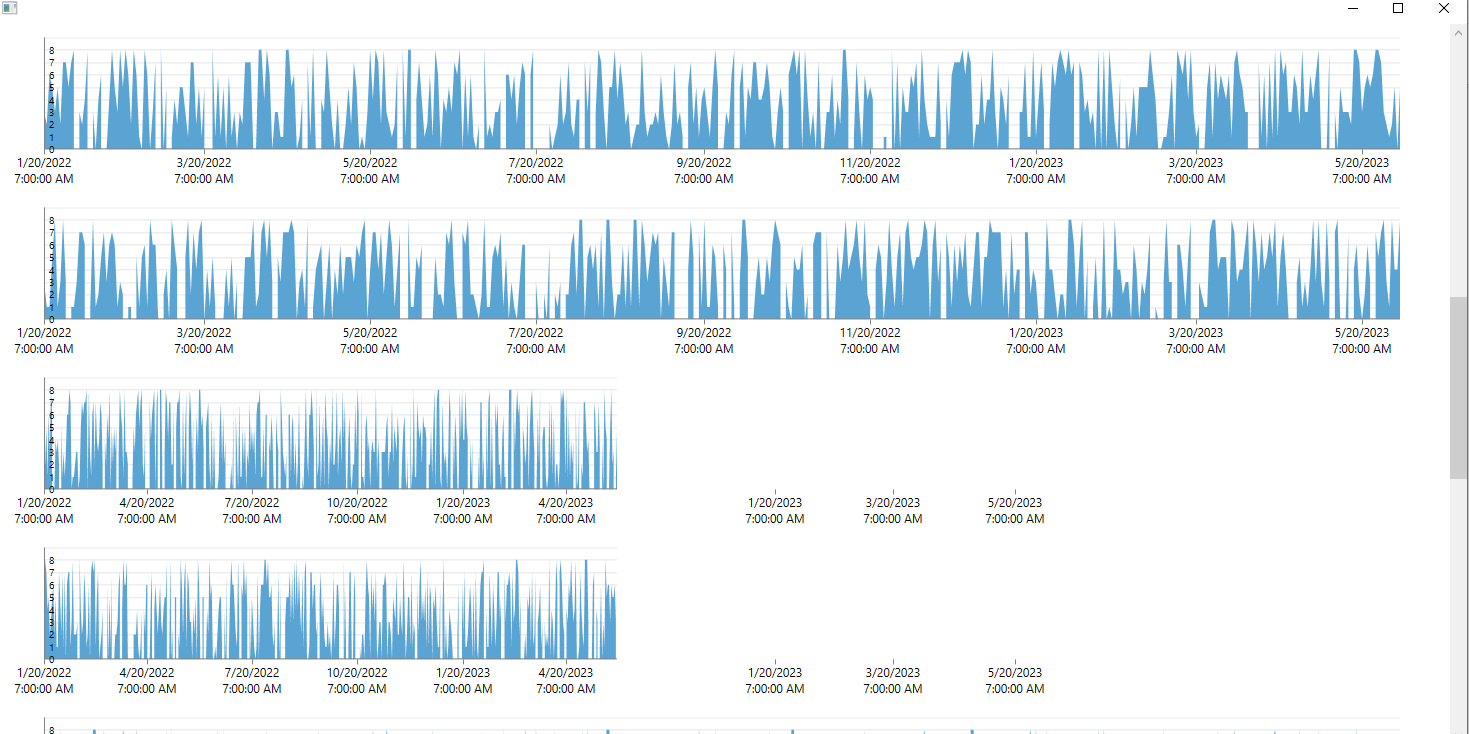
The problem arises when we have many graphs on one window and when we scroll to the bottom then to the middle of the window and then resize the width of the window, not all graphics dynamically resize, some harden to the previous size.
I am attaching a project in which you can reproduce the problem.
And I am attaching a video where the problem is clearly demonstrated.
Please solve the problem as soon as possible for our product it is critical!
Unplanned
Last Updated:
12 Mar 2019 14:39
by ADMIN
ADMIN
Created by:
Martin Ivanov
Comments:
0
Category:
ChartView
Type:
Feature Request
Unplanned
Last Updated:
17 Dec 2021 09:39
by ADMIN
Created by:
Martin Ivanov
Comments:
0
Category:
ChartView
Type:
Feature Request
Currently, the chart provides a selection feature where you can select data points by clicking on their visual elements (ellipses, bars, etc.) or setting the IsSelected property. Add a feature that allows you to select the entire series. This feature is meaningful when using line or area series and you want to highlight (select) the clicked series.
You can easily implement it by subscribing to the MouseLeftButtonDown event of the chart series and change the series' Stroke or Fill property.
You can easily implement it by subscribing to the MouseLeftButtonDown event of the chart series and change the series' Stroke or Fill property.