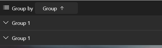
The group header row overlaps the column headers when scrolling to a column that is out of view upon previously resizing the window and the GroupHeaderDisplayMode is Frozen.
Add a setting on the column level to control the case sensitivity more easily.
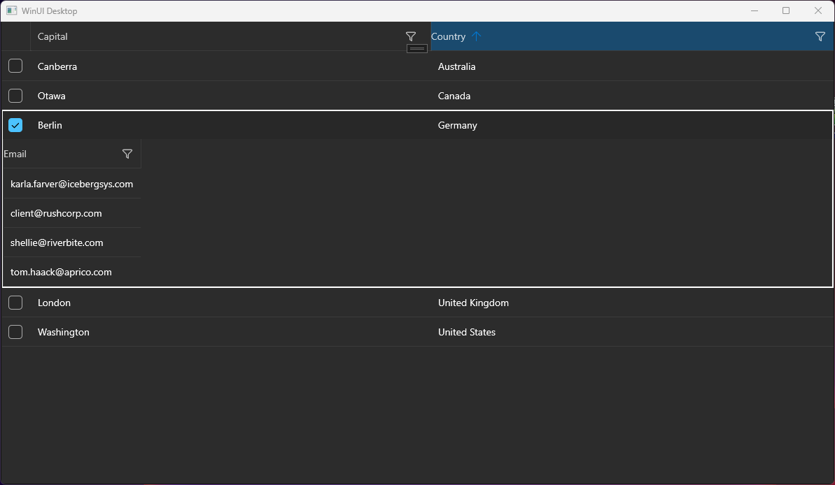
A group can get duplicated when the GroupHeaderDisplayMode is Frozen (this is the default mode). In this case, a group visual is drawn in both the frozen headers area and the scrollable area below.
To work this around, set the GroupHeaderDisplayMode property to Scrollable.
<telerikGrid:RadDataGrid x:Name="dataGrid" GroupHeaderDisplayMode="Scrollable">
The frozen group rows area overlaps part of the column headers on horizontal scroll. This happens when GroupHeaderDisplayMode is Frozen.
To work this around, set the GroupHeaderDisplayMode to Scrollable.
<telerikGrid:RadDataGrid GroupHeaderDisplayMode="Scrollable">
If you use the DataGridComboBoxColumn or the DataGridTemplateColumn with a ComboBox in its template, you cannot open the drop down of the ComboBox when you click onto it. This reproduces only if you try to click on the arrow icon that opens the drop down or somewhere in the control where no text is presented. If you have already selected item and some text is displayed, you can click onto the text in order to open the drop down.
This reproduces also if the ComboBox is defined in the RowDetailsTemplate of the DataGrid.
To workaround this, you can subscribe to the Tapped event of ComboBox control and set the Handled property of the event arguments to True. If you use the DataGridComboBoxColumn, you can create a custom class that derives from it and override its CreateEditorContentVisual method. This will allow you to get the ComboBox and subscribe to its event.
public class CustomComboBoxColumn : DataGridComboBoxColumn
{
	public override FrameworkElement CreateEditorContentVisual()
	{
		var comboBox = (ComboBox)base.CreateEditorContentVisual();
		comboBox.Unloaded += ComboBox_Unloaded;
		comboBox.Tapped += ComboBox_Tapped;
		return comboBox;
	}

	private void ComboBox_Unloaded(object sender, RoutedEventArgs e)
	{
		var comboBox = (ComboBox)sender;
		comboBox.Unloaded -= ComboBox_Unloaded;
		comboBox.Tapped -= ComboBox_Tapped;
	}

	private void ComboBox_Tapped(object sender, Microsoft.UI.Xaml.Input.TappedRoutedEventArgs e)
	{
		e.Handled = true;
	}
}
Allow changing the displayed value. This could be done by introducing a new property for the DataGrid columns (something like DistinctValuesDisplayPath).
Remove the space reserved for the sort indicator in the column header, when CanUserSort is False and therefore the sort indicator is not displayed. The current behavior prevents the user to easily center the header text.
To work this around, you can edit the ControlTemplate of DataGridColumnHeader. In the template, you can update the Visibility of the TextBlock with x:Name set to "SortIndicator" when CanUserSort is False.
The default behavior of the WinUI native Popup is to render within the bounds of its owner element. This means if the DataGrid reaches the end of the window and there is not enough space for the filtering control to draw, it will get clipped.
To avoid the clipping and allow the Popup to get displayed outside of the window, the ShouldConstrainToRootBounds property of the Popup should be set to false.
Add an API in the RadDataGrid control to allow setting the ShouldConstrainToRootBounds option of the Popup.
In the meantime, you can disable the Popup constrain via an implicit Style in App.xaml:
<Application.Resources>
    <ResourceDictionary>
        <ResourceDictionary.MergedDictionaries>
            <XamlControlsResources xmlns="using:Microsoft.UI.Xaml.Controls" />
            <ResourceDictionary Source="ms-appx:///Telerik.WinUI.Controls/Themes/Generic.xaml"/>
            <!-- Other merged dictionaries here -->
        </ResourceDictionary.MergedDictionaries>
        <Style TargetType="Popup">
            <Setter Property="ShouldConstrainToRootBounds" Value="False" />
        </Style>
        <!-- Other app resources here -->
    </ResourceDictionary>
</Application.Resources>
Hello, I tried to implement the sample application from your docs. (https://docs.telerik.com/devtools/winui/controls/raddatagrid/row-details)
But it seems to be not working, the detail area is not displayed completely. Only one column.
I have a similar behavior on another application.
Details:
- .NET 7
- Windows 11 Pro Version 23H2 (22631.3155)
- Telerik WinUI 2.9.0