Currently, VisualStudio2012DarkTheme has a white background in order to be able to read the labels. This change was done when addressing this item:
However, it is inconsistent a dark theme to have a white background color. The design should be improved to achieve consistent look and feel.
Allow user to export current view as an image.
Use the following setup:
private void RadForm1_Load(object sender, EventArgs e)
{
// TODO: This line of code loads data into the 'nwindDataSet.Orders' table. You can move, or remove it, as needed.this.ordersTableAdapter.Fill(this.nwindDataSet.Orders);
this.radPivotGrid1.RowGroupDescriptions.Add(new DateTimeGroupDescription() { PropertyName = "OrderDate", Step = DateTimeStep.Year, GroupComparer = new GroupNameComparer() });
this.radPivotGrid1.RowGroupDescriptions.Add(new DateTimeGroupDescription() { PropertyName = "OrderDate", Step = DateTimeStep.Quarter, GroupComparer = new GroupNameComparer() });
this.radPivotGrid1.RowGroupDescriptions.Add(new DateTim
eGroupDescription() { PropertyName = "OrderDate", Step = DateTimeStep.Month, GroupComparer = new GroupNameComparer() });
this.radPivotGrid1.ColumnGroupDescriptions.Add(new PropertyGroupDescription() { PropertyName = "EmployeeID", GroupComparer = new GrandTotalComparer() });
this.radPivotGrid1.AggregateDescriptions.Add(new PropertyAggregateDescription() { PropertyName = "Freight", AggregateFunction = AggregateFunctions.Sum });
this.radPivotGrid1.AggregateDescriptions.Add(new PropertyAggregateDescription() { PropertyName = "Freight", AggregateFunction = AggregateFunctions.Average });
this.radPivotGrid1.FilterDescriptions.Add(new PropertyFilterDescription() { PropertyName = "ShipCountry", CustomName = "Country" });
this.radPivotGrid1.DataSource = this.ordersBindingSource;
this.radPivotGrid1.ChartDataProvider.UpdateCompleted += radPivotGrid1_UpdateCompleted;
this.radChartView1.DataSource = this.radPivotGrid1;
}
private void radPivotGrid1_UpdateCompleted(object sender, EventArgs e)
{
foreach (CartesianSeries series inthis.radChartView1.Series)
{
series.ShowLabels = true;
series.LabelRotationAngle = 90;
}
}
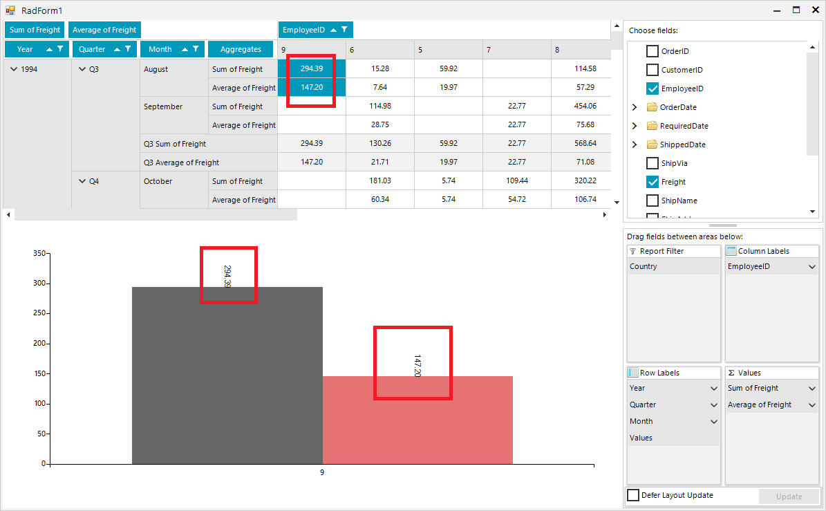
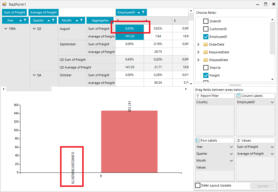
Once you select "% of Grand Total" for one of the aggregates, it would be good the respective chart labels to be formatted in a similar way out of the box:

Desired Behavior:
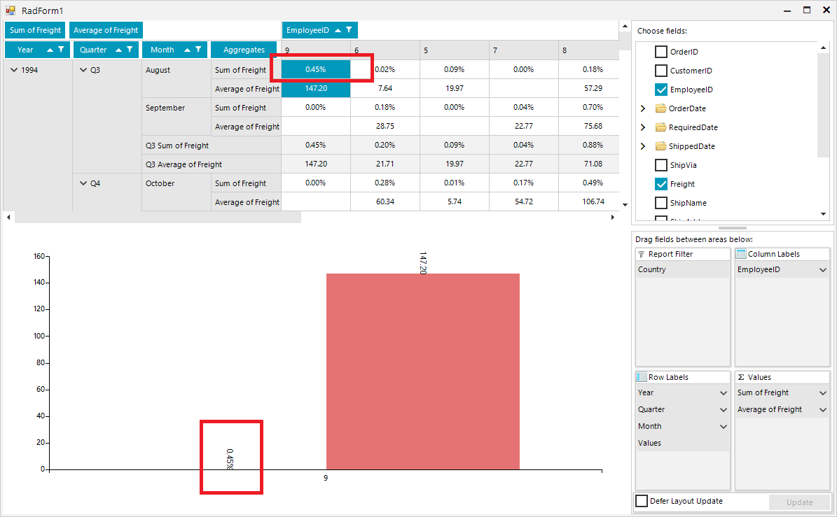
Actual behavior:
Improve performance, when calculating the positions of Smart Labels.
Good day,
My requierment is to have a RadChartView with a LineSeries and a RangeSeries. I add CategoricalDataPoint objects manually to the LineSeries and I manually add RangeDataPoint objects to the RangeSeries.
When I encounter NULL valued datapoints, for the LineSeries, I do the following. The NULL valued datapoints appear as gaps in the chart as expected.
Dim value As Nullable(Of Double)
Dim serControl  As  LineSeries

serControl = New LineSeries()
chart.Series.Add(serControl)
value = IIf(IsDBNull(dr(data.ControlParameter.ID.ToString())), New Nullable(Of Double), dr(data.ControlParameter.ID.ToString()))
serControl.DataPoints.Add(New Telerik.Charting.CategoricalDataPoint(value))
However the RangeSeries do not handle the NULL valued datapoints the same. I get the following error: Nullable object must have a value.
Dim LowerBound, UpperBound As Nullable(Of Double)
Dim serRange  As  RangeSeries

serRange = New RangeSeries()
chart.Series.Add(serRange)
LowerBound = IIf(IsDBNull(dr("Lowerbound"), New Nullable(Of Double), dr("LowerBound"))
UpperBound = IIf(IsDBNull(dr("Upperbound"), New Nullable(Of Double), dr("UpperBound"))
serRange.DataPoints.Add(New Telerik.Charting.RangeDataPoint(UpperBound, LowerBound))
I need to be able to show gaps, not zero's in a RangeSeries when there are NULL values.
How can I do this?
Currently, RadChartView offers exporting to a Bitmap in one of the following formats: https://docs.microsoft.com/en-us/dotnet/api/system.drawing.imaging.imageformat?view=netframework-4.8
It would be nice to have export functionality to a vector image.
When setting the border color of the axis the labels are showing a border with the same color. The color is inherited from the axis element. One should be able to easily disable this, or it should not happen.

How to reproduce:
public partial class RadForm1 : Telerik.WinControls.UI.RadForm
{
    LineSeries lineSeries;

    public RadForm1()
    {
        InitializeComponent();

        this.lineSeries = new LineSeries();

        this.lineSeries.DataPoints.Add(new CategoricalDataPoint(20, "Jan"));
        this.lineSeries.DataPoints.Add(new CategoricalDataPoint(22, "Apr"));
        this.lineSeries.DataPoints.Add(new CategoricalDataPoint(25, "Jul"));
        this.lineSeries.DataPoints.Add(new CategoricalDataPoint(19, "Oct"));

        this.radChartView1.Series.Add(this.lineSeries);

        this.lineSeries.HorizontalAxis.BorderColor = Color.Green;
        this.lineSeries.VerticalAxis.BorderColor = Color.Blue;
    }
}

Workaround: iterate each of the axis labels and set their border color to Transparent
public partial class RadForm1 : Telerik.WinControls.UI.RadForm
{
    LineSeries lineSeries;

    public RadForm1()
    {
        InitializeComponent();

        this.lineSeries = new LineSeries();

        this.lineSeries.DataPoints.Add(new CategoricalDataPoint(20, "Jan"));
        this.lineSeries.DataPoints.Add(new CategoricalDataPoint(22, "Apr"));
        this.lineSeries.DataPoints.Add(new CategoricalDataPoint(25, "Jul"));
        this.lineSeries.DataPoints.Add(new CategoricalDataPoint(19, "Oct"));

        this.radChartView1.Series.Add(this.lineSeries);

        this.lineSeries.HorizontalAxis.BorderColor = Color.Green;
        this.lineSeries.VerticalAxis.BorderColor = Color.Blue;
    }

    protected override void OnShown(EventArgs e)
    {
        base.OnShown(e);

        foreach (var item in this.lineSeries.VerticalAxis.Children)
        {
            AxisLabelElement label = item as AxisLabelElement;
            if (label != null)
            {
                label.BorderColor = Color.Transparent;
            }
        }

        foreach (var item in this.lineSeries.HorizontalAxis.Children)
        {
            AxisLabelElement label = item as AxisLabelElement;
            if (label != null)
            {
                label.BorderColor = Color.Transparent;
            }
        }
    }
}
The same issue can be observed in a DPI-aware application on higher scaling
Workaround: set the RadControl.EnableDpiScaling property to false

public partial class Form1 : Form
{
    public Form1()
    {
        RadControl.EnableDpiScaling = false;

        InitializeComponent();

        LineSeries lineSeries = new LineSeries();
        lineSeries.DataPoints.Add(new CategoricalDataPoint(20, "Jan"));
        lineSeries.DataPoints.Add(new CategoricalDataPoint(22, "Apr"));
        lineSeries.DataPoints.Add(new CategoricalDataPoint(12, "Jul"));
        lineSeries.DataPoints.Add(new CategoricalDataPoint(19, "Oct"));
        this.radChartView1.Series.Add(lineSeries);

        LineSeries lineSeries2 = new LineSeries();
        lineSeries2.DataPoints.Add(new CategoricalDataPoint(18, "Jan"));
        lineSeries2.DataPoints.Add(new CategoricalDataPoint(15, "Apr"));
        lineSeries2.DataPoints.Add(new CategoricalDataPoint(17, "Jul"));
        lineSeries2.DataPoints.Add(new CategoricalDataPoint(22, "Oct"));
        this.radChartView1.Series.Add(lineSeries2);

        LassoZoomController lassoZoomController = new LassoZoomController();
        radChartView1.Controllers.Add(lassoZoomController);
    }

    private void radButton1_Click(object sender, EventArgs e)
    {
        this.radChartView1.ExportToImage(@"..\..\image.png", this.radChartView1.Size);
    }
}
How can I achieve the same behaviour as with the obsolete RadChart plotting the area between the maxima of a sine.
3D Charts will be a nice addition to the WinForms suite