Consider enhancing the ThemeBuilder applicaiton by providing options to export components from ThemeBuilder to Figma with the idea that FIgma designers will have an easier way to create Figma files based on the Kendo/Telerik components and their templates (including variations, functionalities and states)
Requested through t.1684034
Currently, the ThemeBuilder application supports and generates custom styles only for a Drawer with mode set to Push
Consider providing support for Drawer with the mode set to Overlay
Reference rendering: https://github.com/telerik/kendo-themes/blob/develop/tests/drawer/drawer-overlay.html
Mode demo: https://www.telerik.com/kendo-react-ui/components/layout/drawer/display_modes
requested throught t.1700544
We need a way to load/save themes. The theme editor is honestly not very useful as it is. This surely can't be hard to allow a user to upload a file and use that as the basis for making changes. A one-off configuration is not how development works. There was one ticket similar to this that was marked as fixed but bookmarking and loading from a page is a poor and easy way out way to do this imho.
Consider providing a configuration file that stores information about mapped variables (e.g. like Figma variables mapped to Kendo variables)
Example scenario:
1. Create a new Figma design based on UI Kit
2. Export it to ThemeBuilder
3. Map the 3rd party or figma-styles to the ThemeBuilder styles.
4. Save the mappings between them as some external config file
5. When I create a new project based on my customized UI kit and I export it to ThemeBuilder
6. Instead of re-doing for a new project the mappings for a couple of hours again by hand, load up the mappings file which I saved from the previous project and the tools just connects the dots.
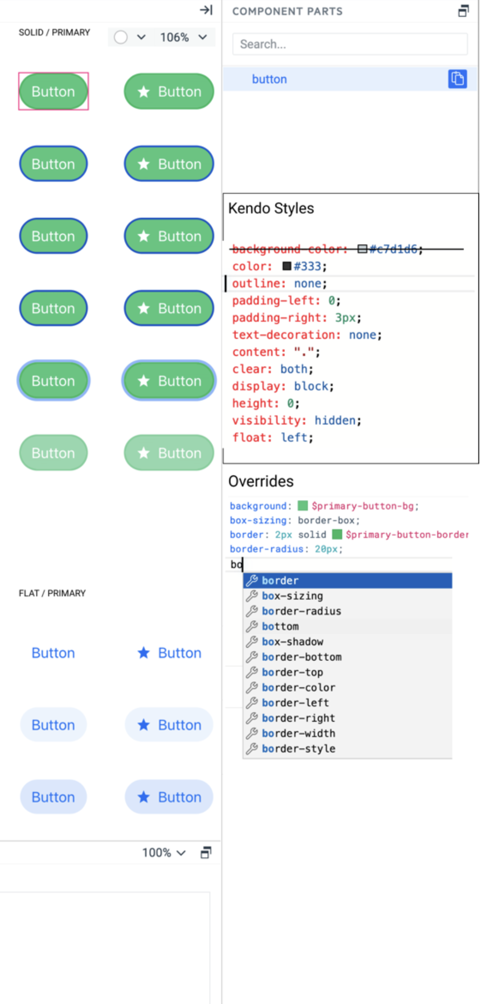
Add a new smart code editor as a variant of the Property Grid with all visual properties. Do not replace the property grid with this editor. They can live next to each other in different tabs. The smart code editor should support all features of the property grid but with advanced functionalities.
1. Show all kendo styles attached to the selected layer in a text format
2. Marks which style is overridden by user styles
3. Users can add any CSS property, not just the one listed by the Proprty grid editors.
4. Intellisense for CSS properties, something like:
5. Intellisense for using sass/css variables – the editor can recognize the property name and list only corresponding tokens for example – background – shows color tokens, box-shadow – shows effect tokens. Something like:
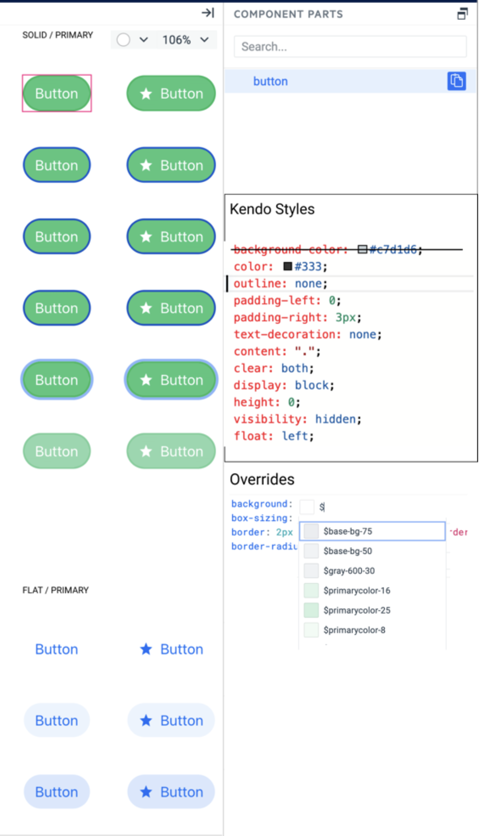
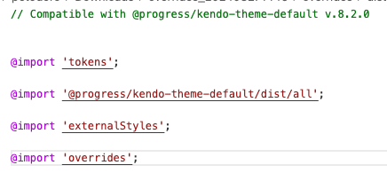
When the ThemeBuilder project has custom variables or variables exported from Figma in the output _tokens.scss file all variables are with the ‘tb’ or ‘figma’ prefix.
It will be good if these prefixes can be configuration options for the project and users can choose what prefix (or no prefix) should use.
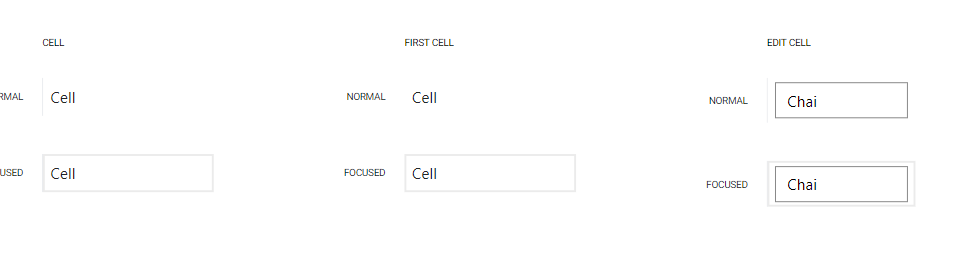
Add a Last Cell template for the Grid component similar to the First Cell template that we currently have exposed.
Requested through t.1626999
The Kendo Themes recently introduced an accessibility swatch A11y for the Default Ocen Blue theme https://www.telerik.com/kendo-angular-ui/components/accessibility/accessibility-swatch/
Feature request: Support for the Ocean Blue A11y Accessibility Swatch in ThemeBuilder.
Greetings,
I know it is possible to access these variables in SCSS given the right setup. However users might not always be in position to have that, for various reasons, e.g.:
- a person that doesn't have the time to setup that
- a person that doesn't want to setup that
- a person that doesn't know how to setup that
- a person that isn't authorized to setup that and has access only to the final CSS file
I think it would be nice to make ThemeBuilder available as CSS custom properties (aka "CSS variables"). Some info about this idea (I guess ThemeBuilder uses SASS behind the scenes?): Convert Sass variables to CSS variables · Issue #3091 · sass/sass (github.com)
Regarding the possibly large amount of variables, I think the ones visible in ThemeBuilder would cover the vast majority of cases.
Whether you intend on doing this or not, could you please document how the exported CSS file is generated behind the scenes? I tried reverse-engineering it since I originally wanted to be able to work on SASS code and then obtain the same result as ThemeBuilder. My guess:
- SASS generates a minified CSS file (with a sourcemap)
- minified CSS then go through Autoprefixer (PostCSS plugin)
- minified and autoprefixed CSS then go through calc (PostCSS plugin)
Thanks!
Consider exposing a ThemeBuilder template for the Popup component.
https://www.telerik.com/kendo-react-ui/components/popup/
https://docs.telerik.com/kendo-ui/controls/popup/overview
https://docs.telerik.com/blazor-ui/components/popup/overview
https://www.telerik.com/kendo-angular-ui/components/popup/
https://github.com/telerik/kendo-themes/blob/develop/tests/popup/popup-no-data.html
Currently, the Drawer components (such as Drawer and Drawer Mini) come with a right border that can't be modified through ThemeBuilder:
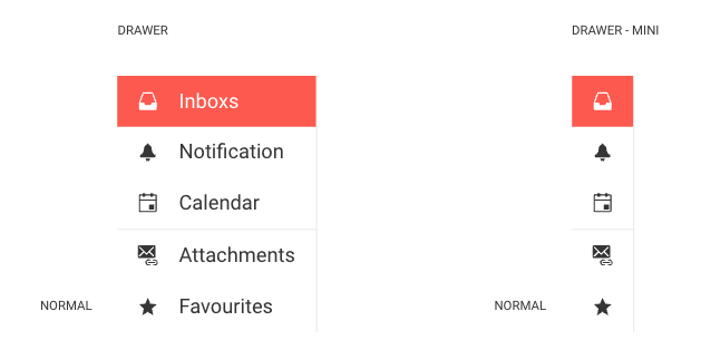
Consider exposing a template that allows to modify this border.
Currently you can only use and customize the default 6 Chart series colors (Kendo Colors Series A, B,C,D,E and F) using ThemeBuilder. Any additional ones needs to be defined in the component code. This is not ideal if you want to manage all colors from ThemeBuilder.
The request to have either have the ability to add new Chart series colors in the ThemeBuilder which you can use with the chart or have more variables exposed at the beginning 25+
Currently, the external CSS files come before the overrides generated through ThemeBuilder. Therefore, it becomes problematic to override these ThemeBuilder overrides with external styles.
Consider allowing the user to choose the order in which the external styles are applied —whether they should come before or after the ThemeBuilder overrides.
Requested through t.1662556.
Currently, there is no exposed template for the nested span of the Notification component. It becomes problematic if you have applied some styles (e.g., the color of the text) to the HTML element "span" and you want to override them through ThemeBuilder.
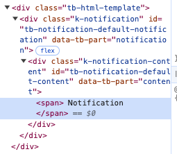
Consider exposing such component part.
Currently, the Checkbox component doesn't have an exposed template for modifying the pseudo-element ::before. If they decide to use font icons to style the icons for the checked and indeterminate states, they cannot achieve this through ThemeBuilder.
Requested through t.1663139.
Currently, the Calendar that is used in ThemeBuilder is considered "infinite", where we can change the months by scrolling. However, in Telerik UI for Blazor, the only calendar available is the "modern" one, which uses arrow buttons to change months. As a result, some of the styles we apply to the calendar templates in ThemeBuilder don't work with this calendar. Additionally, we are unable to style certain elements, like the arrow buttons, using ThemeBuilder.
https://github.com/telerik/kendo-themes/tree/develop/tests/calendarConsider exposing templates for a "modern" Calendar component.
Sometimes, errors occur in ThemeBuilder due to various reasons.
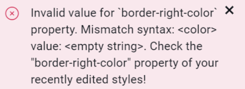
Consider including indicators in these errors to let the users know where they are located so they can possibly fix them through ThemeBuilder's user interface if applicable.
Requested through t.1667194.
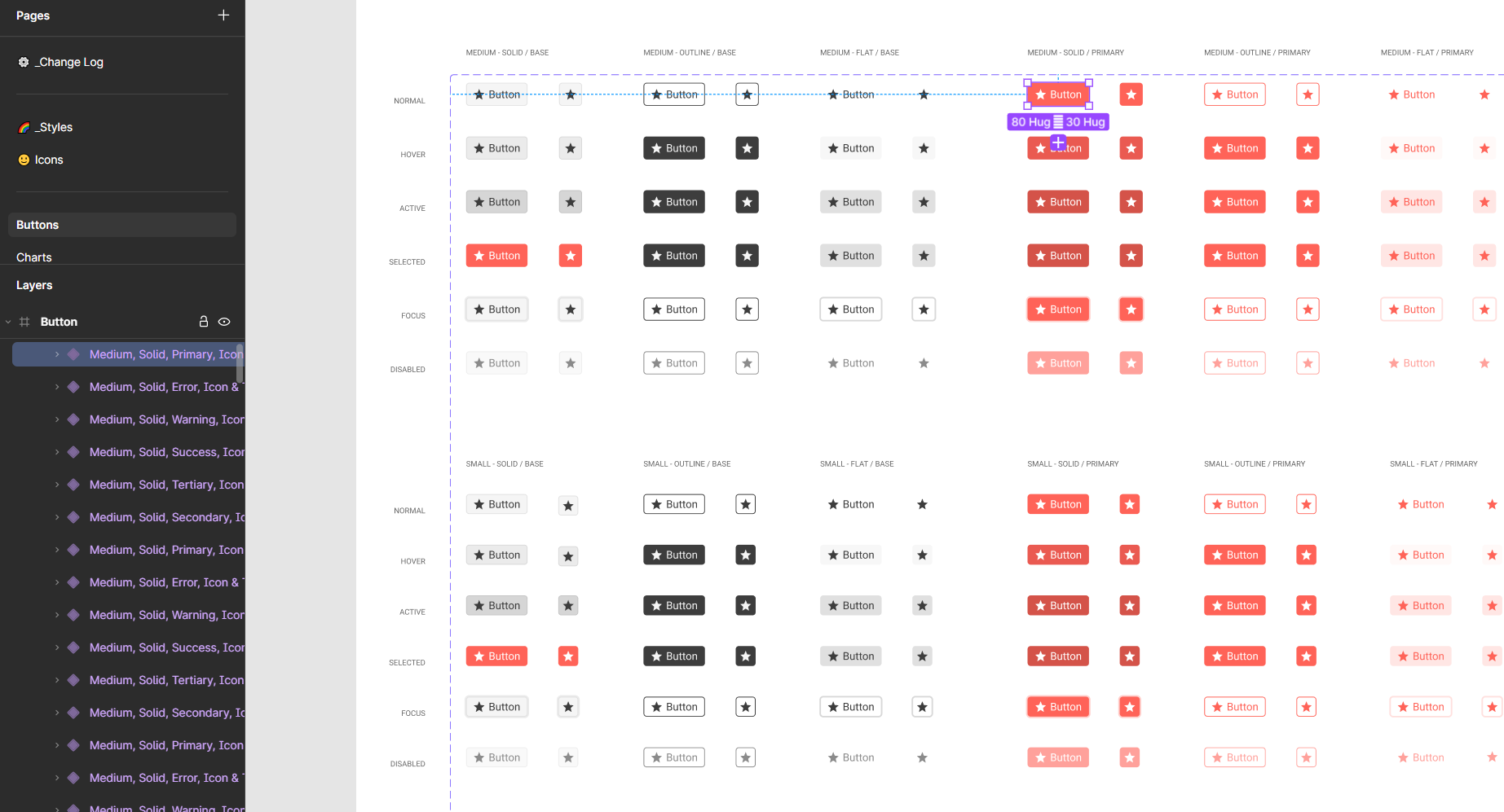
Consider adding a functionality that will allow the bulk export of component variants in Figma while using the Figma plugin for ThemeBuilder.
For example, an option to export and create all variants of the Button in the Telerik UI kit
Consider and research the options for automatically exporting and mapping styles from the Telerik UI Kits to the built-in Telerik/Kendo templates in ThemeBuilder.
Currently, when using Telerik UI Kit alongside the Figma plugin for ThemeBuilde, one can do one of the following:
- Export only the styles *& variables and then manually map the styles in ThemeBuilder
- Export and create custom components, which won't be connected to the Telerik/Kendo components and will have a custom HTML rendering.