We recently upgraded our theme builder to ultimate so we could migrate our theme builder project from R1 2023 to Q4 2024. After we did this there were some small changes we needed to fix but after that we followed all the normal installation procedures.
We are running angular 18 and have updated all kendo components to the latest versions.
After installing the new theme we also added/changed the way we imported the theme package following the documentation (using @use).
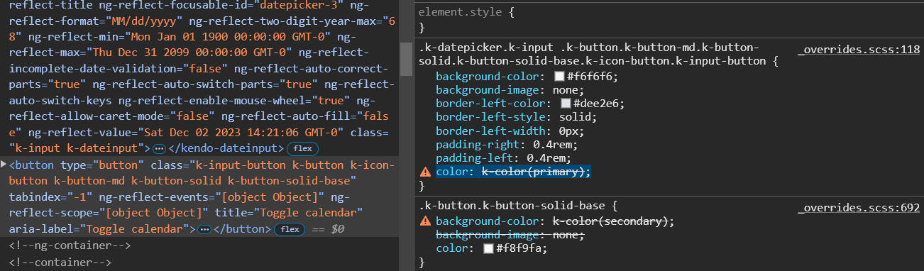
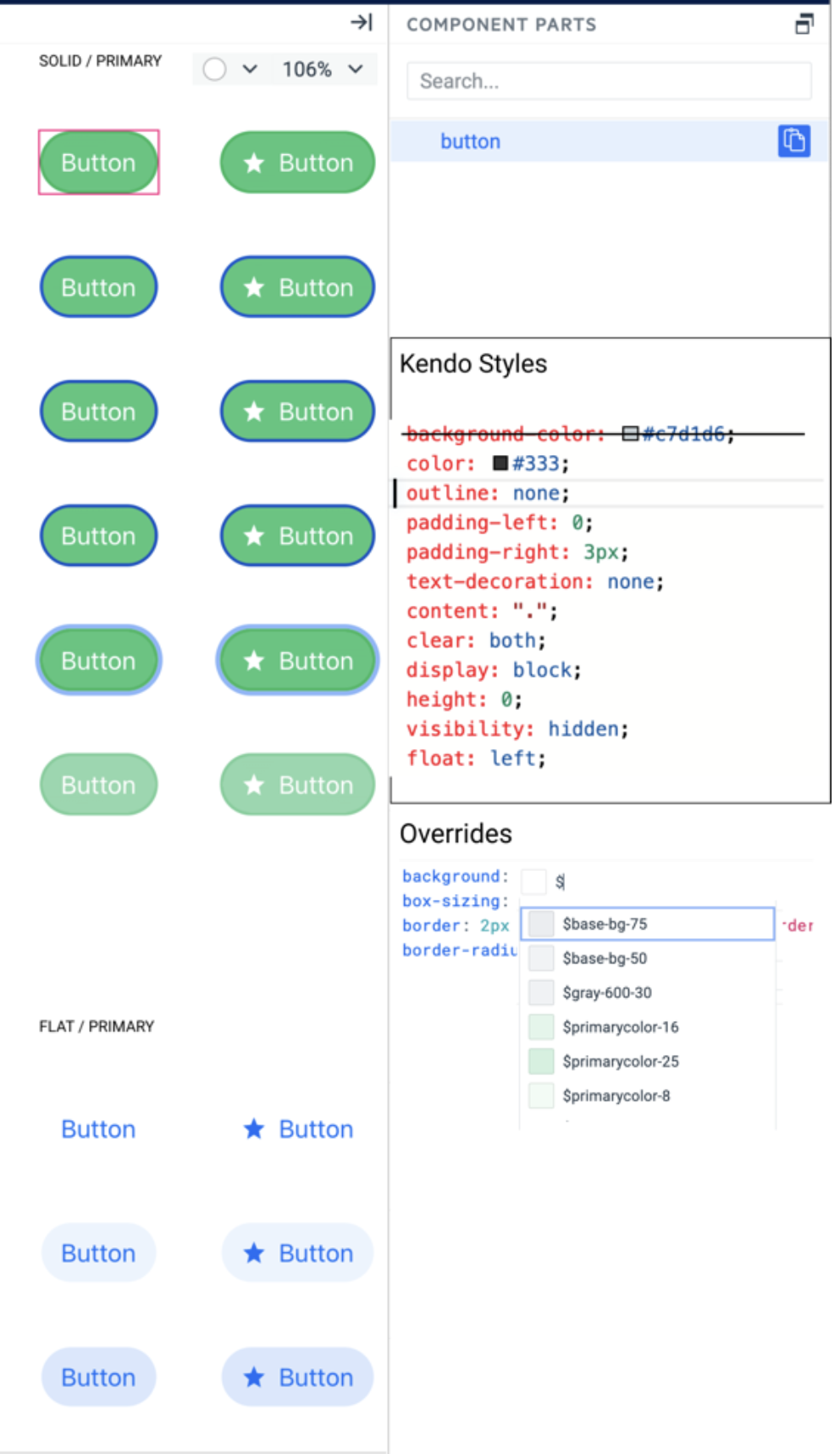
Most everything looks good but there is one large issue with several of our components and that is the kendo theme mixin "k-color" is not working.
In several places there is no color or background color being set on the component(s). When i inspect the style i see color: k-color(primary); is not working. dev tools states that the variable is wrong. i can only assume the mixin is not imported/being used.
Image of my description
The Progress ThemeBuilder currently has the Fluent theme (by Microsoft), but only the light version is available.
As for the other themes (kendo, bootstrap, material) would it be possible to have the dark version too?
Thank you,
best regards
Roberto
With Kendo theme version 8.0.0 the some radius variables like $kendo-border-radius were removed and are no longer present.
Instead, there is now a new feature called kendo-border-radii that automates the creation of different border-radius variables (e.g. like $kendo-border-radius-sm aor $kendo-border-radius-lg)
More about the new variables in Kendo Themes 8.0.0 and above are available in the official documentation:
https://www.telerik.com/design-system/docs/themes/theme-material/theme-variables/#variables
Consider exposing border-radius variables as they were present in older version but are not accessible in TB Q3 2024.
Steps to reproduce the bug
In Themebuilder:
- enable Advanced edit and edit the Grid component.
- Once there, in Grid Construction Elements, go to the GRID DEFAULT part.
- In the top-right element tree area, go in <div> Grid ---> <table> Table.
- Once there, set the Table > Border Collapse property to Separate
- Finally try applying two different values for vertical and horizontal spacing in the Table > Border Spacing property. If necessary, apply a visible border to cells to better see the issue.
Expected behavior : The two different values should be persisted and applied.
Actual behavior : The behavior is strange and editing one value seem to overwrite the other.
The Kendo Themes recently introduced an accessibility swatch A11y for the Default Ocen Blue theme https://www.telerik.com/kendo-angular-ui/components/accessibility/accessibility-swatch/
Feature request: Support for the Ocean Blue A11y Accessibility Swatch in ThemeBuilder.
Currently, in ThemeBuilder, each uploaded font must have a unique font family name.
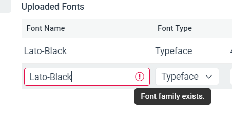
However, in some cases, we would like to add multiple font variants (files) via the same font family name (e.g., all named "Lato") and let the user control them through typography variables (from where users should be able to control the specific weight, type, etc.).
Q: Can one css file be produced for just the components selected in ThemeBuilder?
Ideally, we would like to have the option to produce only partial themes for specific components. This will allow to minimize the size of the output CSS/SASS files, which will allow us to lower the size of the end application.
Alternative ways to achieve similar results through manual application builds: https://docs.telerik.com/themebuilder/partial-theme-build
Hello,
I'm able to customize the components of the webpage, like buttons, grids, etc., but not the entire webpage. Can you support to design an entire webpage using ThemeBuilder so that I can create a login page instead of creating login.css.
Hello,
The MultiSelect and ComboBox Icons seem to have issues. First, in the MultiSelect, I'm not able to customize the icon within the IconButton. In the similar ComboBox, I can customize the icon, but the change is not reflected in the live view.
I would expect that all the clear "X" icons within the dropdown components would inherit from the base TextBox "Clear Icon" but they don't.
Regards,
Brian
When the ThemeBuilder project has custom variables or variables exported from Figma in the output _tokens.scss file all variables are with the ‘tb’ or ‘figma’ prefix.
It will be good if these prefixes can be configuration options for the project and users can choose what prefix (or no prefix) should use.
Consider the option to expose predefined classes of HTML elements from the Kendo themes. This would allow atomic customization and mapping to other imported variables (like ones imported from Figma designs).
For example:
An option to style the H1 header from the Kendo theme, which has the .k-h1 class.
Add a new smart code editor as a variant of the Property Grid with all visual properties. Do not replace the property grid with this editor. They can live next to each other in different tabs. The smart code editor should support all features of the property grid but with advanced functionalities.
1. Show all kendo styles attached to the selected layer in a text format
2. Marks which style is overridden by user styles
3. Users can add any CSS property, not just the one listed by the Proprty grid editors.
4. Intellisense for CSS properties, something like:
5. Intellisense for using sass/css variables – the editor can recognize the property name and list only corresponding tokens for example – background – shows color tokens, box-shadow – shows effect tokens. Something like:
As the subject suggests, I think the ability to support multiple swatches in a single project would be a fantastic addition to Themebuilder!
This change would allow a user to select a theme that'll encompass an app's light mode, and once finished, select a separate theme to repeat the process for dark.
As it currently stands, separate Themebuilder projects need to be created in order to separate light and dark themes.
Thank you in advance for your consideration!

I want to upload 2 variants of the same font (let's say Roboto with weight 300 and 500).
Then I want to configure the same font family for both of them.
This is currently not allowed (see attached screenshot).
I have to choose different names which results in an export like this:
@font-face {
  font-family: Roboto300;
  src: url('../fonts/roboto-v18-latin_latin-ext-300.woff') format('woff');
  font-style: normal;
  font-weight: 300;
  font-display: auto;
}

@font-face {
  font-family: Roboto500;
  src: url('../fonts/roboto-v18-latin_latin-ext-500.woff') format('woff');
  font-style: normal;
  font-weight: 500;
  font-display: auto;
}
But what I want to achieve is this:
@font-face {
  font-family: Roboto;
  src: url('../fonts/roboto-v18-latin_latin-ext-300.woff') format('woff');
  font-style: normal;
  font-weight: 300;
  font-display: auto;
}

@font-face {
  font-family: Roboto;
  src: url('../fonts/roboto-v18-latin_latin-ext-500.woff') format('woff');
  font-style: normal;
  font-weight: 500;
  font-display: auto;
}
My use case is that I want to set the font family only once and the just set different font-weight for individual components.
Also, we have migrated to Kendo / ThemeBuilder in our existing project which relies on fonts to be configured this way.