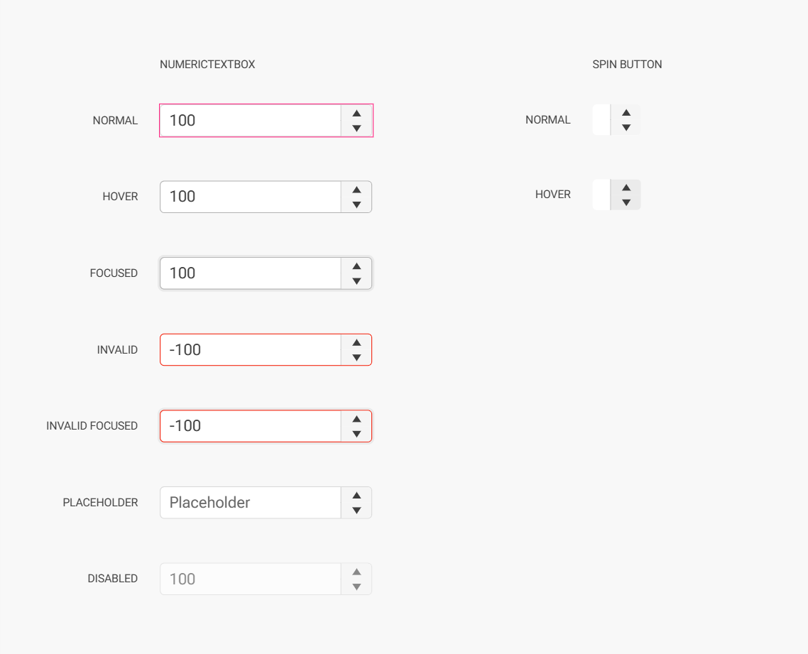
I am having difficulty to theme the NumericTextBox in outline mode. Theme builder shows correctly the themed component, with some difficulties... it seems that I need to set everything up multiple time in order for the tool to store the new values.
When I use the exported theme in a Blazor application, the outline numeric textbox is not able to theme the spinner buttons (up and down) and they default to base color, whitish in light themes, and loose borders when hovering over it. I am attaching the output css from theme builder.
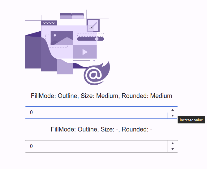
In theme builder I see the following
ThemeBuilder version Q1 20256 is no longer using KendoReact as a live preview tool and instead uses a static HTML package as a source of truth. The benefit is that the ThemeBuilder now uses the Kendo Theme rendering as the source of truth (compared to older versions, where the source of truth was the KendoReact rendering).
However, the downside of that approach is that there is no longer a live preview for designers to see and feel the changes made to the theme.
Consider adding the option to preview a custom ThemeBuilder theme via the "Open in REPL" functionality across all Kendo/Telerik suites. This would provide a great benefit for users by enabling them to live preview the changes in any supported Kendo / Teleri framework (and not only KendoReact is in the older versions)
Consider supporting extended collections in Figma.
Currently, the Themebuilder plugin for Figma can export only variables from the main collections.
More about the extended collections (available only with Figma Enterprise) here:
https://help.figma.com/hc/en-us/articles/36346281624471-Extend-a-variable-collection
Requested through t.1713217
Hey,
I want to add an Opacity Token but am only left with the option to write a % value manually.
Can you please add the option to select a token inside of a components Opacity Selection?
Greetings
Alex
Hey,
I am working with selfmade tokens imported from Figma to Themebuilder. I would like to edit multiple tokens in Themebuilder. E.g. batch edit all token names at once. Is there a way to do that currently? Or something planed like a multiselect in the settings window for tokens?
Thanks
Alex
Modern CSS supports nesting. This would seem to be a good way to cut down on the overall size of the export file.
Are there any plans to update ThemeBuilder to support CSS nesting?
Ex.
Instead of this...
.fk-daterangepicker .k-input-suffix,
.fk-daterangepicker .k-input-prefix {
  cursor: pointer;
  &:hover {
  background-color: var(--kendo-color-primary-subtle-hover);
  }
}
I have to define this set of styles like this...
.fk-daterangepicker .k-input-suffix,
.fk-daterangepicker .k-input-prefix {
  cursor: pointer;
}
.fk-daterangepicker .k-input-suffix:hover,
.fk-daterangepicker .k-input-prefix:hover {
  background-color: var(--kendo-color-primary-subtle-hover);
}
Repeating this pattern over an entire design system adds a lot of extra text...
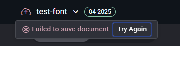
My projects in Themebuilder breaks whenever I try to change the font size!
Steps to reproduce the error:
- Create a new project (Font icons, Q4 2025 latest, Bootstrap)
- Click on "Project setting".
- Click on "Metrics".
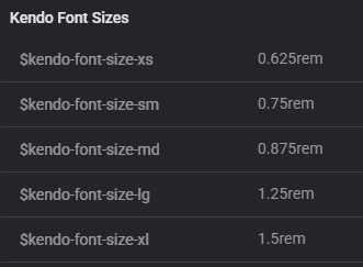
- Change:
- $kendo-font-size-md: 0.875rem
- $kendo-font-size-sm: 0.75rem
- $kendo-font-size-xs: 0.625rem
- Close project settings.
- Now the project is broken.
- Crash in javascript console:
Uncaught _P: There are errors in SASS and it cannot be compiled to CSS.
PATCH https://themebuilderapp.telerik.com/api/v1/projects/6928717ab857146bc01d9a2e/variables 500 (Internal Server Error) - The project cannot be saved:
- Crash in javascript console:
- It is no longer possible to load the project. The same error appears in the console as shown above.
- If I export the metadata from this broken project from the Dashboard and import it into a new project, that project also breaks. I have attached the metadata.

Please help!
Consider adding support for compiling Typography or Effects variables in ThemeBuilder to CSS variables (in the compiled CSS).
Currently, only color and metrics variables are compiled to CSS variables.
Requested through t.1702497
Currently, the ThemeBuilder application supports and generates custom styles only for a Drawer with mode set to Push
Consider providing support for Drawer with the mode set to Overlay
Reference rendering: https://github.com/telerik/kendo-themes/blob/develop/tests/drawer/drawer-overlay.html
Mode demo: https://www.telerik.com/kendo-react-ui/components/layout/drawer/display_modes
requested throught t.1700544
Expose additional styling templates for a Grid component that uses stacked columns (a.k.a. as stacked display mode):
https://www.telerik.com/blazor-ui/documentation/components/grid/columns/stacked
https://demos.telerik.com/kendo-ui/grid/stacked-display-mode
https://www.telerik.com/kendo-angular-ui/components/grid/styling-and-appearance/stacked-layout-mode
Hello,
I'm building my first .net9+ Blazor Hybrid + Web app. I can see that theming is going to be a problem between the Blazor Web UI theme and the native app areas that use App.xaml resources. I'd like to request/suggest that theme builder can take a theme which is typically exported in CSS and also have the option to generate the App.xaml resources so my app native or using Web UI share a common theme.
Thank you.
This is an incredibly important feature for a tool like a "ThemeBuilder" to do. There are too many colors for someone to easily swap out, which makes the tool hard to manage for color. I know we can use another tool to create color palettes and then plug it in, but honestly this is one of the top things a ThemeBuilder should do.
It should make swapping color categories simple by allowing you to select the colors for primary, danger, warning, tertiary, info, etc. and then the tool generates a color palette within the color family automatically. Then, if the user does not like any of the colors automated, they could manually swap them out like they do today.
Hi,
right now you are not able to style the adornments for example of a numeric textbox in ThemeBuilder.
It would be nice if that could be added.
Thanks,
Nina
Consider enhancing the ThemeBuilder applicaiton by providing options to export components from ThemeBuilder to Figma with the idea that FIgma designers will have an easier way to create Figma files based on the Kendo/Telerik components and their templates (including variations, functionalities and states)
Requested through t.1684034
Consider adding support for CSS breakpoing / media queries in ThemeBuilder.
https://developer.mozilla.org/en-US/docs/Web/CSS/CSS_media_queries/Using_media_queries
https://www.w3schools.com/howto/howto_css_media_query_breakpoints.asp
This will enable users to create response design directly within the ThemeBuilder application.
Requested through t.1682156
Expose styling templates for the Wizard components available in the Kendo/Telerik suites
https://github.com/telerik/kendo-themes/tree/develop/tests/wizard
https://demos.telerik.com/blazor-ui/wizard/overview
https://www.telerik.com/kendo-react-ui/components/form/wizard
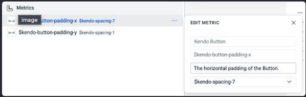
Consider making the generated CSS to contain CSS variables instead of compiled CSS. Currently, that is possible only when using direct variables like $kendo-spacing-1.
However, with the current state (Q1 2025), ThemeBuilder will produce compiled value in the CSS when the variables are non-direct (refer to the first screenshot). In the example below the $kendo-spacing-7 is costom added to the $kendo-button-padding-x and as a result, will be compiled as a value
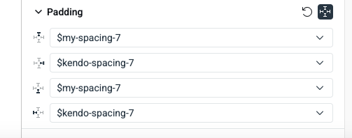
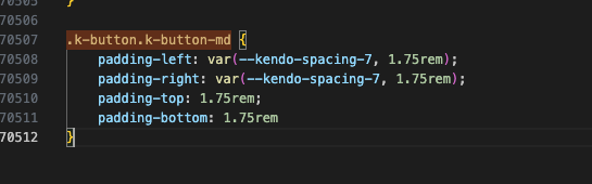
or when the variable is custom-created (second screenshot).
In the example, below the kendo-spacing-7 is used directly and is generated as variable, but $m y-variable is compiled as a value.
Requested through t.1679417
Consider exposing a styling template for the PropertyGrid component
https://demos.telerik.com/kendo-ui/propertygrid/index
It would be helpful for the "< Back" button on the Advanced Edit workspace to take you back to the same scroll position on the Live Preview page (history management). Currently, the back button takes you to the top of the page. This would be helpful when editing several components at the same time.