When setting the ComboBox ItemsSource to be Dictionary, the values are not displayed in the drop down.
Workaround:
The dictionary should be converted to List:
    public Dictionary<string, string> Status { get; set; } = new() { { "1", "Test" }, { "2", "hello" } };
    public IList<string> Data { get => this.Status.Values.ToList(); }
I would like to see a new feature in the RadComboBox for "Select All" functionality.
Here is the general functional paradigm I'm hoping to see.
1. All Selection
- If user checks Select All, it should display every item in the list as checked
- If user unselected All then every item should be unchecked.
2. Partial Deselection
- If user unselect only one item, then it should only unselect that item, but also uncheck the "Select All" checkbox, while leaving the reaming items still checked.
When you add Telerik .NET MAUI controls that use icons, such as ComboBox, AutoComplete, etc, there are font-related exceptions in the output.
Although the exceptions do not affect the behavior and appearance of the controls, they make the output hard to read.
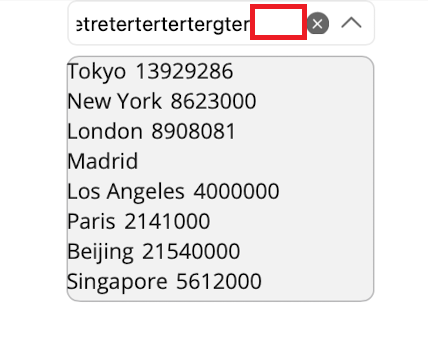
If a "long" placeholder value is set when the user selects a few of the items from the multi-select combobox and taps off of the combobox, the combobox is left displaying extra whitespace below.
System.InvalidOperationException: Event registration is overwriting existing delegate. Either just use events or your own delegate: Microsoft.Maui.Controls.Handlers.Items.ReorderableItemsViewDelegator`2[Microsoft.Maui.Controls.ReorderableItemsView,Microsoft.Maui.Controls.Handlers.Items.ReorderableItemsViewController`1[Microsoft.Maui.Controls.ReorderableItemsView]] UIKit.UIScrollView+_UIScrollViewDelegate
at UIKit.UIApplication.EnsureEventAndDelegateAreNotMismatched(Object del, Type expectedType)
at UIKit.UIScrollView.EnsureUIScrollViewDelegate()
at UIKit.UIScrollView.add_Scrolled(EventHandler value)
at Telerik.Maui.Controls.RadPopup.SetPopupIsOpen(Boolean value)
at Telerik.Maui.Controls.RadPopup.UpdatePopup()
..................
I tested Android and iOS only. Other platforms i cannot test at the moment.
Given the following implementation of the Combobox i observ different behaviour if the bound item is a enum or a class.
<telerik:RadComboBox x:Name="a"
                     ItemsSource="{Binding CloudProviders}"
                     SelectedItem="{Binding SelectedCloudProvider}"
                     IsClearButtonVisible="False">
    <telerik:RadComboBox.ItemTemplate>
        <DataTemplate>
            <Grid HeightRequest="40"
                  Padding="10">
                <Label Text="{Binding Title}"
                       TextColor="{DynamicResource DisabledTextColor}"
                       FontSize="14" />
            </Grid>
        </DataTemplate>
    </telerik:RadComboBox.ItemTemplate>
    <telerik:RadComboBox.SelectedItemTemplate>
        <DataTemplate>
            <Grid HeightRequest="40"
                  Padding="10">
                <Label Text="{Binding Title}"
                       TextColor="{DynamicResource DisabledTextColor}"
                       FontSize="14" />
            </Grid>
        </DataTemplate>
    </telerik:RadComboBox.SelectedItemTemplate>
</telerik:RadComboBox>
If the Itemssource is a Array of a enum type it works as intended.
If the Itemssource is a Array of classes the initial selected display member is not visible. The moment i tap into the closed combobox, the selected member is visible.
The attached screenshots show the page after loading and after touching into the white area(combobox) once.
For Localization and more details, we want to use classes. Is this a bug or do we have a issue in our code here?
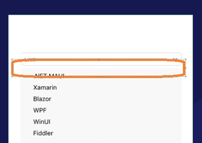
Provide an option to modify the ComboBox so there is no space between the ComboBox and the dropdown.
We would like to be able to override the behavior of the Clear button in the editable combo box.
When the user has started typing into an editable combo box, and they click the Clear button before they've selected another item, we want to revert their text to what was in there before they started typing and keep the previously selected item selected, rather than clearing the text and selected item.
If you can add that functionality, even better, but it should be enough to just expose the Clear button's Click event (with a Cancel param or another way to ensure the text isn't cleared), so we can override the current functionality.
Hi Team,
We have a need for being able to dynamically choose a template for the three available DataTemplate:
Thank you,
Teddy
Reduce the space between the text and the X button.
Hi Team,
Currently, the popup for the RadComboBox doesn't allow you to make it wider than the ComboBox's width (even if you set ItemTemplate to be wider).
The only available properties for styling the "dropdown/popup' are listed here https://docs.telerik.com/devtools/maui/controls/combobox/styling, which happens to include DropDownHeight, but not Width.
This feature request asks you to allow us to set this DropDownWidth via Style, Property, ControlTemplate, or whatever best fit the control architecture.
Thank you,
Matthew
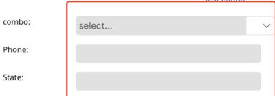
The width of RadEntry, RadMaskedEntry, and RadComboBox are the same on windows, android and ios. On mac there is difference when the width of the defined Column is set to * in grid:
MacCatalyst:
Windows:
Whenever the combobox doesn't have enough space to be displayed on the screen, the footer gets pushed to the bottom and off the dropdown popup.
This was tested on Telerik 3.0 but I also tested it on 3.1, 3.2, 3.2.1, and 4.0 with the same results.


