Progress/Telerik --
I would like Telerik to extend the Microsoft .NET MAUI MediaPicker control to support the selection of MULTIPLE Photos and/or Videos from the Image Gallery.
I believe this is a reasonably standard scenario for use cases where the user takes multiple Photos or Videos with the Camera and then would like to upload them to a server for storage in a web app and database.
The current Microsoft MediaPicker supports the selection of a SINGLE item only.
.NET MAUI - Platform Integration - Media - Photos and Videos
And while there are several GitHub libraries that have done this for Xamarin.Forms (and rely on Xamarin.Essentials), they are either archived or not updated in a timely manner like a 3rd Party - Paid For - Control would be.
Even Telerik/Progress has recently done a Blog Post on how to use the Microsoft Control - Leomaris Reyes published this:
Getting Started with the Media Picker in .NET MAUI
Also, I believe this Feature Request is asking for the same feature:
https://feedback.telerik.com/maui/1552553-upload-images-file-via-in-net-maui
Now, for me personally, I only need multiple image selection. So, if that's easier without the support for the other pieces, I would be happy. To be complete, I'm thinking others would need to select multiple videos.
From Ms. Reyes Blog Post....
private async void TakePhoto(object sender, EventArgs e)
{
  FileResult photo = await MediaPicker.Default.PickPhotoAsync(new MediaPickerOptions
  {
    Title = "Select your photo"
  });

  // Here, add the code that is being explained in the next step.

}
The new control would have something like this:
private async void TakePhoto(object sender, EventArgs e)
{
  IEnumerable<FileResult> photos = await RadMediaPicker.PickPhotosAsync(new MediaPickerOptions
  {
    Title = "Select your photos"
  });

  // Here, add the code to loop through and process the selected images

}
Please let me know if you require additional information.
We have discovered an error when you implement IWindowCreator and create custom window and connect viewmodel via AddSingleton approach
This is the stack-trace:
at System.ThrowHelper.ThrowArgumentOutOfRange_IndexMustBeLessException()

at System.Collections.Generic.List`1.get_Item(Int32 index)

at Telerik.Maui.RadScreen.GetPixelScale(DipScaleType dipScaleType)

at Telerik.Maui.Controls.RadScreenControls.GetPixelScale(VisualElement visualElement, DipScaleType dipScaleType)

at Telerik.Maui.Controls.SkiaSharp.SkiaPainter.GetPixelScale()

at Telerik.Maui.Controls.SkiaSharp.SkiaPainter..ctor(SkiaPainterCacheSettings cacheSettings)

at Telerik.Maui.Controls.Compatibility.DataGrid.MasterArranger..ctor(RadDataGrid dataGrid, NonLayoutPanel root, SkLayoutSlotProvider skLayoutSlotProvider)

at Telerik.Maui.Controls.Compatibility.DataGrid.RadDataGrid.InitArrangers()

at Telerik.Maui.Controls.Compatibility.DataGrid.RadDataGrid.Telerik.Maui.Controls.Compatibility.DataGrid.IGridView.AttachColumn(DataGridColumn column)

at Telerik.Maui.Controls.Compatibility.DataGrid.GridModel.AttachColumn(DataGridColumn column)

at Telerik.Maui.Controls.Compatibility.DataGrid.DataGridColumnCollection.AttachColumn(DataGridColumn column)

at Telerik.Maui.Controls.Compatibility.DataGrid.DataGridColumnCollection.InsertItem(Int32 index, DataGridColumn item)

at System.RuntimeMethodHandle.InvokeMethod(Object target, Void** arguments, Signature sig, Boolean isConstructor)

at System.Reflection.MethodBaseInvoker.InvokeDirectByRefWithFewArgs(Object obj, Span`1 copyOfArgs, BindingFlags invokeAttr)
Runtime exception with Microsoft .NET 8.0.100:
*** NSForwarding: warning: object 0x600002199c20 of class 'Telerik_Maui_Controls_Compatibility_ChartRenderer_iOS_TKExtendedChart' does not implement methodSignatureForSelector: -- trouble ahead
*** NSForwarding: warning: object 0x600002199c20 of class 'Telerik_Maui_Controls_Compatibility_ChartRenderer_iOS_TKExtendedChart' does not implement doesNotRecognizeSelector: -- abort
The issue occurs on:
Nuget - Telerik.UI.for.Maui 6.7.0
Maui Version 8.0.7
.NET SDK 8.0.100
Simulator - iOS 16.4 and 17.2 (Version 15.2 -1019)
Best regards
Regardless of the RadEntry's BackgroundColor property, I've noticed the visible-background-color to differ when the RadEntry receives active focus.
The observed behavior is this:
- RadEntry's visible-background-color generally equals RadEntry's BackgroundColor property
- RadEntry's visible-background-color changes to gray when hovered regardless of day-night mode
- RadEntry's visible-background-color changes to white when focused
- RadEntry's visible-background-color restores to RadEntry's BackgroundColor when unfocused
Typically, in day mode settings (Windows default), the RadEntry's BackgroundColor == white so you don't see the problem. However, in night mode settings (Android default), we want the RadEntry's BackgroundColor == black so the problem is more prevalent since you're typing white text on a white background.
When using Visual States, and, if you try to re-enforce the same BackgroundColor property in all of the visual states, sometimes focus, hover, unfocus, hover, focus sequence will allow you to edit in the RadEntry in your desired RadEntry's BackgroundColor property instead of white, but, most of the time is white.
This problem can be reproduced on Windows and Android if you set your application to night mode Application.Current.UserAppTheme = AppTheme.Dark and set RadEntry's BackgroundColor=Black and TextColor=White in XAML. Put 2 or 3 RadEntry's on the page so you can navigate between them to see the problem.
Hello,
there is probably a Bug in the ListPicker Commands. (https://docs.telerik.com/devtools/maui/controls/listpicker/commands)
Like in the example:
  private void OnAccept(object obj)
    {
        // implement your custom logic here
    }
the object is null.
Shouldn't you get the selected value for further implementations?
Hi,
Similar to WPF: WPF DataServiceDataSource - Overview - Telerik UI for WPF
Add gRPC as an alternative to WCF.
Thanks,
When programatically trying to add an item to RadComboBox.SelectedItems (in multiple selection mode) similar to this answer, we get an ArgumentOutOfRangeException on iOS. It works fine on Android.
The stack trace is strange:
[0:] {"@t":"2023-11-15T20:53:41.1123080Z","@mt":"Unhandled Exception","@l":"Fatal","@x":"System.ArgumentOutOfRangeException: Index was out of range. Must be non-negative and less than the size of the collection. (Parameter 'index')at System.Collections.Generic.List`1[[System.Double, System.Private.CoreLib, Version=8.0.0.0, Culture=neutral, PublicKeyToken=7cec85d7bea7798e]].get_Item(Int32 index)
at Telerik.Maui.RadWrapLayoutManager.ArrangeChildren(Rect bounds)
at Microsoft.Maui.Controls.Layout.CrossPlatformArrange(Rect bounds)
at Microsoft.Maui.Platform.MauiView.CrossPlatformArrange(Rect bounds)
at Microsoft.Maui.Platform.MauiView.LayoutSubviews()
at UIKit.UIApplication.UIApplicationMain(Int32 argc, String[] argv, IntPtr principalClassName, IntPtr delegateClassName) in /Users/builder/azdo/_work/1/s/xamarin-macios/src/UIKit/UIApplication.cs:line 58
at UIKit.UIApplication.Main(String[] args, Type principalClass, Type delegateClass) in /Users/builder/azdo/_work/1/s/xamarin-macios/src/UIKit/UIApplication.cs:line 94
at TeamDynamix.Mobile.WorkManagement.Program.Main(String[] args) in C:\\git\\enterprise\\mobile-app\\TeamDynamix.Mobile.WorkManagement\\Platforms\\iOS\\Program.cs:lin
When I compile my project with <WindowsPackageType>None</WindowsPackageType> option, icons ar enot displayed in Telerik controls (like richeditor)
Same project compiled with package and deployed are ok
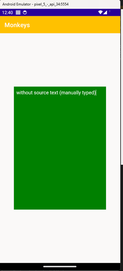
When the Source of a RadRichTextEditor is set, the TextColor is always black. Tested on Android:
  <Grid HeightRequest="400"
        WidthRequest="300">
    <telerik:RadRichTextEditor x:Name="RichTextEditorControl"
                               Source="with source text"
                               TextColor="White"
                               BackgroundColor="Green" />
  </Grid>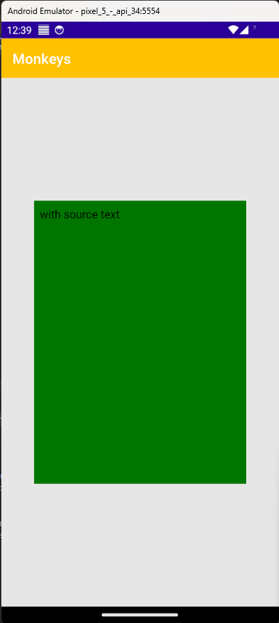
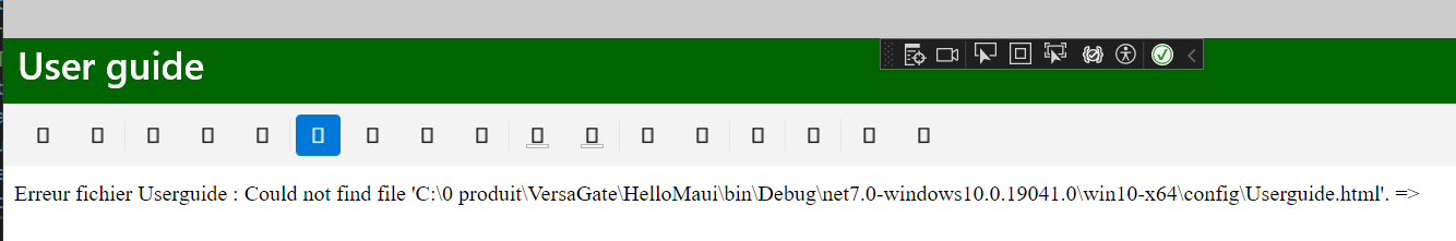
I have an html file with <img src="./images/ForkliftGateMainPage.png" alt="MainPage" width="1600" title="Page principale" />
The image is displayed when I open it with my browser, but not displayed with RadRichtextEditor, Why ?
I'm looking for a splitter control (to display master info on the left view and detailed info on the right view, and the possibility to resize both view)
i tried : Add Splitter control (telerik.com) but it's not working well (only moving a little bit, then it stops)
Any idea how to achieve this ?
Although Maui has SpreadProcessing, it lacks a matching control. For the very different WPF platform you have one I use, and it would be helpful in Maui to display and readily edit class instances with numerous properties. I realize it would be a challenge to fit into mobile screens, but I do hope you will consider it, as I am trying to get all my current WPF features into my Maui work-alike. Thank you.
David Pressman
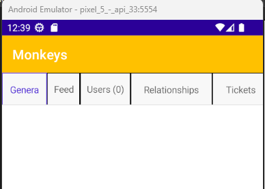
In certain situations, the RadTabView cuts off part of the header text for some of the headers. A specific scenario where this is happening is when the following tabs are present:
- General
- Feed
- Users (0)
- Relationships (0)
- Tickets (0)
- Attachments (0)
The problem is worse when the BorderThickness of the TabViewHeaderItem is set to 1
  <Grid>
    <telerik:RadTabView>

      <telerik:RadTabView.HeaderItemStyle>
        <Style TargetType="telerik:TabViewHeaderItem">
          <Setter Property="BorderColor"
                  Value="Black" />
          <Setter Property="BorderThickness"
                  Value="1" />
        </Style>
      </telerik:RadTabView.HeaderItemStyle>

      <telerik:TabViewItem HeaderText="General" />
      <telerik:TabViewItem HeaderText="Feed" />
      <telerik:TabViewItem HeaderText="Users (0)" />
      <telerik:TabViewItem HeaderText="Relationships (0)" />
      <telerik:TabViewItem HeaderText="Tickets (0)" />
      <telerik:TabViewItem HeaderText="Attachments (0)" />

    </telerik:RadTabView>
  </Grid>