It would be beneficial if the Kendo UI for Vue ColumnMenu had an option to display the visible columns as it is in Kendo UI for Jquery, instead of creating a custom columnMenu:
The current implementation of the Native Grid doesn't support the row reordering functionality when the Grid is configured to work in virtualization mode.
Please provide the row reordering functionality in a scenario with virtual scrolling.
In the current implementation of the GridColumnMenuCheckboxFilter component when its searchBox prop is set to true, the input that appears filters the component's values using the "startwith" filter operator.
Providing a property that can define the filter operator of the searchBox inside the GridColumnMenuCheckboxFilter will be a very useful feature.
The current implementation of the Native Grid doesn't provide the option to access its messages and use them in custom scenarios like Column Menu templates.
Providing the option to take the components' messages would be a nice to have feature.
There are multiple smaller Kendo UI for Vue Native components used inside the Native Grid. In some scenarios, the fine-tuning of the smaller components is essential for the usage of the Grid.
For example, the current implementation of the Grid doesn't provide an option to configure the formatting of the NumericTextBox displayed in the filter of its column menu. Now, to achieve the described functionality we have to use a custom column menu template.
Please add an option to control the configuration of the Native components used internally by the Grid.
Providing an Excel-like behavior inside the Native Grid will be a very nice feature for the component. The described behavior includes:
- Cells and rows selection like in Excel
- Editing like in Excel
- Keyboard navigation like in Excel
Currently, when we use a custom cell template, the rowIndex is not available inside the properties object when a specific row is in edit mode.
If the visualized dataItem is not in edit mode the rowIndex is available in the dataIndex prop but this property disappears when the dataItem enters in edit mode.
Please make the dataIndex prop available no matter if a dataItem is in edit mode or not.
If the Grid is initialized with no items, the first call to resetTableWidth as part of the initialization sets the width style on the k-grid-table to 0px.
If any items are added afterwards this style remains, even though the autogenerated columns have a greater width. This leads to the grid not being visible until its size is set manually.
Sample (Grid demo with column definitions removed and changed load the data after mount instead of after creation): https://codesandbox.io/s/late-hill-rkdhc5?file=/src/Grid.vue
Add groupHeaderColumnTemplate, as in Kendo jQuery Grid and Kendo Vue Wrapper Grid, that can be applied as it is done in this demo https://demos.telerik.com/kendo-ui/grid/aggregates.
The current implementation of the Native Vue Grid doesn't provide an option to control the visibility of the column menu in each component column.
Providing a property that can control the visibility of the different column menus will be very useful in scenarios when we want to create a customized column menu that contains a component with a popup. With the current implementation of the component, if we for example add a DatePicker to the column menu, the opening of the DatePicker's calendar triggers the closing of the column menu. Having a prop that controls the visibility of the column menu we can easily handle the described scenario.
With the current implementation of the Native Grid, if one needs to set a minimum width to a column that needs to add the implementation suggested in this Setting a Minimum Column Width example.
While the approach in the above example works as expected, the logic that needs to be added can be internal for the Grid component. Thus the users will have to add a simple column property like the below and no other configuration should be set.
  {
    field: "ProductName",
    title: "Name",
    minWidth: 200
  }
In the jQuery version of the Grid, the columnMenu can be configured to show/hide the different column menu options.
Here is an example of how the sortable prop can be configured in a way the sorting options will be hidden in the column menu.
Please provide the same configurations options for the column menu in the Native Grid
The native Grid allows you to lock selected columns inside it. When we have locked columns, these are constantly visible inside the Grid, while the unlocked columns can be horizontally scrolled to see their content.
The width of the area in which the unlocked columns can be scrolled depends on a combination of the following:
- The number of locked columns
- The width of the locked columns
- The width of the Grid
Having the above, there are some scenarios in which the area where the unlocked columns are displayed can be covered by locked columns or its size can become so small that the Grid data cannot be read.
Some examples of how the area that displays the unlocked column can become invisible or minified in size are:
- In a Grid with many columns, define many of them as locked
- In a Grid with resizable columns, resize one or a few of the columns in a way their sum width is bigger than the Grid's width
- A few Grid columns are locked but the Grid's width is too small
The current Feature request is about a property that defines the minimum width of the area in which the unlocked columns are scrolled. It could be a property like minUnlockedColumnsVisibleAreaWidth. Having this property defined, it should have a bigger priority over the defined column widths. This means that if there is not enough space to display the different locked columns with their pre-defined widths, the locked columns should be resized in a way the minimum visible area for the unlocked columns has enough width to display data.
The column menu in the Wrapper Grid has the functionality to lock/unlock a selected column.
Can you add this feature to the Native Grid?
Currently, the Native Grid Columns have the minResizableWidth property available in the API,
Can you provide a maxResizableWidth property that will do the same thing for the Grid's width but will limit its maximum width?
When using the chrome accessibility panel to inspect the filter operator button, there is no accessible name or title (hovering over the button does not give a tooltip with the name of the button).
The clear filter button does have an accessible name and title.
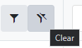
Please correct the filter operator button in order to meet WCAG Accessibility Standard 1.1.1 (Non-Text Content) and 4.1.2 (Name, Role, Value)
Hello there,
I am looking for a loading spinner solution to use with Vue Native Grid. I could not find something on the docs.
Is there any way I can show some kind of loading indicator while loading the data?
I am not using data source from Kendo, just basic method to populate `:data-items="items"`
Thank you!