With the current implementation of the Native Grid, if one needs to set a minimum width to a column that needs to add the implementation suggested in this Setting a Minimum Column Width example.
While the approach in the above example works as expected, the logic that needs to be added can be internal for the Grid component. Thus the users will have to add a simple column property like the below and no other configuration should be set.
  {
    field: "ProductName",
    title: "Name",
    minWidth: 200
  }
Scenario: Native Grid with Virtualization + Grouping.
The field for improvement: The expand/collapse is slow if we have a big number of items in the group which is expanded/collapsedExample: https://codesandbox.io/s/smoosh-waterfall-7gebk1?file=/src/App.vue
In my project, I always use remote data because the data comes from a backend that aggregates data from several sources in the company and because I want to sort, filter, etc on the server to be able to do it on the entire dataset (and I cannot do it in the frontend because it's a lot of data).
In the Wrapper Grid, we can add a "Refresh" button to the pager of the component using the pageable-refresh property.
Such property is not available in the Native Grid. As the Native Grid doesn't use the DataSource component, I can assume that the Refresh button cannot be fully functional out of the box but still we could be able to pass a method that will be triggered once the button is clicked. Then through this method, we can make an API call and update the data.
The column menu in the Wrapper Grid has the functionality to lock/unlock a selected column.
Can you add this feature to the Native Grid?
There are multiple smaller Kendo UI for Vue Native components used inside the Native Grid. In some scenarios, the fine-tuning of the smaller components is essential for the usage of the Grid.
For example, the current implementation of the Grid doesn't provide an option to configure the formatting of the NumericTextBox displayed in the filter of its column menu. Now, to achieve the described functionality we have to use a custom column menu template.
Please add an option to control the configuration of the Native components used internally by the Grid.
In the current implementation of the GridColumnMenuCheckboxFilter component when its searchBox prop is set to true, the input that appears filters the component's values using the "startwith" filter operator.
Providing a property that can define the filter operator of the searchBox inside the GridColumnMenuCheckboxFilter will be a very useful feature.
It will be very helpful if there is an example that demonstrates how we can copy and paste data from Excel to Kendo UI for Vue Native Grid.
Currently, the Native Grid Columns have the minResizableWidth property available in the API,
Can you provide a maxResizableWidth property that will do the same thing for the Grid's width but will limit its maximum width?
In the jQuery version of the Grid, the columnMenu can be configured to show/hide the different column menu options.
Here is an example of how the sortable prop can be configured in a way the sorting options will be hidden in the column menu.
Please provide the same configurations options for the column menu in the Native Grid
Add groupHeaderColumnTemplate, as in Kendo jQuery Grid and Kendo Vue Wrapper Grid, that can be applied as it is done in this demo https://demos.telerik.com/kendo-ui/grid/aggregates.
Providing an Excel-like behavior inside the Native Grid will be a very nice feature for the component. The described behavior includes:
- Cells and rows selection like in Excel
- Editing like in Excel
- Keyboard navigation like in Excel
It would be beneficial if the Kendo UI for Vue ColumnMenu had an option to display the visible columns as it is in Kendo UI for Jquery, instead of creating a custom columnMenu:
We are currently upgrading the vue-gid-wrapper to the better native-vue-grid. Unfortunately some features, like the minScreenWidth, don't seem to be included yet.
I assume the features from the wrapper will all be included in the new native grid, but to be sure I'm requesting the feature (minScreenWidth).
columns: [
        {
          field: 'variableName',
          title: 'fieldTitle',
          width: '125px',
          minScreenWidth: 1000
        },
        ...
      ]
Currently, the Native Grid implementation doesn't provide an option for the implementation of the scenario from the following screenshot.
The thing that can be currently customized in the grouping toolbar of the Native Grid is only its text.
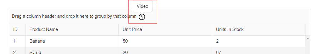
Please provide an option by which we can define a custom template for the grouping toolbar.
The native Grid allows you to lock selected columns inside it. When we have locked columns, these are constantly visible inside the Grid, while the unlocked columns can be horizontally scrolled to see their content.
The width of the area in which the unlocked columns can be scrolled depends on a combination of the following:
- The number of locked columns
- The width of the locked columns
- The width of the Grid
Having the above, there are some scenarios in which the area where the unlocked columns are displayed can be covered by locked columns or its size can become so small that the Grid data cannot be read.
Some examples of how the area that displays the unlocked column can become invisible or minified in size are:
- In a Grid with many columns, define many of them as locked
- In a Grid with resizable columns, resize one or a few of the columns in a way their sum width is bigger than the Grid's width
- A few Grid columns are locked but the Grid's width is too small
The current Feature request is about a property that defines the minimum width of the area in which the unlocked columns are scrolled. It could be a property like minUnlockedColumnsVisibleAreaWidth. Having this property defined, it should have a bigger priority over the defined column widths. This means that if there is not enough space to display the different locked columns with their pre-defined widths, the locked columns should be resized in a way the minimum visible area for the unlocked columns has enough width to display data.
The current implementation of the Native Vue Grid doesn't provide an option to control the visibility of the column menu in each component column.
Providing a property that can control the visibility of the different column menus will be very useful in scenarios when we want to create a customized column menu that contains a component with a popup. With the current implementation of the component, if we for example add a DatePicker to the column menu, the opening of the DatePicker's calendar triggers the closing of the column menu. Having a prop that controls the visibility of the column menu we can easily handle the described scenario.