Dear Telerik Support Team,
Our development team relies on Telerik Kendo DevCraft Ultimate, specifically the Kendo React components, for our projects. We have a suggestion that would greatly improve our developer experience.
When using MUI components, we appreciated the seamless integration with VSCode. Hovering over an MUI component name would display a tooltip with a brief description and a clickable link to the MUI API documentation. This feature allowed us to quickly access examples and API details.
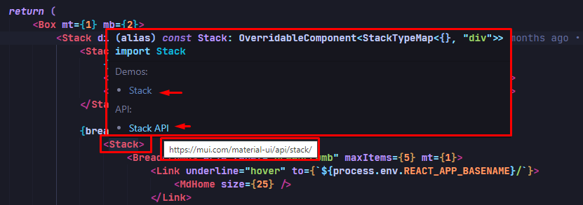
MUI with VSCode
Unfortunately, this feature is absent in Kendo React. We lack a tooltip popup with a direct link to the online Kendo React API documentation. Consequently, it has become challenging for our developers to find examples and access component documentation without manual searches.
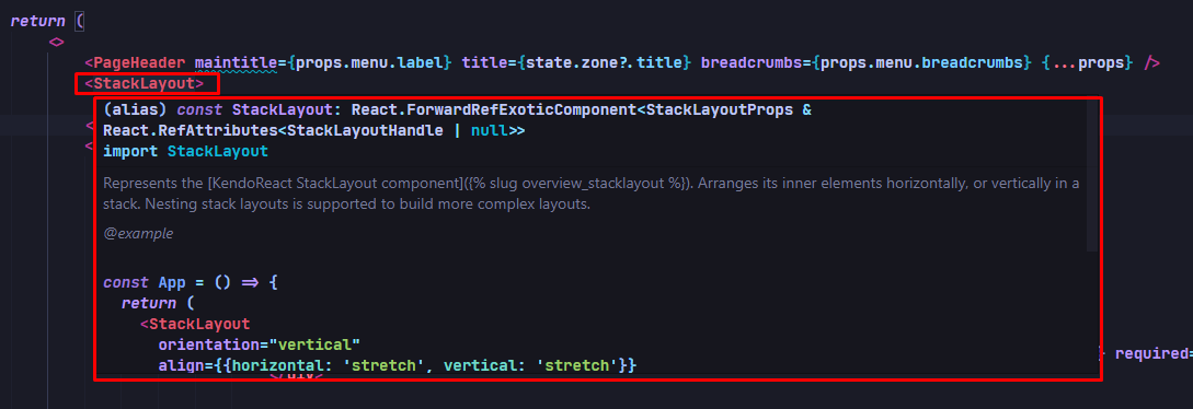
KendoReact with VSCode
We kindly request an enhanced API integration in Kendo React. Adding a tooltip popup with a brief description and clickable link to the online Kendo React API documentation would greatly streamline our workflow, saving us time and improving productivity.
Thank you for your continuous support and commitment to the developer community. We eagerly await your positive response and hope to see this feature included in the Kendo React ecosystem.Best regards,
Hi,
Using KendoReact Scheduler component the functionality to group the events by date, then by resources is not supported. I can only group them by resources first, then by date.
This feature exists in Kendo for jQuery Scheduler component and can be configured by setting the group.date property to true as following:
group: {
date: true,
resources: ["Rooms"]
}
resulting in something similar as in the picture below.
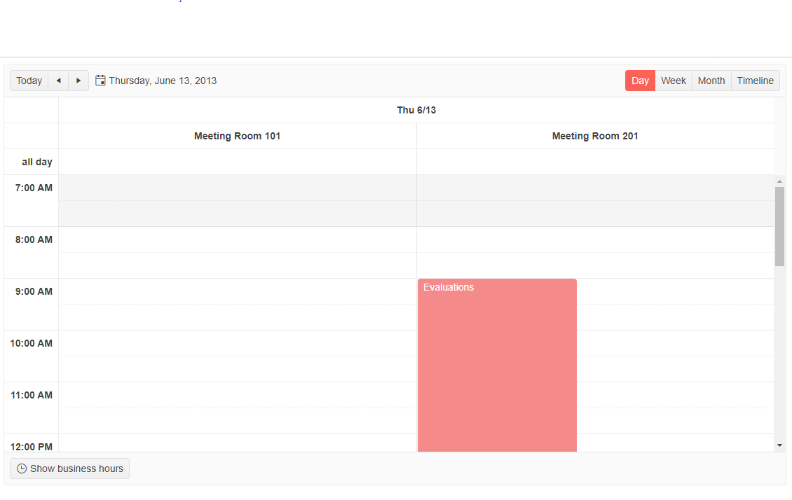
We need the same functionality in KendoReact Scheduler component as well.
Thanks,
Camelia
Hi,
Using KendoReact Scheduler component the functionality to group the events by date, then by resources is not supported. I can only group them by resources first, then by date.
This feature exists in Kendo for jQuery Scheduler component and can be configured by setting the group.date property to true as following:
group: {
date: true,
resources: ["Rooms"]
}
It would be a necessary feature in terms of visibility and usefulness.
hi,
I have attached the file there is a pie chart the labels are outside the pie chart, so I need the labels inside the pie chart ,
also in the bullet chart, I am unable to rid of the labels and title.
thank you
Current Behaviour
When a table is created in the text editor and multiple columns are selected an error is thrown.
Errors:
TypeError: Cannot read properties of undefined (reading 'localsInner')
TypeError: Cannot read properties of undefined (reading 'eq')
Expected Behaviour
When a table is created in the text editor and multiple columns are selected an error must not appear and the user must be able to merge or split the cells.
MInimal Reproduction
I'm providing a reproduction from Kendo React code examples.
https://stackblitz.com/edit/react-su15wr?file=app%2Fmain.tsx
Package
"@progress/kendo-react-editor": "^5.11.0"
Hi, when using the Kendo React Typography component like following:
<Typograpy.h1></Typograpy.h1>
compiler gives the following warning:
Imported JSX component h6 must be in PascalCase or SCREAMING_SNAKE_CASE react/jsx-pascal-case
We would like to use Kendo React to build a micro frontend UI but we did not found any relevant information that this is currently supported.
The main issue we are facing is how it isolate Kendo theme styling between different micro frontends.
Let's say we have 2 micro frontends A and B:
- A is using Kendo v6.
- B is using Kendo v7 (or some other future/past version).
Both of them will include their global Kendo styles which will collide.
After some investigation, we came up with 2 possible approaches:
- Isolating micro frontends using shadow DOM. This is the most common technique but unfortunately not supported by Kendo React yet.
- Prepend custom class to all Kendo CSS selectors (for example ".microfronend-a .k-button" instead of just ".k-button").
We have experimented with the second approach and it seems like a way to go. It also required to append all popups to root DOM node of a micro frontend which can be done easily using PopupPropsContext.
But adding a class to all Kendo CSS selector is technically not a trivial task. It would be nice if Kendo supported this out of the box, for example by providing some SCSS configuration variable.
I've noticed in your other products, the dropdownlists have a property that allows for grouping sets of data.
What would it take to get that included in Kendo UI React?
We have a use case that this would be very helpful.
Thanks.
Hello,
could you add remove / delete event to multiselect, like onRemove or something like that.
Now, because onChange event gives only the currently selected items, I need to do manual diffing what was the item that was removed.
If there were an event for remove / deletion of an item, it would be much easier to handle that.
Br, Miika
If the datagrid inside popup is wider than max screen width, then there is no scrollbar to scroll it horizontally, which means user cannot see the whole datagrid.
When I tried to somehow hack it and set max width of 100vw for the datagrid, then it partially worked - the content could be scrolled horizontally, but the header remained static; position of header cells didn't match positions of scrolled body cells, which would be confusing for the user.
How to reproduce:
1. Open this link: the componet preview
2. Set screen width to 500px.
3. Open the datagrid using the input arrow button.
Result:
The datagrid is truncated horizontally.
Expected:
The datagrid can be scrolled horizontally..
Currently, there is a following signature of function "rowRender" passed to React Grid:
rowRender?: (row: React.ReactElement<HTMLTableRowElement>, props: GridRowProps) => React.ReactNode;
I managed to access something which I assume represents this index somehow by using "row._owner.index" although I'm not completely sure if that is always identical to the index of the row being rendered.
It would be very helpful if an index of a rendered row could be accessed as follows:
rowRender?: (row: React.ReactElement<HTMLTableRowElement>, props: GridRowProps, index: number) => React.ReactNode;
Hi,
Please check this example
https://stackblitz.com/edit/react-bri58e?file=app%2Fmain.jsx
We wanted to break the page once its started overlapping the footer.