Whether the Treelist supports multi column headers ,Nest columns in the columns definition?
Like the Grid
https://www.telerik.com/kendo-react-ui/components/grid/columns/headers/
Hello
There was an error calling “ chart.surface.redraw() ”
onRender = (args,mapValues,stackedOrderBy) => {
const chart = args.target.chartInstance;
const valueAxis = chart.findAxisByName("valueAxis");
const categoryAxis = chart.findAxisByName("categoryAxis");
if (!chart) return;
let x= 1;
if( stackedOrderBy!="Ascending")
x=-1;
let axis = categoryAxis.options;
axis.categories = axis.categories.sort(function (a, b) {
if (mapValues[a] < mapValues[b]) {
return -1*x;
}
if (mapValues[a] > mapValues[b]) {
return 1*x;
}
return 0;
});
chart.surface.redraw();
Add render prop for the SplitButton.
This will allow changing the main button and also the button that opens the DropDownList.
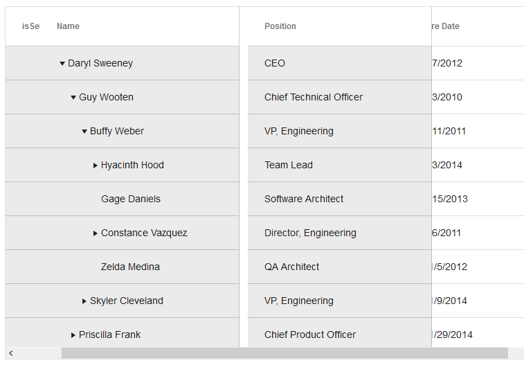
In the case of multiple columns headers, the column width of the KendoReact TreeList is invalid
Hi,
we have a feature request as per description, value isn't changed when manually entering numbers in the field, it only changes when selecting a presented date. When manually entering date, value remains null so reset is actually changing null to null, not the entered value to null. Your colleague mentioned that the feature of exposing mask to be controlled would make it possible to clear the mask.
Please refer to this github issue for more detailed information, containing stackblitz example and gifs of an user case, as it was an ongoing discussion.
Please implement an option to properly reset partially entered dates.
https://github.com/telerik/kendo-react/issues/368
Hello,
I would like to make a general feedback after visiting KendoReact website for the first time. I'll expose a lot of wrongs, but keep in mind my goal is to give you insight for improvement, not to bash.
Context : I'm currently curating React UI frameworks for a new long term project within my company. I am a senior software architect seeking some general feelings about a the product (reliability and performance for example) but also very specific : easy layout management and very accomplished components such as Select.
Navigation
The documentation website ( https://www.telerik.com/kendo-react-ui/components ) is extraordinarily slow, this is very inconvenient when you're browsing to discover what the kit has to offer.
Accessing sub-section actually change the page, requiring a full reload, which again, is so slow I don't want to click on it. Seriously.
Take https://www.telerik.com/kendo-react-ui/components/dropdowns/multiselect/ for example, to discover all the features, I have to trigger several page load. This is not gonna happen ; I'll leave this. I did leave this. It's the most wanted component for me in my research. I left.
Content
The documentation pages does not expose the available properties of the component, I have to visit every sublink and read every source to find out. This is not ok either. I'm looking for a framework to save time, and this is starting to seriously leech my time.
The source code of the given examples are real. I can copy paste into an empty file, and it will work. This is the good side of the coin. The bad side of the coin is it takes me an, abnormal amount of time to see how the component is structured. That's the only thing that interest me on the first look. If I want deeper understanding and knowledge, yes please provide with a link to stackblitz or whatever so I can play with it, but first I want to see what it looks like.
You use unconventional naming. Look around in the js world, how people call stuff :
A form select is a select, not a dropdown. Within your dropdown menu item you have multi-select but you have to find it first !
A grid is a css grid, not a DataTable.
You have in your menu : Forms, Dropdown Select, Inputs, Upload. All of that is Form. How am I supposed to know if I've seen all form features if everything is spread around ? You also have Chart, Gauge and Drawing.
PanelBar ? Never heard of it. Accordion ? That's my boy.
You also present features that don't belong here, like Excel Export or PDF Processing whereas some basic information are missing such as "does it work well with TypeScript ?" : https://www.telerik.com/kendo-react-ui/knowledge-base/?search=typescript .
Features
You have a lot of components, some are very accomplished (i.e. TreeList) and others are quite average, such as Select. Check this competitor component : https://blueprintjs.com/docs/#select. Real world usages. Maybe you can achieve the very same thing with KendoReact, but even if true, I feel you don't understand what I need.
Too few UI framework care about layouts, KendoReact unfortunately is no exception. Layout is not just a box next to another. Layout is ordering content and filtering content depending on the device, it's putting some text over an image, it's making a row of three blocks and make sure they have the same height regardless of their content, it's having a page section that is exactly the size of the visitor's screen ; UIKit is very good at this ( https://getuikit.com/docs/height ). But it's also Special States : empty state ( https://material.io/design/communication/empty-states.html#content ) or result state ( https://ant.design/components/result/ )
My overall feeling is the product is disconnected from the environment and dev culture I'm working in.
When adding an item (or editing an item) - it would be great to have the ability to customise the UI - for the dialog box.
This is for a component being included in a Dynamics365 view - using the PowerApps Component Framework.
Even if we had a 'double click' event - and then I could re-direct to the specific page/entity for editing.
For now - the 'default' dialog for edit doesn't work for what we need...
Currently, the onLegendItemHover can be used to detect mouseover event on a legend item.
Suggest adding an event mirroring the mouseout event.
Kendo UI for jQuery implements this
https://docs.telerik.com/kendo-ui/api/javascript/dataviz/ui/chart/events/legenditemleave
I have a need for the 'Drop files here to upload' text to always be visible in the drop area of the KendoReact Upload component. Example of what I am talking about is in attached images.
When using the tab strip, it'd be nice if there were an event that fired before the tab changed so that we could abort a tab chat. For example, if a tab has some input fields that allow a user to change some setting but they change the tab without hitting save or something. It'd be nice if I could pop up a modal and ask them to save before changing tab.
The function could just return true or false to allow the tab change, etc.
UPDATE: This is live code I prepared for you: https://stackblitz.com/edit/react-ts-dhhsaz?file=index.tsx
I get error:
 Invalid hook call. Hooks can only be called inside of the body of a function component. This could happen for one of the following reasons:
1. You might have mismatching versions of React and the renderer (such as React DOM)
2. You might be breaking the Rules of Hooks
3. You might have more than one copy of React in the same app
But error appears to be inside KendoDrawer component. I can't figure out what is wrong. This is my component:
import React, { useState } from 'react';
import { withRouter, useLocation, useHistory } from 'react-router-dom';

import { Drawer, DrawerContent } from '@progress/kendo-react-layout';
import { Button } from '@progress/kendo-react-buttons';


export const SidebarDrawer = (props:any) => {

    const items = [
        { text: 'Povezivanje', icon: 'k-i-inbox', selected: true, route: '/povezivanje' },
        { separator: true },
        { text: 'Notifications', icon: 'k-i-bell', route: '/notifications' },
        { text: 'Calendar', icon: 'k-i-calendar', route: '/calendar' },
        { separator: true },
        { text: 'Attachments', icon: 'k-i-hyperlink-email', route: '/attachments' },
        { text: 'Favourites', icon: 'k-i-star-outline', route: '/favourites' }
    ];

    const [expanded, setExpanded] = React.useState(true);
    const [position, setPosition] = React.useState(true);
    const [selectedId, setSelectedId] = React.useState(items.findIndex(x => x.selected === true));

    let positionMode = position ? 'start' : 'end';

    const handleSelect = (ev:any) => {
        setSelectedId(ev.itemIndex);
        setExpanded(false);
    };

    const handleClick = () => { setExpanded(prevState => !prevState); };

    const handleChange = () => { setPosition(prevState => !prevState); };

    const drawerProps = {
        expanded: expanded,
        position: positionMode,
        mode: 'push',
        items: items.map(
            (item, index) => ({ ...item, selected: index === selectedId })),

        onSelect: handleSelect,
    }

    return (
        <Drawer {...drawerProps}>
            <DrawerContent>
                {props.children}
            </DrawerContent>
        </Drawer >
    );

};

export default withRouter(SidebarDrawer);
And this is how I use it inside App component:
import React, { useState } from 'react';
import { hot } from 'react-hot-loader';
import { Button } from '@progress/kendo-react-buttons'
import { Grid, GridColumn, GridDetailRow, GridToolbar } from '@progress/kendo-react-grid';
import '@progress/kendo-theme-bootstrap/dist/all.css';

import 'bootstrap/dist/css/bootstrap.min.css';
import { Drawer, DrawerContent } from '@progress/kendo-react-layout';
import { BrowserRouter as Router, Route, Switch } from 'react-router-dom';

import urlConstants from 'ClientApp/constants/urlConstants'
import { Connecting } from '../containers/connecting/Connecting';
import SidebarDrawer from 'ClientApp/components/SidebarDrawer/SidebarDrawer';

export const App: React.FC = () => {


    return (
        <React.Fragment>
            <Router>
                <SidebarDrawer>
                    <Switch>
                        <Route exact={true} path="/" component={Connecting} />

                    </Switch>
                </SidebarDrawer>
            </Router>
        </React.Fragment>
            )
}

export default hot(module)(App);
Hi,
I need to implement two functionality for treelist control
1. Freezing of column and rows
2. Drag and Drop column and rows
Hi,
I'm seeing a bug in TreeList which seems to be related to how locked column positions are being set. The issue I'm seeing is when I scroll to the right the columns either overlap of have a gap between them. See image below.
I also created a demo that demonstrates this issue: https://stackblitz.com/edit/react-lwp4ua?file=app%2Fmain.jsx
Seeing this issue in:
Hello,
Please allow the Form component to submit even if it's not marked as modified internally. I am trying to use the Form within a Stepper workflow, and the Form can have default values based on what they submitted in the previous Step. If they return to the Step with the Form on it, though, and those initial values are not changed while displaying the Form, then the Form internally is not marked as modified, therefor the submit event never fires.
It'd be nice if we could have a boolean to tell the Form if we care to block submission based on modified or not.
Thank you
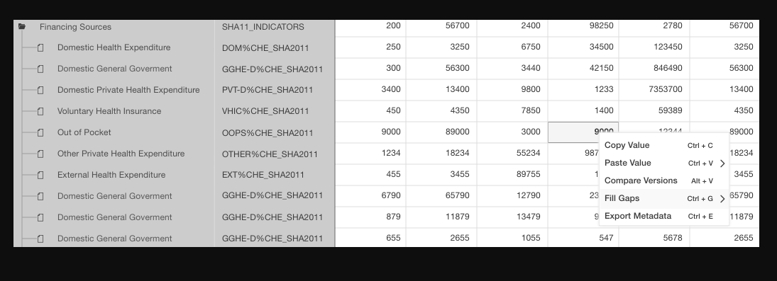
Hello,
I have a query regarding multiple cell paste and transpose paste
1. Multiple cell pastes:
Mouse selection of multiple cells after selecting, the contents present in the cells should get copied and while pasting it should get paste in multiple cells.
e.g i) column no 3 and 4 having value 200 and 56700 after selection of this value gets copied while pasting into column no 3 and 4,250 and 3250 replace by copied value
ii) column no 3 and 4 having value 200 and 56700 and next row value i,e 250and 3250 after selection of this value gets copied while pasting into column no 5, so the values 2400,98250,6750,34500 replace by copied values
2.Transpose Paste:
Mouse selection of two or more cells, then the contents present in that cells should get copied then after clicking on transpose paste the copied cell content get pasted vertically in multiple cells.
e.g column no 3 and 4 having value 200 and 56700 after selection of this value gets copied while pasting into column no 3,250 and 300 replace by copied value
all cells should be editable
I am trying to lock first column in Grid, when I used the instructions in Kendo React documentation I tried the same but as you see in screenshots it's not working.
We need to customize our exported excel to contain some additional information to the top rows of the excel sheet.
On using 'filterable' option as true in ExcelExport React component, it's getting applied on the first row but we want those filters to come on header values present on the 2nd/nth row in case we have some additional information on the top rows.
<ExcelExport
                    data={data}
                    fileName="Products.xlsx"
                    ref={(exporter) => { this._exporter = exporter; }}
                    filterable={true}
                >
Please refer the attached snapshots for actual and expected results needed from customization.